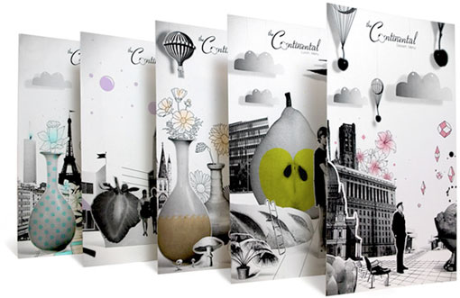
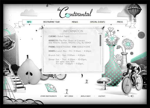
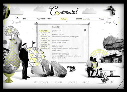
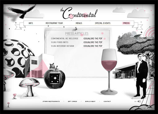
I saw this project by National Forest a little while ago and was just luckily reminded of it again… The Continental epitomizes great restaurant design, and great branding for that matter. All the details come together to create a memorable experience. And everything from the typography to the color palette to the whimsical photos and illustrations fits just perfectly.


Get 300+ Fonts for FREE
Enter your email to download our 100% free "Font Lover's Bundle". For commercial & personal use. No royalties. No fees. No attribution. 100% free to use anywhere.
