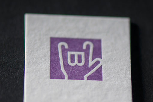
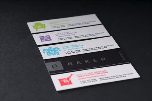
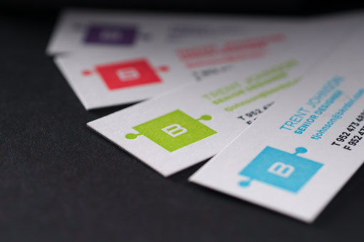
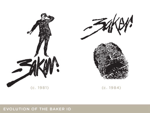
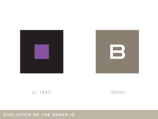
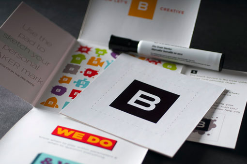
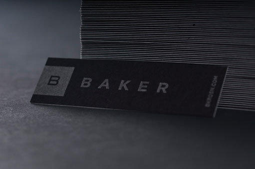
As someone who is always fascinated by the process of designers designing for themselves, this identity redesign is of particular interest to me. Design firm Baker has been around since 1981, when it began as a solo illustration practice. Since then the firm has grown tremendously; and 2010 brought with it the opportunity to redefine themselves, both conceptually and visually. Not only is the resulting design colorful, playful and creative; but the thinking behind it was also carefully considered.
Baker has provided a wealth of information and insight into the redesign through a recap and analysis on their blog; all of which I cannot possibly relay in this little space. So please be sure to check out their blog for Part 1, Part 2, and Part 3 to learn more.


Get 300+ Fonts for FREE
Enter your email to download our 100% free "Font Lover's Bundle". For commercial & personal use. No royalties. No fees. No attribution. 100% free to use anywhere.

