In this article:
- Color’s Psychological Impact in Graphic Design
- How Warm Colors’ Psychological Effects Differ
- How Cool Colors’ Psychological Effects Differ
- The Psychology of Colors Outside of the Rainbow
- Taking Advantage of Color Psychology in Design
- How to Refine Your Use of Color in Graphic Design
- Strategically Using Color Psychology in Graphic Design
Your brain processes color before words, making it incredibly powerful visual stimuli. If you use it strategically, you can subconsciously influence viewers before they even understand what the graphic is about. Understanding color psychology can help you create more impactful designs, helping you deliver results for your clients.
Color’s Psychological Impact in Graphic Design
Something that impacts you psychologically affects your mental and emotional state. It is a change in thoughts, mood and behaviors resulting from specific stimuli. While it is typically an experience or situation, it can be as simple as the colors you use in your designs.
Atefeh Yazdanparast, an associate professor at Clark University, set out to prove color can subconsciously influence psychological reactions. She believes there is a connection between the senses of vision and touch.
To test her hypothesis, she had volunteers look at three different colors. She told them to assign predetermined adjectives to each one. In 91.2% of these instances, they selected the lightest shade as the softest. While Yazdanparast has not yet published her findings, her work highlights the subconscious impact of color.
Various hues trigger unique emotional reactions due to the symbolic meanings you associate with them. Since these associations vary depending on your upbringing, they vary based on geography and demographics.
Viewing a colorful design can affect your mood and perception. It can even trigger a physiological reaction. Your heart rate rises when seeing red but calms when looking at blue. Understanding these effects can help you create more effective designs.
How Warm Colors’ Psychological Effects Differ
Source: https://unsplash.com/photos/coca-cola-zero-can-on-red-table-PuauKEK01As
Careful selection matters because hues have an immediate visual and psychological impact. They trigger different emotional responses, so strategic choice is vital. However, you must keep in mind the feelings they typically evoke are based on general associations, not universal truths.

Get 300+ Fonts for FREE
Enter your email to download our 100% free "Font Lover's Bundle". For commercial & personal use. No royalties. No fees. No attribution. 100% free to use anywhere.
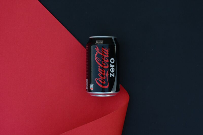
Red
Red is commonly associated with blood, blush and roses, highlighting the dichotomy between the emotions it excites. While it represents anger, tension, power and vigor, it also symbolizes romance, passion and desire. As a tint, pink is associated with charm, affection and sincerity. For these reasons, this hue can encourage impulse buying among your viewers.
Orange
As a combination of red and yellow, orange has a wide range of subconscious associations, making it incredibly versatile. On one hand, its connection to sunsets and fall invokes feelings of hope and energy. On the other hand, its association with traffic cones, fire and safety vests could trigger a psychological danger response, invoking worry or caution in your viewers.
Yellow
Yellow is the color of sunlight, gold coins and daffodils. It excites feelings of impulse and optimism, which persuade people to act with urgency. It is also often associated with illness, anxiety and cowardice, as you can tell from phrases like “yellow-bellied.”
How Cool Colors’ Psychological Effects Differ
Source: https://developer.spotify.com/documentation/design
Green, blue and purple are cool. Since they are more subdued than their warm counterparts, they might not excite strong responses from your viewers. However, they may still have a place in your projects because they trigger unique emotions.
Green
Since green is nature’s hue, it elicits a sense of relaxation, safety and balance. It’s also commonly found in currency, inspiring prosperity, splendor and value. Phrases like “green thumb,” “in the green” and “green with envy” spotlight its psychological impact.
Blue
Both the sky and the sea are blue, so its psychological impact is relatively universal. It evokes a sense of professionalism, trust and honesty, so you can use it for projects in the health care, financial or consulting sectors. As phrases like “feeling blue” and doing something until “blue in the face” suggest, it can also represent melancholy, hopelessness and sadness.
Purple
Purple is found very rarely in nature. As a combination of red and blue, it is both powerful and subdued. Violet hues trigger enjoyment, sensuality and comfort because they are associated with luxury, formality and extravagance. For reference, a “purple patch” is a run of good fortune.
The Psychology of Colors Outside of the Rainbow

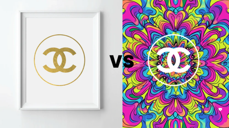
Source: https://www.designrush.com/best-designs/logo/chanel
While colors on the visible light spectrum are the most impactful, black, white and brown still evoke psychological responses because of their associations. Since they are neutral, you can use them to ground your main palette, preventing visual clutter.
Black
Black is the absence of light. While it is technically a shade, your viewers may consider it a hue. Whether you associate it with gloom and solemnity or luxury or sophistication, it can be very powerful as an accent or background. However, using it to color a typeface may not trigger any meaningful response because it is the default color for on-screen text.
White
Like black, true white is technically a tint. It is even less noticeable because it is among the most common background colors for websites. However, since it is the color of freshly fallen snow, blinding light and white-hot fire, it can trigger a sense of cleanliness, innocence or truth.
Brown
Brown is found throughout nature, making it excellent for grounding your viewer. You can create a sense of reliability, support and warmth. It has an undeniable earthiness to it, which you can use to your advantage for projects with a sustainability angle. Luxury goods like chocolate, coffee and almonds are brown, inspiring delight, contentment and bliss with the right branding.
Taking Advantage of Color Psychology in Design
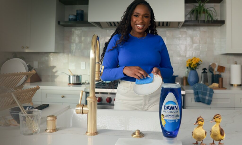
Source: https://dawn-dish.com/en-us/dawn-saves-wildlife/
If you use color strategically, you can engage viewers or entice action. The right combination can direct their attention, trigger an emotion or drive them to make a purchase, subconsciously informing their brand perception and buying habits.
Informed selection is crucial because psychological reactions differ depending on geography and demographics. However, 75% of organizations underutilize the data they have available to them, relying on a one-size-fits-all approach. Targeting the right viewer requires clean, accurate information. If you remove the guesswork, you automatically get the better of three in four competitors.
Imagine you are working for a client selling household cleaning supplies that want to be seen as trustworthy and sustainable. They want their graphic to excite optimism and serenity. You could accomplish this using blue and a touch of yellow.
The longer a word for a color is in use in a language, the greater the number of associations it will have. You can take advantage of these nuances in meaning to strengthen your color choice’s impact, intensifying your audience’s response.
Even if they do not heed your call to action immediately, your work will affect them since cognitive processes like attention, perception and memory are intertwined. Evidence shows color can increase memory retention and shorten response times. Red is the most effective, while black is the least.
How to Refine Your Use of Color in Graphic Design
Selecting and refining your use of color in graphic design is a multistep process.
1. Analyze Palettes Within Your Market
I would start by analyzing competing brands’ color palettes to decide whether I should use something similar or branch out to differentiate myself. Sometimes, specific hues dominate entire industries, simplifying market research.
The fast food industry is an excellent example. Red and yellow are shared by McDonalds, Raising Cane’s, Burger King, Denny’s, Sonic, In-N-Out, Hardee’s and KFC, among others. That’s due to color psychology. This combination makes the viewer hungry, driving sales.
2. Choose RGB or CMYK for Your Design
Where your design ends up determines whether you should leverage red, green and blue (RGB) or cyan, magenta, yellow and black (CMYK). While the former is generally better for digital works, the latter is ideal for print.
This decision is important because you are using color to evoke a psychological response. You want it to be displayed true to life. Digital media often appears brighter and more pigmented than print because the light from screens enhances the RGB gamut.
RGB is additive because it adds red, green and blue light to produce the visible color spectrum. CMYK is subtractive because it inks pigments onto a lighter background. Even though conversion tools technically exist, there is no way to create CMYK colors within the RGB gamut.
3. Consider Different Viewing Experiences
Color is not universal, so you should consider different psychological reactions. For instance, a considerable portion of the global population — an estimated 8% of men and 0.5% of women — experiences color blindness. An inability to distinguish between red and green is most common, but blue-yellow colorblindness is also likely. Prioritize contrast, but be wary of eyestrain.
4. Decide on Hue, Tint, Shade and Tones
A 2025 research paper evaluated 128 years of peer-reviewed articles on color psychology. It shows cool colors correspond with low arousal and low power, meaning they do not invoke as much of a psychological reaction as their warm counterparts.
The researchers also discovered blue, green and purple carry more similar affective meanings, which means they influence related emotions across cultural and geographic barriers. Similarly, tint and shade affected whether the viewer perceived hues as more positive or negative.
How you play with hues, tints, tones and shades can influence the viewer’s perception of your design. You should also consider whether to use warm or cool colors. While you do not have to exclusively use one or the other, your palette will likely skew one way.
5. Try Out Variations Before Finalizing
If I am unsure which direction to go, I try each one. I may play with the entire design or simply swap the typeface’s hue. While changing my project’s color palette adds to my workload, it helps me feel confident in my decision.
Strategically Using Color Psychology in Graphic Design
Each hue can trigger a different emotional, mental and behavioral response. When combined, their meaning can change. While a solid understanding of color theory can help you explore color psychology, you can use your own response to guide your work. However, it is best to remember the feelings each shade evokes to ensure you move in the right direction.