In this article:
Warning labels are a distinct form of visual communication that is fundamentally different from other modes of graphic design, such as persuasive, expressive or brand-related design. Their purpose is to succinctly communicate risk and/or elicit a specific behavior under adverse conditions.
In other types of design work, the focus might be on aesthetics. However, warning labels must provide information, even in situations with heightened emotion. Design becomes more about cognition and how the brain processes color, shape, hierarchy and language when it is a question of safety.
Why Warning Labels Require a Different Design Mindset
People use different processing strategies and different cognitive resources when reading warnings and risk messages compared to other types of communication. Cognitive limitations, such as limited attention, high information loads, and rapid decision-making, constrain risk communication.
Optimized warning systems are considerably better at capturing attention and hazard detection than conventional systems. In a laboratory study of warning signs, an optimized warning format led to a 35.9% increase in attention, 42.3% increase in hazard detection and a 37.8% increase in procedural compliance.
The results highlight the importance of visual design variables, including color contrast, symbol standardization and information hierarchy. The contrast, location, and size of visuals influence communication by directing attention, while meaning-bearing objects are more rapidly identified than textual ones. High-detail images can slow visual processing, so stick to minimalistic visuals for warning labels.
By optimally using color cues and icons to offload the cognitive load and support quick hazard detection. Research shows that visual attention cues and visual memory cues improve hazard recognition in retail settings, and thus should help in other environments as well.
How to Use Psychology When Creating Warning Label Design
An understanding of human psychology allows you to design within a narrow niche without losing message clarity. Here are the actions to help you create more effectively.

Get 300+ Fonts for FREE
Enter your email to download our 100% free "Font Lover's Bundle". For commercial & personal use. No royalties. No fees. No attribution. 100% free to use anywhere.
1. Apply Regulatory Standards
Source: https://www.needpix.com/photo/87017/
Built on decades of behavioral research, safety design models are used because predictable systems are less error-prone under stress than idiosyncratic system designs. International guidelines suggest combining colors, shapes and symbols to avoid ambiguity and ensure quick identification and usability across cultures and environments.
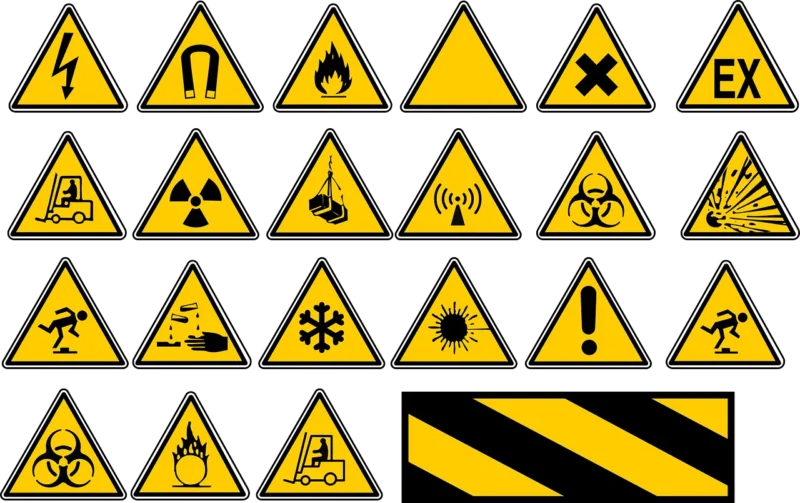
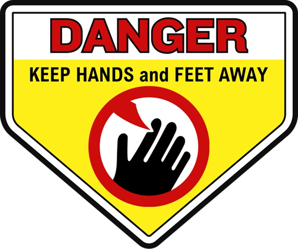
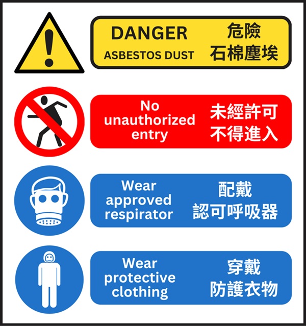
Standardized color and shape systems, applied across a range of contexts, improve recognition and response to hazards. The International Organization for Standardization (ISO) has specific guidelines just for design principles and linguistics related to safety signs and markings (specifically ISO 3864-1:2011 and ISO 3864-2:2016). For example, according to ISO 3864, red signs mean something is prohibited, while yellow signs such as the ones in the example above warn users about some kind of danger, and blue signs mean something is required. Warning signs are also always meant to be triangular under these guidelines, while requirements or things that are prohibited should appear circular. Design within boundaries such as these to establish a coherent and compliant design language before creating.
When creating a warning label, I outline the requirements before beginning the design. What regulations must I follow to ensure the company complies? Starting with what must be included gives me the creative freedom to apply the right concepts. I add sticky notes around my workspace with the elements I need to ensure I follow.
I also build a constraint stack as a quick default before layout. I list the required elements, hierarchy, minimum size and placement rules. I do one pass where I imagine the label being photocopied, scuffed or viewed under a glare. If the fundamentals of the design break, I fix them. I am also in a better position to defend my design when stakeholders want to add embellishment.
2. Design for Cognitive Limits
A label should account for divided attention, as users might be engaged or fatigued. Ambiguous designs create unnecessary points of failure for users. Instead, embrace clear symbols for quick comprehension when the brain is under a cognitive load, such as in an emergency. Utilize contrast and visual signals that allow the user to better comprehend instructions while under extreme stress.
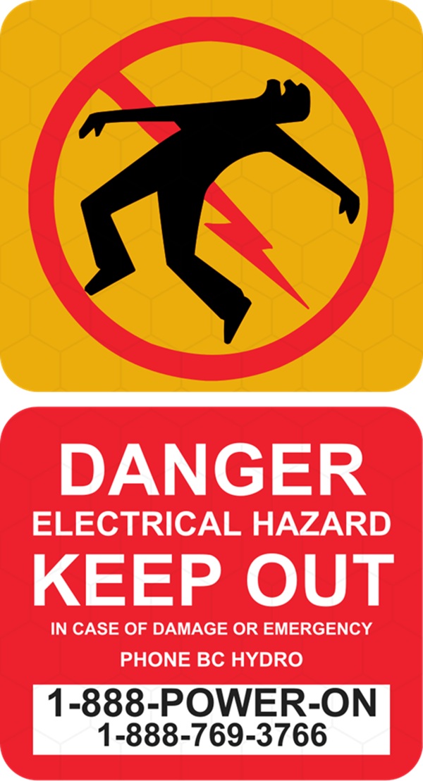
In practice, this means high contrast visual signals — such as the yellow, red, black and white in the above graphic — and a few simple focal points that mean minimal competing elements. When I’m designing according to this principle, I’m testing whether this warning still makes sense or conveys meaning when viewed for less than a second.
If the core message is difficult to discern and sustained attention cannot be maintained, redesign. When I design according to this principle, I ask myself if the warning still makes sense when displayed for a fraction of a second. If the meaning is lost without sustained attention, then the design needs improvement.
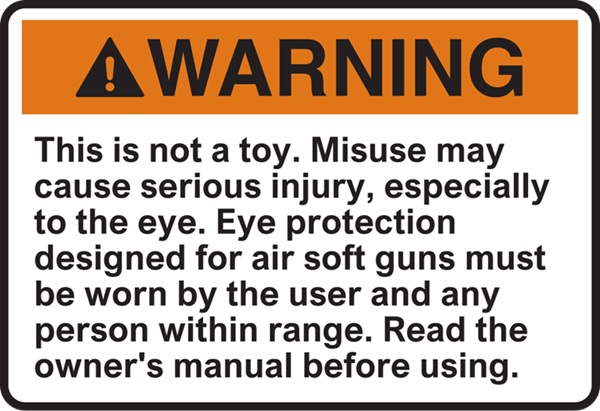
One thing I often do is place the key image in the center of the design, as you see in the example above. The user’s eye naturally goes to the center, and then the red circle around the icon above draws additional attention.
Color categories, symbol types and contrast ratios are nonnegotiable. I can add creative choices later. Ensuring I follow the standards can help me avoid ambiguity that might cause injury.
3. Use Risk Perception Research
Subjectivity plays a role in risk perception. Familiar risks are perceived as less hazardous than new, more dangerous ones. The design should not be biased against familiarity. Designers can use color to draw attention to well-known risks the user might overlook.
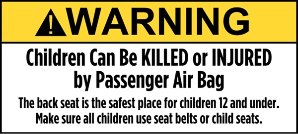
In a study on warning labels, participants rated red as the most dangerous, followed by orange and yellow. When combined with the word “danger,” such as in the image above, it signaled hazard. When I make warnings, I imagine colors as a hierarchy. I try not to waste the high-risk colors on non-immediate dangers.
Lower-risk instructions employ a calmer voice. Avoid overusing any one color, though. Excessive use of red decreases the sense of urgency, which can train users to ignore warnings. Risk signaling is most effective when escalation is clear and used in moderation.
4. Establish Visual Hierarchy
Color captures attention. Contrast determines whether attention is maintained. In visual cognition experiments, luminance contrast is more critical for hazard detection than hue.
Low-contrast warnings are poorly perceived in peripheral vision, glare and low-light environments, not necessarily due to user error.
I really push for the strongest contrast between letters and the background, and a clear visual hierarchy with text size such as in the example above. If the text under low light or at a distance is unreadable, I reject. Reasonable warnings should immediately separate signal from noise.
5. Reinforce Meaning
Signs are symbolic. Studies on symbol recognition show that excessive detail slows reading, while familiarity and simplification speed recognition, particularly under duress.
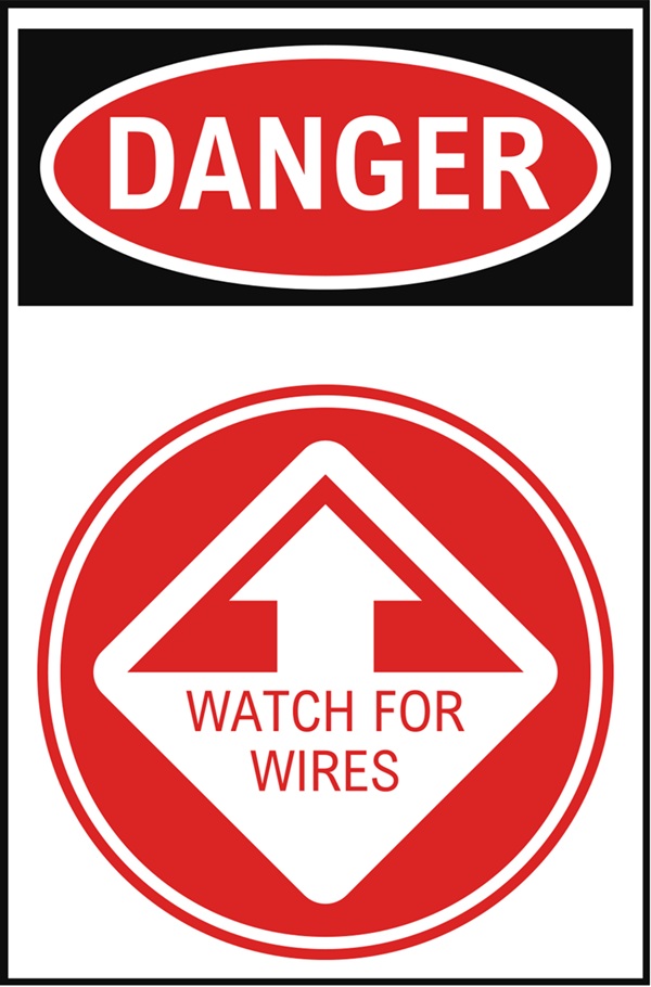
When I start designing an icon, I keep taking details away until it reads better. Decorative shading or stylistic embellishment gets in the way. Symbols must work at a small scale and from a distance, such as the large graphics in the image above.
6. Optimize Typography
Legibility is the priority for word-based warning labels, so sans serif typefaces with open counters are used for better legibility in motion, under glare and in low-light conditions. Mixed case preserves word shape and is associated with faster reading. All-caps text slows word recognition and should be used sparingly for emphasis.
When I’m picking type for warning signs, I tend to move away from branding. What looks suitable for marketing may not work for safety. The hierarchy should be evident and recognizable.
7. Focus on Comprehension
The creative combination of both graphics and text can also reduce cognitive load. Diagrams, step-by-step pictorials, and restrained illustration can sometimes communicate behavior more quickly or effectively than text alone. Educational content works best when it guides better decision-making.
These creative solutions should improve recall, increase recognition and maintain compliance. Visual novelty should not come at the cost of understanding and safety. When I’m creating, nothing gets into the system until I can show its comprehensibility, and anything that seems interesting but takes time is out.
I also take the long view. Warnings that depend upon cultural references, humor or a particular style may not mean the same thing when the context changes. When I design for understanding, I design for text that can be read and understood even years later. In regulated industries, this is even more important, as labels can stay in use for decades. A warning that remains effective amid change is valuable.
Understanding context helps determine how to best apply psychology in practice. Design research suggests that clarity improves safety communication and comprehension. Know the habits of those you’re designing for. If the language reads left to right, an F-pattern design works well. The most crucial information should be in the upper-left of the design where the reader begins their journey.
Designing Warnings That Perform Under Pressure
Effective warning labels can be designed according to psychological principles, internationally recognized standards and disciplined visual design. Colors, shapes, fonts and visual hierarchy are behavioral tools. Given that warning label design should be based on human cognition rather than intuition, revisiting these designs from a cognitive perspective can improve communication, compliance and performance.