In this article:
- Color psychology
- Color in visual hierarchy
- Color in branding and consistency
- Mistakes to avoid
- Trends and innovations in color usage
In the world of User Experience (UX), every detail counts. Color is one of the most powerful tools designers can leverage. Color serves a variety of important purposes, going far beyond simply adding visual appeal. It plays a major role in shaping users’ emotions, guiding their actions, and conveying meaning.
When used strategically, it can create a visually appealing, intuitive design that fosters trust, drives engagement, and leads to better user outcomes. Today we’re going to be talking about how that’s done.

Color psychology
Colors influence human emotions, perceptions, and behaviors in different ways. This takes center stage in UX design, seeing as color helps designers make intentional choices that guide user interactions and enhance the overall experience. Colors have the power to evoke emotional responses.
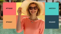
For instance, the color blue is often associated with trust, security, and professionalism, thus rendering it a frequent choice for financial institutions and tech companies. Red, on the other hand, tends to convey urgency, excitement, or passion, which is why it’s commonly used in call-to-action buttons or sales promotions. Green represents sustainability and environmental friendliness.
Different cultures have varying perceptions of some colors as well. For some nationalities, white represents purity and peace while in others it may symbolize morning or loss. Thus, the background of a target audience must always be kept in the back of a designer’s mind. The primary goal though in the use of color in UX design is to align the impact of colors with the intended user experience. An entertainment platform will opt for more vibrant and energetic colors while tech websites use plain black and white intended to focus on information only.
An essential way to identify whether the audience is reacting as desired is by using cost-saving, informative, modifiable mockups. These downloadable PSDs, such as mockups by Yellow, allow the audience to be tested and adjusted to.

Get 300+ Fonts for FREE
Enter your email to download our 100% free "Font Lover's Bundle". For commercial & personal use. No royalties. No fees. No attribution. 100% free to use anywhere.
Color in visual hierarchy
This concept entails the arrangement and organization of elements on a page to guide a user’s attention in a logical and efficient manner. This visual hierarchy helps differentiate between various elements, making it easier for users to prioritize their focus and navigate the interface.
Contrast
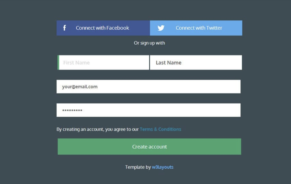
One of the most effective ways color influences visual hierarchy is through the use of contrast. High contrast between elements such as dark text on a light background or a bright call-to-action button on a muted background helps draw attention to important components. For example, a primary action button like Sign Up or Buy Now can be highlighted in a bold color like orange or green to stand out against a more neutral background. This ensures that users instinctively recognize the button’s importance and take action accordingly.
Grouping related items
Using a consistent color for similar actions or content helps users quickly identify patterns, improving the efficiency of their navigation. For instance, navigation menus might be highlighted in one color to signify their function while secondary elements like additional links or tools are given a more subtle hue.
Guidance
In a multi-step form, color can visually distinguish the current step from the previous and upcoming ones, creating a sense of progress and reducing confusion. This strategic use of color helps users intuitively understand where they are in a process, making their journey smoother and more user-friendly. Ultimately, color acts as a tool to enhance clarity and organization within a design, making it easier for users to process information and take actions in a structured manner.
Color in branding and consistency
Color is a powerful tool in branding, playing a huge role in establishing the way users perceive a particular company or product. A brand is reinforced by using consistent color in whatever the media type, whether it be a:
- website
- app
- logo
- brochure
- clothing
- packaging
These also make it more immediately recognizable, which is good. Companies want their goods and services popping up in people’s heads as frequently and quickly as possible. Not only are trust and familiarity important, but so is communicating value. Psychological associations with the brand’s personality also play a big role.
Take, for example, globally recognized brands like Coca-Cola or McDonald’s. The consistent use of red and white in the former’s branding leaves little room to mistake what brand it is. This immediately brings to mind the image of Coca-Cola and subsequently, the taste people remember enjoying. When it comes to the yellow and white of McDonald’s and the big “M”, they remember the saltiness, the burger sauces, the cheese, and the happy meal toys. Customers are also more willing to buy brands when they know and remember well precisely what they’re getting.
Mistakes to avoid

When it comes to creating a smooth and pleasurable user experience, finding a middle ground between aesthetics and functionality is essential.
- Keep it simple: Of course, a company wants to stimulate users with attractive imagery, but this cannot take away from the usability of the design, distract users, or overwhelm them. One thing a company doesn’t want is overly complex or vibrant schemes that may cause clutter, making it hard for users to focus on the most important interface elements.
- Readability: requires the right color contrast.
- Reducing the loud elements: if you have too many attention-grabbing colors in your text, your reader will be looking in different directions at once, not knowing what they should be focusing on.
- Avoid decoration: this should not be an end goal in and of itself unless it’s an artistic design.
- Don’t be dull: remember the importance of aesthetics and stimulation while not sacrificing everything for functionality.
Accessibility
Something that not everybody is sufficiently aware of is that a significant share of the global population suffers from color-blindness. Approximately 8% of men and 0.5% of women experience some form of it, making it important that everyone can use it. The most common forms are the inability to distinguish between red and green, blue and yellow, and shades of grey.
As a result, some people will have trouble distinguishing between these in an interface. If a website uses one of these pairs in indicating errors and success messages, such people may not be able to distinguish between them, leading to confusion and frustration.
Trends and innovations in color usage
As technology and design evolve, X design continues to shift along with it. From new devices to changing user preferences, the way colors are implemented in digital interfaces is constantly adapting. Here are some of the latest trends.
- Dark mode: this has been popularized by big tech platforms and it also is especially comfortable in low-light environments, helping to extend battery life as well.
- Gradients and vivid colors: smooth transitions between two or more colors add depth, dimension, and a modern aesthetic. Bright, saturated hues are being used to create energetic background elements and eye-catching call to action buttons.
- Neomorphism and soft UI: using a soft 3D effect combining a realistic and flat design, subtle gradients, and shadows.
- Customizable color palettes: the more prevalent that personalization becomes, the more that apps and websites allow users to select and set color schemes.
- Color in microinteractions: small, subtle animations or effects that happen in response to user actions are becoming customizable in color too, such as elements changing color while hovering with the mouse.