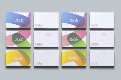
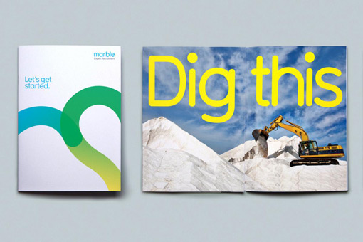
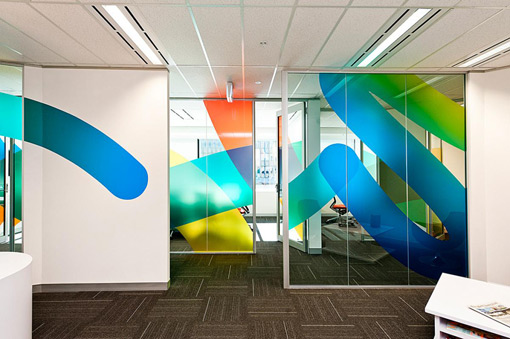
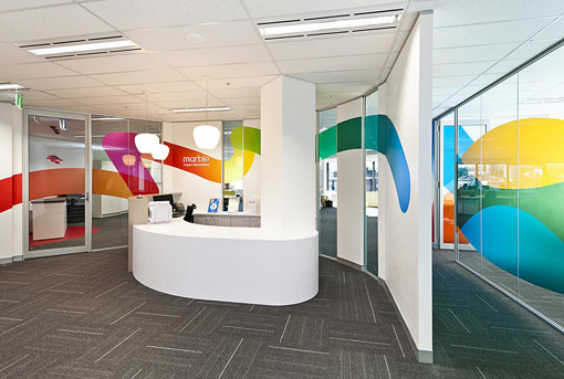
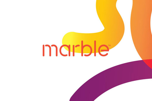
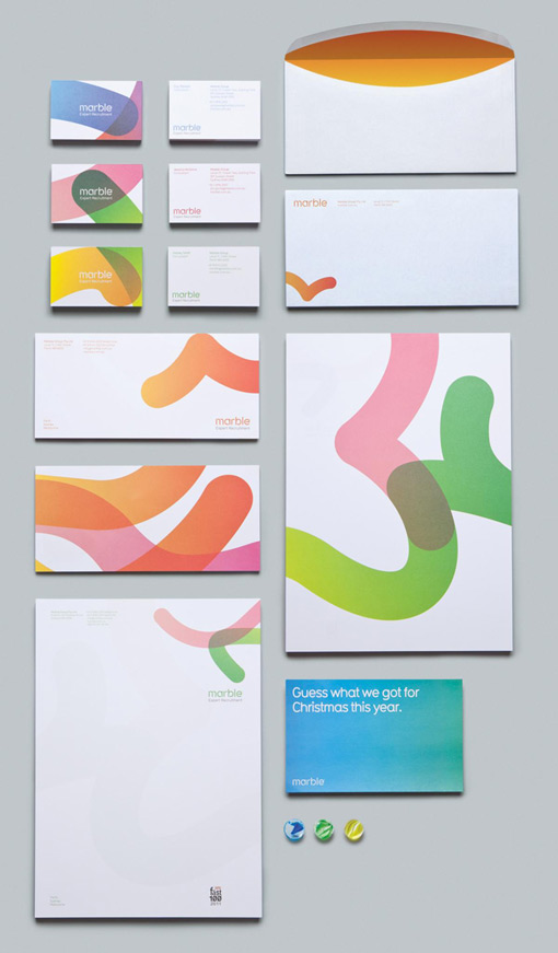
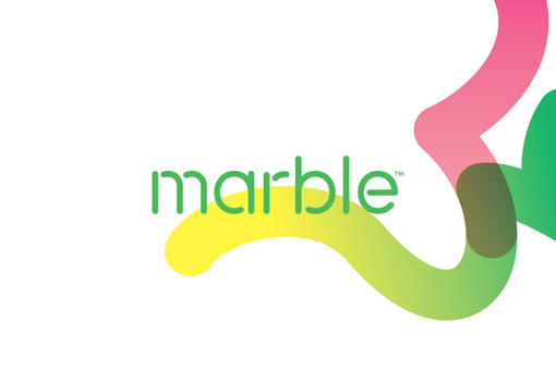
Australian studio There developed this colorful rebrand for Marble, a business whose focus is on technical recruitment for the mining and construction industries. Here’s a bit more insight into their thinking:
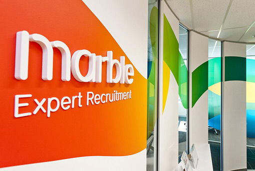
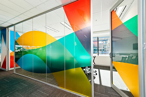
“Bold, colourful and expressive, Marble described themselves as constantly in motion, whilst leaving a ‘positive trail’ – an idea that became the core of the brand strategy. Our scope included brand identity, printed items, office signage and website.
Inspired by the ‘serendipitous nature of the game of marbles’ – our solution expressed this colour and energy as trails left by the eponymous marbles spinning, turning, colliding and rolling around, having a great time.
The identity is a flexible system, with a diverse colour palette and visual elements that constantly change and adapt, depending on the communication requirements.”

Get 300+ Fonts for FREE
Enter your email to download our 100% free "Font Lover's Bundle". For commercial & personal use. No royalties. No fees. No attribution. 100% free to use anywhere.
