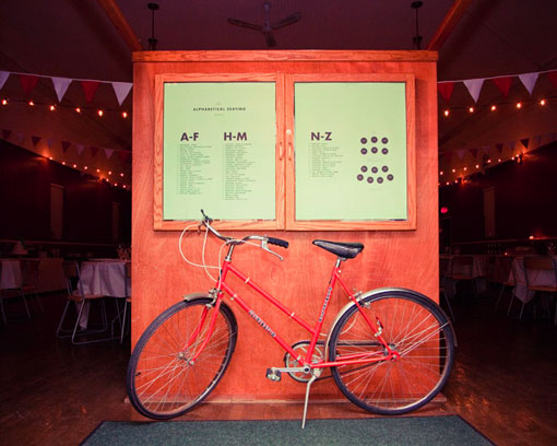
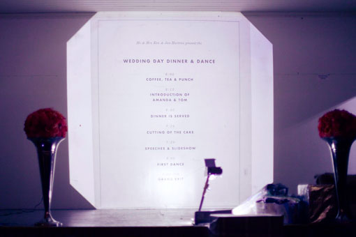
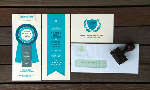
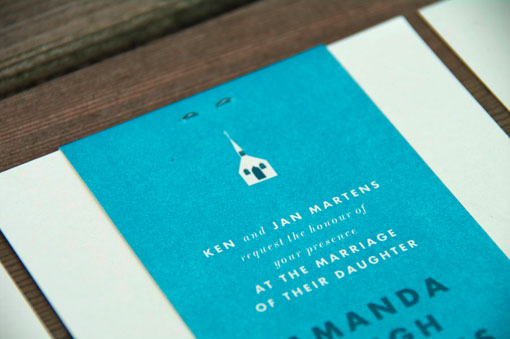
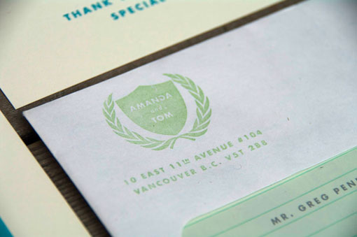
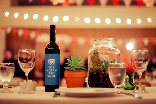
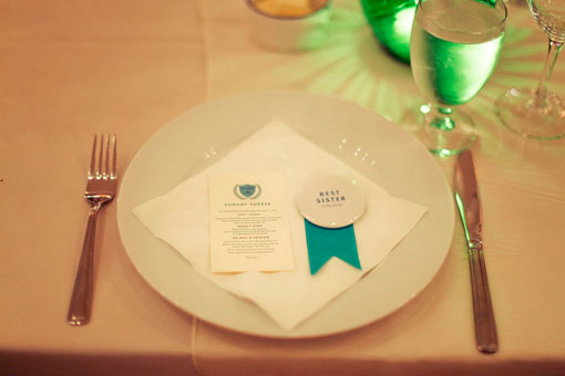
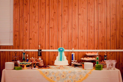
Every so often I come across a portfolio that is filled to the brim with projects I love; and such is the case with the work of Tom Froese. So today I’m actually going to feature a couple of his projects in separate posts, starting with the modern-vintage collateral designed for his own wedding. Aside from having a color palette that includes my favorite color of all time (teal), I’m loving all the playful details—ledger paper, icons, prize ribbons—that really make it sing. If I ever received this in the mail, it would be one of those invitations that I would definitely hold on to.

Get 300+ Fonts for FREE
Enter your email to download our 100% free "Font Lover's Bundle". For commercial & personal use. No royalties. No fees. No attribution. 100% free to use anywhere.
