California-based studio TRÜF recently took on the challenge of rebranding themselves, ending up with a bold Swiss-inspired look:
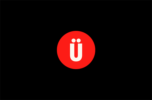
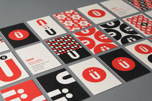
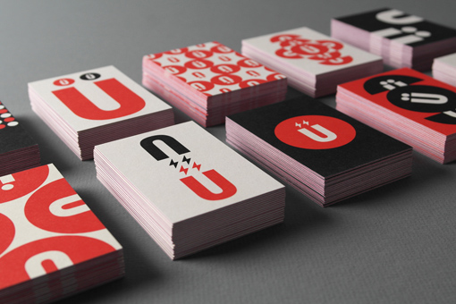
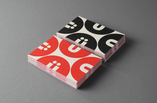
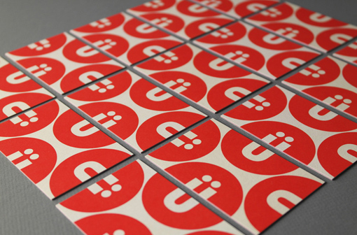
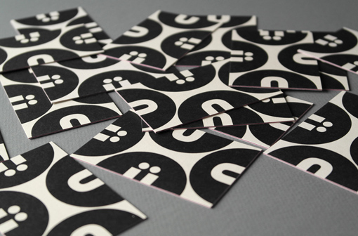
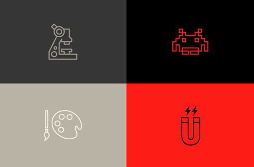
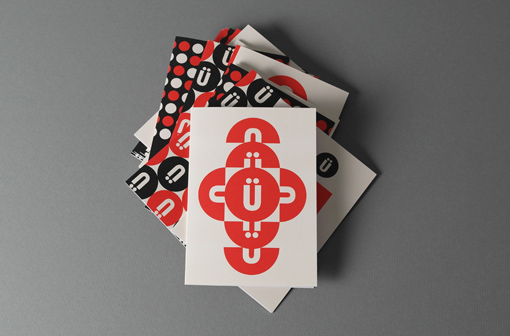
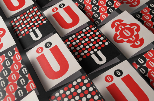
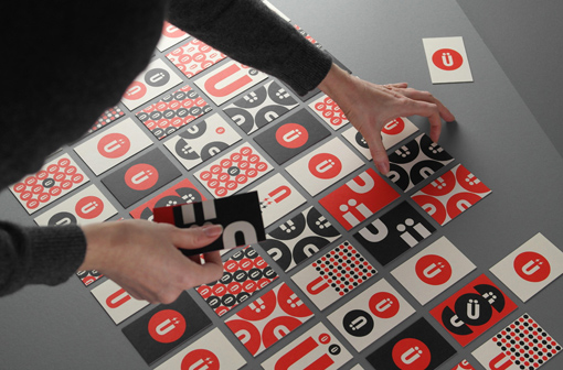
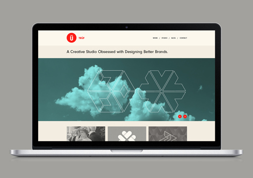
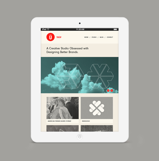
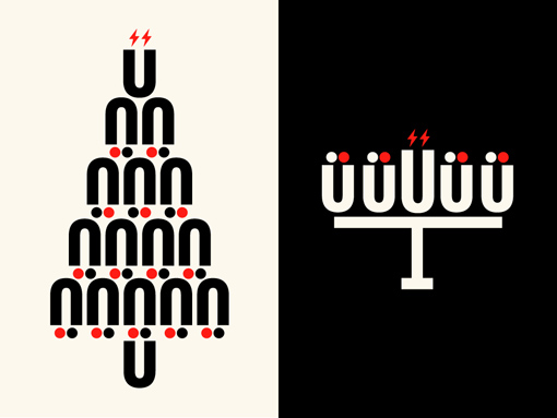
After years of designing better brands for everyone else, we felt it was time to better our own. Moving away from the textured, Russian Constructivist-look and more towards the Swiss, we distilled our identity down to its purest form: der Umlaut. Circles, dots and the Ü motif reconfigure into interlocking and repeat patterns creating a set of unique business and greeting card designs. Electric bolts echo the magnetic philosophy behind our Brand Attraction process. The full system reflects our flexible design aesthetic. We partnered with JMX2 to build a site that’s responsive, making it a true fit for any size screen.

Get 300+ Fonts for FREE
Enter your email to download our 100% free "Font Lover's Bundle". For commercial & personal use. No royalties. No fees. No attribution. 100% free to use anywhere.
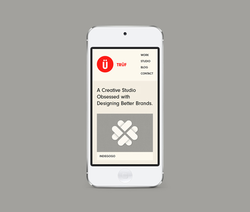
Get a closer look right here.
