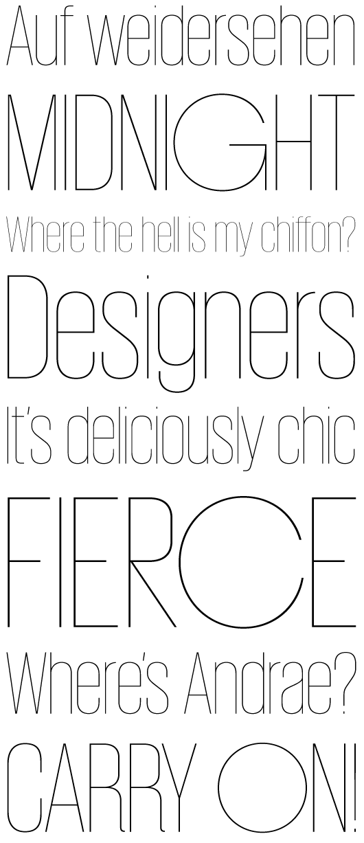
Giorgio Sans is quite the character. Designed by Schwartzco as a quirky companion to their popular serif, Giorgio, the typface features six weights and two styles. In this layout I’m especially enjoying the contrast between the condensed letterforms and the bulbous uppercase titling capitals “O”, “C” and “G”.
Edit: As pointed out to me by John, I was too busy looking at the letterforms as lines and shapes to realize that the specimen was made up of quotes from Project Runway. It does make this even better, indeed—especially “Where’s Andrae”? Amazing.

