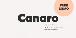
Canaro was released last month by Rene Bieder:
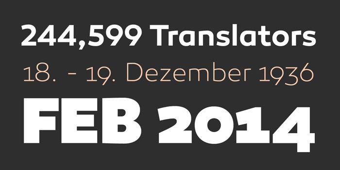
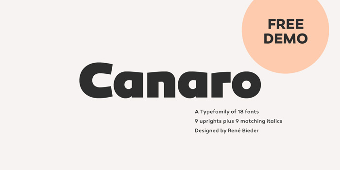
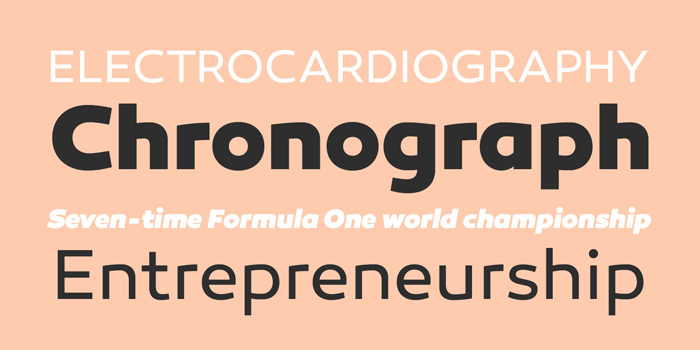
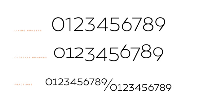
Conceived as an exploration of geometrical typedesigns of the early 20th century, Canaro developed into a font of that period with a modern streak. The lack of spurs provide a unique but unobtrusive appearance and support the contemporary character. In addition, the open shapes in combination with a tall x-height, create legibility in small text sizes. Typographic features like alternative lettershapes, ligatures, oldstyle numbers, arrows, fractions, special characters and many more, round up the whole family. Canaro is available in nine weights plus matching italics. Ranging from sharp and elegant thinner cuts to sporty and athletic heavy weights.
Pick up a copy for yourself at MyFonts.

Get 300+ Fonts for FREE
Enter your email to download our 100% free "Font Lover's Bundle". For commercial & personal use. No royalties. No fees. No attribution. 100% free to use anywhere.