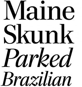
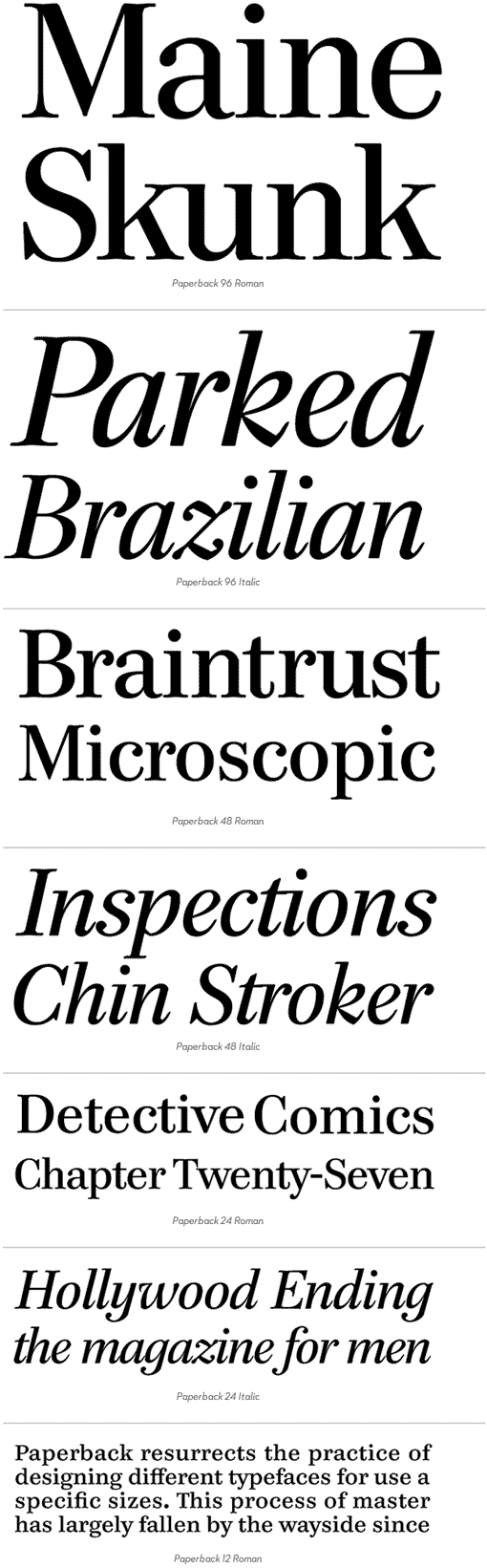
Last week House Industries introduced Paperback, a set of 15 serif fonts including both text and display cuts, plus a series of ornaments. This new release takes on the process of designing typefaces for use at specific sizes, something that is not widely practiced these days:
Paperback is a resurrection of the practice of designing different typefaces for use at specific sizes. This process of mastering has largely fallen by the wayside since the demise of cut metal type. With modern technology, it is now possible to use any typeface at any size. However, this often does not yield optimal typographic results. A font that is intended for display applications may not perform well in text settings. Likewise, a font designed for text applications may not be appropriate in display sizes. Designers have attempted a “one font size fits all” paradigm, but this strategy nearly always results in inflexible typefaces that lack the sturdiness needed for text and the sophistication desired for display. John Downer ingeniously solved this problem in the Paperback family by drawing fonts that are optimized for use in specific size ranges, allowing the family to prosper in a wide range of situations.
Pick up a copy at House Industries.
Want more type? Check out my type wishlist, current favorites and favorite calligraphic scripts on MyFonts.
