In this article:
- Our Favorite Authentic Typewriter Fonts
- What Makes Typewriter Fonts Special?
- Where To Use Typewriter Fonts Effectively
- When To Avoid Typewriter Fonts
- How To Choose The Perfect Typewriter Font
- Pairing Typewriter Fonts With Other Styles
- The Digital Revival of Analog Charm
- Common Typewriter Font Questions
- Conclusion: The Timeless Charm of Typewriter Fonts
Ah…those slightly uneven characters, the mechanical imperfections, and the monospaced rhythm that instantly transports us to a different era. Of course, I’m talking about typewriter fonts. You’ve gotta love ’em.
Typewriter fonts aren’t just relics of the past – they’re experiencing a major resurgence in 2026. From indie coffee shop menus to wedding invitations, screenplay formatting to retro branding projects, these fonts bring authentic character to modern designs.
In this deep dive, we’ll explore the best typewriter fonts of 2026, understand what makes them special, and learn how to use them effectively in your projects. Whether you’re looking to evoke mid-century nostalgia or add that perfect imperfect touch to your next design, you’ll find the perfect typewriter font here. You can use some of our favorite picks with our free typewriter font generator too.
Our Favorite Authentic Typewriter Fonts
Dreamers Typewriter
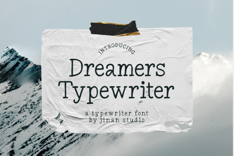
Dreamers Typewriter is a charming serif font that captures the essence of classic typewriters. Its imperfect characters and slight irregularities create a nostalgic, dreamy atmosphere perfect for creative projects that require a touch of vintage appeal.
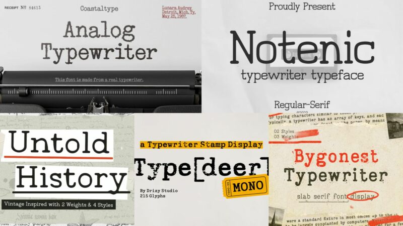
Analog Typewriter
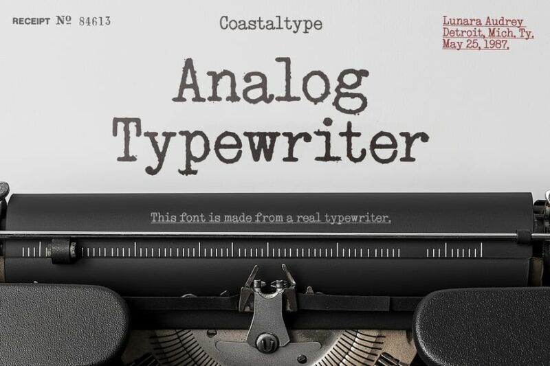
Analog Typewriter is a realistic serif font that emulates the look of traditional typewritten documents. Its crisp, clean characters with subtle imperfections make it ideal for creating authentic-looking vintage or retro-inspired designs.
Feedbacker Typewriter
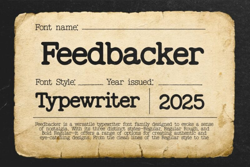
Feedbacker Typewriter is a versatile serif font that combines the charm of typewriter text with modern readability. Its well-balanced characters and slight roughness make it suitable for both body text and display purposes in designs that require a touch of nostalgia.
Detective – Typewriter Typeface
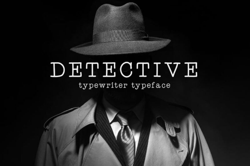
Detective is a serif typewriter font that evokes the atmosphere of classic mystery novels and detective stories. Its slightly irregular characters and moody appearance make it perfect for creating designs with a noir or vintage investigative theme.

Get 300+ Fonts for FREE
Enter your email to download our 100% free "Font Lover's Bundle". For commercial & personal use. No royalties. No fees. No attribution. 100% free to use anywhere.
Notenic – Typewriter Typeface
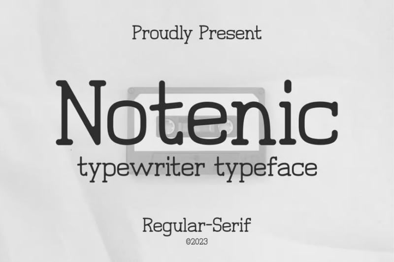
Notenic is a clean and legible typewriter-inspired serif font. Its neat characters with subtle imperfections strike a balance between vintage charm and modern clarity, making it suitable for a wide range of design projects requiring a typewritten look.
Not my type typewriter font
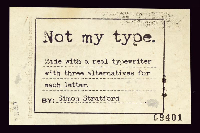
Not my type is a highly realistic typewriter font that captures the imperfections of actual typewritten text. Its uneven ink distribution and slightly misaligned characters create an authentic vintage look, perfect for designs aiming for maximum typewriter realism.
TheCase – Typewriter Font
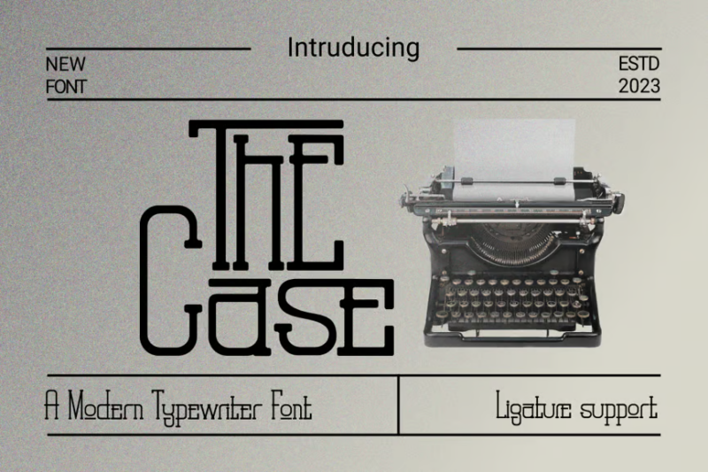
TheCase is a bold and distinctive typewriter-inspired serif font. Its strong characters and slight roughness give it a confident, assertive appearance, making it ideal for headlines, posters, and designs that need to make a statement with a vintage twist.
Untold History – Typewriter Font
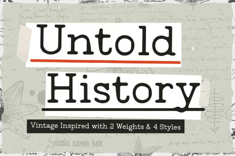
Untold History is a classic typewriter font that exudes an air of timeless narrative. Its well-crafted characters with subtle aging effects make it perfect for designs related to historical documents, vintage storytelling, or projects that require an authentic typewritten look.
Typewriter Inked Handwritten Typeface
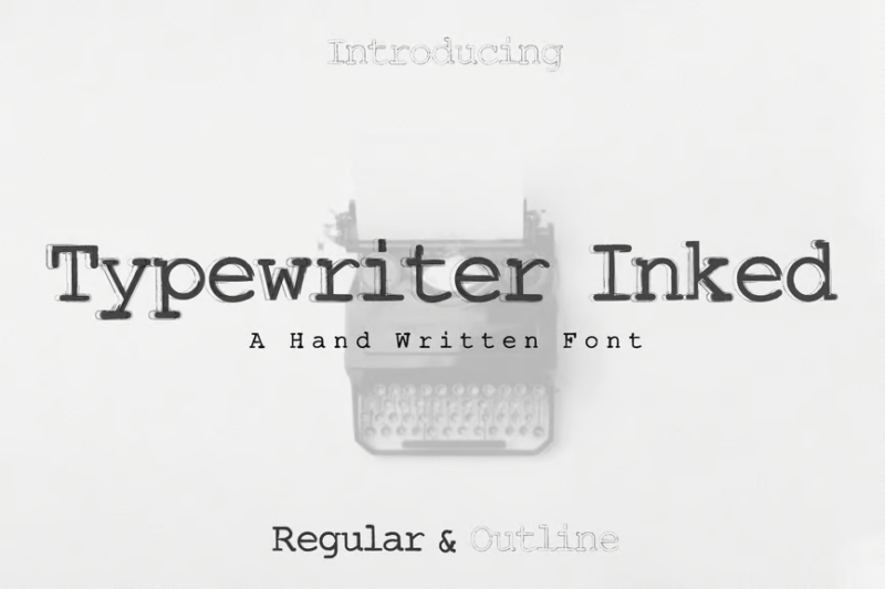
This unique typeface combines the structured look of typewritten text with the organic feel of handwriting. Its inked appearance and slight irregularities create a personal, artisanal aesthetic perfect for designs that require a blend of vintage and handcrafted elements.
Gelato Typewriter Minimal Vintage Stamp Font
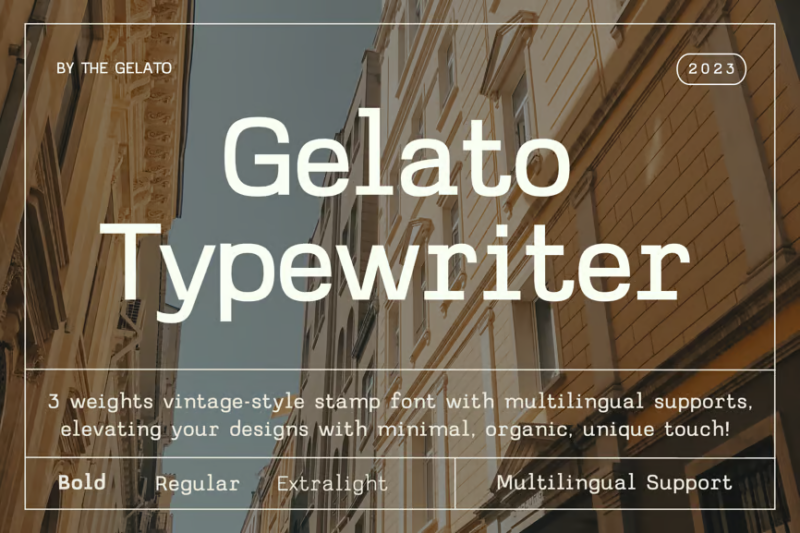
Gelato Typewriter is a minimalist sans-serif font with a vintage typewriter twist. Its clean, stamp-like characters offer a modern take on the classic typewriter aesthetic, making it ideal for contemporary designs that want to incorporate a subtle retro touch.
TypedeerMono – Typewriter Stamp Display Font
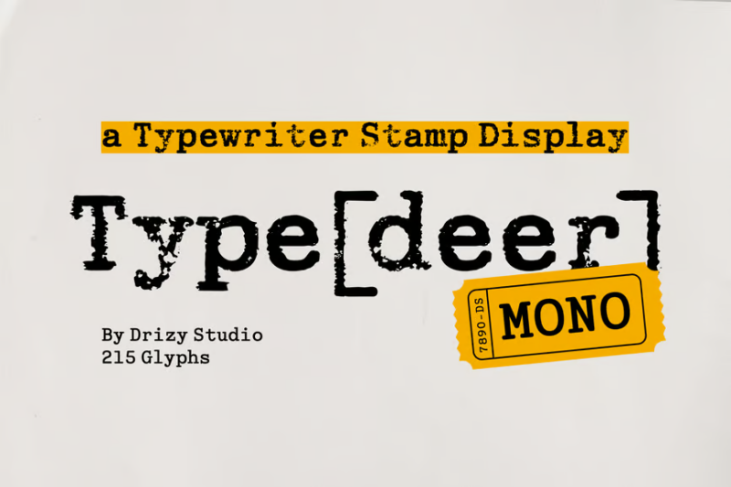
TypedeerMono is a bold, monospaced serif font that combines typewriter aesthetics with a stamp-like quality. Its strong, uniform characters make it excellent for headlines, logos, and designs that need to make a powerful vintage-inspired statement.
Graintype – Typewriter Font
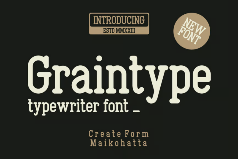
Graintype is a textured typewriter font that adds a grainy, worn quality to its characters. This serif font’s distressed appearance gives designs an aged, authentic feel, perfect for projects that require a vintage or weathered typewritten look.
Frontype – Typewriter Typeface
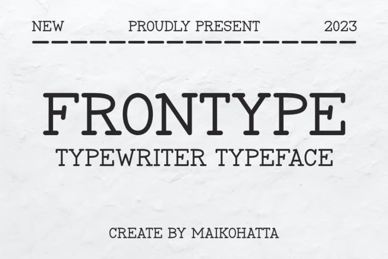
Frontype is a clean, versatile typewriter-inspired serif font. Its well-balanced characters offer excellent readability while maintaining the charm of typewritten text, making it suitable for both body copy and display purposes in vintage-themed designs.
Trioskay – Typewriter Font
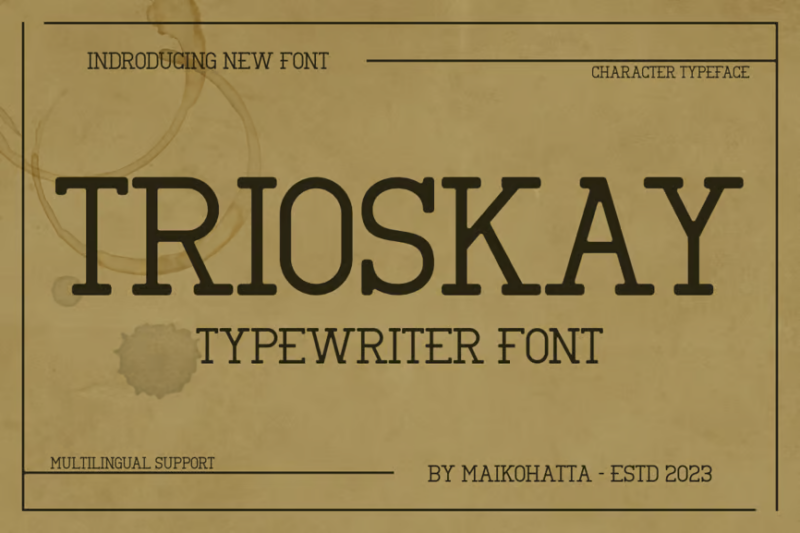
Trioskay is a distinctive typewriter font with a playful, slightly irregular character set. Its unique personality shines through in each letter, making it perfect for designs that want to capture the quirky, imperfect charm of vintage typewriters.
Wolfsmith – Classic Vintage Typewriter Serif Font
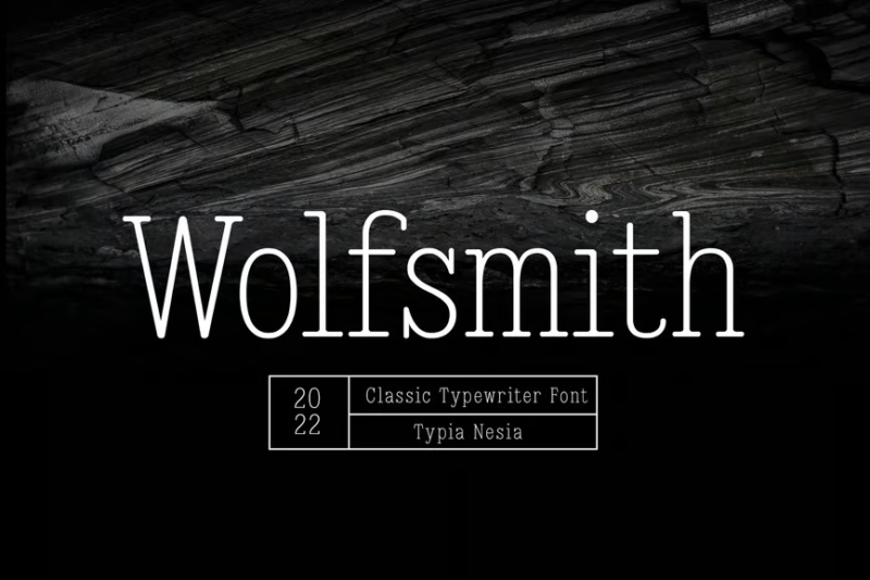
Wolfsmith is a refined, classic typewriter font that exudes sophistication. Its well-crafted serif characters strike a perfect balance between vintage appeal and modern clarity, making it ideal for elegant designs with a touch of nostalgia.
Old Typewriter Font
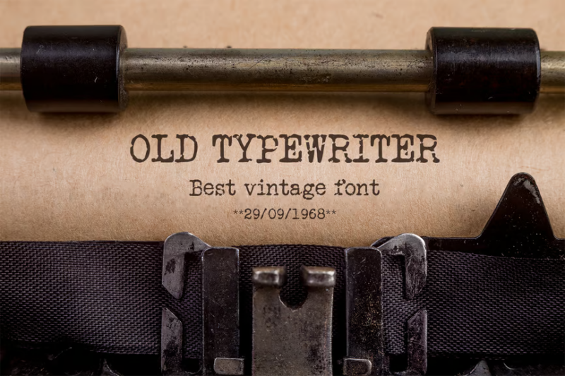
This font captures the essence of aged typewriter text with its worn, slightly faded appearance. Its authentic vintage look makes it perfect for creating designs that require a genuine old-world typewritten aesthetic, such as historical documents or retro-themed projects.
Morequiet – Modern Monospace Typewriter Sans Font
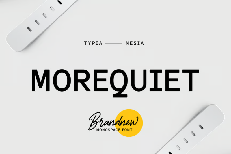
Morequiet is a contemporary take on typewriter fonts, offering a clean, monospaced sans-serif design. Its modern aesthetic combined with typewriter-inspired uniformity makes it excellent for tech-related designs or projects that need a sleek, minimalist typewritten look.
Silk Remington
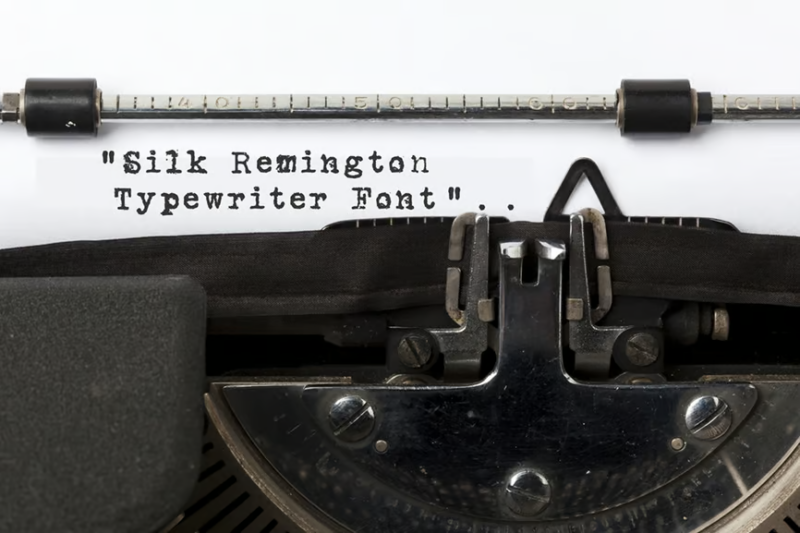
Silk Remington is a unique font that combines sans-serif, script, and handwritten styles. This versatile typeface offers the structure of typewritten text with the fluidity of handwriting, making it perfect for designs that require a personal touch with a hint of vintage charm.
Bygonest – Old Typewriter Font
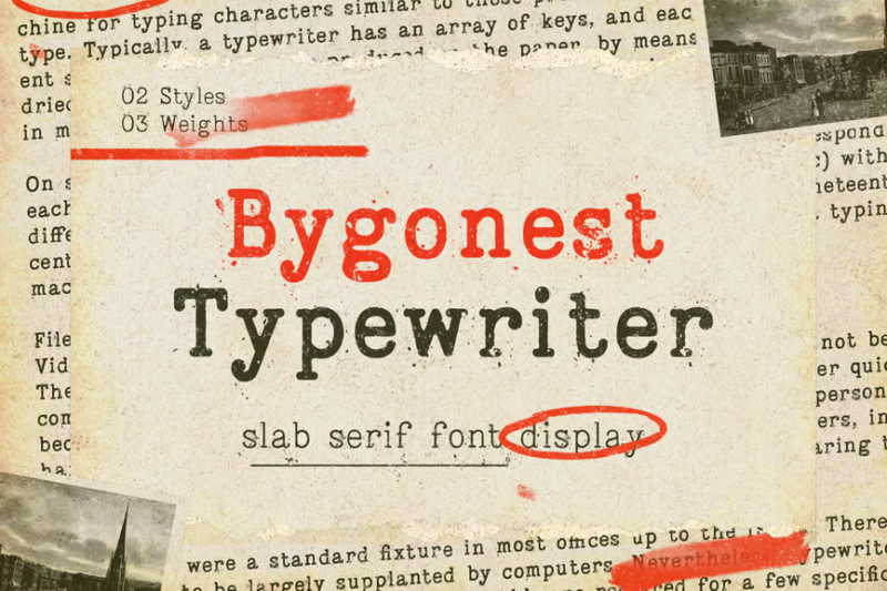
Bygonest is a serif font that captures the essence of old, well-used typewriters. Its slightly irregular, worn characters create an authentic vintage look, ideal for designs aiming to evoke nostalgia or recreate the appearance of aged typed documents.
Mencary A Old Typewriter Font
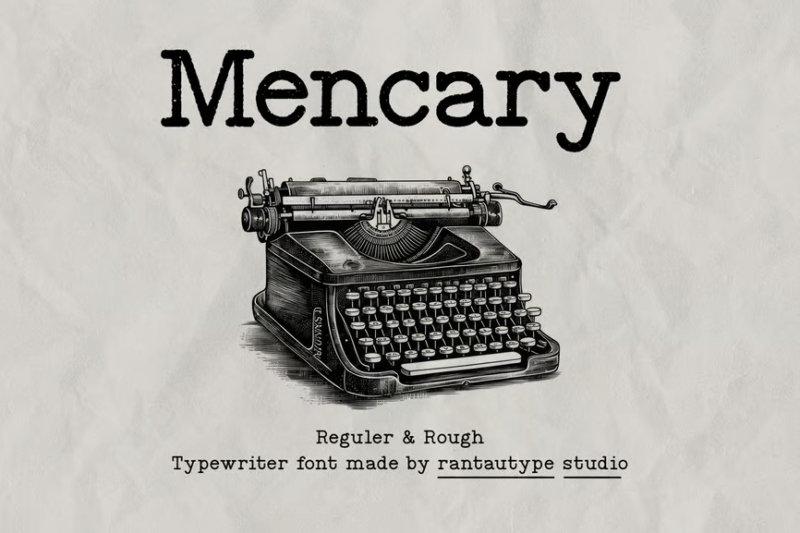
Mencary A is a charming old typewriter font with a distinct personality. Its slightly quirky characters and vintage appeal make it perfect for creating designs with a nostalgic, handcrafted feel, especially suited for retro-themed projects or vintage-inspired branding.
Typrighter
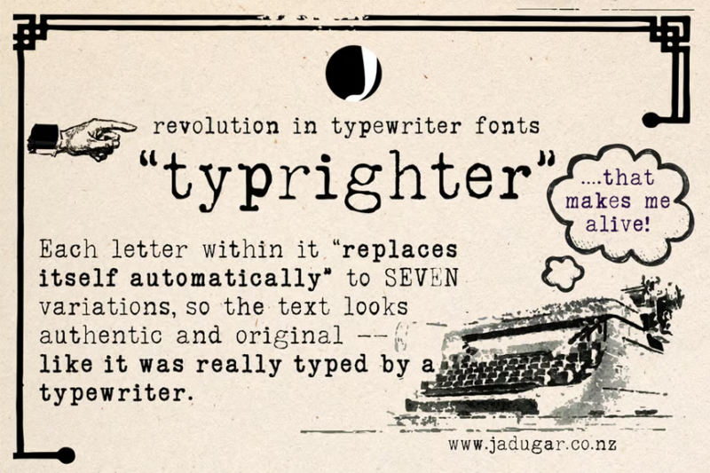
Typrighter is a classic typewriter-inspired serif font that captures the essence of old-fashioned typing. Its well-balanced characters with subtle imperfections create an authentic vintage look, ideal for designs that aim to recreate the charm of typewritten documents.
Perfect Thoughts Font
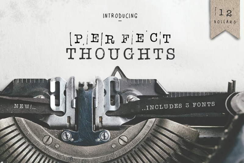
Perfect Thoughts is a refined typewriter-style serif font that combines vintage charm with modern clarity. Its clean, well-crafted characters make it suitable for a wide range of design applications, from body text to headlines in projects that require a sophisticated typewritten aesthetic.
Matches Typeface
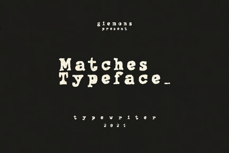
Matches is a decorative typeface that brings a unique, stylized look to the typewriter font genre. Its distinctive characters with match-like elements make it perfect for creating eye-catching headlines, logos, or designs that require a quirky, vintage-inspired touch.
Merchant Ledger
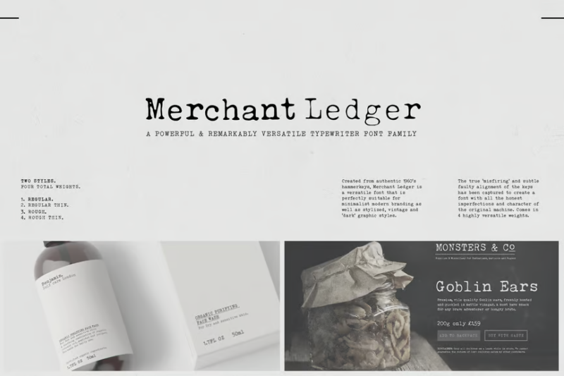
Merchant Ledger is a serif font that combines typewriter aesthetics with a decorative, retro flair. Its characters evoke the feel of old financial documents, making it ideal for vintage-inspired designs, particularly those related to commerce, accounting, or historical themes.
Hyper Writer – Typerwriter Font
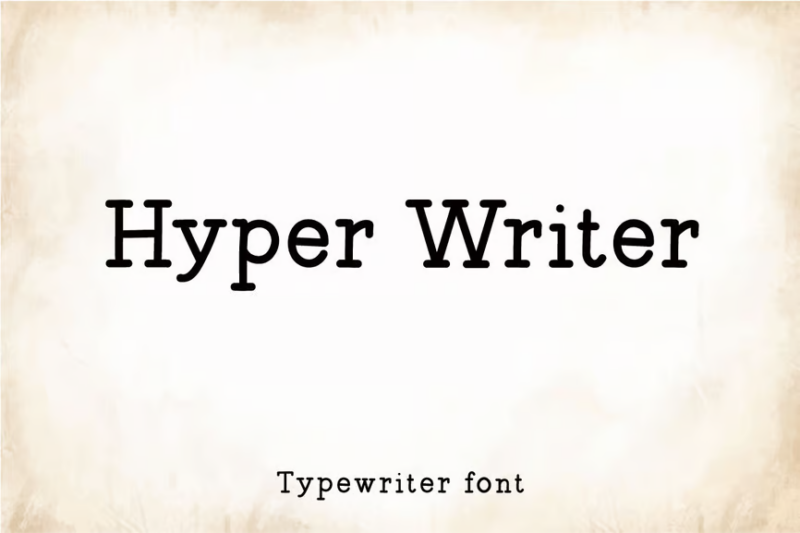
Hyper Writer is a clean, modern take on typewriter fonts. Its crisp, well-defined characters offer excellent readability while maintaining the charm of typewritten text, making it versatile for both digital and print designs that require a fresh typewriter aesthetic.
Inktype
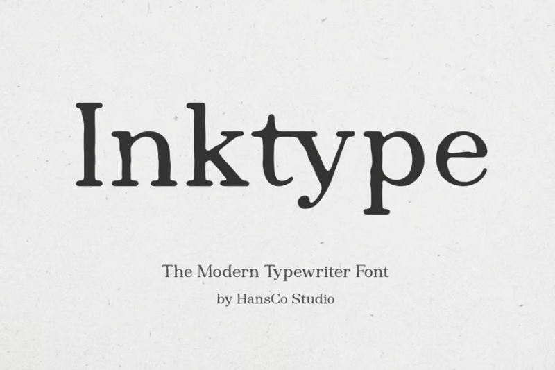
Inktype is a serif font that mimics the look of typed text with inked ribbons. Its slightly rough, irregular characters create an authentic, vintage typewriter appearance, perfect for designs aiming to capture the imperfect charm of old-fashioned typing.
What Makes Typewriter Fonts Special?
What exactly gives typewriter fonts their distinctive character? Here are the key characteristics that define the typewriter aesthetic:
Monospaced Architecture
The most fundamental characteristic of typewriter fonts is their monospaced nature. Unlike proportional fonts where characters occupy different amounts of horizontal space (an “i” takes less space than an “m”), every character in a typewriter font occupies exactly the same width.
This technical limitation of mechanical typewriters created their distinctive rhythm and spacing. The consistent spacing between characters creates a unique visual tempo that instantly registers as “typewritten” to our eyes.
Mechanical Imperfections
Authentic typewriter fonts incorporate the charming imperfections of mechanical typing. Characters might sit slightly above or below the baseline, have uneven ink distribution, or show subtle variations in impression strength.
These imperfections aren’t flaws – they’re essential elements that create authenticity. The most convincing typewriter fonts carefully incorporate these details without sacrificing readability.
Distinctive Characters
Certain characters in typewriter fonts have unique forms that instantly signal their mechanical origins. The lowercase “a” tends to have a simple single-story form, quotation marks are straight rather than curly, and numbers like “0” often include a slash to distinguish them from the letter “O”.
Serif Structure
While not universal, many typewriter fonts feature small serifs – those tiny extensions at the ends of letterforms. These weren’t just stylistic choices but practical engineering solutions that helped create clearer impressions on paper through mechanical striking.
Where To Use Typewriter Fonts Effectively
Typewriter fonts bring distinctive character to many design contexts. Here are some places where they shine brightest:
Scriptwriting & Screenplays
The film and television industry has standardized around typewriter fonts (particularly Courier and its variants) for screenplay formatting. The monospaced nature helps with timing estimates and creates the professional appearance expected in the industry.
Retro & Vintage Design
For projects aiming to evoke mid-century aesthetics or vintage vibes, typewriter fonts instantly establish period authenticity. They’re perfect for posters, packaging, and branding projects with historical themes.
Correspondence & Stationery
Wedding invitations, personal stationery, and letter-themed designs benefit from typewriter fonts’ personal, slightly imperfect touch. They evoke handcrafted communication in an increasingly digital world.
Editorial Design
Pull quotes, sidebars, and special sections in magazines and books can use typewriter fonts to create visual distinction from body text while evoking the journalist’s or writer’s voice.
Code & Technical Content
Monospaced typewriter fonts remain the standard for displaying code and technical content, as their consistent character width helps maintain precise alignment of programming elements.
When To Avoid Typewriter Fonts
While versatile, typewriter fonts aren’t the right choice for every design scenario:
Long-Form Body Text
The monospaced nature of typewriter fonts makes them less space-efficient and potentially more fatiguing to read in long passages than proportional fonts specifically designed for extended reading.
Ultra-Modern Designs
If your design concept aims for cutting-edge contemporary aesthetics with no historical references, typewriter fonts might introduce unintended vintage associations that conflict with your vision.
Situations Requiring Space Efficiency
The equal width allocation to narrow and wide characters means typewriter fonts use horizontal space less efficiently than proportional fonts. For layouts where space is at a premium, consider alternatives.
Very Small Sizes
The distinctive details and imperfections that make typewriter fonts special can become illegible or simply disappear at very small sizes. Reserve them for applications where they can be displayed at sufficient size to appreciate their character.
How To Choose The Perfect Typewriter Font
With so many excellent options available, how do you select the right typewriter font for your project? Consider these factors:
Historical Period
Different typewriter fonts evoke different eras. Some capture the pristine precision of office typewriters from the 1950s, while others reflect the worn, well-loved appearance of a writer’s personal machine from decades of use. Match the historical period to your design concept.
Level of Distressing
Typewriter fonts range from crisp and clean to heavily distressed with uneven ink distribution and alignment issues. Consider how much “authenticity” your project requires – sometimes subtle hints work better than heavy-handed distressing.
Readability Requirements
Will your audience need to read substantial amounts of text set in this font? If so, prioritize more readable typewriter fonts with clearer letterforms and moderate distressing over heavily stylized options.
Supporting Characters
Check whether the font includes all the special characters, accents, and alternate glyphs your project might require. Some typewriter fonts offer extensive character sets, while others provide only basic Latin alphabets.
Pairing Typewriter Fonts With Other Styles
Typewriter fonts rarely stand alone in design projects. Here are some effective pairing strategies:
Contrast With Sans Serifs
The mechanical, slightly ornate nature of typewriter fonts creates beautiful contrast with clean, geometric sans serifs. Try pairing your favorite typewriter font with Futura, Helvetica, or Gotham for headlines or supporting text.
Complement With Vintage Serifs
For projects with comprehensive historical themes, pair typewriter fonts with serif fonts from the same era. Clarendon, Century Schoolbook, or Baskerville can complement typewriter text while maintaining period authenticity.
Balance With Script Fonts
The rigid, mechanical structure of typewriter fonts creates interesting tension when paired with flowing script fonts. This combination works especially well for wedding suites or projects balancing formal and personal elements.
Create Hierarchy With Weight Variations
Many typewriter font families offer multiple weights. Use these variations to create clear hierarchies within your typographic system while maintaining the consistent typewriter aesthetic.
The Digital Revival of Analog Charm
It’s fascinating how typewriter fonts have survived – even thrived – in our digital age. Their continued popularity speaks to something deeper than mere nostalgia.
In a world of infinite digital perfection, the mechanical limitations and charming imperfections of typewriter fonts provide a tangible connection to the physical act of writing. They remind us of the deliberate, thoughtful nature of committing words to paper when backspace wasn’t an option and each keystroke required effort.
For designers, typewriter fonts offer a way to inject character, authenticity, and human touch into projects that might otherwise feel too polished or impersonal. They bridge the gap between digital efficiency and analog soul.
As we move further into 2026, I expect we’ll see typewriter fonts continue to evolve – with designers creating new interpretations that balance authentic mechanical character with modern usability requirements. The best typewriter fonts will always honor their heritage while meeting contemporary design needs.
Common Typewriter Font Questions
Let’s address some frequently asked questions about typewriter fonts:
What font looks like an old typewriter?
Courier, American Typewriter, and Special Elite are widely regarded as the most authentic-looking typewriter fonts. For a more weathered, vintage appearance, consider Trixie, JH Typewriter, or Travelling Typewriter.
What is the standard typewriter font?
Courier and its variants (particularly Courier New and Courier Prime) are considered the standard typewriter fonts. They’re used in screenwriting, legal documents, and anywhere a traditional typewritten appearance is required.
What typewriter font is used for screenplays?
Courier Prime is the industry standard for screenplays. It was specifically designed to address some of the shortcomings of Courier New while maintaining the expected typewriter aesthetic and precise character spacing needed for timing estimates.
Are all typewriter fonts monospaced?
Authentic typewriter fonts are monospaced, as this reflects the mechanical limitation of actual typewriters. However, some modern interpretations create “typewriter-inspired” fonts that incorporate typewriter aesthetics while using proportional spacing for improved readability.
Conclusion: The Timeless Charm of Typewriter Fonts
As we’ve explored, typewriter fonts offer far more than just nostalgic appeal. They provide texture, character, and authentic mechanical charm that can elevate diverse design projects. From the pristine precision of American Typewriter to the weathered character of Trixie Plain, there’s a typewriter font perfect for virtually any creative vision.
In 2026 and beyond, I expect we’ll continue to see these fonts evolve while maintaining their essential connection to the distinctive aesthetic of mechanical typing. The best typewriter fonts will balance authentic details with practical usability, creating bridges between analog charm and digital convenience.
Whether you’re designing a screenplay, crafting vintage-inspired branding, or simply looking to add some mechanical character to your next project, I hope this exploration helps you find the perfect typewriter font. After all, in a world of unlimited digital possibilities, there’s something refreshingly honest about embracing the beautiful limitations that shaped these distinctive typefaces.
Which typewriter font speaks to you? Have you used any of these in your projects? I’d love to hear your experiences in the comments below!