In this article:
- Building Your Typography Foundation
- Connecting College with Design Practice
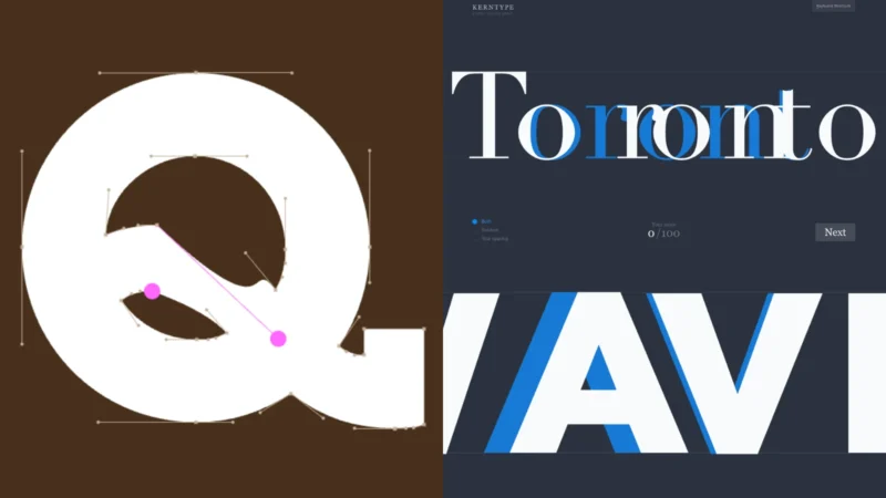
- Core Typography Drills
- Typography Tools and Methods
- Advanced Typography Awareness
- Making Typography Second Nature
Typography isn’t something you learn in one afternoon. Your eye needs training like any other skill. Design students spend years looking at letterforms before they can spot subtle spacing issues or identify typeface families at a glance.
Most typography courses start with theory. Kerning, leading, hierarchy. That’s necessary but boring. Real learning happens when you work with actual types. These exercises build the visual awareness that separates decent designers from great ones. Start with the basics and work your way up. Nobody becomes a typography expert overnight. Each exercise builds on the last one. Skip steps and you’ll miss fundamental concepts that everything else depends on.
Building Your Typography Foundation
Look at the type every single day. Not just reading it but really seeing it. Notice the curves of lowercase letters. Study how different fonts handle the letter g. Watch how spacing changes the feel of a word. Keep a type journal on your phone. Screenshot interesting typography you see on signs, packages, websites. Write notes about what makes each example work or fail. This daily practice trains your eye faster than any textbook.
Typography books help but they’re not enough on their own. Reading about kerning differs from actually fixing it. Theory gives you vocabulary. Practice gives you instinct.
Connecting College with Design Practice
Students handle multiple projects at once. Portfolio pieces, client work, and class research all compete for attention.
The challenge is maintaining quality across everything without burning out. Balancing work with written analysis takes planning. Some students find it helpful to write my paper with academic writers who understand design documentation standards. This approach helps organize complex thoughts about typography theory and visual hierarchy. Clear documentation makes you a better designer overall. The same attention to detail that improves letter spacing also strengthens how you explain sketch decisions. Finding time for both creative work and research requires honest scheduling.
Block out specific hours for typography practice. Treat these sessions like any other class commitment. Consistency matters more than marathon sessions. Regular practice builds skills faster than cramming.

Get 300+ Fonts for FREE
Enter your email to download our 100% free "Font Lover's Bundle". For commercial & personal use. No royalties. No fees. No attribution. 100% free to use anywhere.
Core Typography Drills
Print out words in different fonts. Cut individual letters apart with scissors. Rearrange them on a table without looking at the original. This physical interaction helps you understand spacing better than digital tools alone.
Start with simple words like “HALO” or “WATER” in sans-serif fonts. The simpler forms let you focus purely on spacing. Move to serif fonts once you’re comfortable. Each typeface has different spacing needs.
Hierarchy Studies
Take a simple poster layout. Design it 10 different ways using only one typeface. Change sizes, weights, and spacing. No color, no images. This forces you to create hierarchy through type alone. You’ll discover more variations than you expected.
Typography Tools and Methods
Different tools teach different skills. Hand lettering builds understanding of letterforms. Vector work teaches precision. Code-based typography reveals mathematical relationships. Try them all.
- Analog exercises: Trace letters by hand to understand their construction
- Digital practice: Kern paragraphs manually before using auto-spacing
- Print work: Design posters that only use typography for visual interest
- Screen design: Create text-heavy layouts that remain readable on mobile
- Motion studies: Animate type to understand how movement affects legibility
Reading Type at Different Scales
Set the same paragraph in 8pt, 12pt, 24pt, and 72pt. Notice how spacing that works at small sizes looks weird when enlarged. Type behaves differently at each scale. This matters for everything from business cards to billboards.
Weight Combinations
Pick a type family with multiple weights. Create layouts using only that family. Try five different weight combinations for the same content. Light headers with bold body text. Heavy titles with thin descriptions. Finding the right balance takes experimentation.
Advanced Typography Awareness
After mastering the basics, challenge yourself with harder exercises. Mix serif and sans-serif fonts. Work with condensed and extended variations. Add italic and oblique styles to the mix.
Create type specimens showing every character in a font. Include numbers, punctuation, and special characters. You’ll discover details you never noticed before. The ampersand alone can teach volumes about a typeface’s personality.
Study typography in its natural environment. Museums use specific fonts for a reason. Corporate logos depend on careful letter spacing. Movie posters manipulate type to suggest genre. Real-world examples show typography doing actual work.
Making Typography Second Nature
The goal is automatic recognition. You should identify common typefaces instantly. Spacing problems should jump out at you. Poor hierarchy should feel wrong before you consciously analyze it.
Print designers and digital designers need different skills. Screen typography deals with variable resolutions and user settings. Print work has fixed dimensions and predictable output. Learn both. The fundamentals stay the same but the application differs.
Typography connects design education to professional practice. Studios expect new hires to have trained eyes. Clients can’t articulate what’s wrong with their layouts but they know something feels off. Your job is seeing what others miss and fixing it before anyone else notices the problem.