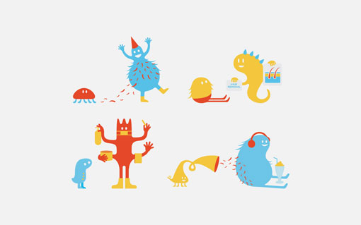
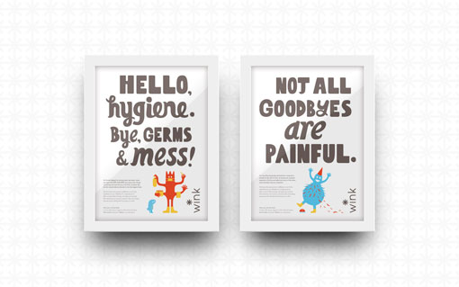
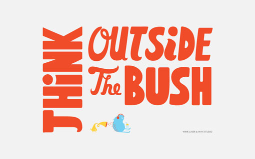
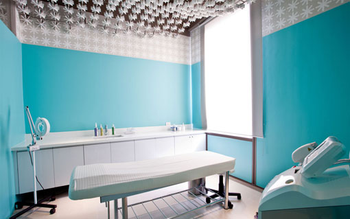
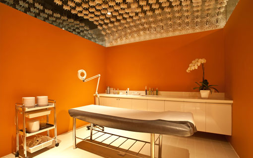
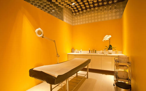
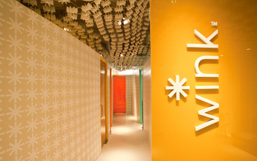
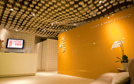
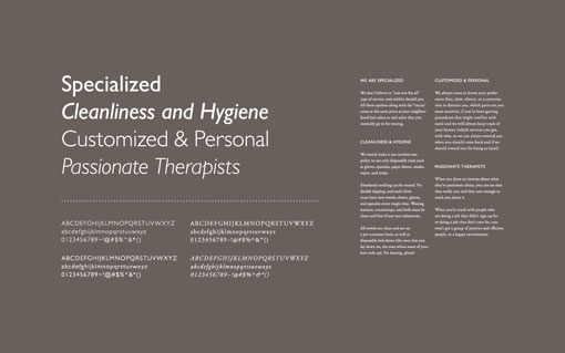
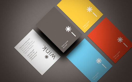
This new project by Vgrafiks is so much fun. Designed for Wink, a laser and wax studio, Vgrafiks chose to go in the opposite direction of the typical, scraping the idea of flowers, pink and overt femininity in favor of a bright, playful and punchy look and feel. I love this description of the company’s brand promise:
A wink may be quick, but it can mean a lot. When someone gives you one, it’s for you and no one else. The clean freaks at Wink Laser and Wax Studio believe that hair removal should always be just a wink away—fast, easy, and personal.

👋 Psst... Did you know you can get unlimited downloads of 59,000+ fonts and millions of other creative assets for just $16.95/mo? Learn more »
Get 300+ Fonts for FREE
Enter your email to download our 100% free "Font Lover's Bundle". For commercial & personal use. No royalties. No fees. No attribution. 100% free to use anywhere.