In this article:
- What Makes a Font Look "Viking"?
- Best Uses for Viking Fonts
- Where to Avoid Viking Fonts
- How to Choose the Perfect Viking Font
- Expert Tips for Using Viking Fonts Effectively
- Viking Font Alternatives
- Common Viking Font Questions
- Conclusion: Unleash Your Inner Viking
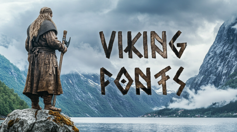
As a designer who’s worked on numerous Nordic-inspired projects, I’ve developed a deep appreciation for Viking fonts. There’s something undeniably powerful about these rugged, ancient letterforms that instantly transport viewers to a world of sagas, runes, and legendary warriors.
Viking fonts aren’t just about looking cool – they’re about channeling the raw, untamed spirit of Norse culture. When used thoughtfully, these fonts can transform ordinary designs into epic visual stories that resonate with primal power and mythic significance.
In this comprehensive guide, I’ll share the most impressive Viking fonts of 2026, explore what makes them so distinctive, and provide expert tips on how to use them effectively in your designs. So grab your design battleaxe, and let’s venture into the realm of Norse typography!
Viking Base Display Font
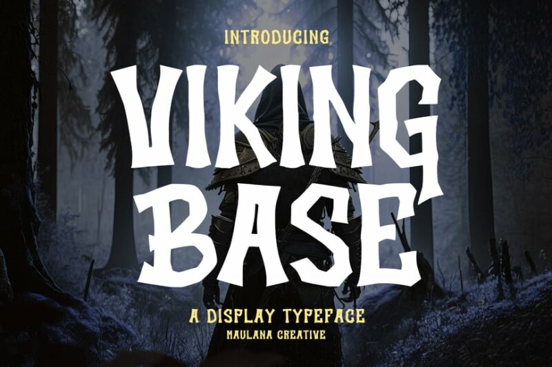
This decorative font embodies the spirit of Viking culture with its bold and rugged appearance. Its sharp edges and angular forms make it perfect for creating impactful headlines or logos with a Norse-inspired theme.
Old North
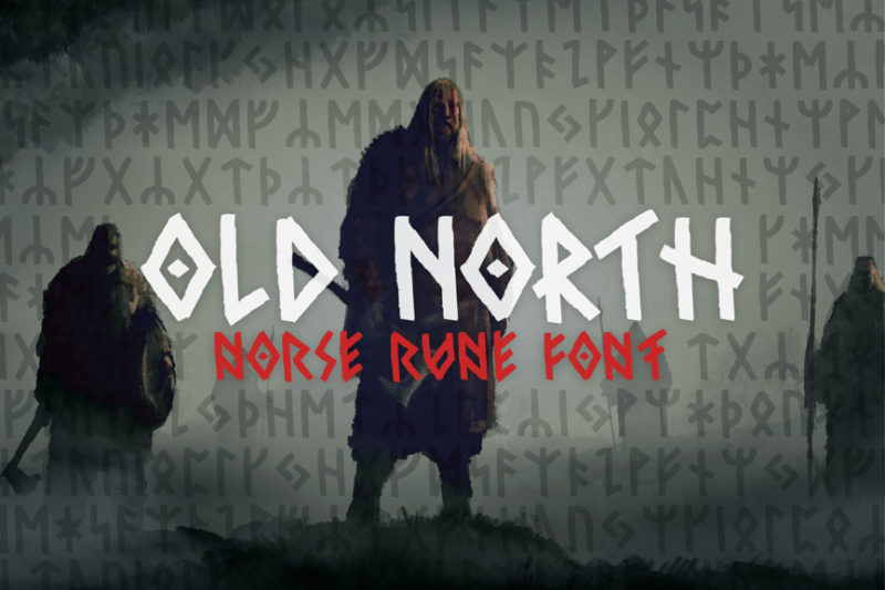
Old North is a handwritten script font that incorporates Viking and runic elements. Its organic, flowing style gives designs an authentic, historical feel while maintaining readability, making it ideal for both titles and short paragraphs.
Mjölnir – Nordic Tribal Font
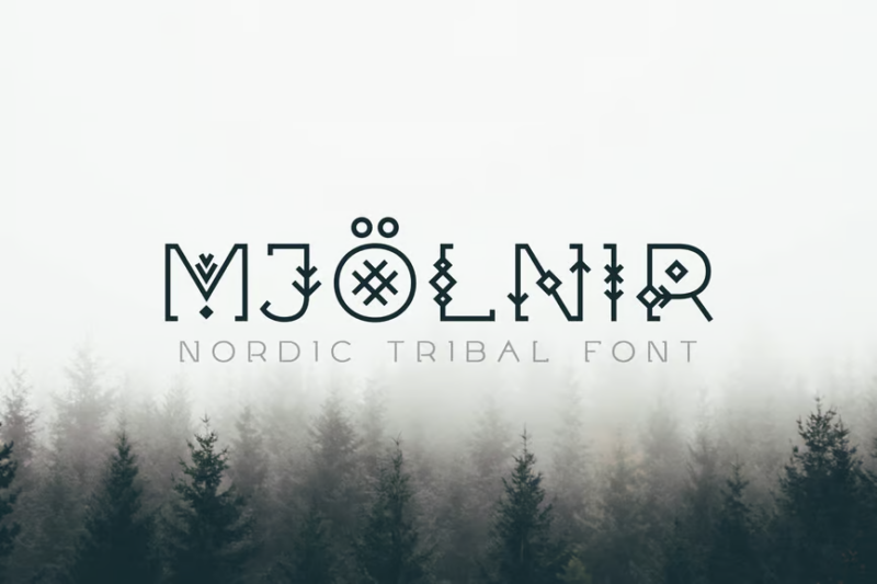
Inspired by Thor’s hammer, this tribal font features intricate Nordic patterns within each character. Its unique design makes it perfect for creating eye-catching titles or logos that require a strong, mythological presence.
Cartius
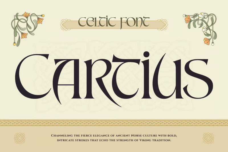
Cartius is a serif font with a medieval and Celtic flair. Its elegant yet sturdy letterforms evoke a sense of ancient manuscripts, making it suitable for projects requiring a touch of historical authenticity or fantasy-themed designs.

Get 300+ Fonts for FREE
Enter your email to download our 100% free "Font Lover's Bundle". For commercial & personal use. No royalties. No fees. No attribution. 100% free to use anywhere.
Jegbod – Scandinavian Display Typeface
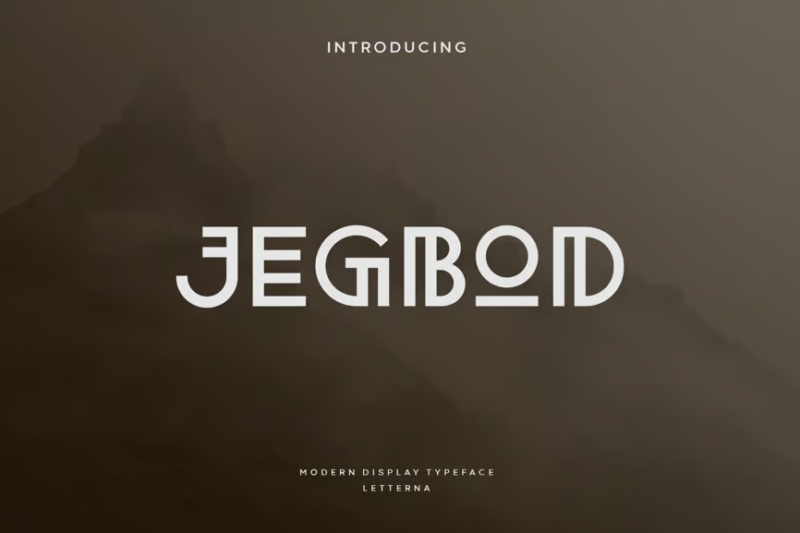
This decorative typeface combines Scandinavian design elements with a bohemian and gothic twist. Its unique character shapes and ligatures make it an excellent choice for creating distinctive headlines or branding materials with a Nordic edge.
Eloanora – Medieval Blackletter Font
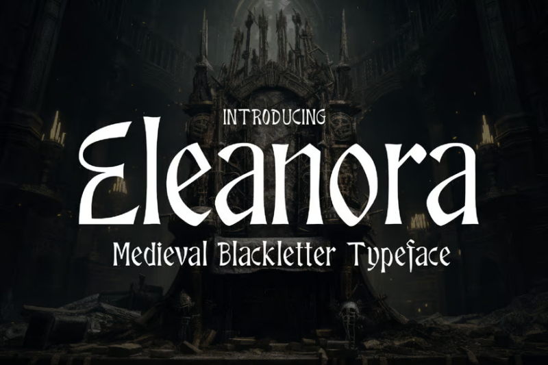
Eloanora is a blackletter font that captures the essence of medieval calligraphy. Its ornate and intricate letterforms make it perfect for creating an atmosphere of fantasy or historical gravitas in titles and decorative text.
She Dance – Celtyic Typeface
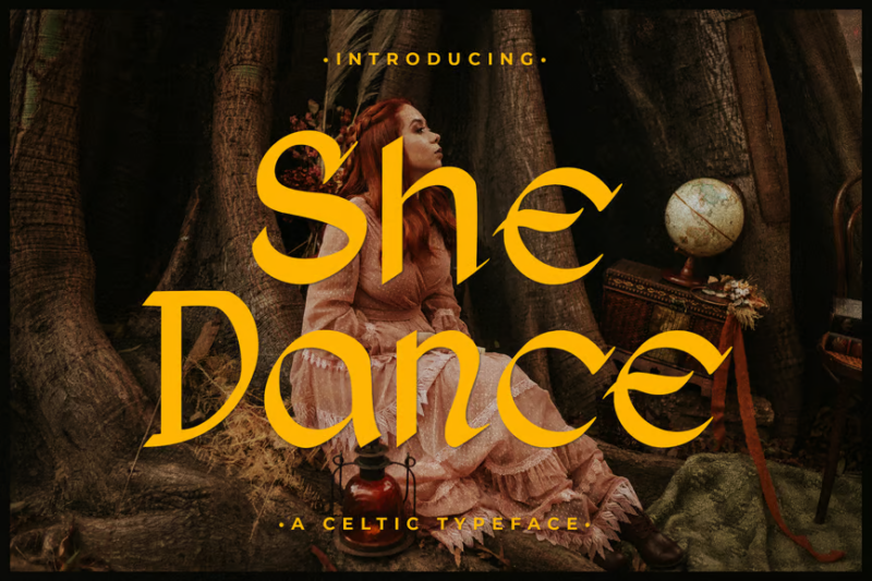
This Celtic-inspired typeface combines decorative elements with a flowing, dance-like quality. Its aesthetic appeal makes it ideal for projects related to Irish or Scottish themes, as well as designs requiring a touch of mystical elegance.
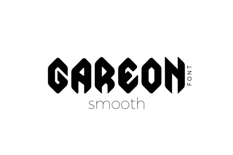
Gareon font

Gareon is a decorative font with an ancient, weathered appearance. Its rough edges and uneven baselines give it a timeworn charm, perfect for creating logos or headlines that evoke a sense of history and tradition.
Lexaviers
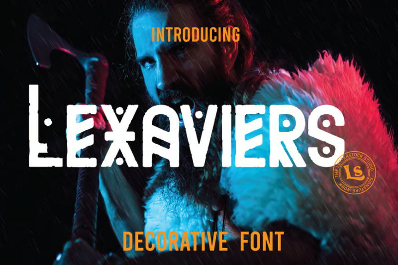
Lexaviers is a decorative font designed with logotypes in mind. Its unique letterforms and ligatures offer a modern twist on classic typography, making it suitable for creating distinctive brand identities or eye-catching titles.
DarkSword Light Font
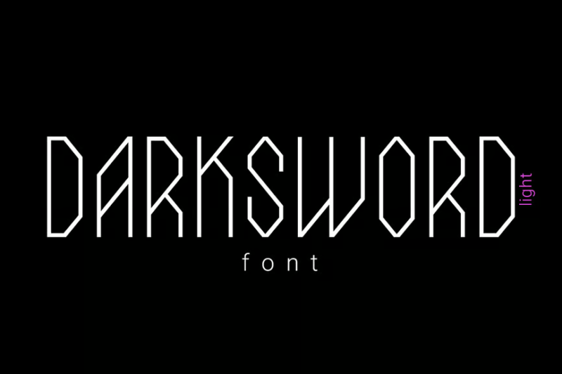
This sans-serif font combines a technological feel with stylish design elements. Its clean lines and subtle futuristic touches make it ideal for modern, tech-oriented projects or designs that require a sleek, contemporary look.
IHD Decorative
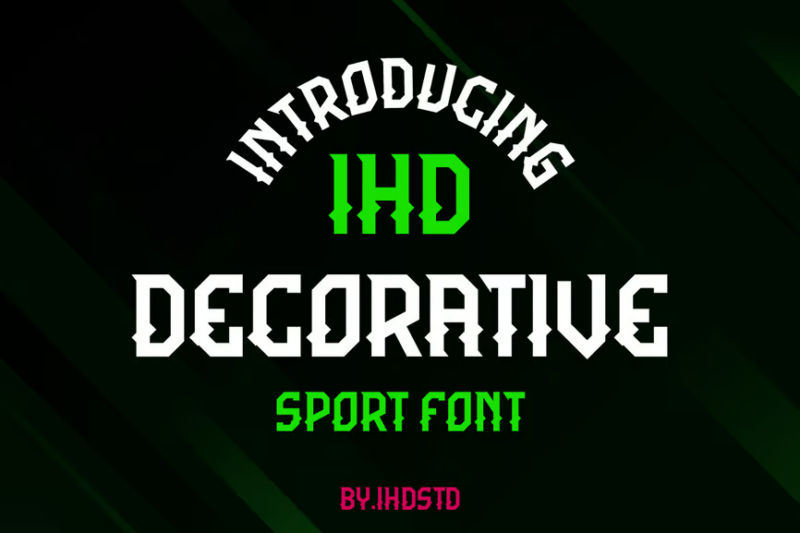
IHD Decorative is a font designed with mascots and characters in mind. Its playful and expressive letterforms make it perfect for creating fun, engaging designs for children’s books, animated projects, or brand mascots.
Gareon Smooth Font
A smoother variant of the Gareon font, this typeface retains its ancient charm while offering improved readability. It’s perfect for longer text passages in projects that require an antique feel without sacrificing legibility.
Windshire – Blackletter Typeface
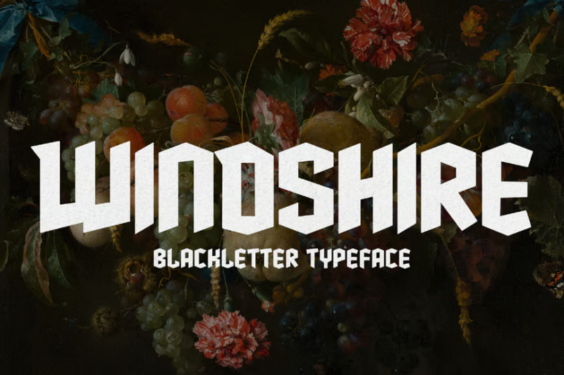
Windshire is a gothic blackletter typeface with a Scottish twist. Its ornate letterforms and sharp angles make it ideal for creating dramatic titles or logos, especially for projects with a medieval or Celtic theme.
Jotunheim Typeface
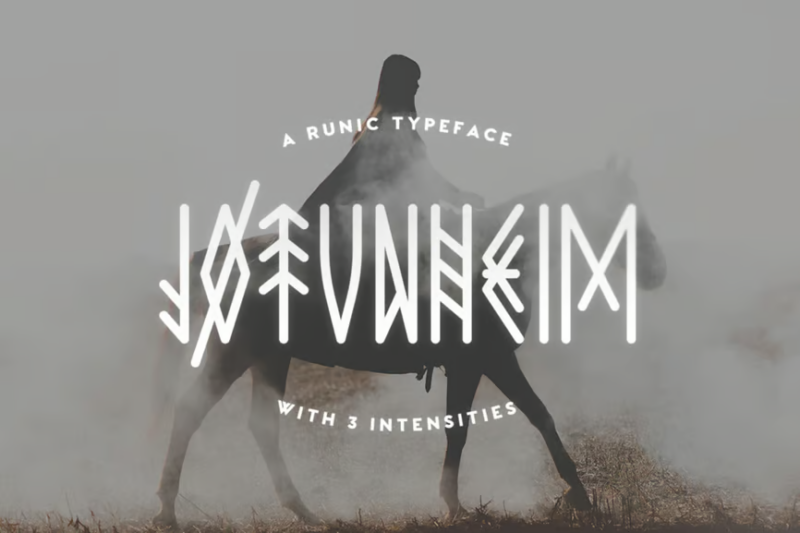
Named after the land of giants in Norse mythology, this decorative font incorporates runic elements and fantasy-inspired design. It’s perfect for creating immersive titles or logos for fantasy novels, games, or Norse-themed projects.
Enchant – Mystical 1600s Typeface
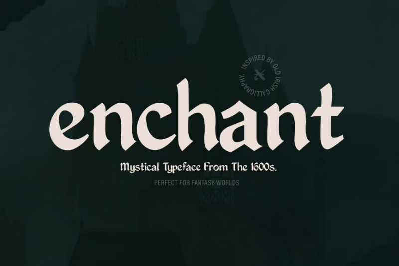
Enchant is a decorative font that captures the mystical essence of 17th-century typography. Its gothic influences and intricate details make it ideal for creating an air of mystery and magic in titles or short text passages.
Garked

Garked is a decorative font featuring Nordic and Viking-inspired symbols. Its unique characters make it perfect for creating authentic-looking runes or adding a touch of Norse mythology to designs and logos.
Noatun Typeface
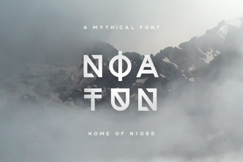
Noatun is a sans-serif display typeface with a strange and distinctive appearance. Its unusual letterforms and modern aesthetic make it suitable for creating eye-catching headlines or unique branding materials that demand attention.
Archsara
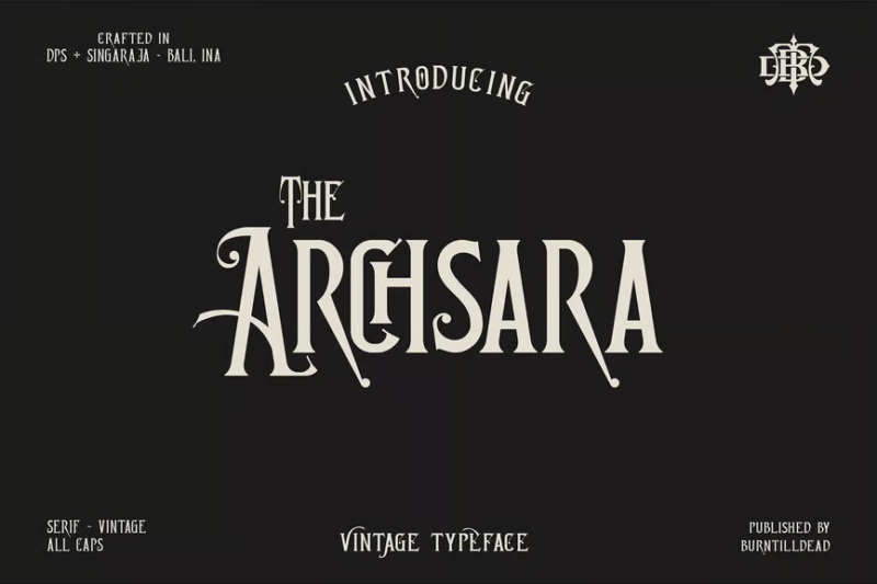
Archsara is a serif font with a vintage-inspired decorative style. Its elegant letterforms and subtle ornamental touches make it ideal for creating sophisticated logos, headlines, or body text in projects that require a classic, timeless feel.
King Castle – Celtic Typeface
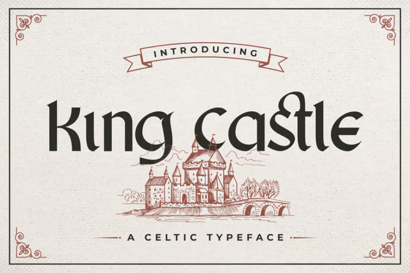
This decorative Celtic typeface incorporates elements of Danish design. Its regal appearance and intricate details make it perfect for creating titles or logos for projects related to medieval themes, fantasy realms, or Celtic heritage.
Terlena Victorian Vintage Display Font
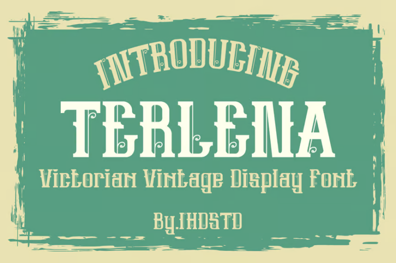
Terlena is a decorative display font that combines Victorian-era aesthetics with modern design elements. Its versatile character set, including symbols and mascot-friendly glyphs, makes it ideal for creating vintage-inspired logos or headlines with a playful twist.
Zoyavia Serif Display Typeface
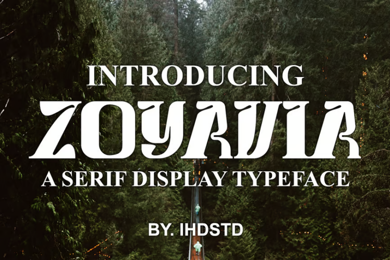
Zoyavia is a serif display typeface with subtle Viking-inspired elements. Its bold serifs and balanced proportions make it excellent for creating impactful logos or headlines, especially for projects that blend modern design with a touch of Norse heritage.
What Makes a Font Look “Viking”?
What gives Viking fonts their distinctive character? Let’s examine the defining features that make a font feel authentically Norse:
Angular, Runic Elements
Authentic Viking fonts incorporate the angular nature of historical runic inscriptions. These straight-line characters with few curves were originally designed to be carved into wood or stone, making them practical for the tools and materials available to Norse craftsmen.
The Elder Futhark and Younger Futhark alphabets (the actual writing systems used by Vikings) relied heavily on straight lines meeting at sharp angles – a characteristic that gives Viking fonts their distinctive look.
Weathered, Carved Appearance
Many Viking fonts feature a slightly weathered or eroded appearance, reminiscent of rune stones that have endured centuries of Nordic weather. This distressed quality adds authenticity and character.
The impression that letters have been physically carved or chiseled – rather than written – is another hallmark of Viking typography. Some fonts achieve this through irregular edges, texture overlays, or simulated depth.
Decorative Elements from Norse Art
Effective Viking fonts often incorporate decorative motifs from Norse art: interlaced patterns, animal elements (particularly wolves, ravens, and dragons), and knotwork designs.
These embellishments might appear as serifs, terminals, or standalone decorative elements, adding visual interest while connecting the typography to broader Norse visual culture.
Bold, Strong Construction
Viking fonts tend to have a bold, sturdy appearance that communicates strength and durability – values important in Norse culture. Heavy weight, strong verticals, and solid construction create this impression of power and permanence.
The overall effect should be one of solidity and resilience – typography that could withstand the hardships of the Viking age.
Best Uses for Viking Fonts
Viking fonts have a distinctive personality that works beautifully in specific contexts. Here are some ideal applications where these Norse-inspired typefaces really shine:
Gaming and Entertainment
Viking fonts are perfect for video games, tabletop games, and entertainment properties set in Norse mythological settings or inspired by Viking culture. They immediately establish the right atmosphere and historical context.
From game logos and UI elements to character names and in-game signage, these fonts help immerse players in the world of Norse mythology and adventure.
Branding for Nordic-Inspired Businesses
Businesses with connections to Scandinavian heritage or Norse themes benefit tremendously from appropriate Viking typography. This includes craft breweries, outdoor adventure companies, Nordic restaurants, and brands leveraging the current popularity of Nordic design.
The distinctive character of Viking fonts can help these businesses stand out in the marketplace while authentically connecting to their cultural inspiration.
Book Covers and Media
Historical fiction, fantasy novels, and non-fiction works about Norse mythology or Viking history gain immediate visual context through the use of Viking fonts. A well-chosen runic or Norse-inspired typeface instantly communicates genre and setting to potential readers.
Similarly, documentaries, films, and television series about Viking themes benefit from appropriate typography in promotional materials and title sequences.
Heritage and Cultural Events
Viking reenactment groups, Scandinavian cultural festivals, and museum exhibitions about Norse history can use Viking fonts to create signage, programs, and promotional materials that feel authentic and appropriate to their subject matter.
These fonts help establish historical context and cultural connections, enhancing the overall experience for participants and visitors.
Where to Avoid Viking Fonts
While Viking fonts are powerful design tools in the right context, there are situations where they simply don’t work well:
Everyday Business Communication
For standard business documents, emails, contracts, or any communication requiring maximum readability and professionalism, Viking fonts are generally inappropriate. Their decorative nature and historical associations can undermine clarity and business credibility.
Stick with standard professional fonts for day-to-day business operations, even if your brand has Norse elements in other contexts.
Extended Body Text
Most Viking fonts are display faces designed for headlines, titles, and short phrases. They rarely work well for long passages of text, as their decorative elements and unusual forms can reduce readability and cause eye fatigue.
For longer content, pair a Viking display font with a more readable serif or sans-serif for body text.
Contexts Requiring Neutrality
The strong cultural and historical associations of Viking fonts make them unsuitable for contexts where neutral, universal communication is essential. Their distinctive character can overshadow or inappropriately flavor the message.
Academic papers, news reporting, or multi-cultural contexts may be better served by more neutral typography.
Modern, Minimalist Designs
The ornate, historical character of Viking fonts generally clashes with clean, minimalist design aesthetics. In contemporary, streamlined layouts, these fonts can feel out of place and disrupt the visual harmony.
Reserve them for designs where historical or mythological references are appropriate and intentional.
How to Choose the Perfect Viking Font
Selecting the right Viking font requires careful consideration of several factors:
Historical Accuracy vs. Readability
Determine where your priority lies on the spectrum between absolute historical authenticity and modern usability. Some projects (like museum exhibits) might require fonts closely modeled on actual runic inscriptions, while others (like brand logos) might need a more accessible interpretation of Norse styles.
The most authentic runic fonts can be nearly illegible to modern readers unfamiliar with these writing systems, so consider your audience carefully.
Cultural Context
Consider the specific period, region, or mythological context you’re referencing. Viking culture spanned centuries and multiple regions, with variations in artistic styles. Some fonts better represent early Viking aesthetics, while others draw from later medieval Norse influences.
Research the specific cultural context you’re designing for, and choose a font that aligns with that particular aspect of Norse history or mythology.
Technical Requirements
Ensure your chosen font has all the characters, weights, and format support you need. Some Viking fonts offer limited character sets or lack important special characters, which could cause problems in certain applications.
Check that the font includes any specific Norse characters or symbols required for your project, and verify that it’s available in formats compatible with your design software and output media.
Pairing Potential
Few designs use Viking fonts exclusively. Consider how your chosen font will pair with other typefaces in your project. Look for clean, simple fonts that provide contrast to the more decorative Norse elements without competing for attention.
A strong, relatively plain sans-serif often works well for body text alongside a more ornate Viking display font for headlines and titles.
Expert Tips for Using Viking Fonts Effectively
To make the most of Viking typography in your designs, follow these professional recommendations:
Embrace Negative Space
Viking fonts tend to be visually dense and powerful. Give them room to breathe by surrounding them with ample negative space. This prevents the design from feeling cluttered and allows the distinctive characteristics of the font to shine.
Consider the composition of actual rune stones, which typically feature clean, simple layouts with generous spacing around the inscriptions.
Use Scale for Impact
Viking fonts often work best at larger sizes where their distinctive details and character can be fully appreciated. Don’t be afraid to make them a dominant element in your composition when appropriate.
For maximum impact, try using a single word or short phrase in a large, bold Viking font as the focal point of your design.
Consider Color Strategically
Traditional colors associated with Viking artifacts and Norse mythology can enhance the authenticity of your typography. Think deep reds, ocean blues, forest greens, and earthy browns and grays.
For a contemporary twist, black Viking fonts on light backgrounds often provide striking contrast while maintaining readability. Gold or silver treatments can add a luxurious, mystical quality appropriate for mythological themes.
Add Authentic Embellishments
Enhance your Viking typography with appropriate decorative elements drawn from Norse art: dragons, ravens, wolves, ships, axes, shields, and traditional knotwork patterns all complement Viking fonts beautifully.
These elements can frame text, fill negative space, or create borders that reinforce the Norse aesthetic without overwhelming the typography itself.
Viking Font Alternatives
Looking for something with Norse energy but not quite so literal? Consider these alternatives:
Celtic Fonts
Celtic typography shares some aesthetic qualities with Viking fonts – particularly the interlaced patterns and historical character. These fonts offer a similar feel but draw from Irish, Scottish, and Welsh traditions rather than Scandinavian ones.
Fonts like Celt, Insular Majuscule, or Book of Kells can provide that ancient, mythological vibe with a different cultural flavor.
Gothic/Blackletter Fonts
While from a later historical period, Gothic and blackletter fonts share the strong, bold character of Viking typography. These medieval-inspired fonts can provide a similar historical weight without being specifically Norse.
Options like Fraktur, Textura, or modern interpretations like Blackmoor offer that ancient, powerful presence with broader historical associations.
Modern Geometric Fonts
For a contemporary take on the angular, carved quality of runic writing, consider modern geometric fonts with strong, straight lines and sharp angles. These can reference Norse aesthetics more subtly while feeling thoroughly modern.
Fonts like Futura, Geometric Slabserif, or Eurostile can capture some of that Viking energy while working in thoroughly contemporary contexts.
Hand-Carved Fonts
Fonts designed to mimic hand-carved woodwork or stonecutting can capture the hand-crafted, physical quality of Viking inscriptions without specifically referencing Norse culture.
Look for fonts with irregular edges, simulated depth, and an organic quality that suggests physical craftsmanship rather than digital precision.
Common Viking Font Questions
Let’s wrap up by answering some frequently asked questions about Viking typography:
What font do Vikings use?
Historical Vikings didn’t use fonts as we understand them today. They used runic writing systems, primarily the Elder Futhark (early Viking age) and Younger Futhark (later Viking age). These weren’t typefaces but actual different alphabets with their own characters and rules.
Modern “Viking fonts” are contemporary designs inspired by these historical runic inscriptions and Norse artistic motifs, adapted to our modern Latin alphabet for easier readability.
What is the Viking rune font called?
There isn’t a single definitive “Viking rune font.” Numerous digital fonts recreate historical runic alphabets, including “Elder Futhark,” “Younger Futhark,” and “Anglo-Saxon Runes.” For authentic historical projects, look for fonts specifically named after these historical writing systems.
For more stylized modern interpretations that maintain runic characteristics while using our familiar alphabet, fonts like “Norse,” “Viking,” “Runestone,” or “Valhalla” offer different approaches to Viking-inspired typography.
Are Viking fonts hard to read?
The readability of Viking fonts varies significantly. Authentic runic fonts (using actual historical characters) are indeed difficult for modern readers unfamiliar with these ancient writing systems. However, most commercial “Viking fonts” are designed for the modern Latin alphabet, making them more accessible.
Even modern Viking-inspired fonts can present readability challenges due to their decorative elements and unusual forms. They’re generally best used for headlines, titles, and short phrases rather than extended body text.
Is there a Norse font in Word?
Microsoft Word doesn’t include specific Viking or Norse fonts in its standard installation. However, Word does include some blackletter fonts like “Old English Text MT” that share certain characteristics with medieval-inspired typography.
For authentic Viking typography in Word, you’ll need to install third-party fonts. Many quality Norse-inspired fonts are available from type foundries and design marketplaces, both free and paid.
Conclusion: Unleash Your Inner Viking
Viking fonts offer designers a powerful tool for channeling the strength, mystery, and cultural richness of Norse heritage. From the authentic angularity of runic inscriptions to modern interpretations that balance historical character with contemporary usability, these fonts bring a distinctive voice to any project connected to Viking themes.
Whether you’re designing for gaming, branding, publishing, or cultural events, the right Viking font can transform ordinary text into a powerful evocation of Norse mythology and Viking spirit. Just remember to use them thoughtfully, respecting their historical context while meeting the practical needs of your modern audience.
So grab your design battleaxe and set sail for creative Valhalla! With these epic Viking fonts in your arsenal, you’re ready to create designs worthy of the sagas themselves.
Which Viking font is your favorite? Do you have Norse-inspired design projects to share? Let me know in the comments below!
