For the month of August, a series of guest posters will be filling in on DWL with daily posts. Today’s posts come to you from Gerren Lamson of Creative Market. For more from Gerren, be sure to check out his shop and follow him on Twitter. Enjoy!
I’m a sucker for visual texture in graphic and web design. It is, of course, one of the 7 elements of design. Recently though, it has become increasingly popular to apply a distressed, aged look of logos, illustrations, and more — almost to the point of doing it on every project.
To me, there are two recurring issues with the overuse of visual texture in design, which are as follows:
- It can be used to replace the honest, hard-working history of an established brand. If a company has been around for 50 years or more, people will lean towards trusting their experience and quality because of it. Adding visual texture to a brand new company’s image shouldn’t be done with the conscious or subconscious intention of faking this to the consumer.
- It’s easy to poorly use visual texture by over applying the amount and using visual textures that are complex in the wrong application. The general rule of thumb here is to shoot for less, and use visual texture if it’s organic to the creation process of the piece. And, if it supports the content of the image, then well, you’ve really got something special.
That being said, it doesn’t mean we shouldn’t use visual texture at all. It can help a designer achieve various looks depending on the content of the texture, whether or not it’s vector (higher contrast) or raster (lower contrast), and if it supports the meaning of the visual at hand.
The following examples are some of my favorite uses of tastefully applying visual texture in appropriate contexts:
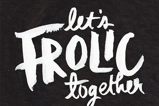
Let’s Frolic Together by Simon Walker
Simon let’s the natural texture of toothy black paper that’s been scanned in come across. The paper then receives white paint which varies in opacity based on the pen pressure as the lettering is drawn.

Get 300+ Fonts for FREE
Enter your email to download our 100% free "Font Lover's Bundle". For commercial & personal use. No royalties. No fees. No attribution. 100% free to use anywhere.
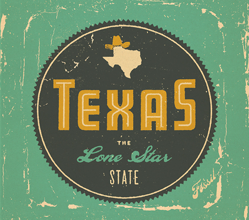
Texas: The Lone Star State by Brent Couchman
The metallic distressed texture feels like a beer can that was thrown out of the back of a pick-up truck on I-10. It also compliments the metal tins that Fossil use as packaging for their wallets and watches perfectly.
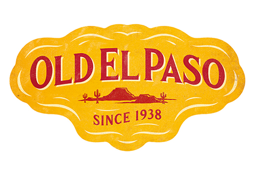
Old El Paso by Simon Walker
The subtle light and dark texture on this logo re-design reinforces that the company has been in business for 75 years. It feels like the desert in West Texas, too.
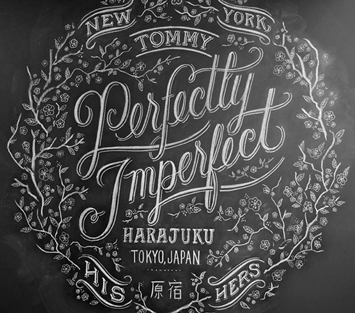
Perfectly Imperfect by Dana Tanamachi
Dana’s pieces have a distinct visual texture because they’re always drawn in chalk on a black chalkboard surface. It’s all natural.
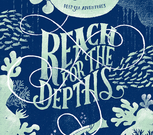
Reach for the Depths by Mary Kate McDevitt
The rock-like texture in this ocean-inspired piece fits naturally into the hand-drawn, scanned illustration style that Mary used to produce it.
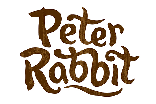
Peter Rabbit by Simon Walker
The wood grain texture reinforces that Peter Rabbit lives in the forest and has for some time now.
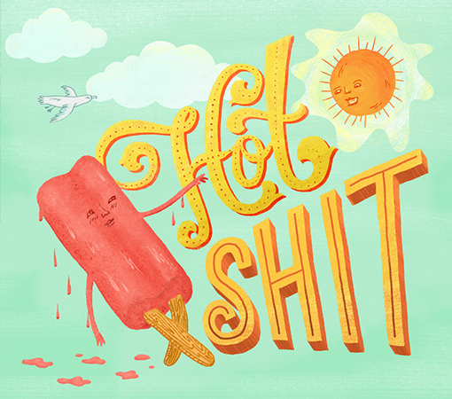
Hot Shit by Mary Kate McDevitt
The subtle grit in this colorful illustration makes the popsicle a little bit more edible, the type feel slightly baked, and the rays of the sun vibrate down upon the scene.
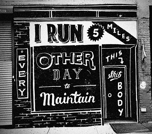
Louis by Jon Contino
Jon’s hand-illustrated lettering always contains a little bit of dirt since he draws on paper and scans them in to keep the look as organic to the creation process as possible.
Inspired? Then check out some of these great texture resources on Creative Market that may help you give your design projects that nice textured look you may be after:
50 Subtle Grunge Textures by Liam McKay (PS .abr brush)
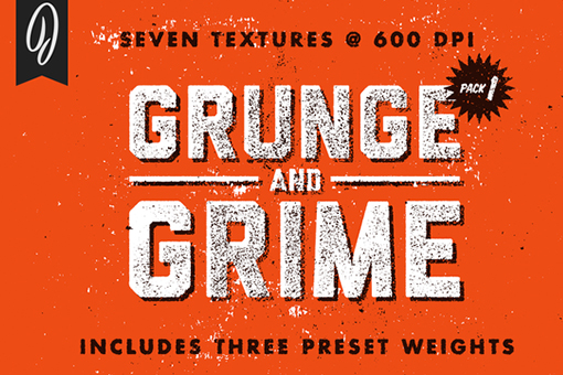
Grunge and Grime Texture Pack 1 by Jack Fahnestock (600 dpi .pngs)
Vintage Inked Textures by Go Media (300 dpi .jpgs)
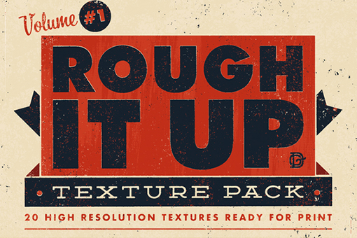
Rough It Up Texture Pack Vol. #1 by Drew Gliever (600 dpi .pngs)
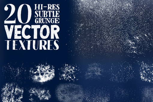
20 High-Res Subtle Grunge Vector Textures by Sean McCabe (.AI vector file)
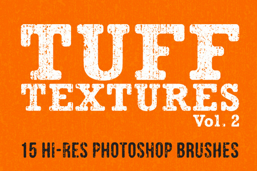
Tuff Textures Vol. 2 by Lunch Box Brain (PS .abr brush)
Subtle Textures Pack by Design Panoply (~600 dpi.jpgs)
Seamless Tileable Textures by Jack Fahnestock (.psb)

