In this article:
- The Science Behind Blue: Understanding Primary Colors
- Exploring Different Shades of Blue
- Creating Muted Blue Shades
- Manipulating Blue Temperature
- Creating Turquoise and Aqua Blues
- Lightening and Darkening Blue
- Material Considerations When Mixing Blue
- Incorporating Blue in Your Artistic Practice
- Conclusion: Mastering the Art of Blue
Blue is more than just a color—it’s an experience. When we encounter blue, we’re drawn to its tranquil beauty, finding ourselves unable to look away from its calming presence. There’s something intrinsically special about blue that sets it apart from every other color on the spectrum.
As an artist who’s spent years exploring color theory and application, I can tell you that blue isn’t just visually appealing—it’s psychologically powerful. Scientific research has consistently shown that blue induces feelings of calmness, stability, and confidence. This explains why medical institutions frequently incorporate blue into their logos and why natural blue environments like oceans and clear skies evoke such strong emotional responses.
But what if you’re sitting at your easel wondering exactly how to create the perfect blue? Maybe you’re trying to capture the exact shade of a twilight sky, or perhaps you’re aiming for that deep oceanic blue that seems to pull you in. Understanding how to create and manipulate blue is essential for any artist, whether you’re a professional or someone who creates for personal enjoyment.
In this comprehensive guide, I’ll walk you through everything you need to know about creating blue from scratch, manipulating its properties to achieve different shades, and incorporating this versatile color into your artistic repertoire.
The Science Behind Blue: Understanding Primary Colors
Blue is traditionally classified as a primary color alongside red and yellow in the RYB color model that most of us learned in school. In this model, primary colors are those that cannot be created by mixing other colors. However, this is actually a misconception that deserves clarification.
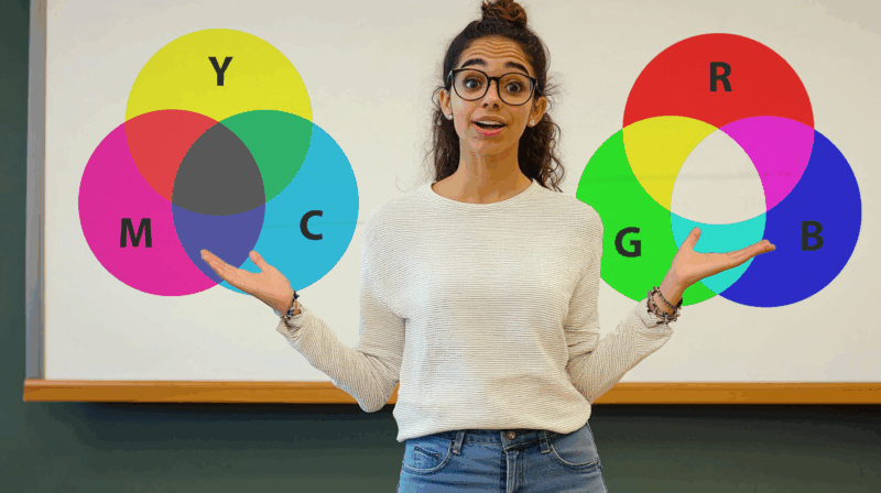
The truth is more nuanced and depends on which color model you’re using. In the modern printing industry and in digital design, we often use the CMYK color model (Cyan, Magenta, Yellow, and Key/Black). In this subtractive color model, blue can indeed be created through color mixing.
Creating Blue Through Color Mixing
So what colors make blue? In the CMYK subtractive color model, blue is created by combining magenta and cyan pigments. This might seem counterintuitive at first, especially if you’ve always thought of blue as a primary color that cannot be created by mixing others.

Get 300+ Fonts for FREE
Enter your email to download our 100% free "Font Lover's Bundle". For commercial & personal use. No royalties. No fees. No attribution. 100% free to use anywhere.
Cyan itself is a greenish-blue color, while magenta is a purplish-red that sits between the red and purple wavelengths on the color spectrum. When these two colors are combined in the right proportions, they produce a true blue hue. This is the principle behind modern color printing technology.
This doesn’t diminish blue’s importance—it simply reflects the difference between the traditional RYB color model taught in elementary schools and the more scientifically accurate CMYK model used in professional printing and design.
Exploring Different Shades of Blue
The world of blue extends far beyond a single shade. From the lightest powder blue to the deepest navy, the spectrum of blue hues is virtually unlimited. Creating these different shades requires understanding how blue interacts with other colors and how to manipulate its properties.
Let’s explore how to create some of the most popular blue shades that you might want to use in your artwork or design projects.
Creating Classic Blue Variants
Each shade of blue has its own character and emotional impact. Here’s how to create some classic blue variants:
Navy Blue
Navy blue is a dark, rich blue that’s often associated with professionalism, security, and authority. To create this deep blue shade, start with a standard blue and add small amounts of both orange and black. The orange helps to mute the blue slightly while the black deepens it. Be cautious with the orange—add too much and you’ll risk creating a muddy or greenish hue.
Royal Blue
Royal blue is a vibrant, slightly purplish blue that conveys elegance and sophistication. To achieve this regal shade, begin with a standard blue and add small amounts of purple and a touch of black. The purple enhances the richness of the blue while the black adds depth without making it too dark.
Cornflower Blue
Cornflower blue is a softer, more delicate blue with a slightly grayish undertone that gives it a sophisticated, understated quality. To mix this hue, combine blue with a small amount of gray. This creates a soft, muted blue that’s less intense than royal or navy blue but still has a distinct blue character.
Teal Blue
Teal is a blue-green shade that captures the essence of tropical waters. To create teal, mix blue with green in roughly equal proportions. Adjust the ratio to lean more toward blue or green depending on the exact shade of teal you’re trying to achieve. This versatile color works beautifully in both bright, vibrant compositions and more subdued, atmospheric pieces.
Turquoise Blue
Turquoise is a bright, refreshing blue-green shade that evokes images of crystal-clear lagoons and tropical paradises. To mix turquoise, combine blue with green and then add white to brighten it. The key is finding the right balance—too much green and you’ll lose the blue quality, too little and you won’t capture that distinctive turquoise character.
Cobalt Blue
Cobalt blue is a deep, intense blue with a slightly violet undertone. You can create a similar effect by mixing turquoise with ultramarine blue. This creates a vibrant, dynamic blue that stands out in any composition. Cobalt blue has been a favorite of artists for centuries due to its intensity and brilliance.
Cerulean Blue
Cerulean blue resembles the color of a clear, bright sky—slightly lighter than cobalt but with a similar vibrancy. To create cerulean blue, mix white with cobalt blue until you achieve that perfect sky-blue shade. This color has a freshness and clarity that makes it perfect for landscapes and atmospheric effects.
Indigo Blue
Indigo is a deep blue-purple shade that bridges the gap between blue and violet on the color spectrum. To create indigo, mix blue with a small amount of red. This creates a rich, mysterious blue with purple undertones that can add depth and intrigue to your artwork.
Powder Blue
Powder blue is a pale, soft blue that’s gentle and calming. To create powder blue, mix white with royal blue until you achieve that perfect pastel shade. The white lightens the blue without changing its underlying character, creating a soothing, delicate hue.
Creating Muted Blue Shades
Professional artists rarely use blue straight from the tube. Instead, they spend considerable time mixing muted blues—those with lower saturation that appear more natural and harmonious in compositions. Understanding how to create these muted shades is crucial for developing a sophisticated color palette.
Using Complementary Colors to Mute Blue
The key to creating effective muted blues lies in understanding complementary colors. On the color wheel, complementary colors sit directly opposite each other. Blue’s complementary color is orange, which means adding orange to blue will neutralize or mute it.
Color Mixing Process
When you combine ultramarine blue with cadmium orange, the blue becomes less vibrant and takes on a more subdued quality. This creates a deep, muted blue that has more complexity and nuance than a pure blue. The trick is to use just enough orange to mute the blue without turning it into a completely different color. Add too much orange, and you’ll end up with a brownish or greenish hue instead of the muted blue you’re aiming for.
Creating Brownish-Blue Tints
Another way to create interesting muted blues is by combining burned umber with ultramarine or cobalt blue. This combination creates a brownish-blue tint that’s perfect for shadows, atmospheric effects, or areas where you want a more subdued blue presence.
Color Mixing Process
These muted blues are essential for creating realistic shadows and adding depth to your paintings. They also help create a more harmonious overall color scheme by reducing the visual impact of pure blue, which can sometimes appear too artificial or intense.
Manipulating Blue Temperature
Color temperature is a crucial concept in art and design. While blue is generally considered a cool color, there are both warm and cool variants within the blue family. Understanding how to manipulate the temperature of blue allows you to create different moods and atmospheres in your artwork.
Creating Warmer Blue Shades
Even though blue is typically classified as a cool color, some blues have a warmer quality than others. Ultramarine blue, for instance, is naturally warmer than cobalt blue. But sometimes you might need an even warmer blue for your specific artistic vision.
Color Mixing Process
To create warmer blue shades, you can mix ultramarine blue with alizarin crimson. This combination produces a softer, warmer blue with subtle red undertones. The red component in alizarin crimson counteracts the coolness of the blue, resulting in a more inviting, less sterile blue.
Another effective combination is cobalt blue with cadmium green. While this might seem counterintuitive, cadmium green contains a yellow component that warms the blue. The resulting blue won’t be as warm as the ultramarine-alizarin crimson combination, but it offers a different type of warmth that can be perfect for certain applications.
Creating Cooler Blue Shades
To create cooler blues, you’ll want to incorporate colors that enhance the natural coolness of blue. One effective approach is to add a touch of veronese green or cadmium green to your blue base.
Veronese green is particularly effective for cooling blues because it’s a bright, cool green with blue undertones. When mixed with ultramarine blue, it creates a very cool, slightly darker blue shade. For a lighter, brighter cool blue, try mixing veronese green with cobalt blue.
Color Mixing Process
Cadmium green, which contains a slight red component, produces a different type of cool blue. It works well for creating cool blues that still have a hint of warmth—perfect for capturing the complex colors of shadows on snow or water.
Creating Turquoise and Aqua Blues
Turquoise and aqua blues are essential colors for painting skies, water, and tropical scenes. These colors have a vibrancy and clarity that can bring life to any composition.
Mixing Perfect Turquoise Shades
Turquoise blues have a hint of yellow in their composition, which can only be achieved by adding some green to your blue base. To create a beautiful turquoise, start by mixing cadmium green with ultramarine or cobalt blue. This combination creates a blue with a distinctive turquoise quality.
For a lighter turquoise, add a small amount of white to the mixture. This lightens the color while maintaining its vibrant character. The result is a bright, refreshing turquoise that’s perfect for tropical water scenes, decorative elements, or any composition that needs a touch of exotic color.
Color Mixing Process
For an even more stunning turquoise, try mixing veronese green—a vibrant, cool green—with cobalt or ultramarine blue. This combination creates a rich turquoise that retains much of its blue character while incorporating the green element that defines turquoise. Adding white to this mixture creates a light turquoise that maintains its brilliance and clarity.
Lightening and Darkening Blue
Being able to control the value (lightness or darkness) of your blue colors is essential for creating depth, atmosphere, and contrast in your artwork. Let’s explore how to effectively lighten and darken blue shades.
Creating Light Blue Shades
The most common way to lighten blue is by adding white. When you combine ultramarine blue with white, you create a vibrant cornflower blue that maintains the warmth of the original ultramarine but with a lighter value. This combination is perfect for painting skies, water highlights, or any element that requires a light blue with warm undertones.
Color Mixing Process
Cobalt blue mixed with white creates an even brighter light blue with a cleaner, crisper quality. This combination is excellent for painting clear skies, shallow tropical waters, or any subject that calls for a bright, fresh blue.
If you’re out of white paint or want to create a different type of light blue, you can try adding a small amount of yellow or light green to your blue. However, be aware that this method not only lightens the blue but also makes it slightly cooler and can shift it toward a more turquoise hue.
Creating Dark Blue Shades
For dark blues, you have several options depending on the exact quality you want to achieve.
Adding dioxazine purple to ultramarine blue creates a rich, deep blue with subtle violet undertones. This combination works well for night skies, deep water, or any subject that requires a dark but vibrant blue. Since dioxazine purple contains red pigments, combining it with cobalt blue will likely create a slightly more muted dark blue.
Color Mixing Process
Burnt umber is excellent for creating dark, muted blues when combined with either cobalt or ultramarine blue. The resulting color has a brownish undertone that gives it a natural, earthy quality. This type of dark blue works well for shadows, creating atmospheric distance, or any application where you want a dark blue that’s not too vibrant or overwhelming.
Another approach for creating dark blue is to mix phthalo green and alizarin crimson with your blue base. This combination simulates the effect of burnt umber but gives you more control over the exact qualities of the dark blue you create.
Material Considerations When Mixing Blue
It’s important to remember that the process of creating blues varies depending on the medium you’re using. Different paints have different properties that affect how colors mix and interact.
Medium-Specific Color Mixing
With acrylics, colors tend to dry slightly darker than they appear when wet. This means you might need to mix your blues slightly lighter than your target shade to account for this darkening effect.
Watercolors, on the other hand, dry lighter than they appear when wet. They also tend to mix more freely than other paints, which can make it challenging to control the exact blue shade you’re creating. When working with watercolors, you might need to use more concentrated pigments to achieve rich blue tones.
Oil paints allow for the most subtle color mixing because they dry slowly, giving you time to adjust and refine your blue shades. They also maintain their vibrancy exceptionally well, making them ideal for creating rich, deep blues.
Pigment Quality and Permanence
The quality of the pigments you use significantly impacts the blues you can create. Higher quality paints contain more pigment and fewer fillers, resulting in more vibrant, lightfast blues that won’t fade over time.
Some blue pigments, like ultramarine, are known for their excellent permanence, while others may fade with exposure to light. When creating blues for artwork that needs to last, consider the permanence rating of the pigments you’re using.
Incorporating Blue in Your Artistic Practice
Now that we’ve explored the technical aspects of creating different blue shades, let’s consider how to incorporate these blues effectively in your artwork.
Psychological Impact of Different Blues
Different blue shades evoke different emotional responses. Dark blues like navy and indigo convey authority, wisdom, and depth. They can create a sense of mystery or formality in your compositions.
Medium blues like cobalt and royal blue suggest reliability, trust, and clarity. These blues are often used to create a sense of stability and confidence.
Light blues like powder blue and cerulean evoke feelings of tranquility, openness, and freshness. They’re perfect for creating airy, peaceful atmospheres in your artwork.
Understanding these psychological associations can help you choose the right blue shades to express your artistic vision and create the emotional impact you’re aiming for.
Color Harmony with Blue
Blue works beautifully in various color harmonies. It creates striking complementary schemes when paired with orange, analogous harmonies when combined with purples and greens, and triadic harmonies when used with red and yellow.
For a more subtle approach, consider using a monochromatic blue scheme, exploring various shades, tints, and tones of blue within a single composition. This can create a cohesive, harmonious effect that’s both sophisticated and visually interesting.
Conclusion: Mastering the Art of Blue
Blue is more than just a primary color—it’s a versatile, emotionally resonant hue that can transform your artwork. Understanding how to create blue from scratch using magenta and cyan pigments, and learning how to manipulate its properties to achieve different shades, temperatures, and intensities, gives you tremendous creative power.
Whether you’re aiming for the tranquil calm of a light powder blue, the regal authority of a royal blue, or the mysterious depth of an indigo, the knowledge and techniques shared in this guide provide the foundation you need to master the art of blue.
Remember that creating the perfect blue is both a science and an art. The formulas and techniques provided here are starting points—don’t be afraid to experiment, adjust, and discover your own unique blue shades that express your personal artistic vision.
Blue has captivated humans for millennia, from the lapis lazuli pigments of ancient Egypt to the ultramarine of Renaissance masterpieces to the digital blues of contemporary design. By understanding and mastering this fascinating color, you connect yourself to this rich artistic tradition while adding your own creative voice to the ongoing conversation.
So pick up your brush, mix your pigments, and dive into the endless possibilities of blue. Your artistic journey will be all the richer for it.
