In this article:
- What Is Chromatic Aberration?
- A Technical Flaw in Print
- The Use of Chromatic Aberration in Graphic Design
- Examples of Chromatic Aberration in Use
- When to Use Chromatic Aberration Intentionally
- When a Flaw Becomes a Feature
Chances are you have seen a blurry photo at one point in your life with a sliver of red or blue clinging to the edges. This is chromatic aberration at work, and it was once a frustrating issue for printers and photographers.
I used to obsess over it in Photoshop, trying to remove it to keep my work clean — but lately, I’ve started to notice it in a different light. It provides a stylized effect that makes your images look moody, and now you can see it in action across social media and brand identities.
Here’s more on chromatic aberration, how it came to symbolize error and why designers are leaning into it now more than ever.
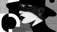
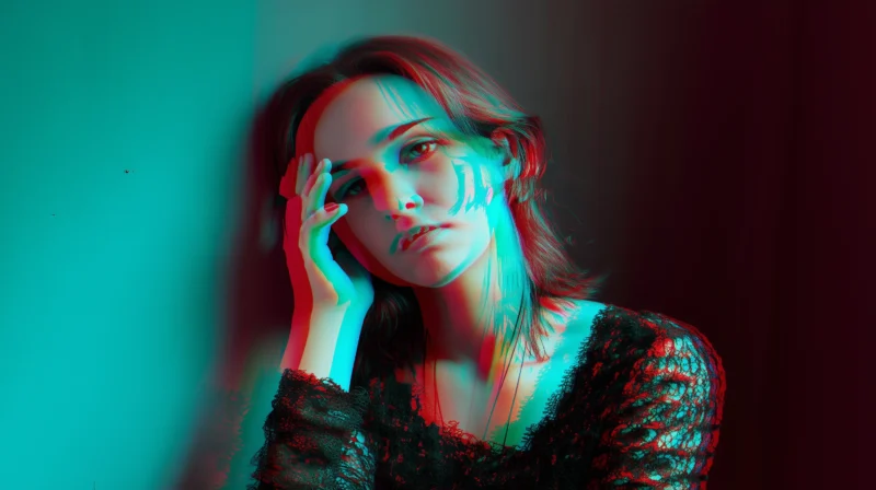
What Is Chromatic Aberration?

Source: https://unsplash.com/photos/woman-in-black-shirt-with-black-hair-HGOnkPhRklU
Chromatic aberration is a by-product of how light behaves. When a lens fails to bring all wavelengths of color to the same focal point, you can get a distortion of color. This effect is also known as color fringing and spherochromatism.
It happens when reds, greens and blues spread slightly apart at the edges of shapes, creating a ghostly outline. Technically speaking, it is a lens-based issue. However, from a visual standpoint, it is a slight blur that makes objects feel off.
There are two main types of chromatic aberration:
- Lateral: This happens when different colors misalign at the edges of an image.
- Axial: This occurs when colors blur along the focal axis.
Essentially, lateral aberration gives you red-and-blue outlines on the sides of objects, while the axial looks like a rainbow haze bleeding into the foreground or background.

Get 300+ Fonts for FREE
Enter your email to download our 100% free "Font Lover's Bundle". For commercial & personal use. No royalties. No fees. No attribution. 100% free to use anywhere.
Most people first notice chromatic aberration through a camera lens or old printed photos. Designers and photographers rarely seek to achieve it.
Rather, it is an accidental effect that photographers have always tried to prevent or fix. However, brightly colored edges have become trendy recently, and designers have started using them more in their work.
A Technical Flaw in Print
Before color fringe found its way into mood boards and motion graphics, it unwelcomely lived in the margins of analog print. In the early days of offset printing, getting clean, crisp alignment between colors was a science and an art. When the registration was off — even by a hair — it resulted in that visual slip with edges doubling and colors peeking out like shadows.
I remember watching home videos as a kid and seeing cyan auras or red-glow outlines. I didn’t know the term for it then, but I saw chromatic misregistration firsthand. That kind of flaw in commercial printing could mean an entire run needed to be scrapped or reprinted.
It was costly, frustrating and embarrassing for printers and designers. Considering the global printing industry was worth $494.53 billion in 2023, those mistakes could come with a heavy price tag today. Precision was more than a creative idea — it was a business necessity.
Because of that, chromatic aberration became synonymous with error. It clashed with the industry’s obsession over alignment and order, so anything that introduced distortion was corrected or left on the cutting room floor.
However, looking back, there was something compelling about those unintended overlaps. Fast-forward to today. Designers have brought them into style, featuring them everywhere, from video games to editorials.
The Use of Chromatic Aberration in Graphic Design
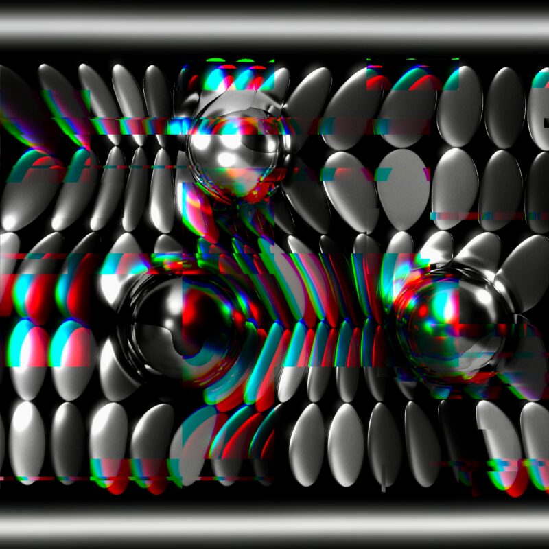
Source: https://unsplash.com/photos/a-black-and-white-photo-of-a-bunch-of-balls-fOFzwhcfjxQ
Everything changed once we moved from paper to pixels — tools got sharper, alignment became easier and errors became avoidable. With mistakes like chromatic aberration becoming more preventable, some of us started missing those imperfections.
The early 2010s saw a rise in design movements like vaporwave, glitchcore and vintage iconography — styles that celebrated it. Color fringing found new life here, giving visuals personality.
I have also noticed it popping up more in album art, indie game interfaces and web design for experimental fashion labels. Designers use it to inject tension or dreamy dissonance into their work. It has become a shorthand of nostalgia and futurism, blurring analog history and digital intent.
What was once a sign of imperfection is now a tool for evoking feeling. Whether you use it to mimic VHS fuzz or disrupt the pristine look of modern UI, chromatic aberration has gone from something we edited out to what we now lean into with purpose.
Examples of Chromatic Aberration in Use
Today, the design incorporates color fringing to convey motion, duality and slight edge. The following examples show how artists have implemented it across different mediums.
TikTok’s Logo: A Brand That Pulses Off the Screen

Source: https://unsplash.com/photos/red-and-whites-logo-I4p0FcjDBJI
At first glance, TikTok’s logo looks like a stylized musical note, but when you look closer, you will see a chromatic offset at the edges. The use of cyan and red shadows symbolizes rhythm and youth. It captured the blur you get when your phone camera cannot keep up with movement.
It is a perfect fit for a platform driven by music and motion. The logo hums like a subwoofer, effectively using chromatic aberration to communicate energy and immediacy.
“Spider-Man: Into the Spider-Verse”: A Cinematic Effect of Visual Layers
Chromatic aberration became part of the visual language of “Into the Spider-Verse.” The film features comic book textures with 3D animation, and the effect becomes especially apparent during glitch moments where scenes involve alternate realities. The characters and backgrounds sometimes split into RGB fringes, creating that digital distortion that became a major part of the storyline.
This visual separation was featured in numerous comic books, and “Into the Spider-Verse” brought those effects to life seamlessly into different frames. Here, chromatic aberration establishes a connection to the narrative, where dissonance, transition and identity take place.
Asda’s Christmas Ad: A Touch of Nostalgia
In Asda’s 2022 holiday commercial, starring Will Ferrell as Buddy the Elf, the company applied chromatic aberration to create a connection between “Elf”’s original 2003 footage and new in-store scenes. The VFX team seamlessly composited Buddy into a new environment with a slight digital fuzz and RGB distortion to bring back the early 2000s film.
The result was charmingly imperfect. The slight color fringing created a nostalgia that matched the ad’s throwback concept while giving it a warm feeling. In a season packed with hyper-polished ads, Asda’s creativity stood out by adopting the idea of analog media without losing its digital edge.
When to Use Chromatic Aberration Intentionally
Chromatic distortion is great at creating visual depth and texture in design. However, it has a strong effect that can cause visual discomfort and affect a viewer’s ability to focus on an image or design with distortion. That is why it is best to use it intentionally. Here are a few scenarios where it can enhance your design rather than distract from it.
1. Evoke Emotion or Atmosphere
Use chromatic distortion when creating a mood, such as unease, dreaminess or motion. If you are designing something that leans into surrealism or nostalgia, it can help set the tone instantly. It works especially well in genres like sci-fi, retro-futurism and fantasy. Use it to make audiences feel something instead of filling space.
2. Support Narrative or Concept
Sometimes, a story needs to look slightly broken to feel complete. If your project involves themes of duality or glitch, spherochromatism can visually mirror that idea.
We have seen it work beautifully in “Into the Spider-Verse,” where character arcs and universes split at the seams. If conceptually aligned, the effect can reinforce a larger narrative. Ask yourself if this effect says something or only acts as a decoration.
3. Draw Focus or Disrupt It
Color fringing can pull a viewer’s eye or push it away. When used around key visual elements, it can add movement or urgency. Conversely, applied subtly to background elements, it can add texture without stealing attention.
It can also intentionally disrupt “perfection,” which is useful for brands or layouts that want to feel raw and rebellious. Test its placement and intensity. Sometimes, a little misalignment goes a long way.
However, it is also important to think carefully about your audience. Approximately 16% of the population worldwide has a disability, from visual impairments to cognitive challenges. When using chromatic distortion, aim for balance — enough to make a visual statement without compromising clarity or accessibility.
4. Add Visual Interest Without Extra Assets
You do not have to budget for custom 3D renders or motion graphics, but you can add energy with smart color shifting. Chromatic aberration is a fast way to give static designs a dynamic edge, especially in digital posters and headers. Something as simple as Canva or Adobe After Effects now offers ways to apply it. During implementation, think of it as an expressive layer with more personality.
5. Match the Brand Personality
Leveraging this effect in design may work well for edgy tech startups but not so much for a luxury skin care brand. Chromatic aberration carries a certain aesthetic weight that signals digital fluency and youth. That makes it a great fit for brands that want to speak to Gen Z, embrace chaos and appear digitally native.
As a takeaway, make sure the effect aligns with your tone. Otherwise, it risks looking out of place and unintentional.
When a Flaw Becomes a Feature
Chromatic aberration has gone from a print mishap to a delightful digital effect, reminding us that design can be “messy” but still look good when done intentionally. When implemented purposefully, it can send the right message and connect with audiences emotionally. The next time you want to add a red-blue fringe to an image, remember to aim for impact when incorporating imperfections in your design.