In this article:
- The Best Wide Fonts of 2026
- Why Wide Fonts Pack Such a Visual Punch
- Where to Use Wide Fonts for Maximum Impact
- Where to Avoid Wide Fonts
- How to Choose the Perfect Wide Font
- Fantastic Wide Font Alternatives
- Pairing Fonts with Wide Typefaces
- Common Wide Font Questions
- Conclusion: The Expanding Universe of Wide Fonts
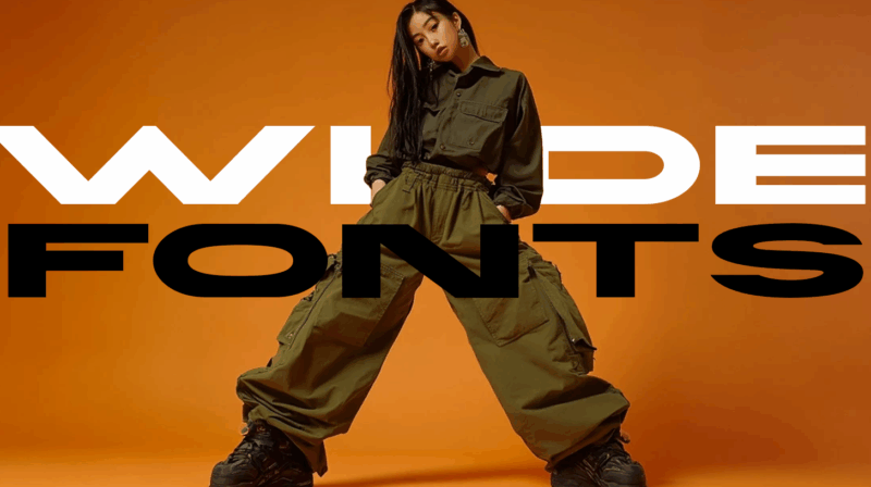
Wide fonts are back, everyone! The extended letterforms create greater visual impact while occupying more space in your designs. Whether you’re crafting headlines for websites, designing album covers, or creating impactful signage, the right wide font can transform ordinary text into something extraordinary.
In this deep dive, I’ll be exploring the best wide fonts to consider in 2026. We’ll uncover:
- What makes wide fonts so impactful in design
- How to choose the perfect wide font for your project
- The top 25 wide fonts that are making waves this year
- Best practices for implementing wide fonts effectively
- Ideal pairings to complement your wide font choices
Let’s stretch our typographic horizons and explore the expansive world of wide fonts!
The Best Wide Fonts of 2026
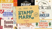
Not all wide fonts deliver equal impact. I’ve curated this list of the most powerful wide typefaces that are dominating design in 2026. Each brings its own unique flavor while maintaining that commanding presence wide fonts are known for:
Taruno Wide Family
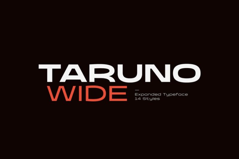
Taruno Wide Family is a bold and expansive sans-serif typeface. Its wide letterforms make it ideal for headlines and display purposes, offering a strong visual impact and excellent readability at larger sizes.
Hellenic Wide
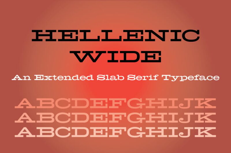
Hellenic Wide is a distinctive serif font with a vintage jukebox feel. Its wide characters and ATF-inspired design make it perfect for creating retro-themed designs or adding a nostalgic touch to modern projects.
Whoomp Extended Wide Modern Sans Serif
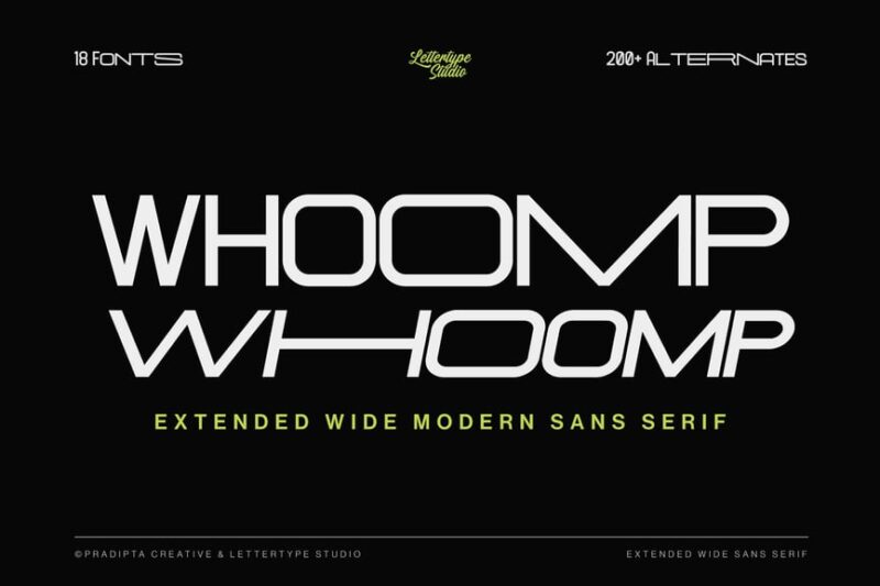
Whoomp is a unique, extended sans-serif font with a modern twist. Its wide letterforms and sporty aesthetic make it an excellent choice for athletic branding, event posters, or any design requiring a bold, contemporary look.

Get 300+ Fonts for FREE
Enter your email to download our 100% free "Font Lover's Bundle". For commercial & personal use. No royalties. No fees. No attribution. 100% free to use anywhere.
Grunge Wall Wide Font
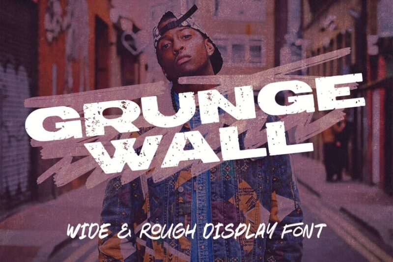
Grunge Wall Wide Font combines urban aesthetics with a rough, distressed appearance. This sans-serif typeface is perfect for creating edgy, street-style designs or adding a raw, unpolished feel to graphic projects.
Triumph – Sans Serif Wide Font
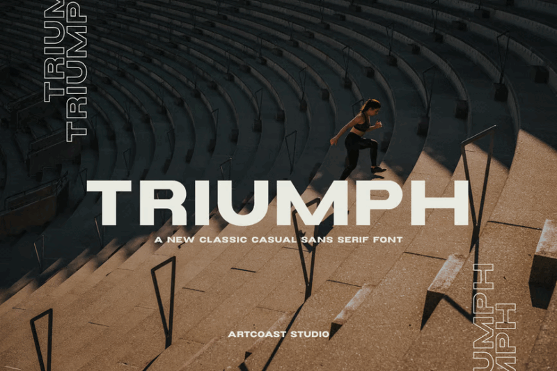
Triumph is a bold, wide sans-serif font that exudes confidence and strength. Its clean lines and extended characters make it ideal for impactful headlines, logos, or any design requiring a powerful typographic presence.
Norwide – Wide Display Font
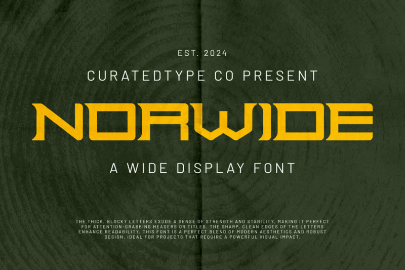
Norwide is a bold, geometric display font with a wide stance. Its clean, modern design and strong visual presence make it perfect for creating eye-catching headlines, posters, or branding materials that demand attention.
Sonety Modern Wide Sans Typeface
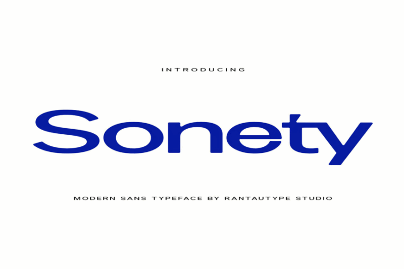
Sonety is a modern, wide sans-serif typeface designed for brand identity and typographic-focused projects. Its clean lines and balanced proportions make it versatile for both headlines and body text in contemporary designs.
UNDERDOG – Modern Wide Slab Serif
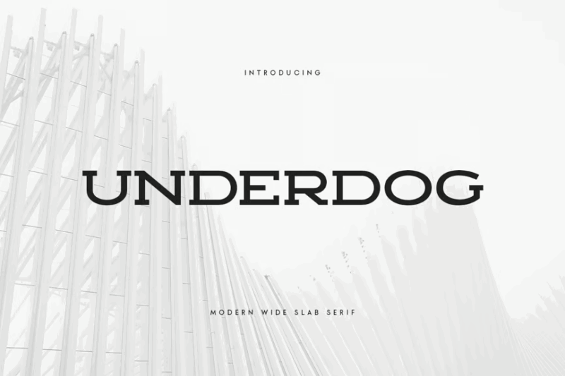
UNDERDOG is a modern wide slab serif font that combines boldness with a touch of sophistication. Its strong, action-oriented design makes it perfect for promotional materials, sports branding, or any project requiring a powerful typographic statement.
Mores – Modern Wide Sans Serif
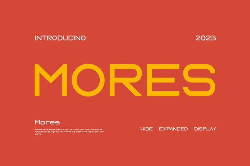
Mores is a contemporary wide sans-serif font with a clean and minimalist aesthetic. Its modern design and excellent readability make it suitable for a variety of applications, from branding to editorial design.
Nero – Ultra Wide Display
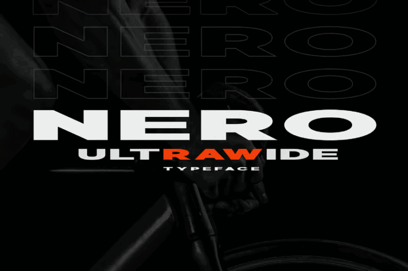
Nero is an ultra-wide display font that commands attention. Its expansive letterforms and bold presence make it ideal for advertising, posters, and large-format designs where maximum visual impact is desired.
Thousand Extra Wide Sans Serif
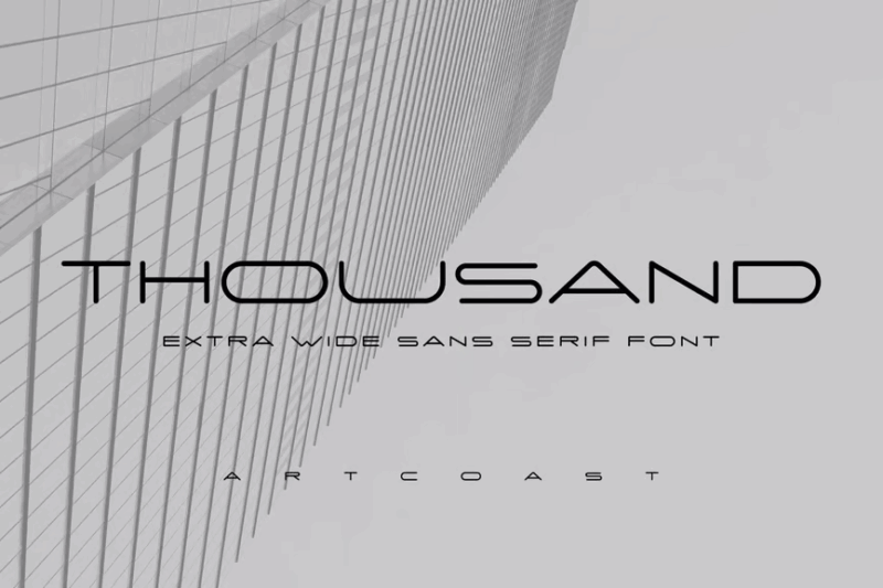
Thousand is an extra-wide sans-serif font that pushes the boundaries of letter width. Its extreme proportions make it a standout choice for creating dramatic headlines, logos, or any design where space-filling typography is needed.
Enfonix – Stretch Font
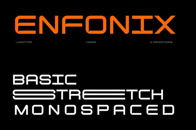
Enfonix is a modern, extended sans-serif font with a unique stretched appearance. Its elongated letterforms create a sense of movement and dynamism, making it perfect for tech-related designs, posters, or contemporary branding projects.
Rugen – All Caps Expanded
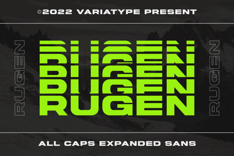
Rugen is an all-caps expanded font with a bold, stacked design. Its unique vertical arrangement and wide characters make it ideal for creating impactful logos, headers, or designs where vertical space is a priority.
CS Volans – Techno Font
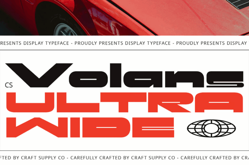
CS Volans is a bold, expanded techno font with a futuristic edge. Its geometric shapes and clean lines make it perfect for technology-related designs, sci-fi themes, or any project requiring a modern, cutting-edge typography.
Akegin font
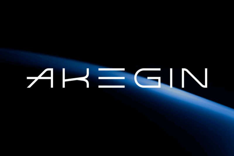
Akegin is a versatile font that combines sans-serif elements with decorative touches. Its unique blend of styles makes it suitable for a wide range of design projects, from branding to editorial layouts, offering both readability and visual interest.
Digdaya
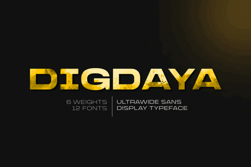
Digdaya is an expanded sans-serif font with a modern, confident appearance. Its wide letterforms and clean design make it excellent for creating strong headlines, logotypes, or any design requiring a bold typographic presence.
Grandspan – A Bold Font Family
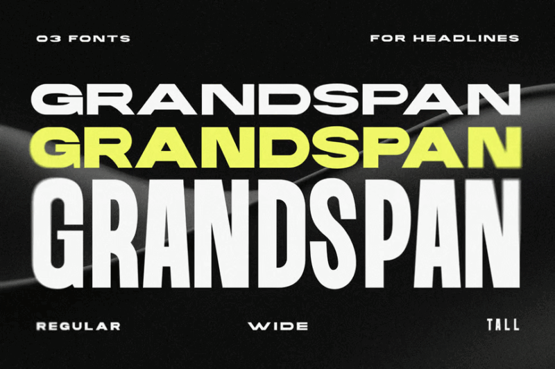
Grandspan is a bold sans-serif font family designed for impact. Its strong, confident letterforms make it ideal for headlines, titles, and branding projects where a powerful typographic voice is needed.
Overdrive – Elite Automotive Font
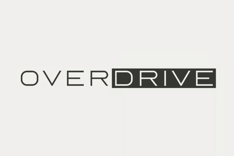
Overdrive is a geometric sans-serif font with an Italian flair, perfect for automotive-related designs. Its sleek, modern appearance evokes speed and luxury, making it ideal for car branding, racing events, or high-end product packaging.
MBF Neowave
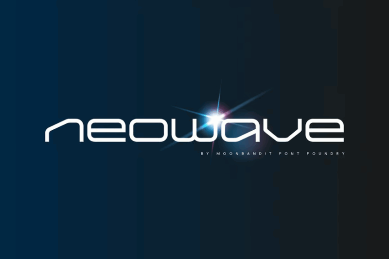
MBF Neowave is a futuristic sans-serif font designed for modern branding. Its clean lines and contemporary feel make it perfect for tech companies, digital products, or any design project aiming for a cutting-edge, forward-thinking aesthetic.
Moxgel Font
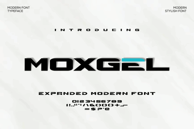
Moxgel is a modern sans-serif font with a fresh, contemporary look. Its clean design and balanced proportions make it versatile for various applications, from branding to digital interfaces, offering both style and readability.
MBF Astronomos
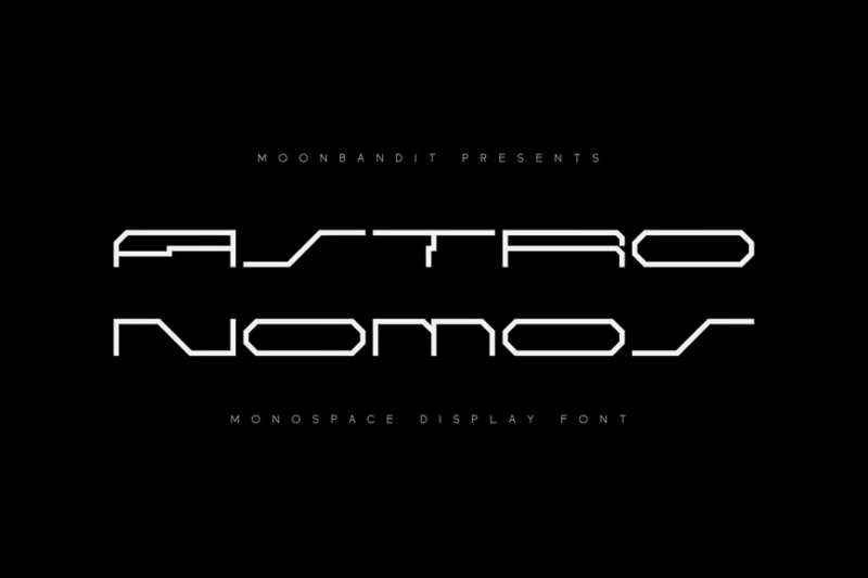
MBF Astronomos is a futuristic, minimalist font that combines decorative elements with a sans-serif base. Its unique design evokes a sense of space and technology, making it perfect for sci-fi themed projects or cutting-edge brand identities.
MBF Androica
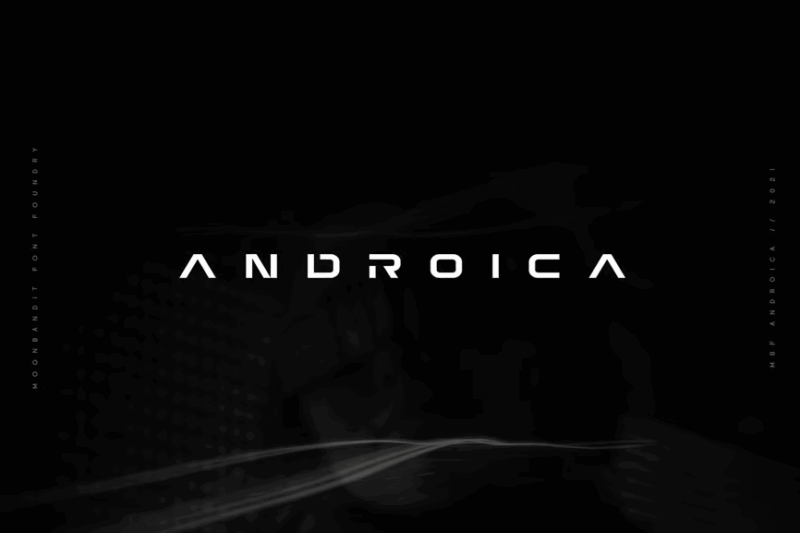
MBF Androica is a modern, futuristic sans-serif font with a sleek appearance. Its clean lines and contemporary design make it ideal for tech-related branding, user interfaces, or any project requiring a forward-thinking typographic approach.
Wavacorp modern font
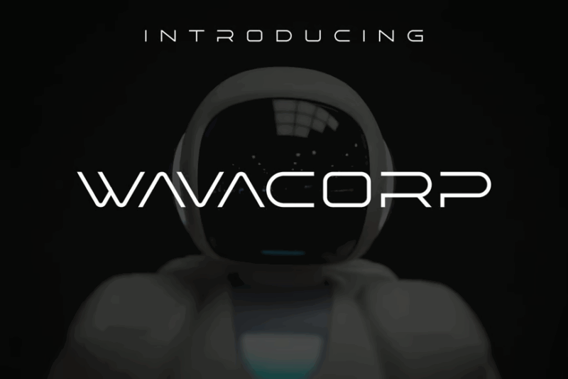
Wavacorp is a modern font that blends sans-serif simplicity with subtle decorative elements. If you like space or science fonts, this one might be for you.
Fathead Display Font
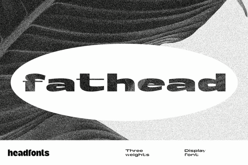
Fathead is a bold, industrial-inspired display font with a chunky, substantial appearance. Its heavy letterforms and raw aesthetic make it perfect for creating impactful headlines, posters, or designs that require a strong, gritty typographic presence.
Perfect Sans
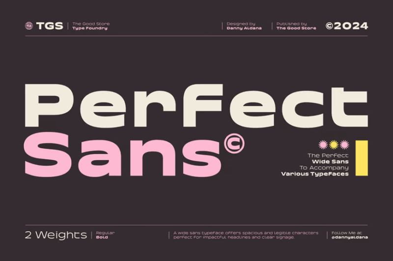
Perfect Sans is a clean, modern sans-serif typeface designed for versatility and readability. Its balanced proportions and crisp edges make it an excellent choice for both body text and headlines across various design applications.
Northura – Modern Sans Family
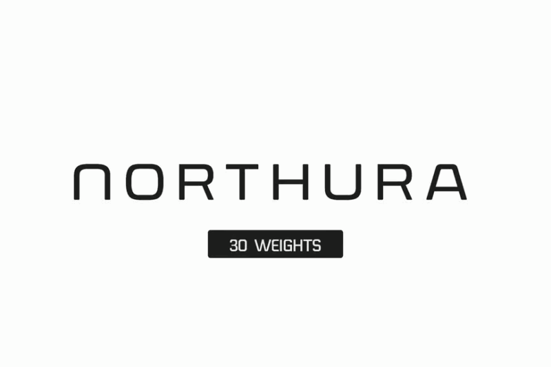
Northura is a modern sans-serif font family with a futuristic edge. Its clean lines and contemporary design make it suitable for a wide range of applications, from branding to user interfaces, offering a fresh and forward-thinking typographic voice.
Centauri – Futuristic Font

Centauri is a futuristic font designed to evoke a sci-fi aesthetic. Its unique letterforms and space-age feel make it perfect for science fiction-themed designs, tech branding, or any project requiring a bold, forward-looking typographic approach.
Space Odyssey – Modern Sans
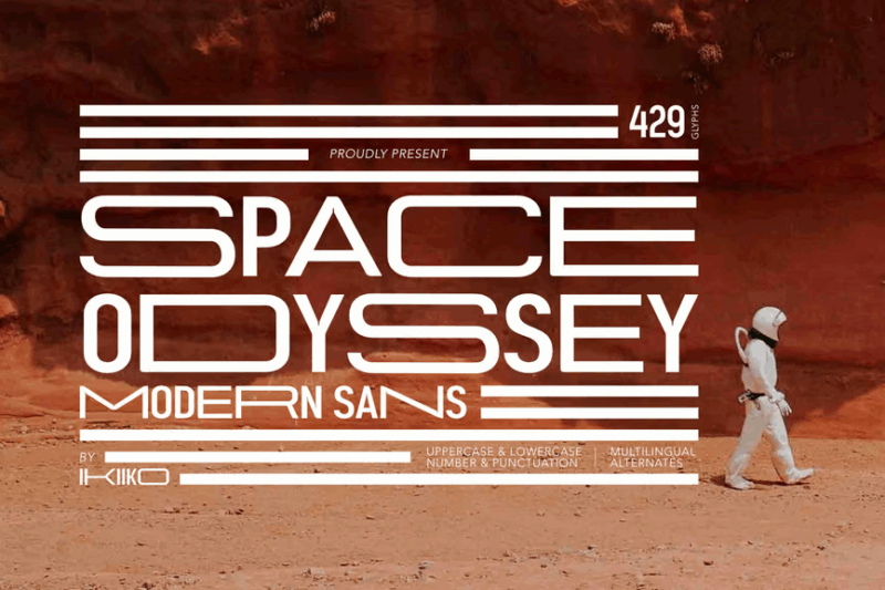
Space Odyssey is a modern sans-serif font with a futuristic twist. Its clean design and subtle space-inspired elements make it ideal for contemporary branding, tech-related projects, or designs targeting a trendy, “hypebeast” aesthetic.
Dirty Stains – Ink Bleed Font
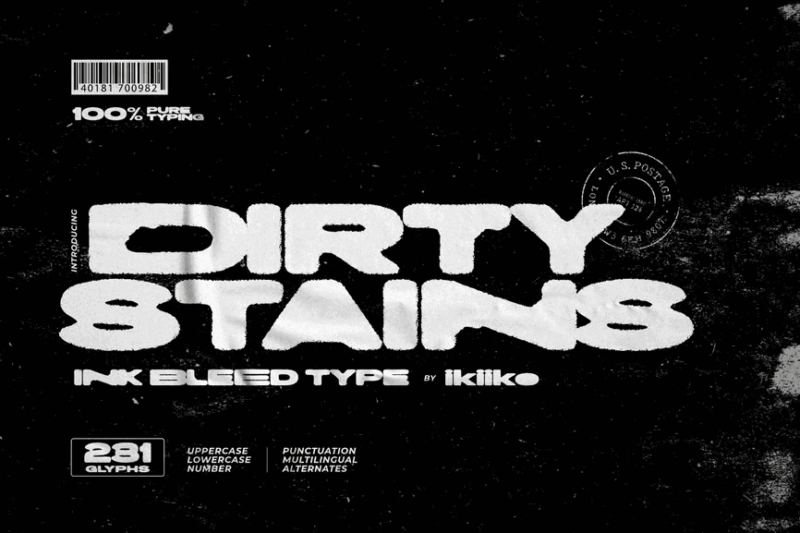
Dirty Stains is a unique font that mimics the look of bleeding ink. Its grungy, textured appearance makes it perfect for creating edgy, urban designs, album covers, or any project requiring a raw, handmade aesthetic with a touch of chaos.
Why Wide Fonts Pack Such a Visual Punch
Wide fonts aren’t just regular typefaces that have been stretched in Photoshop (please don’t do that!). Their expanded proportions are intentionally designed to create specific visual effects and emotional responses. Here’s why wide fonts have such remarkable impact:
First, the expanded horizontal width naturally commands more visual real estate. Like a person stretching their arms wide, these fonts take up space and demand attention. This makes them particularly suited for headlines, logos, and anywhere you want text to be unmissable.
Next, wide fonts create a sense of stability and confidence. The expanded letterforms establish a solid, grounded presence that feels authoritative and assured. This is why wide fonts are frequently chosen for institutions, corporations, and brands wanting to project reliability.
The generous spacing between strokes in wide fonts often improves readability at a distance. This makes them particularly effective for signage, billboards, and other applications where text needs to be legible from afar.
Finally, wide fonts carry specific aesthetic associations depending on their style. Some evoke retro 70s vibes, others feel distinctly architectural and modern, while still others communicate a sense of luxury and expansiveness.
These qualities combined—space occupation, stability, improved distance legibility, and diverse aesthetic associations—explain why designers consistently turn to wide fonts when they need to make a major typographic statement.
Where to Use Wide Fonts for Maximum Impact
Knowing where to deploy wide fonts is just as important as choosing the right one. Here are the applications where wide fonts truly shine:
Headlines & Titles
The most obvious use for wide fonts is in headlines, titles, and other large-format text. Their expanded proportions make them natural attention-grabbers at the top of pages, articles, or posters. A wide font can transform an ordinary headline into something memorable and impactful.
Branding & Logos
Wide fonts excel in branding applications, especially for companies wanting to project stability, confidence, or a sense of expansiveness. Think about how technology companies, architectural firms, and fashion brands often leverage wide typefaces in their logos to establish their visual presence.
Environmental Design & Signage
The enhanced legibility of many wide fonts makes them perfect for wayfinding systems, building signage, and environmental graphics. Their expanded letterforms remain readable at various distances and angles, giving them practical advantages beyond mere aesthetics.
Editorial Design
Magazine spreads, annual reports, and other editorial designs benefit tremendously from the judicious use of wide fonts. They create natural focal points on a page and establish visual hierarchy when paired with more standard width body text.
Album Covers & Entertainment
The music industry has long embraced wide fonts for their dramatic impact on album covers and promotional materials. From classic 70s rock albums to contemporary electronic music, wide fonts help establish a distinctive visual voice for artists.
Where to Avoid Wide Fonts
As powerful as wide fonts can be, they aren’t suitable for every application. Here are situations where you might want to reconsider using a wide font:
Body Text
This should go without saying, but wide fonts are rarely appropriate for extended reading. Their expanded proportions can slow reading speed and cause eye fatigue when used for paragraphs of text. Stick to standard width fonts for body copy.
Mobile Interfaces
The limited horizontal space on mobile screens means wide fonts can become problematic, requiring excessive line breaks or horizontal scrolling. Use wide fonts sparingly in responsive designs, and consider standard alternatives for smaller screens.
Densely Packed Layouts
If your design already contains numerous elements competing for attention, adding wide fonts might push the composition into overwhelming territory. Wide fonts need room to breathe—they’re not the best choice for information-dense layouts.
Formal or Traditional Contexts
Some wide fonts, particularly those with more expressive or decorative qualities, may not be appropriate for highly formal or traditional contexts where conservative typography is expected. Always consider your audience and purpose.
How to Choose the Perfect Wide Font
With countless wide fonts available, selecting the right one requires careful consideration of several factors:
Project Goals & Tone
Start by defining what you want to communicate. Need to project authority? Consider a sturdy, architectural wide font. Looking for retro appeal? Explore 70s-inspired expanded typefaces. Wide fonts carry distinct personalities, so align your choice with your message.
Technical Requirements
Consider where and how your font will be displayed. Will it be used primarily in print or digitally? Does it need to work at very large or very small sizes? Are certain characters (like numbers or symbols) particularly important for your application?
Font Family Completeness
Some wide fonts are standalone display faces, while others come as part of extensive families with multiple weights and styles. If you’ll need versatility within your design system, prioritize wide fonts that are part of larger, well-developed families.
Legibility Concerns
Not all wide fonts maintain equal legibility. Some sacrifice readability for style, while others carefully preserve letter recognition despite their expanded proportions. Test your chosen font at intended usage sizes before committing.
Pairing Potential
Few designs use wide fonts exclusively. Consider how your wide font will pair with other typefaces. Look for complementary fonts that provide sufficient contrast while maintaining harmony with your wide font selection.
Fantastic Wide Font Alternatives
If you’re looking for alternatives that create similar impact to wide fonts, consider these options:
Ultra-Bold Weights
Super heavy, bold fonts can create similar visual weight and presence without the horizontal expansion of wide fonts. They work particularly well when vertical space is limited but you still need impact.
Stacked Type Compositions
Sometimes the solution isn’t a wide font but a creative typographic arrangement. Stacking large, impactful letters can create a commanding presence while working within narrow spaces.
Condensed Fonts at Large Sizes
Counter-intuitively, extra-condensed fonts used at very large sizes can sometimes achieve similar attention-grabbing results to wide fonts, particularly when you need to fit substantial text in a limited space.
Custom Lettering
For truly unique projects, consider custom lettering rather than off-the-shelf fonts. This allows for perfectly tailored proportions that can incorporate wide characteristics while remaining unique to your brand or project.
Pairing Fonts with Wide Typefaces
The key to successful typography often lies in thoughtful combinations. Here are some approaches to pairing other fonts with your wide typefaces:
Balance with condensed fonts. One of the most effective strategies is pairing wide display fonts with condensed styles for secondary information. This contrast creates dynamic tension while maximizing space efficiency.
Match character traits. Look for shared characteristics between your wide font and its companions. Similar x-heights, stroke contrasts, or geometric principles can create harmony despite width differences.
Use neutral body text. When your wide font is making a bold statement, consider pairing it with a neutral, highly readable font for body text. This allows the wide font to shine while ensuring comfortable reading for longer content.
Create a super-family. Some type families include both wide and standard width variants. Using these related designs ensures consistency while allowing for different functional needs.
Common Wide Font Questions
Let’s address some frequently asked questions about wide fonts:
What’s the difference between wide, extended, and expanded fonts?
While these terms are often used interchangeably, they can have subtle differences depending on the type foundry. Generally, “extended” and “expanded” refer to fonts specifically designed with wider proportions, while “wide” can sometimes refer to either purpose-built wide fonts or standard fonts that have been digitally stretched (though the latter is generally considered bad practice).
Can I just stretch a regular font to make it wide?
Technically yes, but please don’t! Professionally designed wide fonts have been carefully crafted with adjusted proportions, stroke weights, and spacing. Simply stretching a standard font creates distortions and imbalances that are obvious to the trained eye and less effective visually.
Are wide fonts more expensive than regular fonts?
Not necessarily. Pricing typically depends on the foundry, the comprehensiveness of the family, and licensing terms rather than the width of the characters. However, some specialty wide display fonts from boutique foundries may command premium prices.
Do wide fonts work well in responsive web design?
This depends on the specific implementation. Wide fonts can be challenging on smaller screens, but with careful CSS management, font size adjustments, and possibly switching to standard width alternatives at certain breakpoints, they can be successfully incorporated into responsive designs.
Conclusion: The Expanding Universe of Wide Fonts
Wide fonts occupy a special place in the designer’s toolkit. They command attention, establish authority, and create unmistakable visual impact when used thoughtfully. From the architectural to the playful, from the vintage to the cutting-edge, there’s a wide font for virtually every bold design need.
As we’ve seen through our exploration of the top 25 wide fonts of 2026, these expanded typefaces continue to evolve and diversify. No longer limited to a few industrial or display contexts, today’s wide fonts offer remarkable versatility while maintaining their distinctive ability to make a statement.
The key to success with wide fonts lies in understanding their strengths and limitations. When given room to breathe, paired thoughtfully with complementary typefaces, and applied to appropriate contexts, wide fonts reward designers with typographic impact that standard width fonts simply cannot achieve.
What are your favorite wide fonts? Have you discovered creative applications for them in your design work? Share your experiences in the comments below!