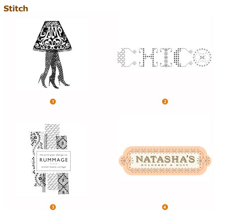
Logo Lounge recently published their annual round up of current logo trends. Two of the overarching themes they noticed include the overall move toward more cleanliness as well as a “less is more” approach. Sounds good to me.
Check out a few examples below, and view the full article here.

Designed by: 1. The Woodbine Agency, 2. tenn_do_ten (couldn’t find a link for this one, sorry), 3. The Pink Pear Design Company, and 4. Hammerpress

Designed by: 1. Colorblind Chameleon, 2. Range, 3. Pearpod, and 4. Cricket Design Works
