In this article:
- The Best Dripping Fonts of 2026
- What Makes Dripping Fonts So Visually Effective?
- Where Can You Use Dripping Fonts?
- Where to Avoid Dripping Fonts
- Tips for Using Dripping Fonts Effectively
- Fantastic Dripping Font Alternatives
- Common Dripping Font Questions
- The Evolution of Dripping Typography: From Horror to Mainstream
- Conclusion: Making an Impact with Dripping Typography
As designers, we’re constantly searching for typography that can evoke specific emotions and create memorable visual impact. And when it comes to adding an edgy, horror-inspired, or liquid-like quality to your designs, dripping fonts are an absolute game-changer.
Dripping fonts feature letterforms with liquid-like extensions that appear to melt, ooze, or drip downward, creating a dynamic, often unsettling visual effect. Whether you’re designing for Halloween promotions, horror genres, graffiti-inspired projects, or simply want to add some rebellious flair to your work, dripping fonts offer that perfect splash of personality.
Here’s my list of the best dripping fonts. Enjoy!
The Best Dripping Fonts of 2026
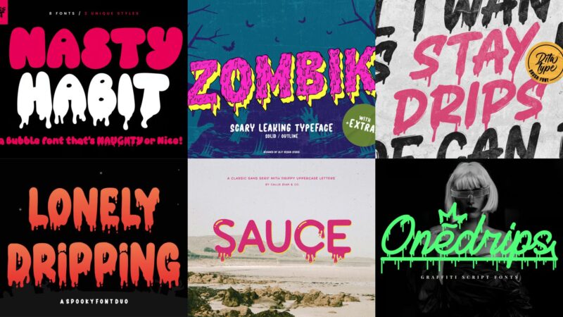
Not all dripping fonts deliver the same visual punch. I’ve curated a collection of the most impressive dripping fonts that truly stand out in 2026. Here they are:
Stay Drips
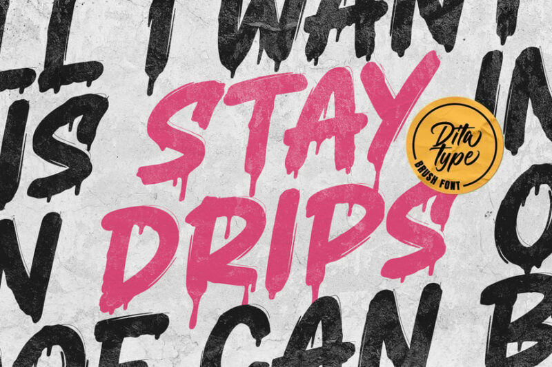
Stay Drips is a script-style font with a playful, dripping effect. Its fluid lines and organic shapes make it perfect for creating eye-catching designs with a casual, handwritten feel or even a spray-paint feel. This font would be ideal for projects requiring a fun, energetic vibe.
Retro Drip
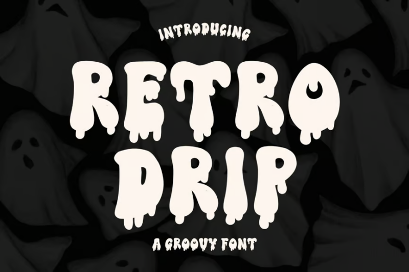
Retro Drip combines vintage aesthetics with a modern dripping effect. This decorative font evokes a sense of nostalgia while maintaining a contemporary edge. It’s well-suited for party invitations, posters, and retro-themed designs.
Sticky Blood
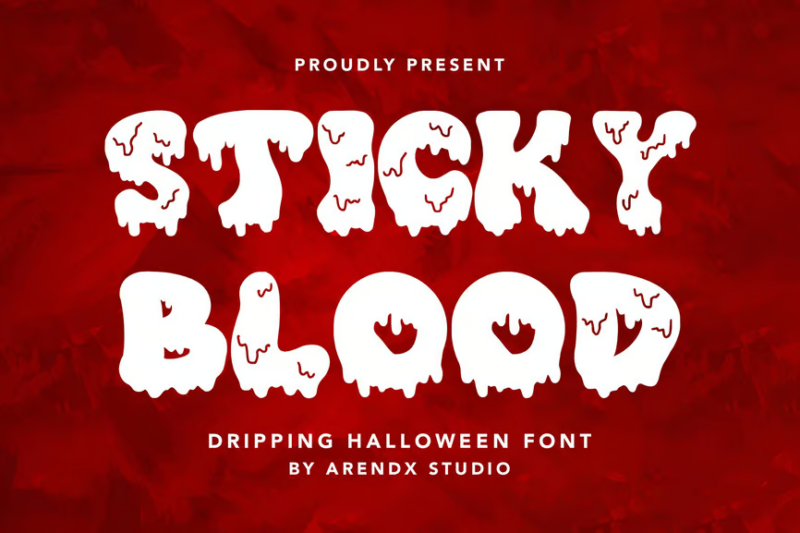
Sticky Blood is a chilling Halloween-themed font featuring dripping, blood-like letters. Its eerie appearance and irregular shapes make it perfect for creating spine-tingling designs. This font is ideal for horror movie posters, Halloween event promotions, or any project requiring a scary, visceral impact.

Get 300+ Fonts for FREE
Enter your email to download our 100% free "Font Lover's Bundle". For commercial & personal use. No royalties. No fees. No attribution. 100% free to use anywhere.
Dripping Drops
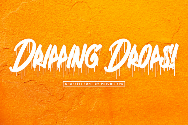
Dripping Drops is a graffiti-inspired font that captures the essence of street art. Its bold, liquid-like letterforms create a sense of movement and urban energy. This font is perfect for designs that aim to convey a rebellious, edgy, or youthful vibe.
Lonely Dripping Halloween Display Font
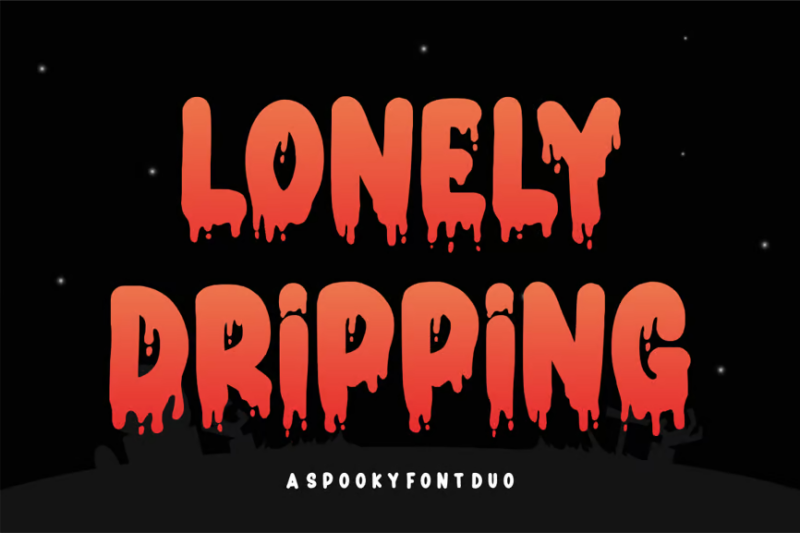
This font combines a sans-serif base with eerie, dripping effects, perfect for Halloween-themed designs. Its unique blend of clean lines and spooky elements makes it versatile for various horror and mystery projects. Use it to create attention-grabbing headlines or spooky logo designs.
Ghouls Bloods

Ghouls Bloods is a chilling, dripping font that embodies the essence of horror. Its irregular, blood-like letterforms create a sense of unease and terror. This font is perfect for horror movie titles, book covers, or any design project aiming to evoke fear and suspense.
Scarow
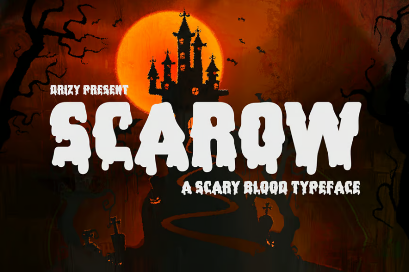
Scarow is a blood-dripping font that brings a terrifying edge to any design. Its jagged, uneven letterforms create a sense of danger and unpredictability. This font is ideal for Halloween-themed projects, horror game logos, or any design requiring a frightening, visceral impact.
Bloody Shout
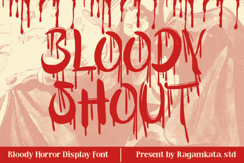
Bloody Shout is a creepy horror font that combines bold, attention-grabbing shapes with dripping effects. Its intense, shouting quality makes it perfect for creating impactful horror-themed designs. Use this font for movie posters, book covers, or any project that needs to convey a loud, terrifying message.
Chill Blood
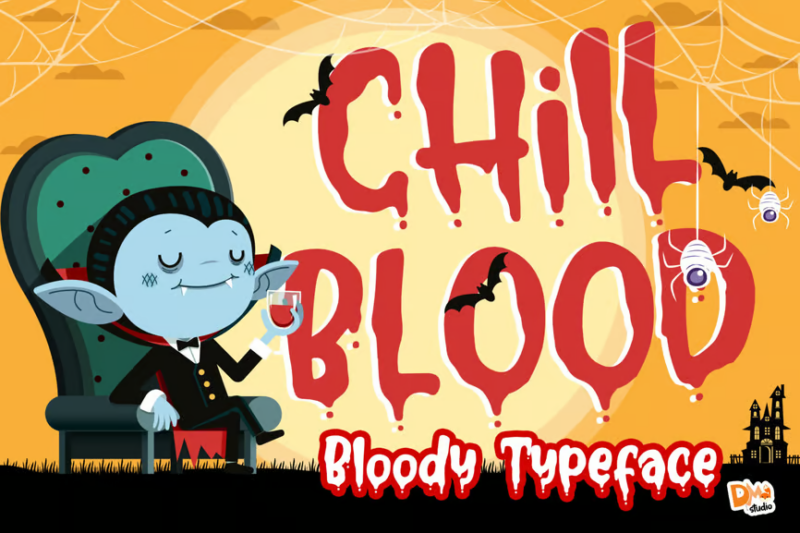
Chill Blood is a bloody typeface that blends script and decorative styles. Its fluid, dripping design creates a chilling effect while maintaining readability. This font is perfect for creating eerie, yet stylish designs for horror-themed projects or Halloween events.
Paint King Dripping Graffiti Display Font
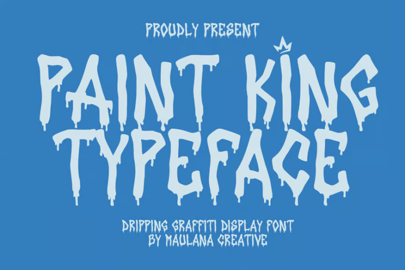
Paint King is a bold, dripping graffiti font that exudes urban style and creativity. Its thick, paint-like letterforms create a strong visual impact reminiscent of street art. This font is ideal for designs that aim to capture the essence of urban culture, youth-oriented brands, or artistic projects.
Groovy Night Halloween Display Font
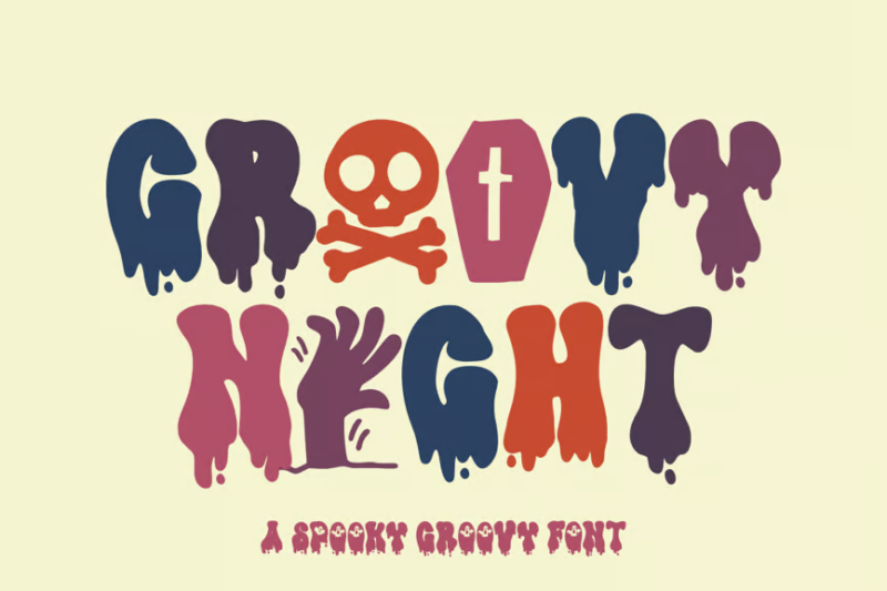
Groovy Night is a retro-inspired Halloween font that combines spooky elements with a 70s aesthetic. Its unique blend of vintage and horror makes it perfect for creating eye-catching, nostalgic Halloween designs. Use this font for themed party invitations, posters, or any project that needs a funky, spooky touch.
Death Markers
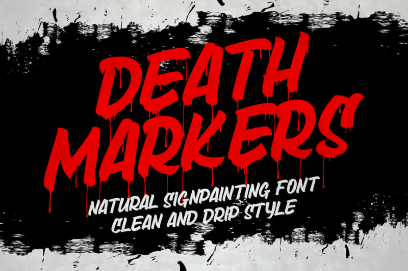
Death Markers is a font that mimics the raw, organic look of hand-painted letters. Its rough, uneven edges give it a natural, slightly ominous feel. This font is perfect for creating designs with a handmade, slightly macabre aesthetic, suitable for horror-themed projects or grungy, alternative designs.
Filthy Creation

Filthy Creation is an outrageous slime font that pushes the boundaries of typography. Its dripping, gooey letterforms create a visceral, almost disgusting effect. This font is perfect for designs that aim to shock, amuse, or create a strong visual impact in horror, comedy, or avant-garde projects.
Onedrips
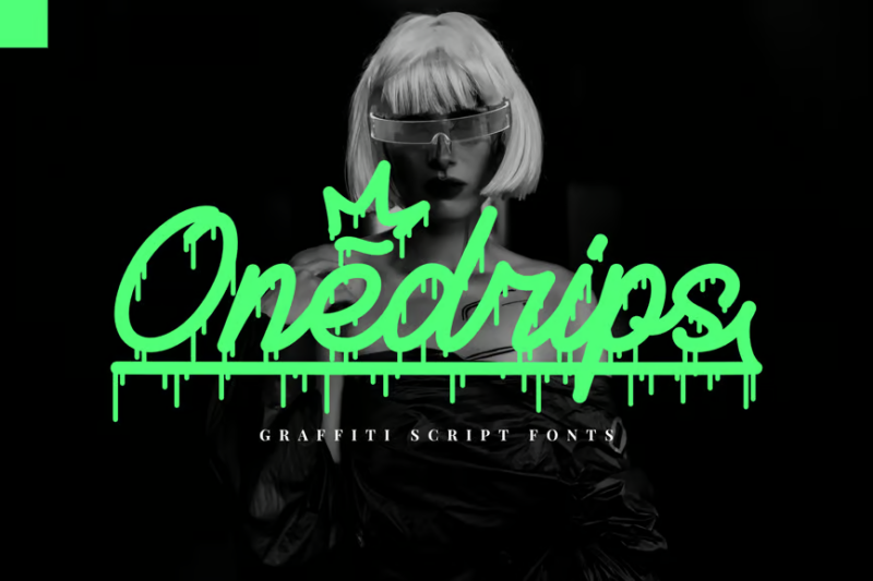
Onedrips is a cursive font that combines urban style with fluid, dripping effects. Its dynamic letterforms create a sense of movement and energy. This font is ideal for designs that aim to capture the essence of street culture, hip-hop aesthetics, or any project requiring a bold, expressive script.
Crimson Ghouls
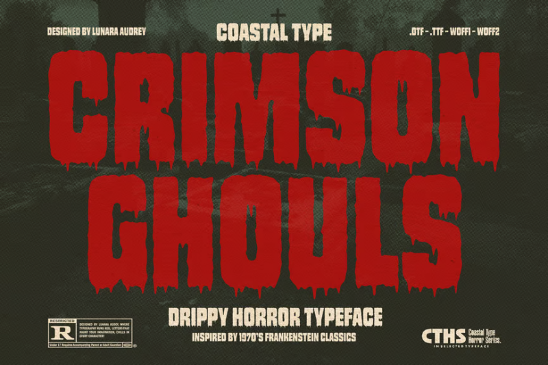
Crimson Ghouls is similar to the popular font Impact, but with a drippy texture. It’s a horror-themed font that evokes the atmosphere of classic scary movies. Its irregular, slightly distressed letterforms create a sense of unease and foreboding. This font is perfect for horror film titles, book covers, or any design project aiming to create a vintage horror aesthetic.
Drippy Message
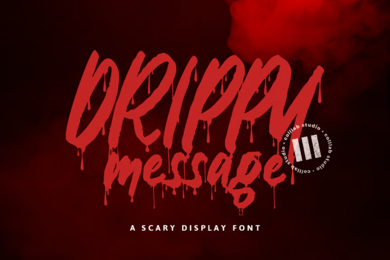
Drippy Message is a handwritten font with a playful, dripping effect. Its casual style and fluid forms make it perfect for creating designs with a friendly, approachable feel. This font is ideal for social media graphics, informal branding, or any project that requires a personal, handcrafted touch.
Sauce Typeface

Sauce Typeface is a versatile font family that includes sans-serif, script, and decorative styles with a drippy effect. Its varied styles allow for dynamic typographic compositions. This font is perfect for creating cohesive designs across different applications, from branding to editorial layouts.
Mystero
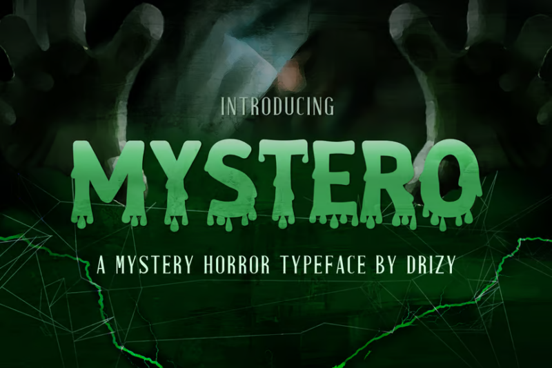
Mystero is a mystery horror font that combines eerie aesthetics with an air of intrigue. Its irregular, slightly distorted letterforms create a sense of unease and curiosity. This font is ideal for mystery novel covers, thriller movie titles, or any design project that aims to evoke a sense of the unknown and supernatural.
Meltdog
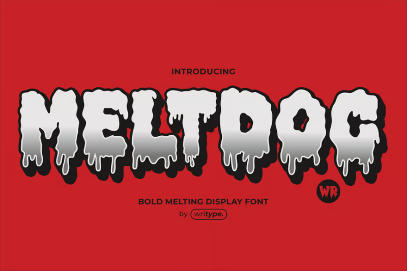
Meltdog is a melted display font that creates a unique, surreal effect. Its distorted, liquid-like letterforms give the impression of letters melting before your eyes. This font is perfect for creating attention-grabbing designs in surrealist art projects, psychedelic posters, or any design that aims to challenge visual perception.
Toxic Inked
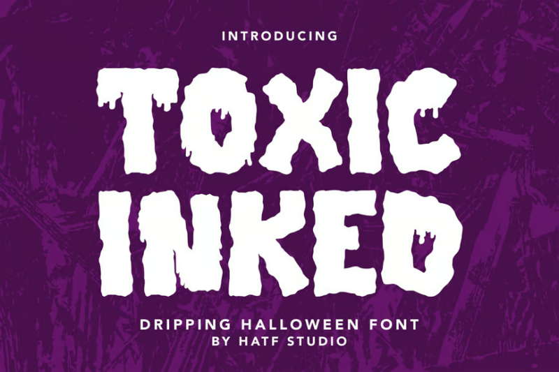
Toxic Inked is a decorative font that combines a grungy aesthetic with dripping effects. Its irregular, inky letterforms create a sense of danger and contamination. This font is ideal for designs related to punk rock, environmental hazards, or any project requiring a raw, edgy typographic style.
Venom
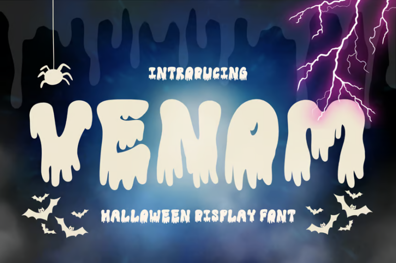
Venom is a spooky, Halloween-themed font that embodies danger and toxicity. Its sharp, dripping letterforms create a sense of threat and unease. This font is perfect for horror-themed designs, comic book titles, or any project that aims to convey a sense of menace and otherworldly danger.
Hallow Creeps
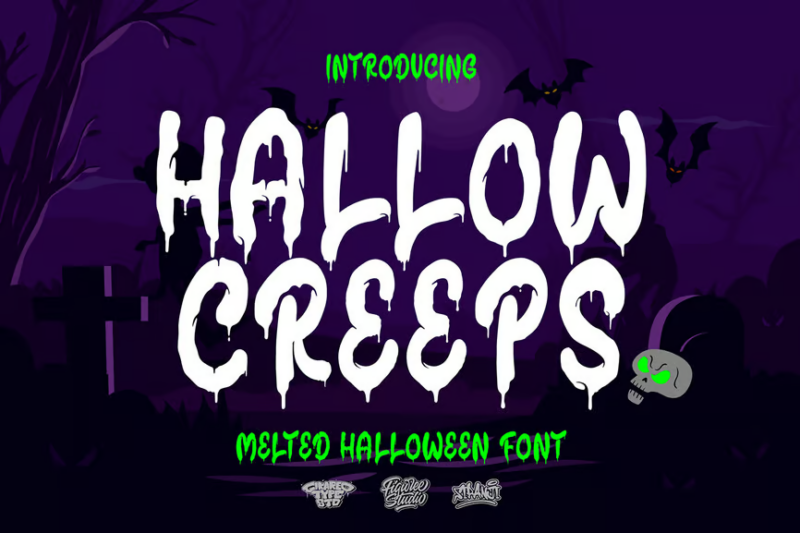
Hallow Creeps is a melted Halloween font that combines eerie aesthetics with a liquid-like appearance. Its distorted, dripping letterforms create a sense of unnatural movement and decay. This font is ideal for creating spine-chilling designs for Halloween events, horror-themed products, or any project requiring a ghoulish, melting effect.
Gloomy Grave
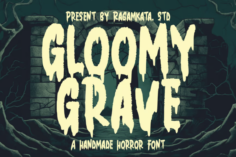
Gloomy Grave is a creepy horror font that evokes the atmosphere of old, forgotten cemeteries. Its irregular, slightly crumbling letterforms create a sense of age and decay. This font is perfect for creating eerie designs for gothic literature, horror games, or any project aiming to convey a sense of ancient, lurking evil.
Zombik Typeface
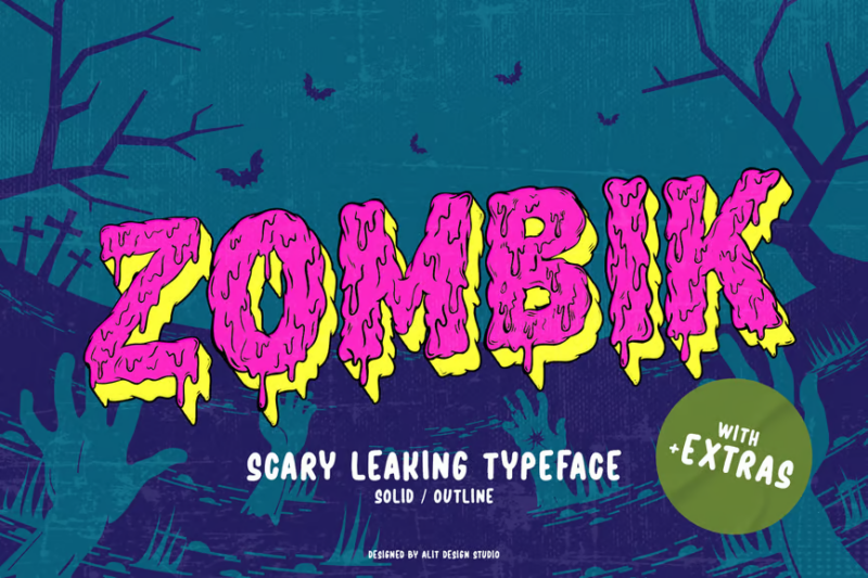
Zombik Typeface is a horror-themed neon font that captures the essence of the undead. Its rough, decaying letterforms create a sense of rot and reanimation. This font is ideal for zombie-themed projects, apocalyptic designs, or any horror-related content that needs to convey a sense of unstoppable, gruesome persistence.
Nasty Habit Graffiti Bubble Font
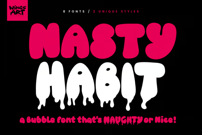
Nasty Habit is a graffiti-inspired bubble font that brings urban street art to life. Its bold, rounded letterforms create a playful yet edgy aesthetic. This sans-serif font is perfect for creating eye-catching designs in youth-oriented branding, street wear graphics, or any project that aims to capture the energy of urban culture.
What Makes Dripping Fonts So Visually Effective?
Dripping fonts capture our attention and create emotional impact through several key characteristics:
Dynamic Movement
The dripping elements add a sense of motion and activity to otherwise static typography. This implied movement creates visual interest and draws the eye downward through the design, keeping viewers engaged longer.
The drips themselves suggest that something is actively happening – melting, oozing, bleeding – which adds a temporal element to the design. This sense of “catching something in the act” creates immediacy and urgency.
Emotional Associations
Dripping elements trigger strong emotional and physical associations. Depending on the style, they might evoke blood (horror, danger), slime (disgust, childhood fun), paint (creativity, graffiti culture), or melting (heat, transformation).
These visceral connections make dripping fonts particularly effective for designs aiming to provoke specific emotional responses or tap into primal feelings.
Rebellious Personality
Dripping fonts inherently break the rules of traditional typography. Letters are meant to be clean, precise, and legible – drips deliberately mess with these conventions, creating a sense of rebellion and nonconformity.
This makes them perfect for brands or messages that want to position themselves as edgy, alternative, or challenging to the status quo.
Textural Interest
The irregular shapes created by dripping elements add texture and depth to typography. Instead of flat, uniform letterforms, dripping fonts create varied visual weight and organic shapes that add richness to designs.
This textural quality helps dripping fonts stand out against cleaner backgrounds and creates more memorable visual impressions.
Where Can You Use Dripping Fonts?
Dripping fonts offer versatility across many design applications, particularly when you need to make a bold statement:
Halloween & Horror
The most obvious application – dripping fonts are perfect for Halloween promotions, horror movie posters, haunted house advertisements, and spooky event flyers. The dripping elements instantly communicate the genre and tone.
For seasonal businesses focused on Halloween or horror attractions, dripping fonts can become a cornerstone of brand identity, instantly signaling the thrilling experiences awaiting customers.
Music & Entertainment
Many music genres – particularly heavy metal, horror punk, and certain electronic music scenes – embrace dripping typography for album covers, band logos, concert posters, and merchandise.
The rebellious, intense nature of dripping fonts perfectly complements these genres’ aesthetic and attitude, helping artists establish visual identities that match their sound.
Streetwear & Urban Brands
Dripping fonts have deep connections to graffiti culture and street art, making them natural fits for streetwear brands, skateboarding companies, and urban-focused businesses.
The liquid quality suggests movement and flow, complementing active brands while the slightly rebellious feel appeals to younger, trend-conscious audiences.
Food & Beverage
Certain food businesses – particularly those selling messy, indulgent foods – can use dripping fonts to visually suggest the ooey-gooey deliciousness of their products.
Ice cream shops, chocolate brands, sauce companies, and burger joints can all use dripping typography to make customers practically taste the product before they even try it.
Kids’ Products
Playful, colorful dripping fonts (especially those suggesting slime or goo) can be perfect for children’s products, particularly those capitalizing on kids’ fascination with messy, slimy things.
Toy brands, activity kits, and certain snack foods aimed at children can use dripping fonts to communicate fun and transgressive messiness that appeals to younger audiences.
Where to Avoid Dripping Fonts
While versatile, dripping fonts aren’t appropriate for every context. Here are situations where they should generally be avoided:
Professional Services
Law firms, medical practices, financial institutions, and other professional services should typically steer clear of dripping fonts. The playful, potentially horror-associated style undermines the trust, stability, and reliability these businesses need to convey.
Instead, these industries should stick with clean serif or sans-serif fonts that communicate professionalism and dependability.
Luxury Brands
With rare exceptions (like the “Dripping Gold” font mentioned earlier), most dripping fonts clash with the refined, elegant aesthetic of luxury brands. The messy, irregular nature of dripping elements typically contradicts the precision and perfection associated with premium products.
For luxury contexts, stick with refined serif fonts or elegant scripts that communicate sophistication.
Clear Communication
Any content requiring immediate, clear legibility – such as emergency information, wayfinding, instructions, or legal text – should avoid dripping fonts. The decorative drips can compromise readability, especially at smaller sizes or for quick scanning.
Always prioritize clarity over style when important information needs to be communicated efficiently.
Serious Topics
Content addressing serious social issues, health concerns, or sensitive topics should typically avoid dripping fonts, as they may appear to trivialize important matters or bring unnecessary playfulness to weighty subjects.
The strong associations with horror, rebellion, or playfulness can undermine the gravity of serious communication.
Tips for Using Dripping Fonts Effectively
To maximize the impact of dripping fonts while maintaining design integrity, keep these guidelines in mind:
Size Matters
Dripping fonts generally work best at larger sizes where the details of the drips can be fully appreciated. At very small sizes, the drips may become indistinct blobs or compromise legibility.
Use dripping fonts for headlines, titles, logos, and other prominent display text rather than body copy or fine print.
Consider Color Psychology
The color of your dripping font dramatically affects its emotional impact. Red drips evoke blood and horror, green suggests slime or toxicity, black might suggest ink or oil, while pastels can create a more playful, candy-like effect.
Choose colors that reinforce the specific “dripping substance” you want to evoke for maximum psychological impact.
Balance with Clean Elements
Pair dripping fonts with cleaner, more legible typography for supporting text. This creates effective contrast and ensures that important information remains readable even as the dripping elements add visual interest.
A common approach is using dripping fonts for headlines while keeping body text in a simple sans-serif for maximum readability.
Mind Your Spacing
The irregular nature of dripping elements means you’ll need to pay extra attention to letter spacing. Drips from one letter may encroach on the space of adjacent letters, potentially creating readability issues.
Adjust tracking and kerning carefully to ensure drips enhance rather than obscure your text, and allow extra vertical space for the drips to extend without overlapping other design elements.
Consider Animation Potential
For digital applications, dripping fonts offer excellent opportunities for subtle animation. Animated dripping effects can make web headers, social media posts, and digital advertisements particularly engaging.
Even simple animations that make the drips appear to slowly ooze downward can dramatically enhance the visual impact of your typography.
Fantastic Dripping Font Alternatives
If you love the energy of dripping fonts but need something slightly different, consider these alternatives that capture similar vibes:
Splatter Fonts
Splatter fonts feature paint-like splatters and splashes that create a similar sense of liquid movement but with more chaotic, explosive energy compared to the downward flow of dripping fonts.
These work well for action-oriented designs, paintball companies, art studios, or any brand wanting to convey creative energy and dynamic movement.
Grunge/Distressed Fonts
Grunge fonts share the rebellious spirit of dripping fonts but focus on erosion, scratches, and weathering rather than liquid movement. They communicate a worn, lived-in quality that feels authentic and raw.
Perfect for vintage-inspired designs, rock bands, coffee shops, and brands wanting to convey history and authenticity without the liquid associations.
Neon/Glowing Fonts
Like dripping fonts, neon typography creates a sense of energy and movement through light rather than liquid. The glowing quality suggests intensity and nightlife energy.
Ideal for clubs, bars, entertainment venues, and brands wanting to capture after-dark excitement or technological themes without the potential horror associations of dripping elements.
Hand-Painted Brush Fonts
Brush fonts capture some of the organic, flowing quality of dripping fonts but in a more controlled, artistic manner. They suggest human creativity rather than uncontrolled oozing.
Great for artistic brands, handmade products, creative services, and designs needing a personal touch without the extreme stylization of dripping elements.
Common Dripping Font Questions
Let’s address some frequently asked questions about dripping fonts:
What font has drips?
Many fonts feature dripping elements, with popular options including “Fright Night,” “Slime City,” “Meltdown,” “Blood Lust,” and “Drippy.” Each offers different styles of drips, from horror-inspired blood to playful slime or melting effects.
How do I make a font look like it’s dripping?
If you can’t find the perfect dripping font, you can modify existing fonts using vector editing software like Adobe Illustrator. Create your text, convert to outlines, and then manually add drip shapes extending from the bottom of key letterforms. For digital applications, CSS effects or SVG animations can create dripping visuals from standard fonts.
Are dripping fonts only for Halloween?
While dripping fonts are popular for Halloween and horror themes, they have much broader applications. Depending on style and color, they can work for graffiti art, streetwear brands, children’s products (especially slime-themed), certain food businesses, music genres, and any brand wanting to convey an edgy, nonconformist attitude.
Can dripping fonts be elegant?
Though rarely considered traditionally elegant, certain dripping fonts like “Melted Gold” or “Liquid Crystal” can create a more sophisticated dripping effect. Using metallic finishes, subtle drips, and careful color selection can elevate dripping fonts beyond their typical associations with horror and rebellion.
Do dripping fonts work for logos?
Dripping fonts can make for memorable, distinctive logos when aligned with the brand’s personality and industry. They’re particularly effective for businesses in entertainment, alternative fashion, horror themes, or youth culture. However, consider simpler drip elements for logos to ensure they remain recognizable at smaller sizes and across different applications.
The Evolution of Dripping Typography: From Horror to Mainstream
Dripping typography has a fascinating history that reflects broader cultural and design trends:
Dripping font aesthetics first gained prominence in mid-20th century horror movie posters and pulp fiction covers. The “dripping blood” lettering became visual shorthand for horror and suspense, immediately signaling genre to potential audiences.
In the 1970s and 80s, heavy metal bands adopted and expanded on dripping typography, using it for album covers and band logos to convey intensity and rebellion. Groups like Iron Maiden and Mötley Crüe helped popularize more stylized versions of dripping fonts.
The 1990s saw dripping typography enter skate culture and streetwear, with brands like Slime Balls using dripping elements to appeal to youth audiences drawn to transgressive, anti-establishment aesthetics.
Digital typography and the rise of the internet in the 2000s made custom dripping fonts more accessible to designers everywhere, leading to more varied applications beyond traditional horror contexts.
Today, dripping fonts have found their way into mainstream design, with even major brands temporarily adopting dripping elements for special promotions, limited edition products, or seasonal campaigns.
This evolution shows how a once-niche typographic style has expanded its reach while still maintaining its core appeal – the visceral, emotional reaction to seeing something that appears to be actively melting or oozing before our eyes.
Conclusion: Making an Impact with Dripping Typography
Dripping fonts offer designers a powerful tool for creating memorable, emotionally resonant typography. From horror and rebellion to playfulness and indulgence, the simple addition of dripping elements to letterforms opens up rich visual storytelling possibilities.
The key to success with dripping fonts lies in intentionality – understanding what specific emotion or association your particular dripping style evokes, and ensuring that aligns with your broader design goals and brand messaging.
Used thoughtfully, dripping fonts can help your designs stand out in an increasingly crowded visual landscape, creating immediate recognition and emotional connection with your audience.
Whether you’re designing for the next big horror film, a revolutionary streetwear brand, a children’s slime toy, or an indulgent dessert shop, the right dripping font can elevate your typography from merely informative to viscerally impactful.
Which dripping font catches your eye? Are you team horror drip, candy drip, or something else entirely? Let me know in the comments below!

