In this article:
- The Best Grunge Fonts of 2026
- What Makes Grunge Fonts So Irresistibly Raw?
- Where Grunge Fonts Absolutely Dominate
- When to Pump the Brakes on Grunge
- Mastering the Art of Grunge Font Selection
- Pairing Grunge Fonts Like a Pro
- The Psychology Behind Grunge Font Appeal
- Expert Tips for Grunge Font Success
- Common Grunge Font Mistakes to Avoid
- The Future of Grunge Typography
Grunge fonts have a pull that’s hard to ignore. As a graphic designer who’s seen trends come and go, I’m still drawn to their raw, untamed spirit. They bring a kind of beautiful chaos to the design world—gritty, rebellious, and unapologetically real.
These aren’t your clean-cut, corporate typefaces. Grunge fonts wear their flaws with pride—textured, distressed, and dripping with attitude. Rooted in the anti-establishment vibe of the ’90s music scene, they’ve carved out a permanent place in design history and remain just as impactful today in 2026.
When you want to cut through the noise and say something bold, grunge fonts rise to the occasion. Whether you’re aiming for vintage angst or just trying to shake up a modern layout with some edge, they offer that elusive “perfectly imperfect” aesthetic.
In this guide, we’re diving headfirst into the world of grunge typography—from the cultural roots that gave it life to how you can wield it with intention in your own work. Throw on your favorite flannel, cue up the grunge playlist, and let’s dig into some fonts with real grit.
The Best Grunge Fonts of 2026
Let me share my curated collection of grunge fonts that are absolutely crushing it right now. These aren’t your basic distressed typefaces – they’re the real deal:
Wasted Youth
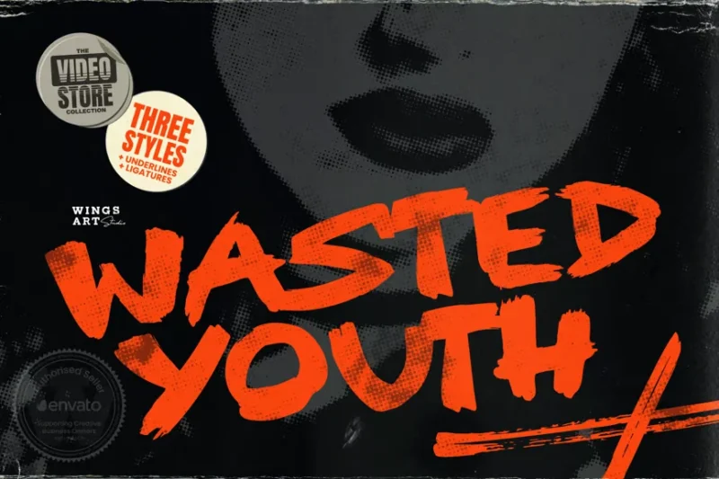
Wasted Youth is a 90s-inspired brush font that captures the essence of grunge typography. Its rough, handwritten style and nostalgic feel make it perfect for creating authentic retro designs or adding a touch of alternative flair to modern projects.

Get 300+ Fonts for FREE
Enter your email to download our 100% free "Font Lover's Bundle". For commercial & personal use. No royalties. No fees. No attribution. 100% free to use anywhere.
Grunge! Bold Brush Typeface
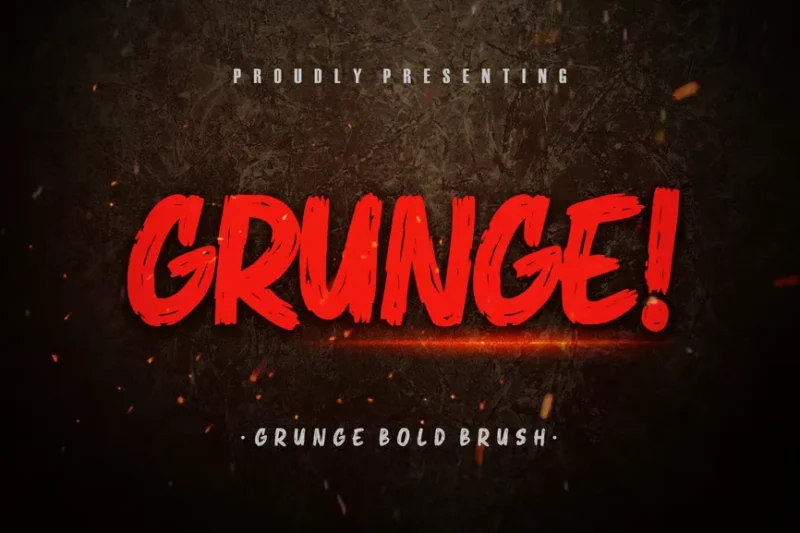
This bold brush typeface combines grunge aesthetics with a strong, impactful presence. Its thick strokes and distressed texture make it ideal for creating eye-catching headlines or branding materials that demand attention.
Beats
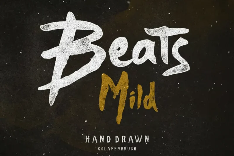
Beats is a rusty, script-style font that exudes character and texture. Its weathered appearance and handwritten feel make it perfect for creating designs with a vintage or industrial vibe.
Halybed | Grunge Typeface Font
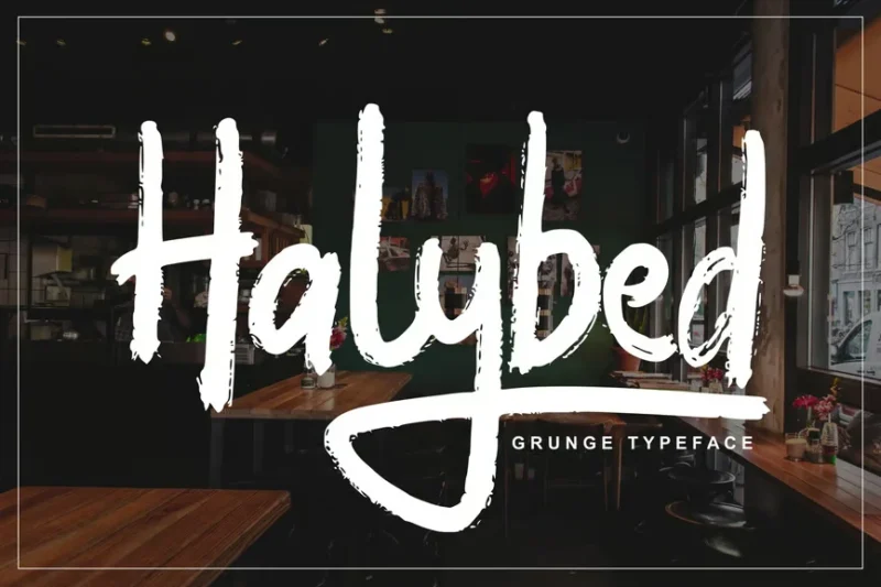
Halybed is a versatile grunge typeface that combines script, handwritten, and decorative styles. Its chalky style and unique character shapes make it ideal for creating designs with an edgy, alternative aesthetic.
Slaters Duct Tape
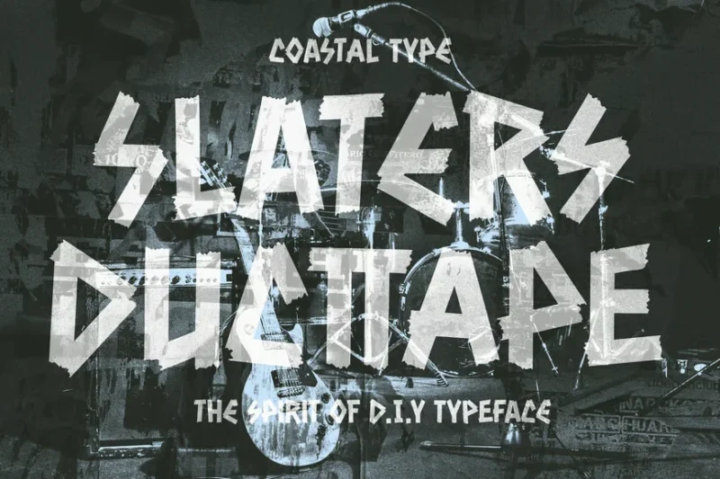
Slaters Duct Tape is a decorative font that mimics the look of text created with duct tape. Its punk-inspired aesthetic and unconventional appearance make it perfect for music-related designs or projects that require a DIY, rebellious feel.
Rushtar
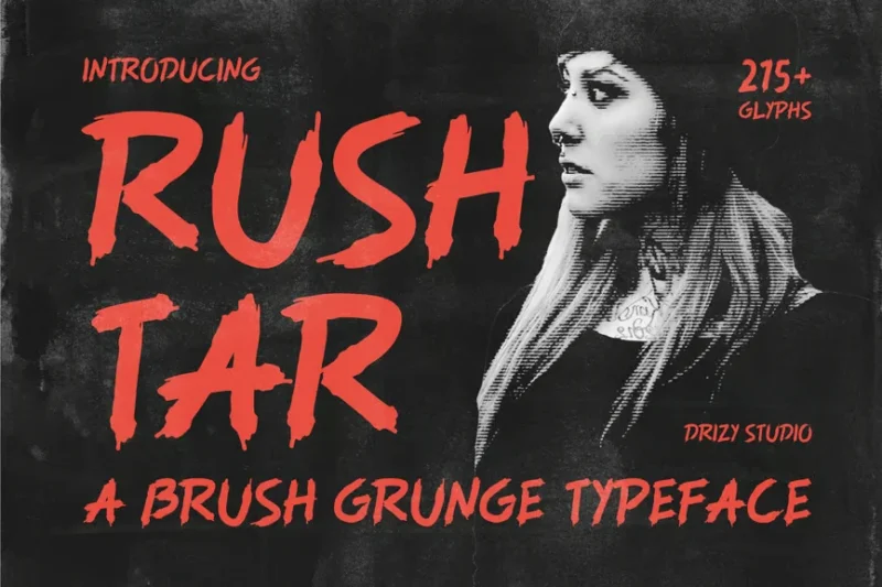
Rushtar is a brush grunge typeface that combines expressive strokes with a distressed finish. Its dynamic character and worn texture make it ideal for creating impactful display designs with a raw, energetic feel.
Grunges Grunge Brush Font
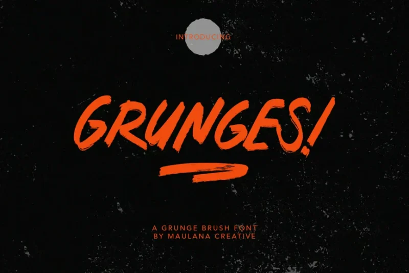
Grunges is a versatile grunge brush font that blends sans-serif, decorative, and script styles. Its rough, textured appearance makes it perfect for creating designs with a bold, weathered aesthetic across various applications.
Death Rock Grunge Business Font
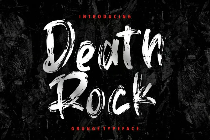
Death Rock is a grunge business font that combines script and decorative styles with a rock-inspired edge. Its unique blend of professionalism and alternative aesthetics makes it suitable for creating edgy business materials or music-related designs.
Eather | Modern Grunge Typeface
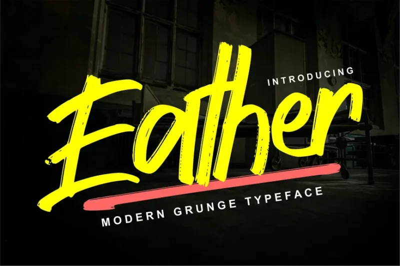
Eather is a modern grunge typeface that merges script and decorative styles. Its contemporary approach to distressed typography makes it ideal for fashion-forward designs or projects that require a fresh take on the grunge aesthetic.
Late Night Brush Font
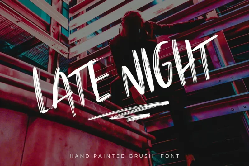
Late Night is a versatile brush font that combines sans-serif, script, and decorative styles with a grungy twist. Its expressive strokes and worn texture make it perfect for creating designs with a late-night, alternative vibe, particularly suited for band-related projects.
Gasela | Grungetype Font
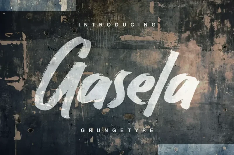
Gasela is a grunge-style font that combines sans-serif and decorative elements. Its distressed appearance and bold character make it perfect for creating eye-catching posters or designs that demand attention with a raw, edgy feel.
Gotriez Handmade Brush Rough Font
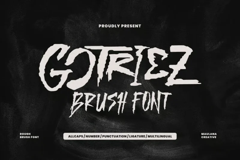
Gotriez is a handmade brush font with a rough, grungy texture. Its organic strokes and irregular forms give it an authentic, hand-crafted feel, ideal for creating designs with a personal touch and raw aesthetic.
Nightmare | Grunge Brush Font
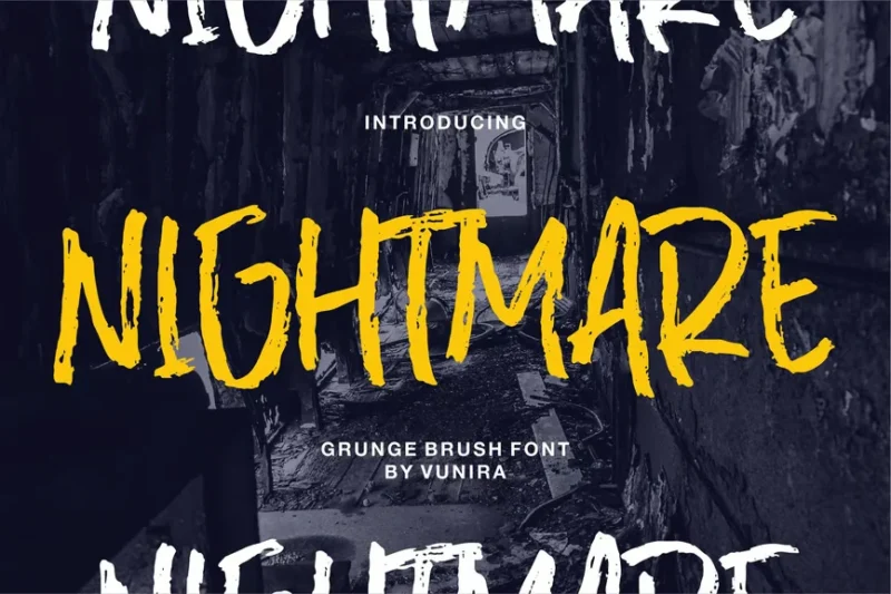
Nightmare is a grunge brush font that exudes a dark, vintage atmosphere. Its distressed texture and irregular brush strokes make it perfect for creating designs with a haunting, mysterious vibe or for projects that require a touch of gothic aesthetics.
Great Glory Brush Font
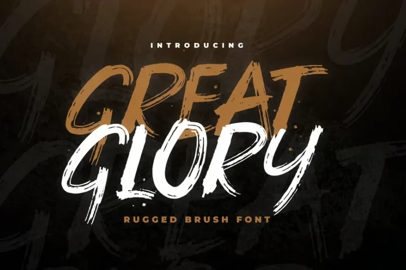
Great Glory is a decorative brush font with a grungy twist. Its bold strokes and distressed finish create a powerful visual impact, making it ideal for designs that need to convey strength and character with a touch of raw authenticity.
Hunk Brush Typeface
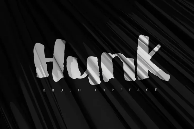
Hunk is a versatile brush typeface that combines script and decorative styles. Its expressive strokes and dynamic character make it suitable for a wide range of design applications, from branding to editorial projects that require a bold, artistic touch.
Grantland
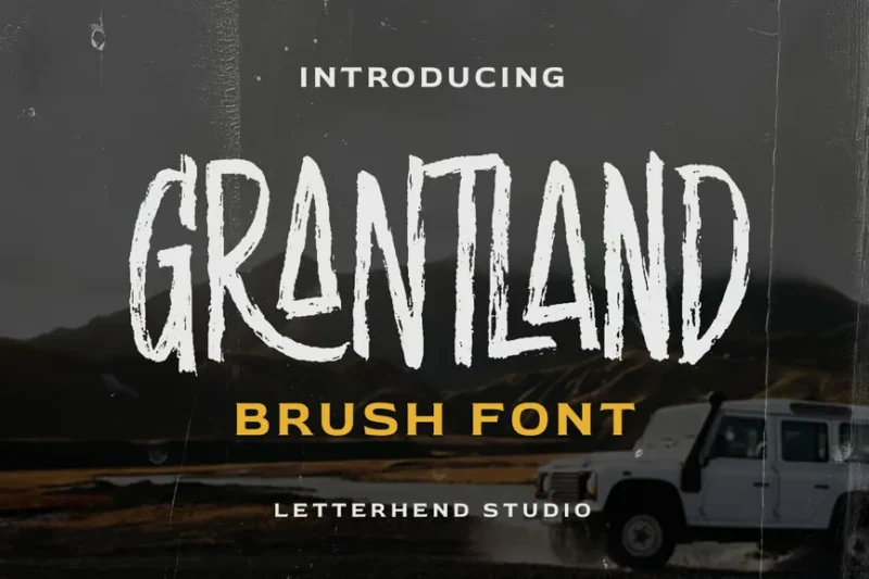
Grantland is a decorative brush font with a distinct display quality. Its bold strokes and tall character shapes make it perfect for creating eye-catching headlines or designs that require a strong, artistic presence.
Mockate Brushes Handmade Font
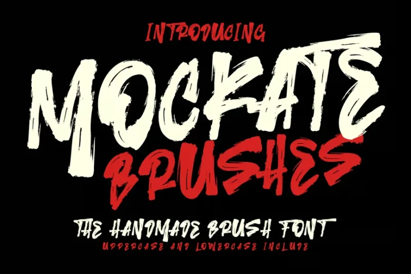
Mockate is a handmade brush font with a grungy, contemporary edge. Its expressive strokes and irregular forms give it a fresh, urban feel, making it ideal for creating designs with a modern, street-inspired aesthetic.
Fellocity
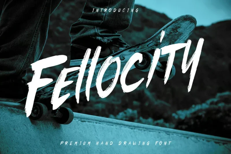
Fellocity is an urban brush font that combines script and decorative styles with a millennial twist. Its dynamic strokes and modern grunge aesthetic make it perfect for creating designs that appeal to a young, trendy audience.
Grunge Font – Freestyle Display Font
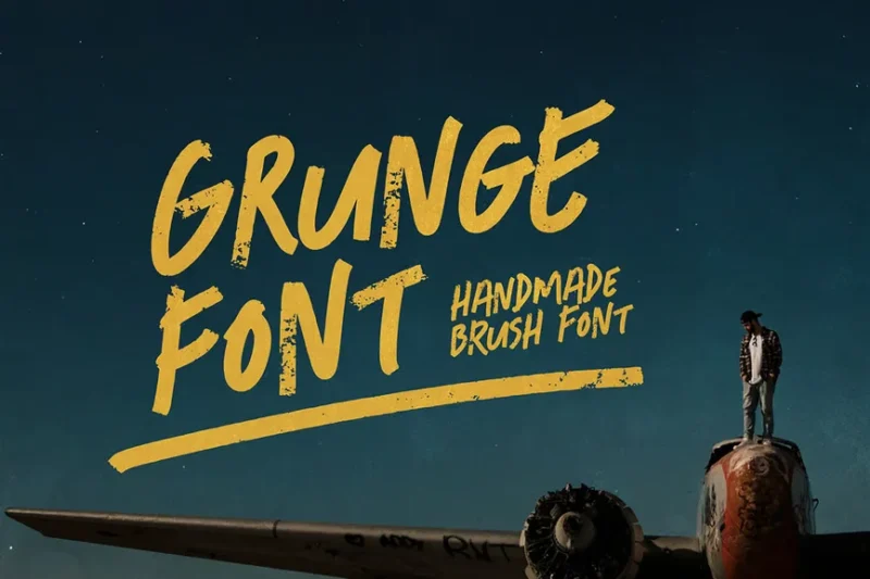
This versatile grunge font combines sans-serif, script, and handwritten styles for a truly unique brush typeface. Its freestyle nature and worn texture make it ideal for creating edgy, urban-inspired designs.
Dustiny
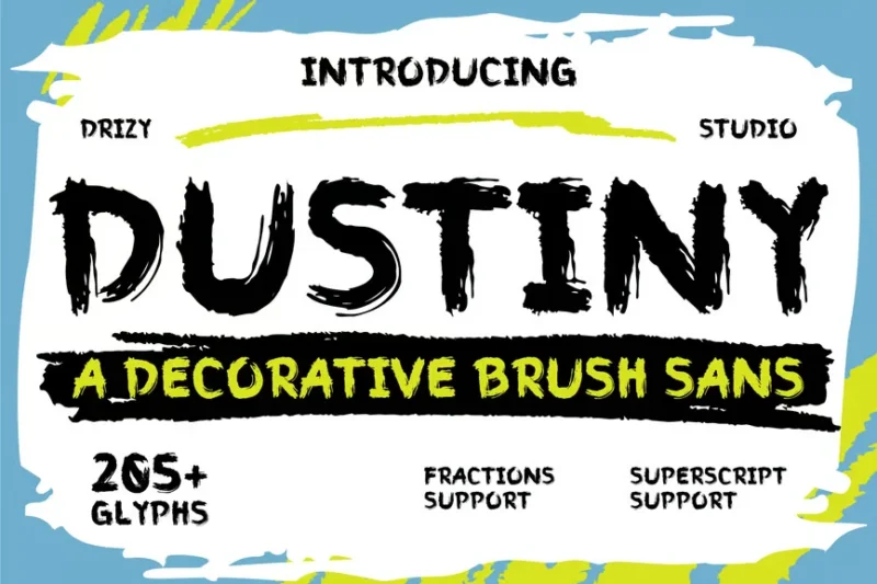
Dustiny is a decorative brush sans-serif font with a rustic, weathered appearance. Its rough edges and uneven strokes give it a handcrafted feel, perfect for designs that require a touch of vintage charm.
Splattica
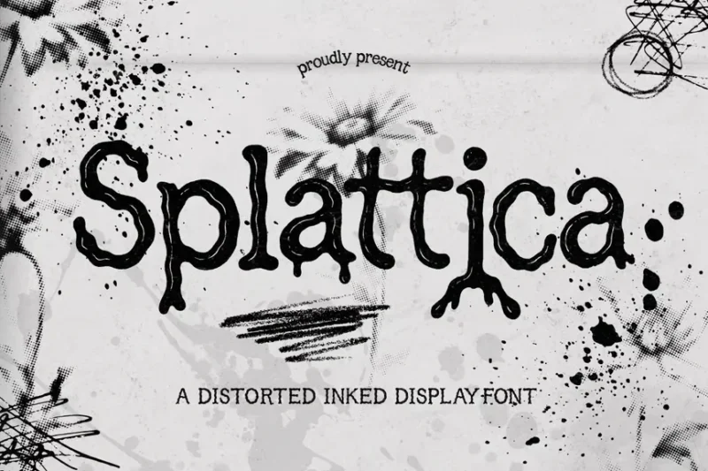
Splattica is a distorted, hand-inked display font that pushes the boundaries of legibility. Its splattery, ink-like texture and dripping letterforms create a chaotic yet captivating visual impact, ideal for bold headlines and artistic projects.
FCK Trasher
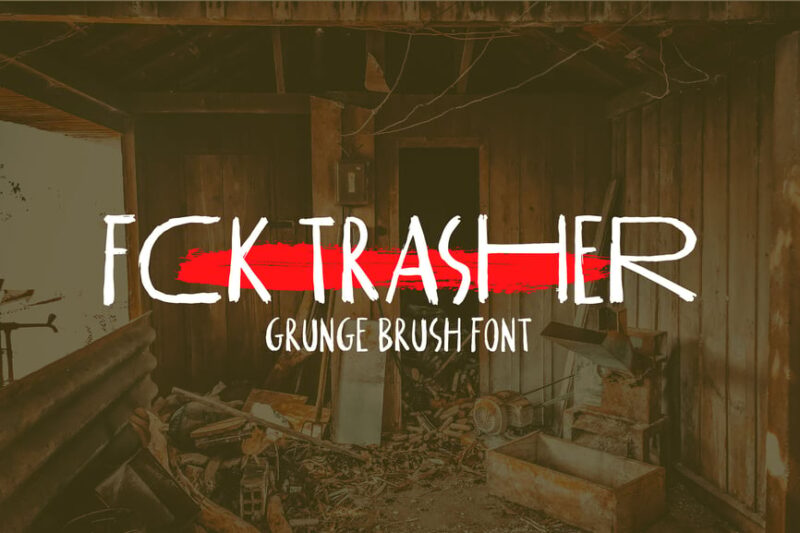
FCK Trasher is a bold, grungy sans-serif font with a rebellious edge. Its distressed appearance and irregular letterforms make it perfect for creating eye-catching designs with a punk or alternative vibe.
Mother Bones
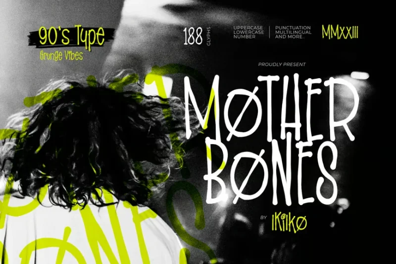
Mother Bones captures the essence of 90s grunge typography with its rough, handwritten style. This font’s nostalgic vibe and irregular forms make it perfect for creating authentic retro designs or adding a touch of alternative flair to modern projects.
Garth
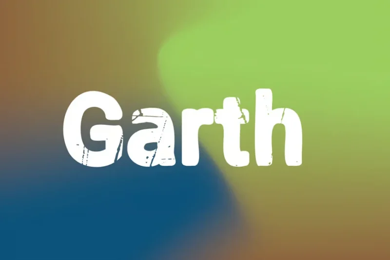
Garth is a grungy sans-serif font with a strong poster-like presence. Its bold, distressed characters make it an excellent choice for creating impactful headlines or designs that require a raw, urban aesthetic.
Grunge Fonts Trashed
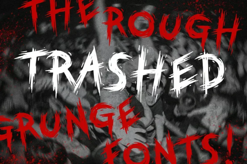
This script-style grunge font embodies a thrilling, edgy punk font vibe with its trashed appearance. The irregular, hand-drawn quality of the letters makes it perfect for creating designs with a sense of urgency or rebellion.
Nether Grunge Display Font
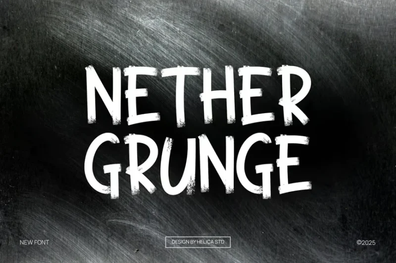
Nether is a grunge display font that combines script and handwritten styles with a distressed finish. Its unique character shapes and worn texture make it ideal for creating eye-catching headlines or logos with an underground feel.
Brain volt
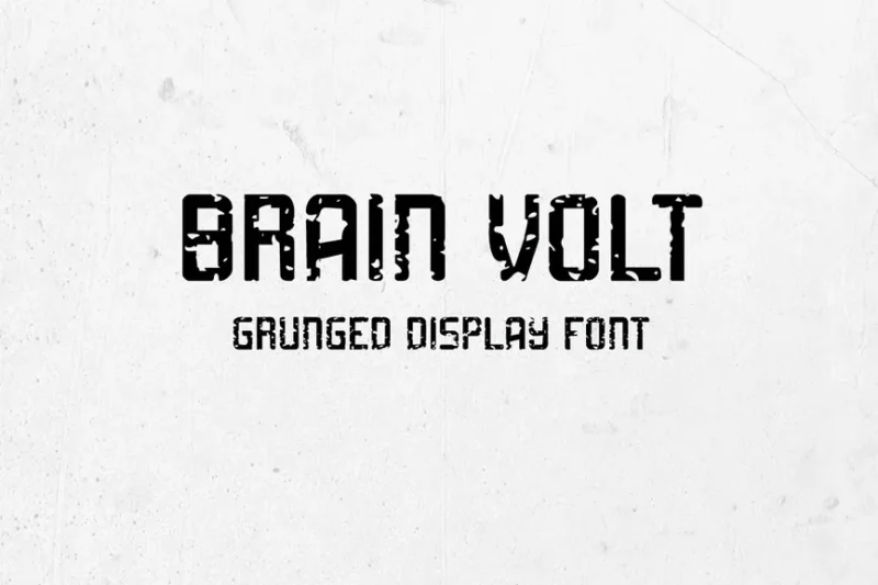
Brain volt is a grunged display font with an abstract, electrifying appearance. Its distressed letterforms and erratic lines create a sense of energy and movement, perfect for designs that need to convey a dynamic, cutting-edge vibe.
Grouns
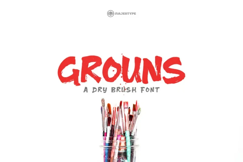
Grouns is a script and handwritten font that showcases a beautiful blend of brush strokes and artistic flair. Its flowing lines and organic shapes make it an excellent choice for creating designs with a personal, hand-crafted touch.
Rocky Grounge
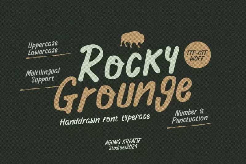
Rocky Grounge is a hand-drawn typeface that embodies a rugged, grungy aesthetic. Its rough brush strokes and irregular forms give it a raw, authentic feel, perfect for designs that require a bold, unconventional approach.
T-grungz Font
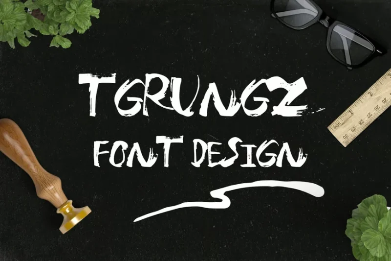
T-grungz is a cool, brush-style script font with a grungy twist. Its casual, handwritten appearance combined with distressed details makes it ideal for creating designs with a laid-back yet edgy vibe.
Grunge
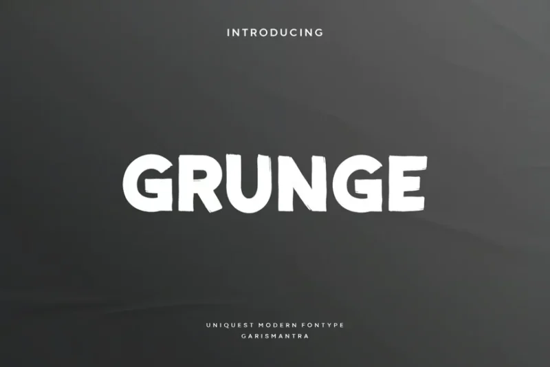
This bold, decorative grunge font is perfect for making a statement. Its distressed appearance and strong character forms make it ideal for creating eye-catching designs, particularly for birthday-themed or celebratory projects.
GrittyPress
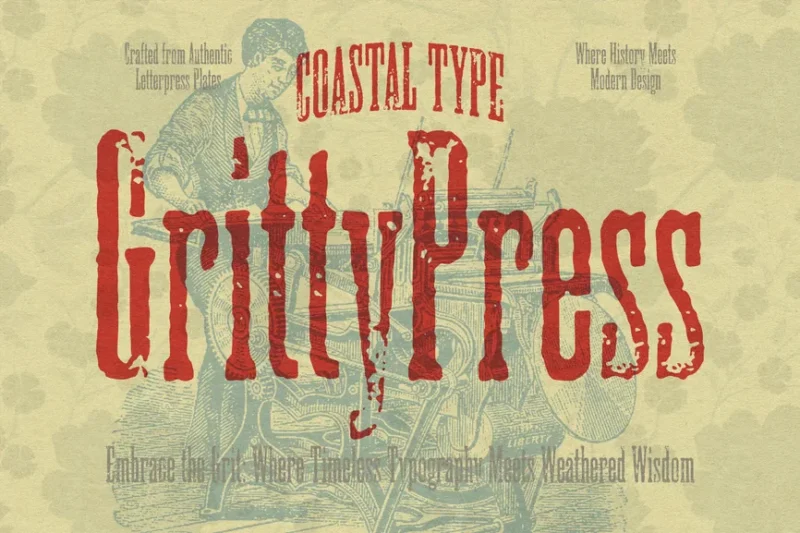
GrittyPress is a serif font that combines a letterpress-inspired look with a grungy texture. Its vintage appeal and worn details make it perfect for creating designs with a timeless, authentic feel.
TwissGrunge Rough Grunge Font
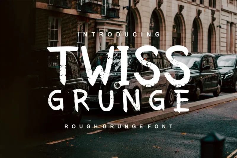
TwissGrunge is a rough, handwritten grunge font that exudes character and texture. Its irregular forms and distressed finish make it ideal for creating designs with a raw, unpolished aesthetic.
Dirtbag
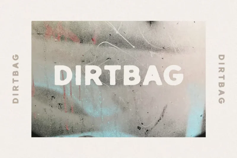
Dirtbag is a versatile grunge font that combines sans-serif, script, and decorative styles. Its rough, worn appearance makes it perfect for creating designs with a rebellious edge, particularly suited for band-related projects.
What Makes Grunge Fonts So Irresistibly Raw?
The appeal of grunge fonts lies in their deliberate imperfection. Unlike the clean, geometric precision of modern sans-serifs or the elegant curves of traditional scripts, grunge fonts celebrate the beauty of decay, wear, and authentic human touch.
Distressed Textures The hallmark of any great grunge font is its weathered appearance. These typefaces feature rough edges, scratches, smudges, and worn-away sections that make text look like it’s been through battles. The distressing isn’t random – it’s carefully crafted to maintain readability while conveying that coveted “lived-in” aesthetic.
Irregular Baselines and Spacing Unlike their pristine counterparts, grunge fonts often feature inconsistent letter spacing and wobbly baselines. This irregularity mimics the natural imperfections of hand-lettering or aged signage, creating an organic, humanized feel that resonates with viewers on an emotional level.
Bold, Unapologetic Presence Most grunge fonts are designed to make a statement. They’re typically bold, high-contrast, and impossible to ignore. This commanding presence makes them perfect for headlines, logos, and any application where you need to grab attention and hold it.
Authentic Imperfection In our increasingly digital world, grunge fonts offer something precious: authenticity. They remind us of analog processes, human craftsmanship, and the beautiful imperfections that make something truly unique. This authenticity is what makes grunge fonts so emotionally compelling.
Where Grunge Fonts Absolutely Dominate
Understanding where and when to deploy grunge fonts is crucial for maximizing their impact. Here are the spaces where these rebellious typefaces truly shine:
Music Industry Branding This one’s a no-brainer. From album covers to band logos, merchandise to concert posters, grunge fonts are practically synonymous with music marketing. They instantly communicate rebellion, authenticity, and raw creative energy – perfect for rock, metal, punk, and alternative genres.
Streetwear and Fashion The fashion world has embraced grunge aesthetics with open arms. Clothing brands targeting younger demographics use grunge fonts to convey edginess, urban culture, and counter-culture appeal. Think vintage band tees, skateboard brands, and underground fashion labels.
Gaming and Entertainment Video games, especially those with post-apocalyptic, horror, or action themes, frequently employ grunge fonts in their branding and UI design. The weathered aesthetic perfectly complements gritty storylines and intense gaming experiences.
Restaurant and Bar Branding Craft breweries, dive bars, BBQ joints, and restaurants with rustic or industrial themes often leverage grunge fonts to create authentic, approachable branding that feels genuine rather than corporate.
Event Promotion Music festivals, art shows, underground events, and alternative gatherings use grunge typography to attract their target audience and communicate the authentic, non-mainstream nature of their events.
Vintage and Retro Designs When designing anything that needs to feel aged, weathered, or vintage, grunge fonts are invaluable tools for creating convincing period aesthetics without looking artificially distressed.
When to Pump the Brakes on Grunge
While grunge fonts are incredibly versatile, there are definitely contexts where their rebellious nature works against your goals:
Corporate and Professional Settings Law firms, financial institutions, healthcare providers, and other industries that require trust and professionalism should generally avoid grunge fonts. The distressed aesthetic can undermine credibility and make organizations appear unprofessional or unreliable.
Luxury Branding High-end fashion, jewelry, luxury cars, and premium services typically require elegant, refined typography. Grunge fonts can cheapen the perceived value of luxury products and confuse brand positioning.
Small Text Applications The distressed details that make grunge fonts so appealing at large sizes become illegible muddy messes when scaled down. Always test readability at your intended size before committing to a grunge font.
Accessibility Concerns Users with visual impairments may struggle with the irregular letterforms and distressed textures of grunge fonts. Consider your audience’s accessibility needs before choosing highly stylized typography.
Mastering the Art of Grunge Font Selection
Choosing the perfect grunge font requires balancing several key factors:
Match the Mood Are you going for apocalyptic and harsh? Vintage and nostalgic? Urban and street-smart? Different grunge fonts convey different emotional tones. A heavily distressed, sharp-edged font feels more aggressive than a gently weathered vintage-style typeface.
Consider Your Audience Younger demographics typically embrace grunge aesthetics more readily than older, conservative audiences. Factor in your target market’s style preferences and cultural associations with grunge imagery.
Evaluate Legibility Never sacrifice readability for style. The best grunge fonts maintain excellent legibility despite their distressed appearance. Test your chosen font at various sizes and in different contexts to ensure it communicates effectively.
Think About Brand Consistency If you’re incorporating grunge fonts into an existing brand, ensure they complement rather than clash with your established visual identity. Sometimes a subtle nod to grunge aesthetics works better than a complete stylistic overhaul.
Pairing Grunge Fonts Like a Pro
The secret to successful grunge font implementation often lies in smart pairing strategies:
Balance Distressed with Clean Pair your grunge headline font with a clean, readable sans-serif for body text. This creates visual hierarchy while maintaining functionality.
Layer Textures Thoughtfully When combining grunge fonts with textured backgrounds or distressed graphics, be careful not to create visual chaos. Sometimes less distressed elements work better together.
Consider Color Carefully Grunge fonts often work best in high-contrast color schemes. Black on white, white on dark backgrounds, or bold colors that pop against neutral backgrounds tend to maximize impact.
The Psychology Behind Grunge Font Appeal
Understanding why grunge fonts resonate so deeply with audiences can help you deploy them more effectively:
Authenticity in a Digital World In our perfectly filtered, digitally polished society, grunge fonts represent something genuine and unprocessed. They tap into our longing for authentic experiences and real human connection.
Rebellion and Individuality Grunge fonts allow brands and individuals to express non-conformity and independent thinking. They’re visual shorthand for “we don’t follow the rules” – a powerful message in the right context.
Nostalgia and Cultural Memory For many audiences, grunge aesthetics trigger nostalgic memories of the 90s alternative culture, creating emotional connections that go beyond mere visual appeal.
Expert Tips for Grunge Font Success
After years of working with distressed typography, here are my top recommendations:
Start Subtle If you’re new to grunge fonts, begin with more subtly distressed options before moving to heavily weathered designs. This helps you develop an eye for what works in different contexts.
Focus on Contrast Grunge fonts perform best when there’s strong contrast between the font and its background. Don’t let your carefully chosen typography get lost in busy or similarly textured backgrounds.
Test Across Media What looks amazing on screen might not translate well to print, and vice versa. Always test your grunge font choices across all intended applications.
Know When to Stop It’s easy to get carried away with grunge aesthetics. Remember that effective design often requires restraint – let your grunge font be the star without overwhelming the entire composition.
Common Grunge Font Mistakes to Avoid
Even experienced designers can stumble when working with grunge typography. Here are the pitfalls to watch out for:
Overdoing the Distress More weathering doesn’t always mean better results. Sometimes a subtle grunge effect creates more sophisticated, versatile designs than heavily distressed alternatives.
Ignoring Hierarchy Grunge fonts can be so visually compelling that designers forget to establish clear information hierarchy. Ensure your most important message remains the most prominent.
Mismatched Aesthetics Pairing grunge fonts with pristine, minimalist design elements can create jarring visual disconnects. Strive for cohesive aesthetic storytelling throughout your design.
Sacrificing Function for Form Never let style completely override functionality. If your audience can’t read your message, your design has failed regardless of how cool it looks.
The Future of Grunge Typography
As we move further into 2026, grunge fonts continue evolving while maintaining their core appeal. We’re seeing interesting hybrid approaches that blend grunge aesthetics with modern functionality, creating typefaces that feel both contemporary and authentically weathered.
Digital tools are also enabling more sophisticated distressing effects, allowing designers to create custom grunge treatments that feel unique rather than relying on preset distressed fonts. This trend toward customization ensures that grunge aesthetics remain fresh and relevant.
The key to success with grunge fonts lies in understanding their emotional impact and deploying them strategically. When used thoughtfully, these rebellious typefaces can transform ordinary designs into memorable brand experiences that resonate deeply with your target audience.
So whether you’re designing for the next underground music festival or adding some authentic grit to a craft brand, remember that the best grunge fonts don’t just look weathered – they tell stories of rebellion, authenticity, and uncompromising creative vision. Choose wisely, design boldly, and let your typography rebel with purpose.
What’s your favorite grunge font for capturing that perfect rebellious spirit? Share your top picks in the comments below!