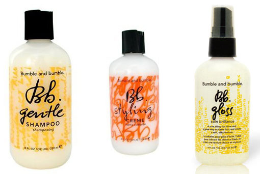
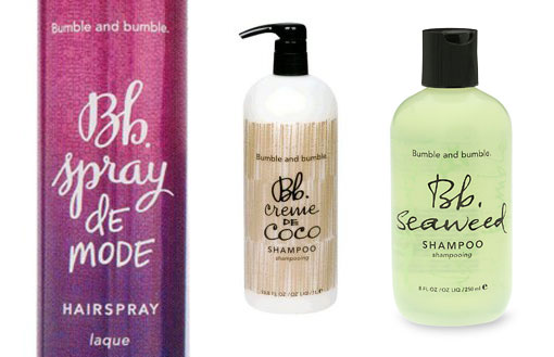
I love the typography-driven packaging for Bumble and Bumble hair products. I’m especially drawn to the scripts used for the Bb logo and product title. I had initially thought it was the same across the whole brand but when I researched this post I noticed the script is slightly different from product to product.
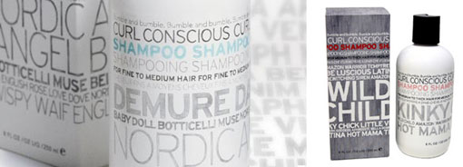
Their curl conscious packaging takes a different approach, but it’s also type-driven…
Find more packaging design goodness at The Dieline.

Get 300+ Fonts for FREE
Enter your email to download our 100% free "Font Lover's Bundle". For commercial & personal use. No royalties. No fees. No attribution. 100% free to use anywhere.


