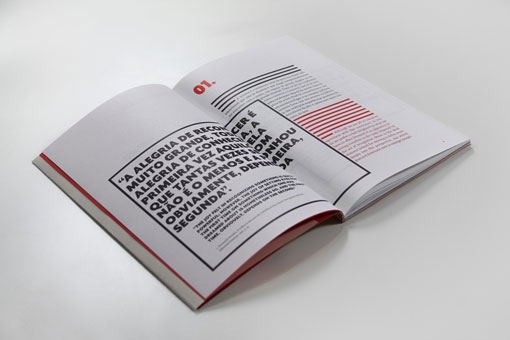
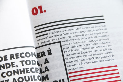
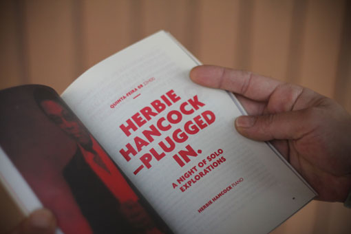
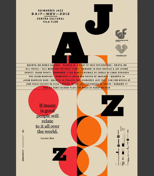
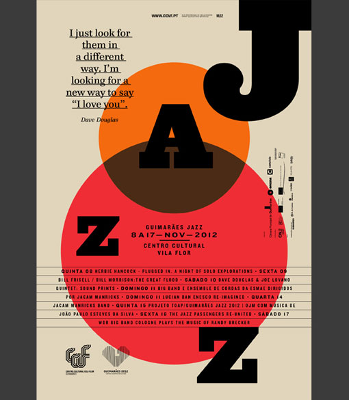
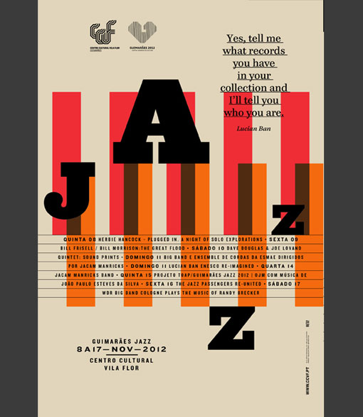
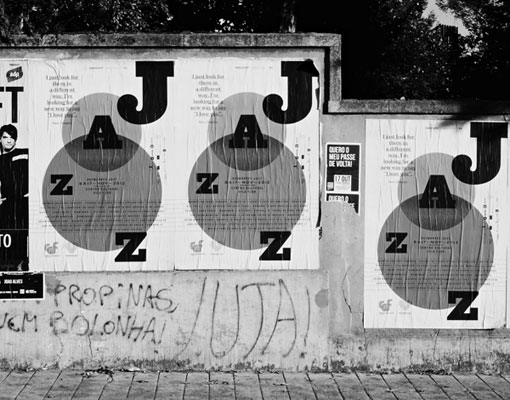
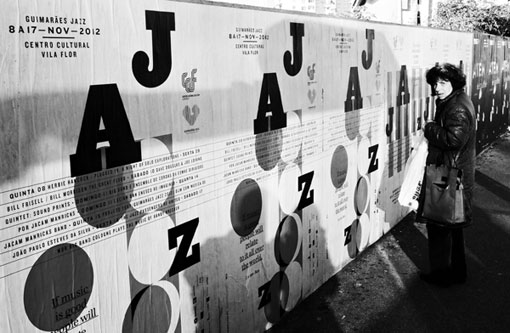
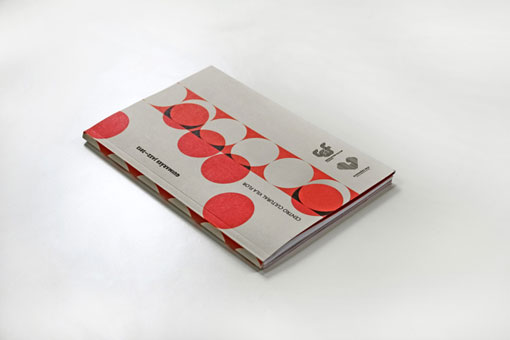
I’ve always enjoyed the designs Martino&Jaña have created for the Guimarães Jazz festival. (If you’ve missed their past work on DWL you can check them out here: 2009, 2010, 2011.) This year’s edition is no different. Here’s a bit about their approach to the 2012 posters and book:
We also tried to get the vintage look of the golden years of Jazz, with the intention of maintaining the warmth and personality that the years lend the communication.

Get 300+ Fonts for FREE
Enter your email to download our 100% free "Font Lover's Bundle". For commercial & personal use. No royalties. No fees. No attribution. 100% free to use anywhere.
