In this article:
- Best Condensed Fonts
- Understanding Condensed Fonts
- When to Use Condensed Fonts
- Trends in Condensed Typography
- Tips for Using Condensed Fonts Effectively
- Case Studies: Successful Use of Condensed Fonts in Branding and Design
- Tools and Resources for Working with Condensed Fonts
- Online Resources for Font Inspiration and Education
- Creating Custom Condensed Fonts
- Conclusion
- Common Condensed Font Questions
Choosing the best condensed fonts can transform your design projects by providing a sleek and modern look that maximizes space without sacrificing readability. These fonts are ideal for creating striking visuals where space is at a premium, such as posters, headlines, or digital interfaces. Condensed fonts make your message stand out while conserving precious space.
You will find a selection of condensed fonts ranging from minimalist sans-serif styles to bold, elegant serifs. Each type brings its own personality to a project and offers versatility for any design challenge. Exploring these font options allows you to find the perfect match for your needs, whether you’re aiming for a vintage feel or a more contemporary vibe.
But there’s more to these narrow fonts than modern uses fonts like Impact in online memes. The origins of condensed typefaces can be traced back to the late 19th century. Printing and advertising demanded typography that could convey messages in tight spaces without compromising clarity. Since then, these fonts have evolved to play a significant role in modern design, offering a wide range of styles from minimalist and sleek to bold and expressive.
Understanding when and how to use condensed fonts effectively can elevate your design work to a new level. The key is to know how different styles function in varying contexts and choose the right one for your project. Let’s explore these options and make your designs more compelling.
Key Takeaways
- Condensed fonts save space while maintaining readability.
- They range from modern sans-serif to traditional serif styles.
- Effective use of condensed fonts enhances design appeal.
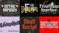
Best Condensed Fonts
Valinguan Condensed – Modern Condensed Sans Serif
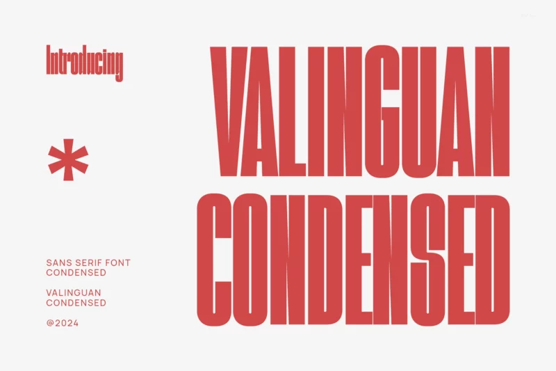
Valinguan Condensed offers a sleek, modern look with its narrow letterforms. Perfect for creating impactful logos, stylish magazine layouts, and eye-catching product packaging.
Harold Condensed Font
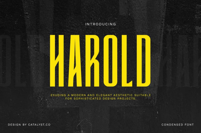
Harold Condensed brings a bold, compact presence to your designs. Ideal for headers, quotes, and striking logotypes that demand attention.

Get 300+ Fonts for FREE
Enter your email to download our 100% free "Font Lover's Bundle". For commercial & personal use. No royalties. No fees. No attribution. 100% free to use anywhere.
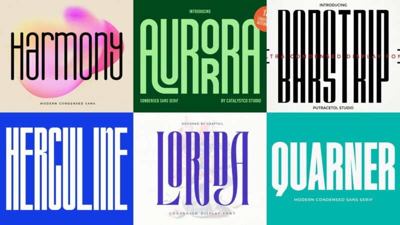
Lorida – Condensed Display
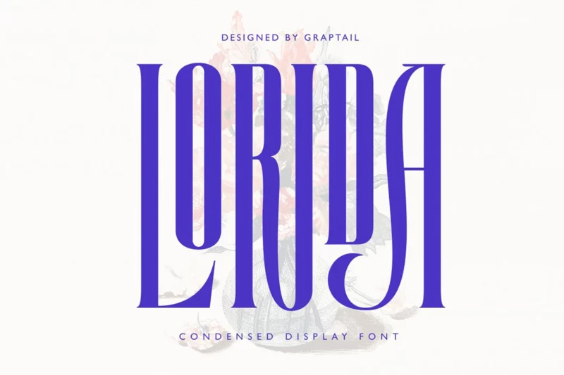
Lorida combines elegance with efficiency in its condensed display style. Perfect for creating sophisticated movie titles, posters, and branding materials.
Howard – Ultra Condensed
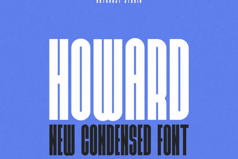
Howard pushes the limits of condensed design with its ultra-narrow profile. Great for creating striking vertical layouts and space-efficient designs.
Lordherline Condensed Sans
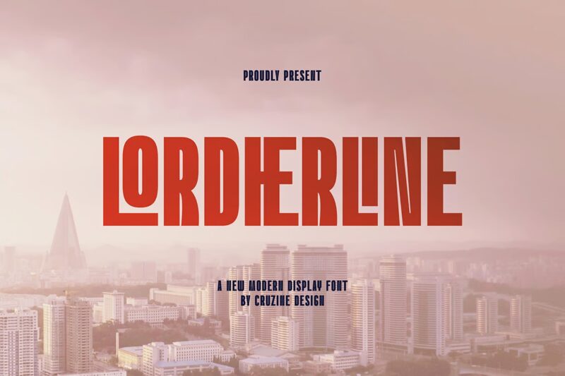
Lordherline offers a modern, clean aesthetic in a condensed package. Its sharp edges and balanced proportions make it perfect for contemporary branding projects.
BARSTRIP – Ultra Condensed
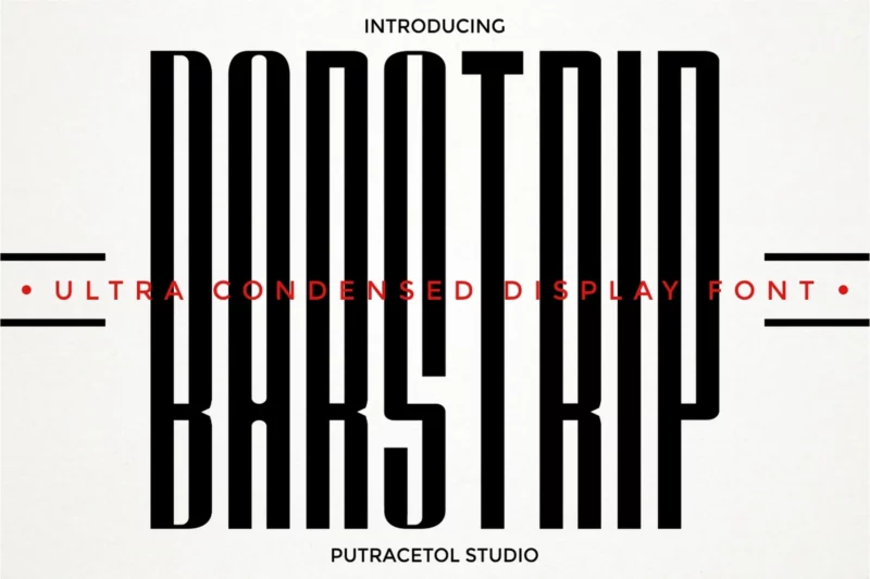
BARSTRIP takes inspiration from barcode symbols, offering a unique ultra-condensed look. Ideal for creating distinctive logos and edgy graphic designs.
Herculine – Condensed Font
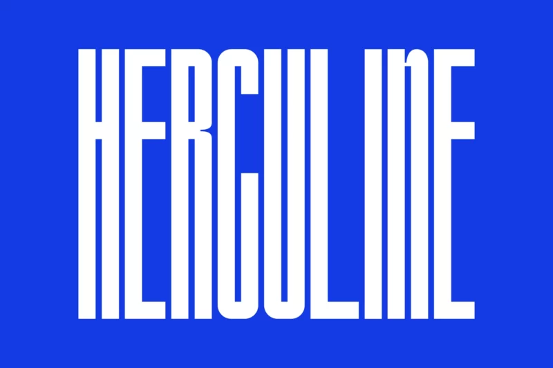
Herculine stands tall with its super-condensed, towering design. Perfect for creating impactful headlines and modern, sleek branding materials.
Albercio – Condensed Sans
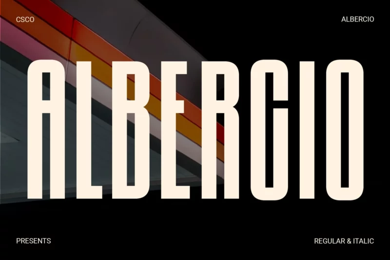
Albercio marries sleekness with impact in its condensed form. Its versatility shines in various design applications, from posters to headlines.
Homura – Condensed
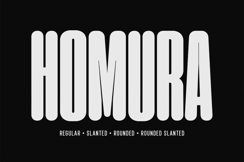
Homura draws inspiration from newspaper headlines, offering a bold and elegant condensed design. Excellent font for quotes.
Harmony – Modern Condensed Sans
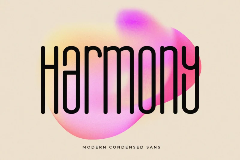
Harmony lives up to its name with a balanced, modern condensed design. Its clean lines make it suitable for a wide range of branding and design projects.
Galcia – Condensed Rounded Typeface
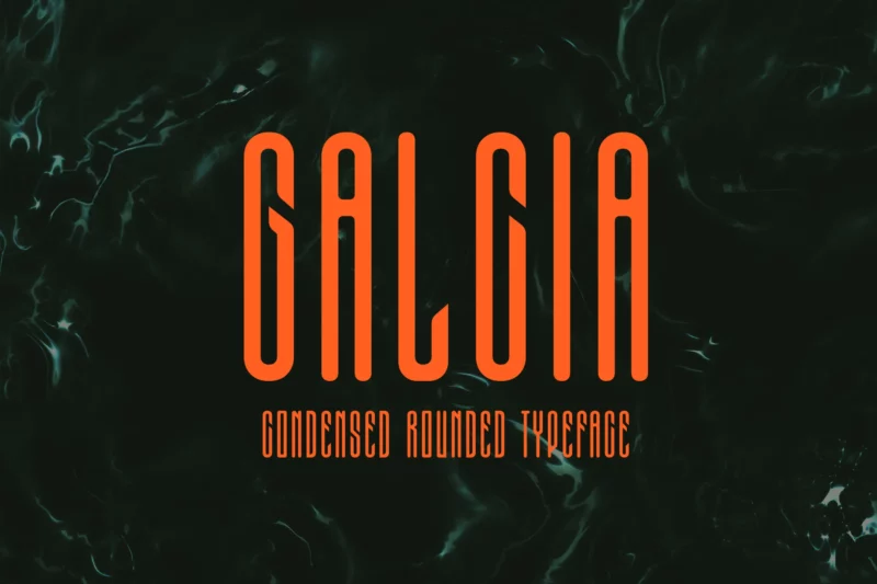
Galcia offers a unique blend of condensed design with rounded edges. Its friendly yet compact appearance is perfect for approachable branding and packaging designs.
Harliton – Condensed Font
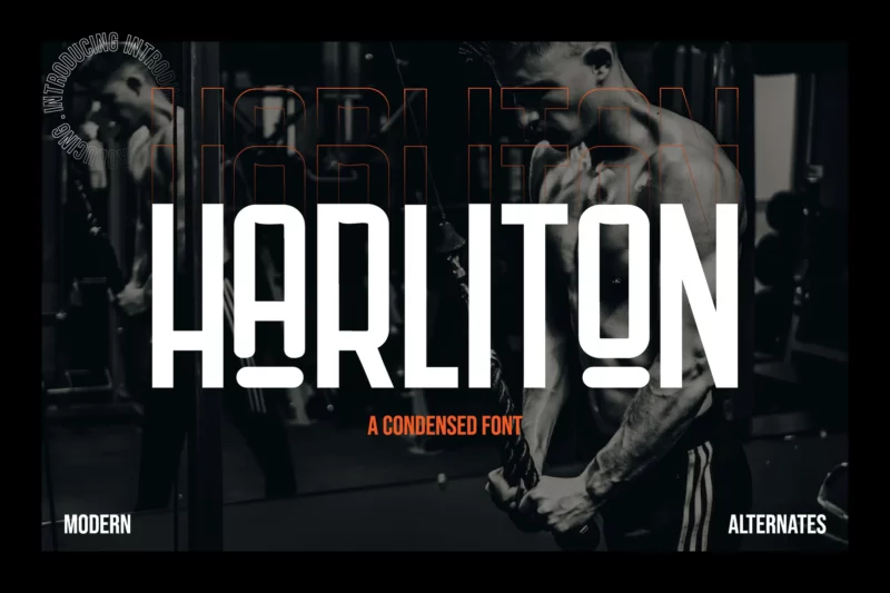
Harliton makes a bold statement with its condensed design. Perfect for creating memorable brands across various mediums, from merchandise to digital platforms.
Monetizer – Condensed Sans
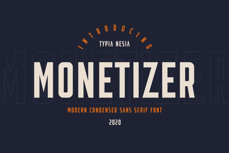
Monetizer brings a professional touch to condensed typography. Its clean lines and balanced proportions make it ideal for modern advertising and editorial designs.
Quarner – Modern Condensed Sans
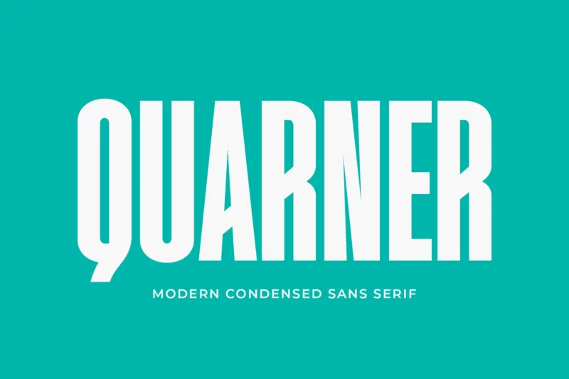
Quarner offers a sleek, contemporary take on condensed sans serif design. Its versatility shines in branding, editorial, and packaging applications.
Aurorra – Condensed Sans Serif
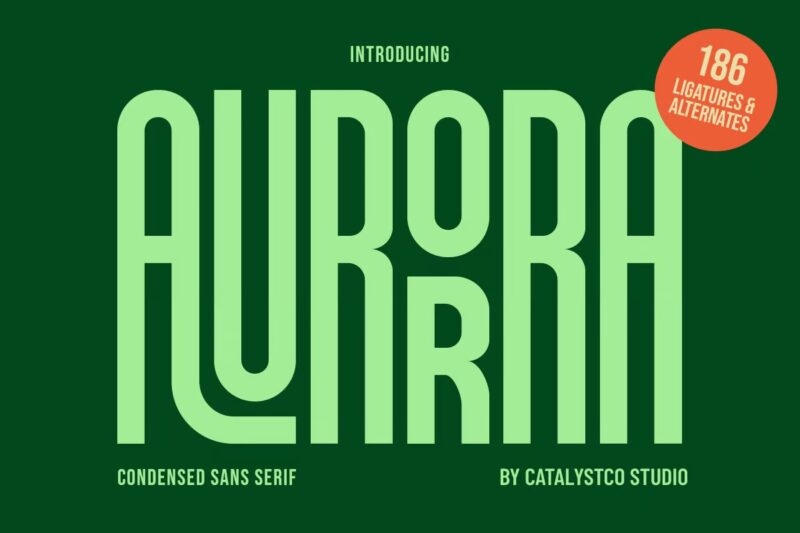
Aurorra brings a touch of elegance to condensed typography. Its refined letterforms are excellent for creating sophisticated logos and header text.
AKAGEEH | Retro Condensed Font
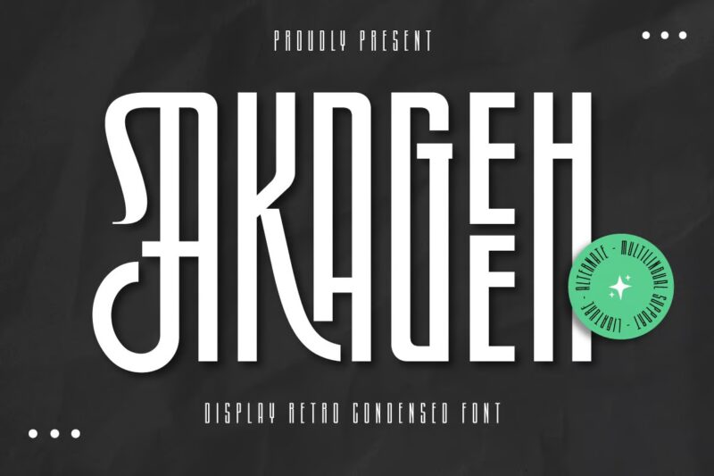
AKAGEEH blends retro charm with modern condensed design. Its unique character makes it perfect for creating standout vintage-inspired branding and graphics.
Neu Forma Grotesk
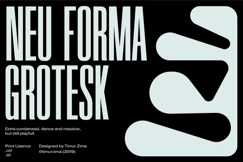
Neu Forma Grotesk offers an extra condensed grotesque style with a unique character. Its massive presence is perfect for attention-grabbing magazine spreads and posters.
Porlane – Font Family
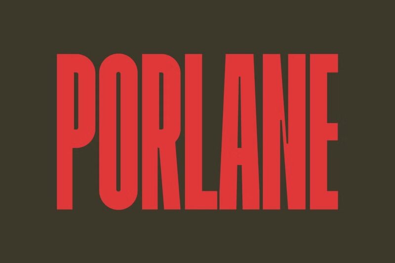
Porlane brings a contemporary twist to condensed sans-serif design. Its distinctive shapes and high legibility make it ideal for modern titling and display purposes.
Mouzambik – Condensed Font
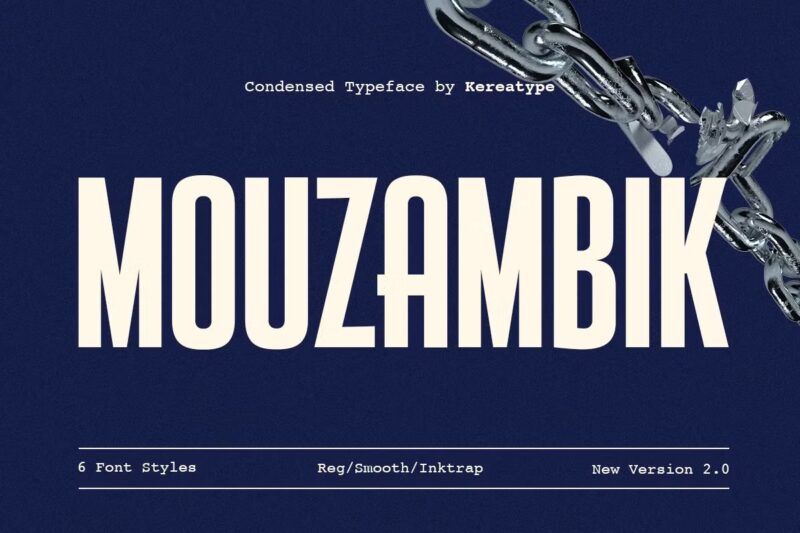
Mouzambik offers a bold and intricate personality in its condensed form. With multiple styles and extensive features, it’s perfect for creating standout designs across various media.
Mercantile Ultra Condensed
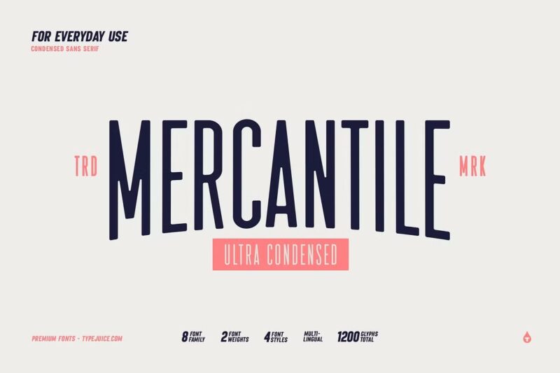
Mercantile pushes condensed design to its limits with its ultra-narrow profile. Available in various styles, it’s ideal for creating impactful vertical layouts and space-efficient designs.
Brandbe — Stylish Sans Serif
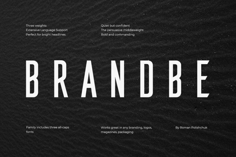
Brandbe offers a clean and compressed sans-serif design with sharp glyphs. Its versatility shines in branding, logos, and packaging across various industries.
Meuga | Condensed Sans Serif Font
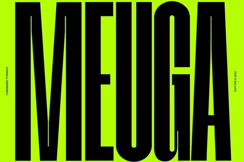
Meuga brings a sleek and modern touch to condensed typography. Its minimalist design is perfect for creating contemporary headlines and impactful digital advertisements.
Grandmaid Condensed Font
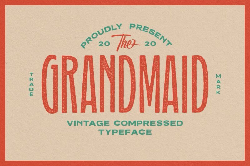
Grandmaid offers a highly compressed sans-serif design with a touch of vintage charm. Its versatility makes it suitable for classic branding, T-shirts, and logotypes.
Bebas Neue
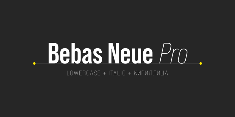
Bebas Neue is a classic condensed sans-serif that has stood the test of time. Its clean, bold appearance makes it a go-to choice for impactful headlines and modern designs.
Proelium
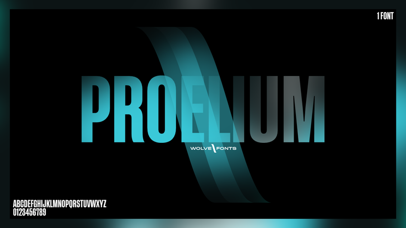
Proelium brings a strong, modern impression with its bold, condensed style. It’s ideal for creating powerful headers and main text in designs that demand attention.
Heading Now
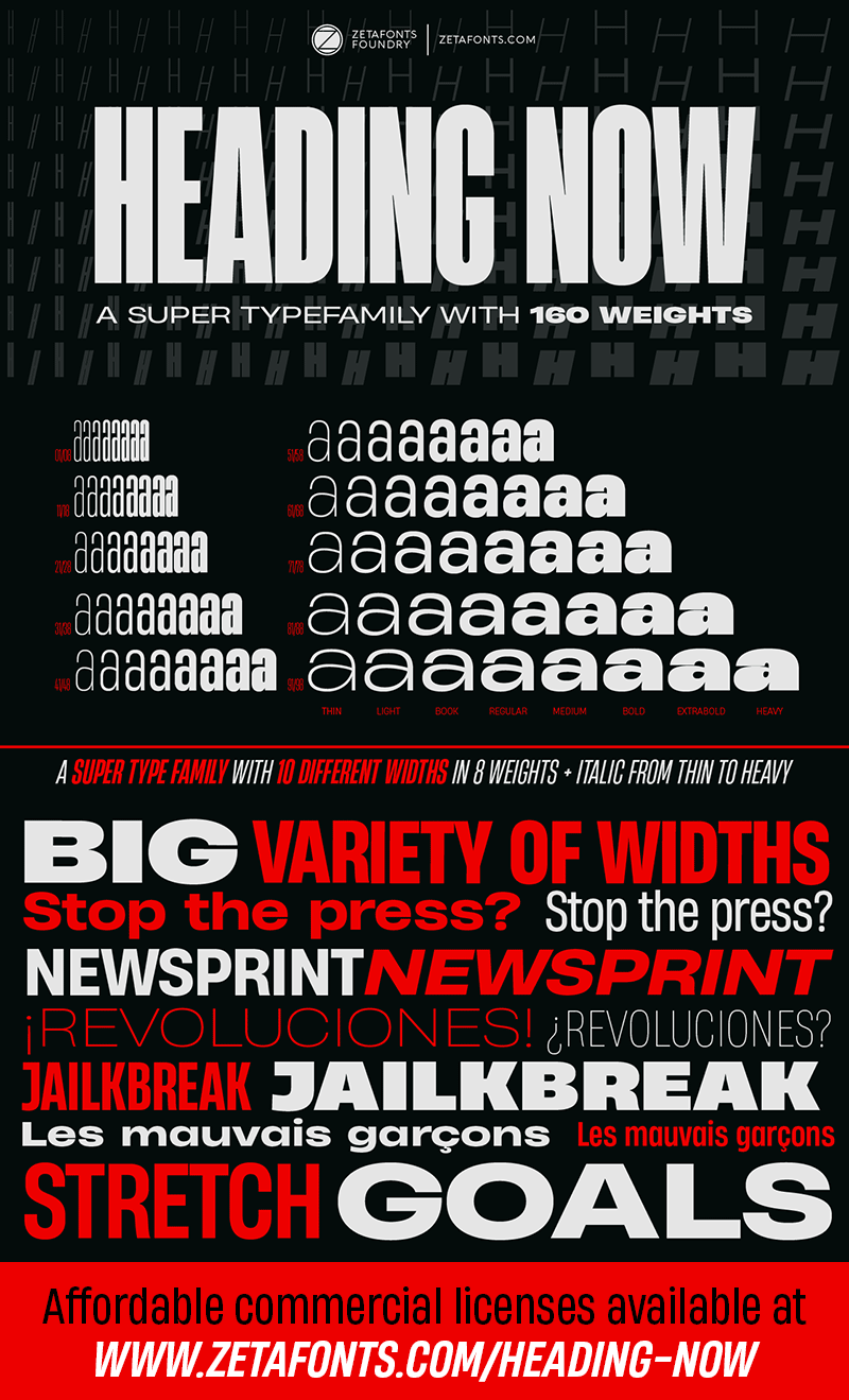
Heading Now offers a vast range of widths and weights in its sans-serif design. This versatile superfamily provides solutions for various typographic challenges.
Gobold
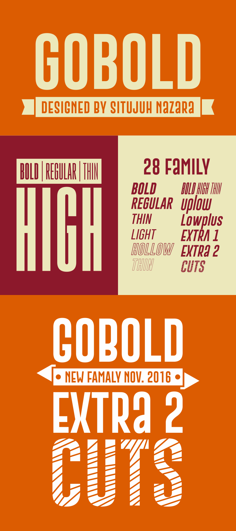
Gobold presents a stunning, elegant sans-serif design with multiple weights. Its bold appearance makes it perfect for creating eye-catching headlines and logos.
Kenyan Coffee
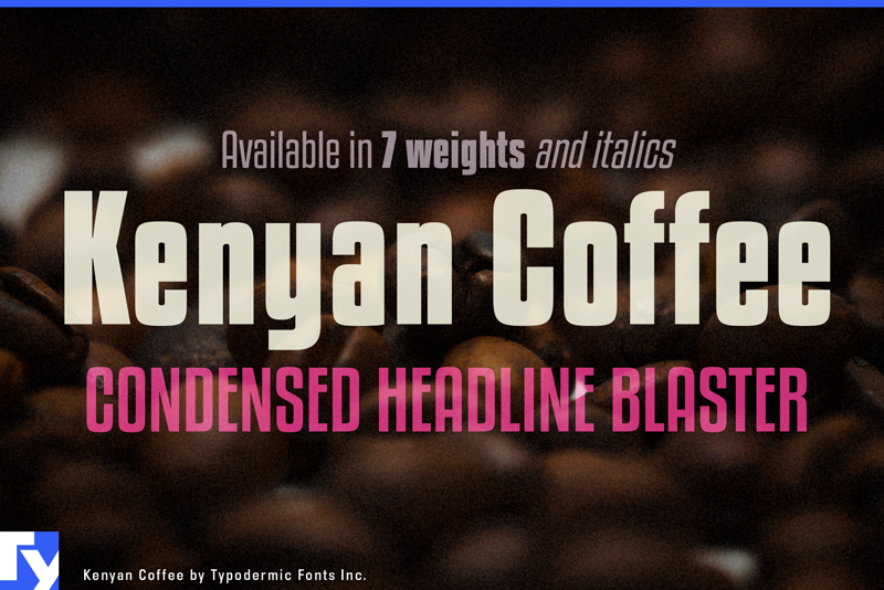
Kenyan Coffee offers a slim, blocky display typeface inspired by 1960s headliners. Available in multiple weights, it’s perfect for creating retro-inspired designs with a modern twist.
Barlow Condensed
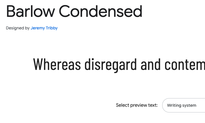
Barlow Condensed is a slightly rounded, low-contrast grotesk typeface. Its design, inspired by California’s visual style, makes it perfect for creating clear, impactful typography.
Saira Condensed
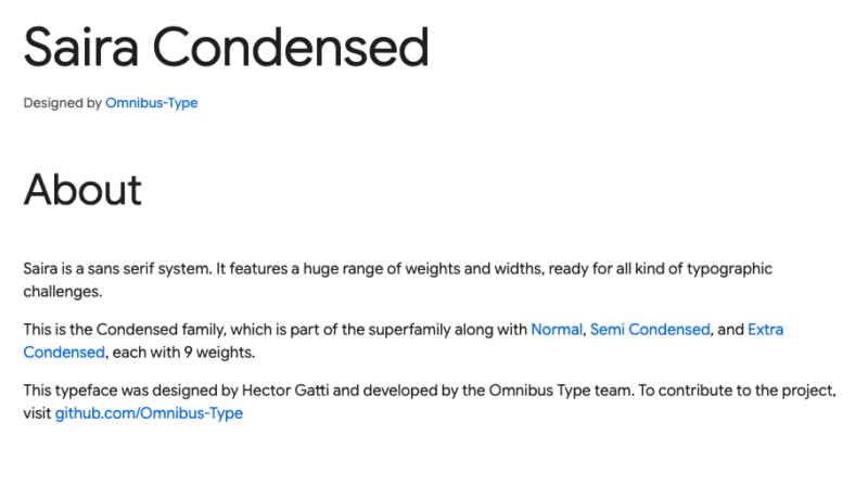
Saira Condensed is part of a comprehensive sans-serif system. With its wide range of weights, it’s ready to tackle various typographic challenges across different mediums.
Roboto Condensed
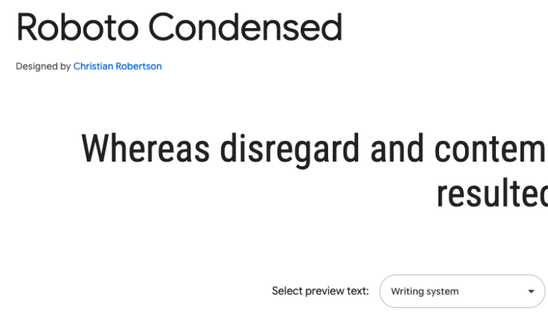
Roboto Condensed balances mechanical forms with friendly, open curves. Its natural width and reading rhythm make it versatile for both digital and print applications.
Fira Sans Condensed
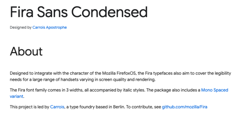
Fira Sans Condensed is designed for optimal legibility across various screen qualities. Its clean, modern appearance makes it suitable for both body text and display purposes.
Understanding Condensed Fonts
Condensed fonts are characterized by their reduced width, allowing more text to fit in tighter spaces. These fonts are often used in typography to create a visually appealing effect while maximizing space. This section explores key characteristics of condensed fonts, how they differ from narrow or compressed fonts, and the pros and cons of using them.
Characteristics of Condensed Fonts
Condensed fonts have narrower letterforms compared to regular fonts. This quality makes them efficient for designs where space conservation is crucial. They often maintain a balance between readability and style, making them suitable for various applications including headlines, posters, and advertisements.
Both sans serif and serif fonts can be condensed. Sans serif condensed fonts often provide a clean, modern look, while serif condensed fonts add a touch of elegance. They maintain distinct letter shapes despite their reduced width, ensuring the text remains legible.
Differences between Condensed, Narrow, and Compressed Fonts
While condensed, narrow, and compressed fonts may appear similar, they have distinct differences. Condensed fonts have a width but maintain the integrity of their letter shapes. Narrow fonts, in contrast, might be initially designed to be slim throughout their structure.
Compressed fonts are narrower than condensed fonts, often used when even more minimal width is desired. You will notice that condensed fonts and compressed fonts are used sparingly to preserve readability in intense design environments.
Advantages and Disadvantages of Using Condensed Fonts
The benefits of using condensed fonts include maximizing space and creating a unique visual style in your designs. They are particularly useful in layouts where space is limited, such as in packaging, advertising, and web design. Often, they can emphasize specific lines or elements in your design.
However, using condensed fonts can also pose challenges. Overuse may lead to readability issues, particularly in smaller sizes or dense blocks of text. It’s recommended to use these fonts sparingly and ensure contrast with other text elements.
When to Use Condensed Fonts
Condensed fonts are useful for making text stand out in space-constrained scenarios and can be integrated with different typefaces to achieve appealing visual hierarchies. Understanding their practical applications and industries that best employ these fonts is crucial for enhancing your design projects.
Ideal applications
Condensed fonts excel in creating impactful headlines and posters, where space is limited but you want to maintain readability and boldness. This font choice is perfect for grabbing attention, helping to ensure that key information is prominent and engaging.
Use them for logos, where compactness and clarity are essential to communicate brand identity effectively. Their narrow structure can also lend a dynamic appearance to modern and vintage designs.
In scenarios like magazine covers, condensed fonts allow you to include more text without overwhelming the layout. They maintain readability even in smaller sizes, making them a powerful choice for modern typography needs in websites and print media.
Industries and design fields that benefit from condensed fonts
The fashion industry often employs condensed fonts in branding, due to their sleek and modern appeal. Similarly, the advertising field benefits from these fonts as they enhance messages within limited space.
In film and entertainment, posters and promotional materials utilize condensed fonts to attract audience attention. Tech companies also favor these fonts for user interfaces and digital platforms, where maintaining usability and style is key.
By sparing space, while conveying strong messages, condensed fonts serve various industries effectively.
Combining condensed fonts with other typefaces
Pairing condensed fonts with complementary typefaces can create visual interest and improve readability. Use serif or script fonts as companions to provide contrast and flavor, adding elegance or informality depending on the project’s tone. For a refined look, match condensed sans-serif fonts with non-condensed serif typefaces, balancing modern and vintage styles.
When designing a hierarchy within a layout, utilize varying weights. Bold condensed fonts for headings can juxtapose nicely with lighter, more traditional body text. This creates layers of importance and guides the reader smoothly through the content.
Trends in Condensed Typography
Condensed fonts are shaping various aspects of design, from web to print, by offering sleek and space-efficient solutions. Designers are finding innovative ways to incorporate these fonts, influenced by current trends and emerging styles, while also anticipating shifts in their application.
Current design trends utilizing condensed fonts
In today’s digital landscape, condensed fonts are gaining popularity for their ability to create impact in limited space. They are prominently used in web design to improve readability and aesthetic appeal. Bold, condensed fonts are favored for headlines and display font design, ensuring that content captures user attention instantly.
In print designs, these fonts are perfect for situations where space is at a premium, such as in magazine layouts or product packaging. They bring a modern edge, while still maintaining clarity and legibility.
Emerging styles and variations
As font design continues to evolve, new variations of condensed fonts are emerging to address diverse design needs. Blending traditional typography with contemporary influences, designers are creating styles that range from sharply angular to softly curved, providing options tailored for both body text and headlines.
An interesting development is the rise of fonts that balance between condensed and ultra-condensed attributes, offering flexibility in various design contexts. There’s also a trend toward incorporating elements like variable widths in single typefaces to enhance versatility. These innovations allow greater adaptability across different platforms and media.
Predictions for future trends
You can expect condensed fonts to continue playing a significant role in digital media and branding strategies. The demand for typefaces that optimize content delivery in compact formats will grow with increasing focus on mobile and responsive design.
There’s a predicted shift toward using more personalized, custom-tailored fonts, allowing businesses to establish unique visual identities. As AI and machine learning influence design processes, the ability to generate adaptive fonts might open new avenues for creativity in typography.
Tips for Using Condensed Fonts Effectively
When utilizing condensed fonts, it’s essential to ensure their readability and pair them wisely with other typefaces. Different mediums require specific considerations to make the most of these fonts.
Maintaining Readability and Legibility
Readability should be your first concern when using condensed fonts. Fonts like Oswald and Roboto Condensed offer clarity when used correctly. Be mindful of the distance between characters (kerning) and lines (leading) to prevent clutter.
Short paragraphs with simple language enhance understanding. Choose larger font sizes for longer text to maintain the ease of reading. Test readability in various lighting conditions and on different screens or print materials.
Pairing Condensed Fonts with Other Typefaces
Combining condensed fonts with different typefaces can be powerful if done right. Calcio Ultra Condensed pairs well with more traditional serif fonts for an elegant look, creating contrast and visual interest.
Essenziale can make a striking header when paired with cleaner sans-serif fonts. Be consistent with your font choices in any design to maintain a cohesive style. Highlight headers or key sections using bold fonts for emphasis, ensuring they stand out visually.
Best Practices for Different Mediums
Different mediums demand tailored approaches for condensed fonts. In print design, fonts like Louvre should be tested for clarity, as ink absorption can affect crispness. Use thicker weights for headlines to ensure they are legible.
In digital formats, scaling properly is crucial. Check how the font renders across various devices and screen sizes. Use web fonts compatible with different browsers to ensure consistent appearance. Adjust settings like anti-aliasing to improve the digital legibility of condensed fonts.
Case Studies: Successful Use of Condensed Fonts in Branding and Design
Condensed fonts have been instrumental in creating impactful visual identities across various industries. These fonts contribute to branding by allowing for clarity and emphasis, particularly in logotypes and advertising designs.
Notable examples from various industries
In the luxury market, the use of Jorvik Informal, a condensed wobbly serif font, has been notable for its elegant style. This font is utilized in different logos, such as the logo for Clinique, a luxury cosmetics brand.
The fashion industry often employs condensed fonts in advertising designs to maintain a sleek and modern look. For example, brands use these fonts in promotional materials where space is limited, enabling a clean, structured presentation. Logotypes in fashion must convey unmistakable style, and the narrow structure of condensed fonts offers a bold yet elegant presence.
Analysis of why the chosen condensed fonts work well
The success of condensed fonts in branding lies in their ability to facilitate balance and clarity. Fonts like Radovan allow you to enhance visual hierarchy by using them strategically for titles and headers, ensuring essential elements stand out. Their narrow design accommodates more content within limited spaces, making them ideal for both print and digital advertising.
In logo design, condensed fonts create a streamlined and cohesive brand identity. They can reinforce a brand’s message by adding emphasis without causing visual clutter. The alignment and proportion achieved through condensed fonts help your branding materials connect more effectively with your target audience.
Tools and Resources for Working with Condensed Fonts
Exploring various tools and resources can greatly enhance your ability to effectively use condensed fonts. These include software for managing your font library, design tools that support these fonts, and online platforms offering inspiration and educational materials.
Font Management Software
Effective font management is crucial when working with condensed fonts in creative projects like posters and flyers. Software like Connect (formerly Suitcase Fusion) and FontBase can help organize and activate fonts efficiently. These tools allow you to sort fonts by categories and quickly find the right typeface for t-shirt designs or bold messages.
Connect is a robust option with cloud syncing capabilities, enabling you to access your font collection from any device. Alternatively, FontBase offers an intuitive interface and essential features for organizing and previewing condensed fonts without the additional cost.
Design Tools with Good Condensed Font Support
Several design tools offer excellent support for condensed fonts, crucial for projects requiring bold typography. Adobe Illustrator is a standout choice, with advanced text tools that allow for fine-tuning of typography. This can be particularly useful when designing posters or flyers.
Canva is another tool with extensive font features, including many modern, condensed options. Its user-friendly drag-and-drop interface makes it easy to incorporate these fonts into digital designs or printed materials like t-shirts.
Both tools provide extensive libraries of templates and elements, making design faster and more efficient.
Online Resources for Font Inspiration and Education
Online platforms are invaluable for finding inspiration and learning more about condensed fonts. Websites like Design Shack offer curated lists of recommended fonts, perfect for use in various creative projects. These resources showcase different applications and provide practical examples of use.
Platforms such as Skillshare and Udemy offer courses focused on typography, teaching you how to make the most out of condensed fonts in your designs. Additionally, forums and communities on sites like Behance provide a space for sharing projects and discussing font use, offering insight into effective applications.
Creating Custom Condensed Fonts
Designing your own condensed font involves understanding key principles, utilizing the right tools, and considering specific design needs. The information below will help you navigate these aspects effectively, ensuring your custom typeface is both functional and visually appealing.
Basic Principles of Condensed Font Design
Condensed fonts emphasize the efficient use of horizontal space while maintaining readability. When creating a condensed typeface, focus on proportions and balance. Each letter must feel visually cohesive in narrower widths, especially in all-caps letters.
Multilingual support is vital if you plan to expand your font’s usability. Consider various accents and diacritical marks. Explore different font weights to provide versatility for both print and digital media. Ensure readability across weights by adjusting stroke contrast delicately.
Tools for Creating and Modifying Fonts
A variety of tools are available for designing condensed typefaces. Programs like FontForge and Glyphs are popular for beginners and professionals. FontLab offers advanced features for intricate designs, while RoboFont is ideal for custom scripting.
Plugins and extensions can further enhance functionality for multilingual support and various font weights. These tools allow you to test and modify characters efficiently, refining all-caps designs and modern sans-serif aesthetics. Experiment with built-in libraries to ensure your font fits well across different platforms.
Considerations for Developing a Condensed Typeface
When developing a condensed typeface, audience and application are key considerations. Analyze where and how your font will be used. For instance, digital displays may require adjustments for screen readability.
All-caps letters and modern sans-serif styles demand precision to maintain consistency across text. Evaluate spacings around each character to avoid crowding and ensure legibility. Consider visual hierarchy when using different weights.
For extended functionality, incorporate elements that support versatility, like varied font weights, making your typeface suitable for diverse design needs. Proper consideration of these factors will enhance the effectiveness of the final font design.
Conclusion
Condensed fonts hold significant value in the realm of design. Their compact nature makes them perfect for ensuring that content fits even in limited spaces. This makes them especially useful for magazines and editorial designs, where space is often at a premium. You can achieve a clean and professional look without compromising readability.
Incorporating condensed typefaces into your designs can elevate the visual impact of labels and headlines. These fonts draw attention effectively, making them ideal for projects that require bold statements. A well-chosen condensed font can transform a simple label into a striking design element.
Using condensed fonts in website headers allows you to make the most of the available space without overwhelming your design. This aids in creating a modern and streamlined appearance, keeping the focus on the message you want to convey. It ensures that your titles and headers remain prominent and appealing.
Don’t hesitate to experiment with different condensed typefaces. You’ll discover a versatile range of styles that can suit various design needs. Whether you aim for a formal tone or a playful touch, there is likely a condensed font that fits the bill. Embrace the flexibility these fonts offer and let your creativity flow in diverse projects.
Common Condensed Font Questions
Understanding the best condensed fonts can enhance your design projects. This section addresses the availability of top condensed fonts across various platforms like Google Fonts, Canva, and Microsoft Word, and highlights bold options for eye-catching headlines.
What are some top condensed fonts available on Google Fonts?
When you explore Google Fonts, you’ll find several high-quality condensed options like Dorsa and Zen Loop. These fonts are designed to maintain readability while offering a sleek, narrow appearance, making them suitable for minimalist and professional design projects.
Can you suggest popular condensed fonts used in Canva for professional design?
Canva provides a range of condensed fonts that are popular among designers for their versatility and style. Fonts such as Bebas Neue and League Spartan are frequently used due to their clean lines and ability to make a strong visual impact. These fonts can be seamlessly integrated into various design templates on Canva.
What are some commonly used condensed fonts in Microsoft Word for narrow text styling?
In Microsoft Word, you can access various condensed fonts ideal for creating narrow text styling. Fonts like Arial Narrow and Condensed Sans are commonly used by professionals for reports, documents, and designs where space is limited but readability is crucial.
Which bold condensed fonts are preferred for impactful headlines?
For bold and eye-catching headlines, fonts like Bondie and Devant Pro are often recommended. These condensed fonts are designed to stand out and are ideal for use in posters, banners, and any design requiring a strong, bold statement.