In this article:
- My 19 favorite fonts for quotes right now
- Why Your Font Choice Matters
- Key Factors for Pairing Fonts with Quotes
- Recommended Categories for Quotes
- Carefully Select Fonts for Maximum Impact
Selecting the best font for quotes can elevate them from forgettable to impactful. A thoughtful font choice helps convey the precise tone and makes the words more memorable. But with endless font options to consider, where should you start?
This guide will explore the best fonts for quotes across multiple styles so you can find the perfect match. Follow our font recommendations and transform ordinary quotes into sharper, more resonant designs.
My 19 favorite fonts for quotes right now
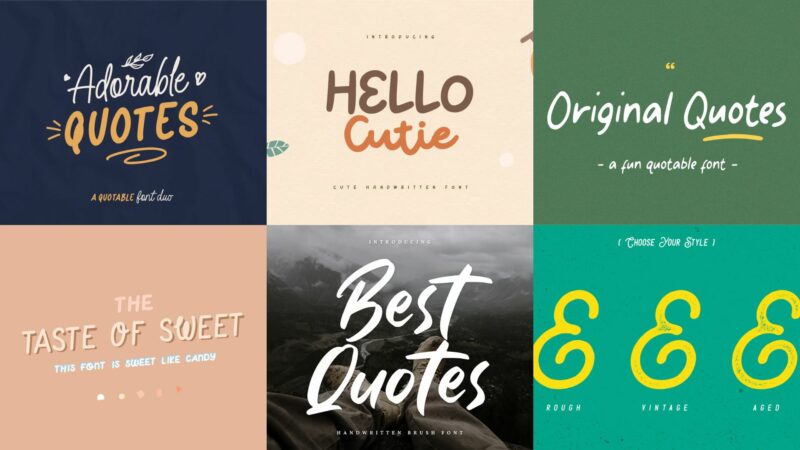
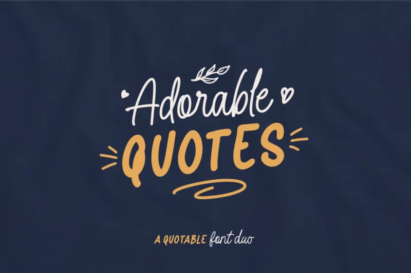
Adorable Quotes Font Duo
The Adorable Quotes Font Duo brings charm and versatility to your typography toolkit. This harmonious pairing includes a delightful script and its alternate version, perfect for creating eye-catching quotes, branding materials, and product packaging. With a wide range of glyphs, multilingual support, and OpenType features, this duo empowers designers to craft captivating visual experiences.
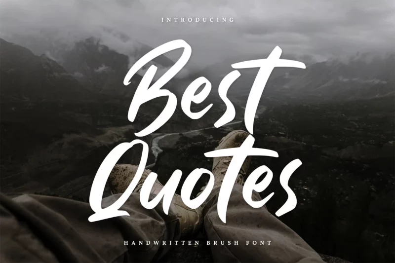
Best Quotes-Handwritten Font
Elevate your designs with the classy and unique Best Quotes handwritten font. Each letter boasts a distinctive touch, making it ideal for professional branding projects, logos, and, of course, quotes. With PUA encoding and multilingual support, this versatile font ensures your message stands out in any language.
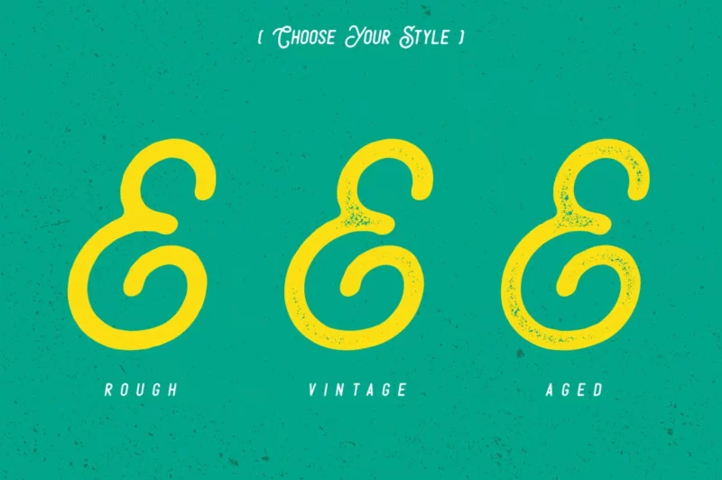
Sunday Quotes
Sunday Quotes offers a trio of vintage-inspired styles: Rough, Vintage, and Aged. This hand-drawn character set comes with OpenType features that make creating authentic vintage designs a breeze. Perfect for branding, logos, product packaging, invitations, and more, Sunday Quotes brings a touch of nostalgia to your projects.

Get 300+ Fonts for FREE
Enter your email to download our 100% free "Font Lover's Bundle". For commercial & personal use. No royalties. No fees. No attribution. 100% free to use anywhere.
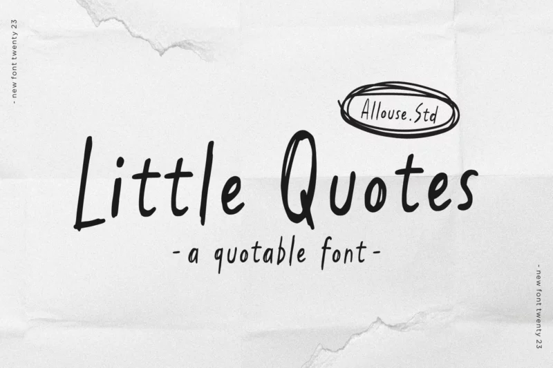
AL – Little Quotes
Add a dash of playful messiness to your designs with AL – Little Quotes. This font shines in product packaging, branding projects, magazines, social media content, and wedding materials. With multilingual support and web-ready formats, Little Quotes lets you express words with character across various platforms.
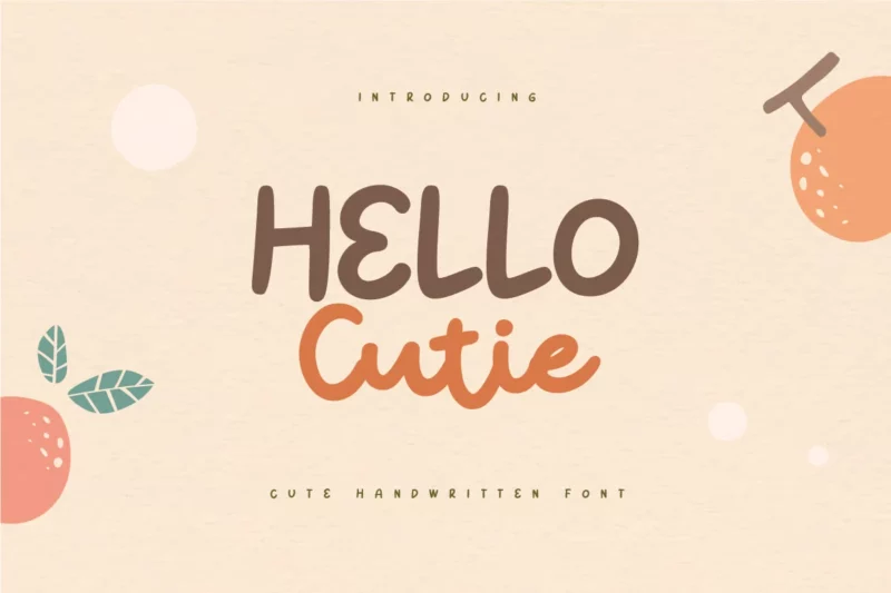
Hello Cutie – Cute Quotes Handwritten Font
Infuse your designs with cheerful charm using Hello Cutie. This adorable handwritten font is tailor-made for quote designs, cute logos, and any project that needs a touch of whimsy. From product designs to merchandise, Hello Cutie promises to bring a smile to your typography.
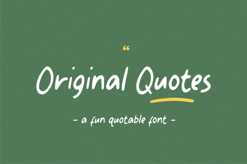
Original Quotes Script Font
Original Quotes Script Font combines fun and casualness in a playful package. This versatile font excels in handwritten notes, greeting cards, eye-catching quotes, and distinctive branding. With multilingual support and web-ready formats, Original Quotes Script Font ensures your message comes across with personality.
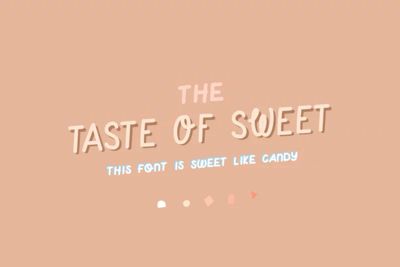
Taste of Sweet | a cute handwritten quote font
Sweeten your designs with Taste of Sweet, a playful handmade font that comes in regular and light versions. This charming typeface includes uppercase and lowercase options, numbers, and non-English support. With added ligatures for extra fun, Taste of Sweet is perfect for creating motivational quotes and adding a dash of cuteness to any project.
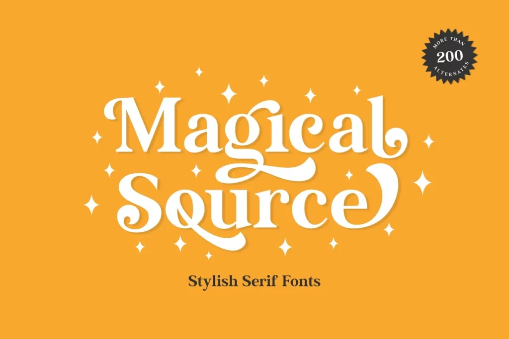
Magical Source: Whimsical Font
With 200+ alternate characters, Magical Source empowers you to create one-of-a-kind typography. This playful serif oozes versatility for headlines, branding, and more.
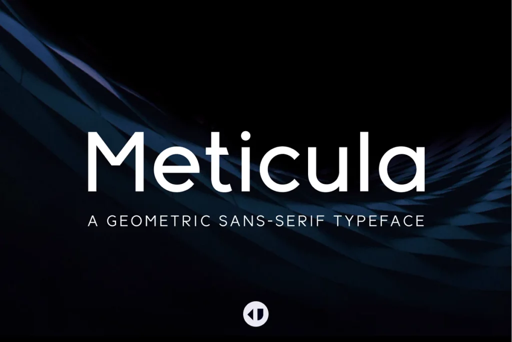
Meticula: Sans-serif Typeface
Meticula’s geometric sans-serif styles masterfully balance sleek minimalism with modern diversity across 18 fonts. An exquisite choice for diverse graphic and web design projects.
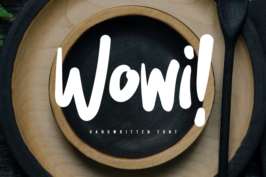
Wowi: Bold, Fun Typeface
Infuse authentic, handcrafted warmth into designs with Wowi. This inviting font creates the perfect signature touch for branding, invitations, packaging, and more. If you like Wowi, you’ll really enjoy our Fun Font Collection too.

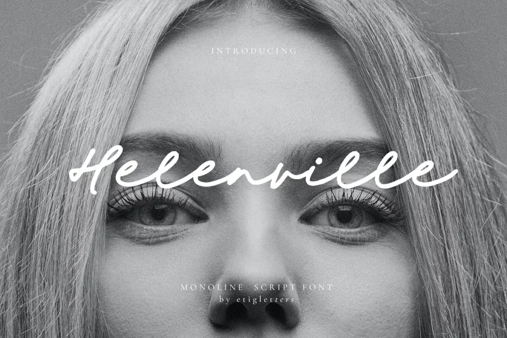
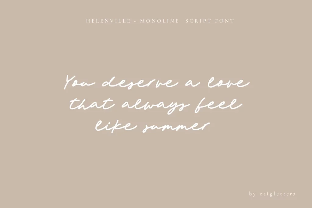
Helenville: Monoline Script
Modern yet extraordinarily charming, Helenville elevates signatures, lettering, and quotes with its stylish monoline elegance.
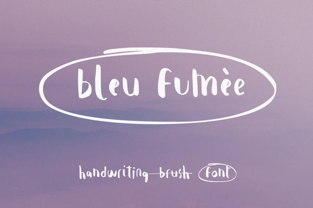
Bleu Fumee: Handwriting Font
Handwritten with extraordinary European charm, Bleu Fumée infuses social media, invitations, and lettering with artistic flair.
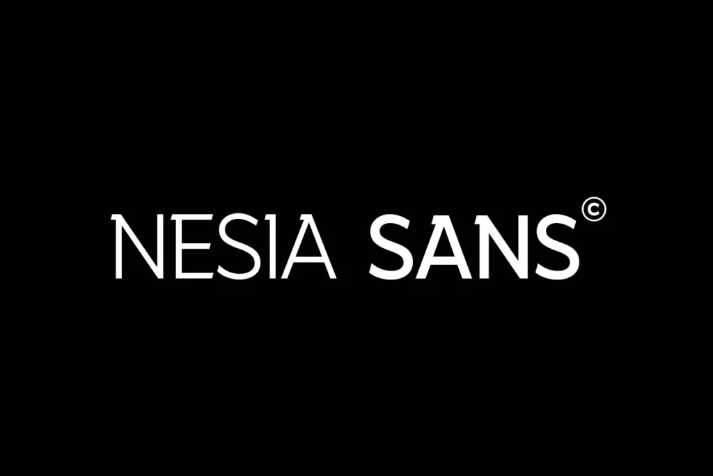
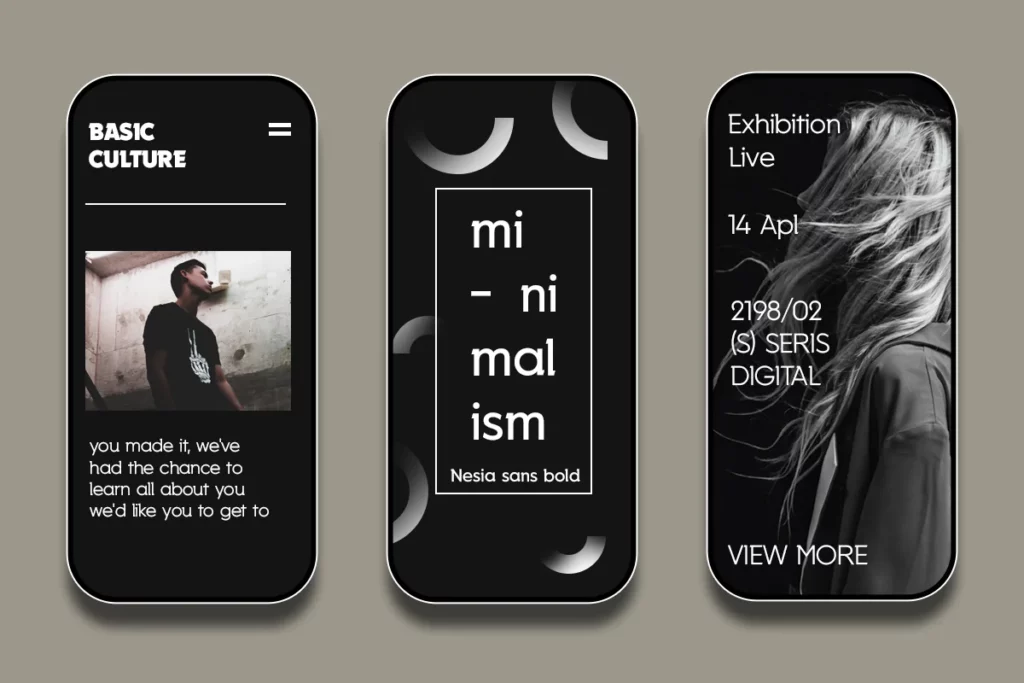
Nesia: Sans-Serif Font
Nesia Sans is a sharp, contemporary semi-sans serif that will inspire spectacular designs. Its bold simplicity lends an eye-catching yet refined style to any project.
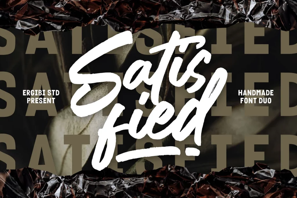
Satisfied: Brush Font
Blend hand-brushed elegance and urban edge with Satisfied. This creative duo of fonts adds an authentic handmade look to designs.

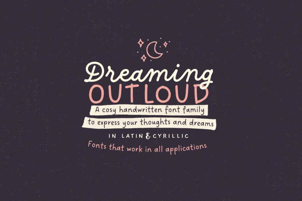
Dreaming Outloud Font Pack
The Dreaming Outloud handwritten fonts effortlessly express thoughts and quotes with authentic charm and hundreds of creative extras.
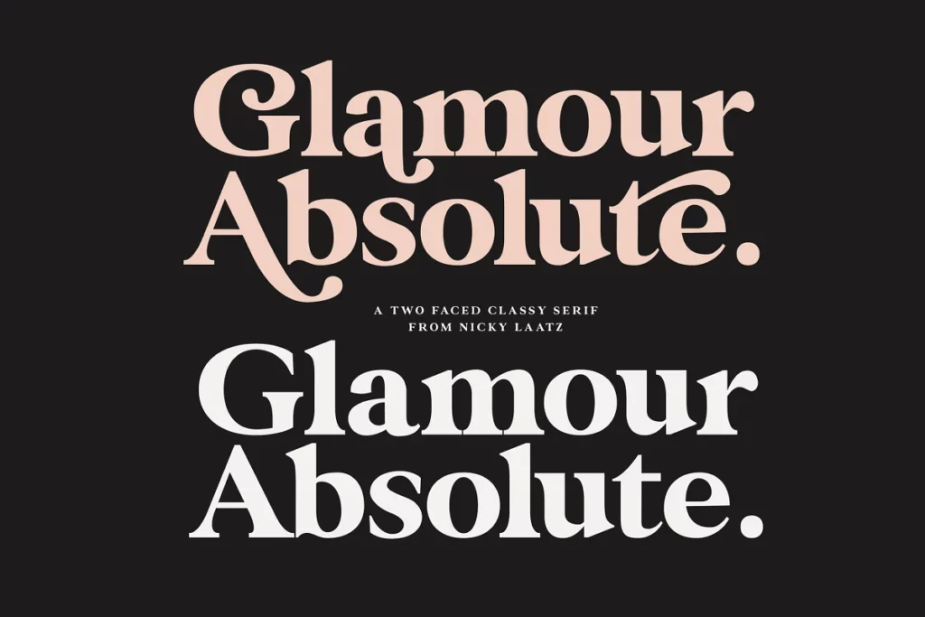
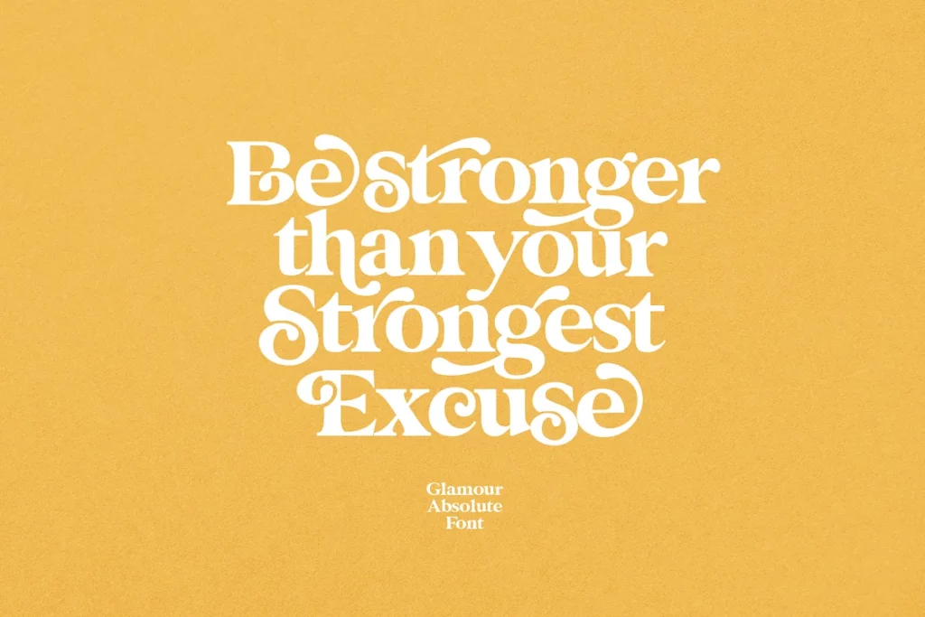
Glamour Absolute: Modern/Vintage Font
Boldly make a vintage or modern statement with the adaptable split personality of Glamour Absolute. Ideal for varied branding and designs.
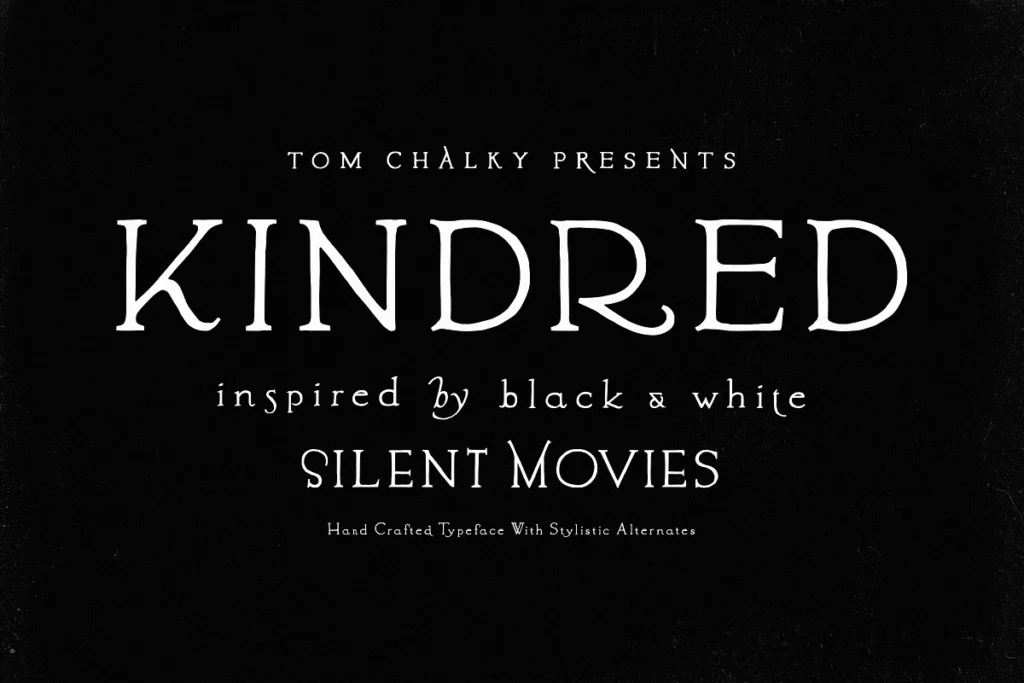
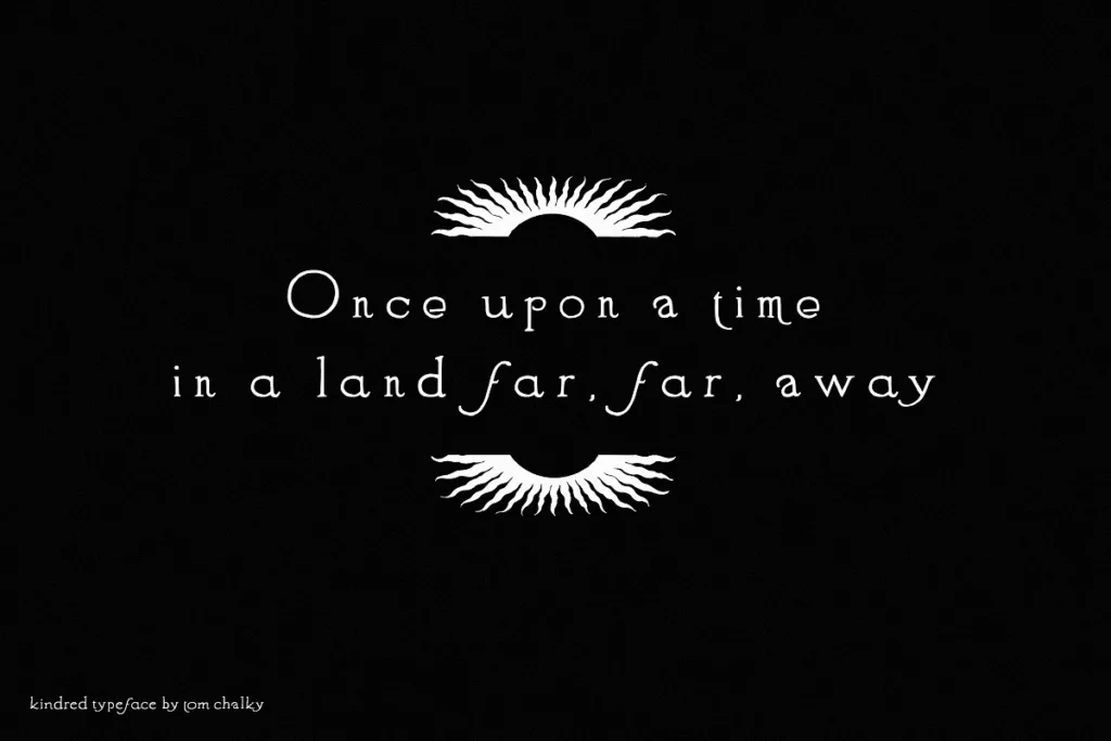
Kindred: Stylistic Alternative Font
Recalling vintage cinema, Kindred’s quirky flair and copious alternate characters empower unlimited creative typography designs.
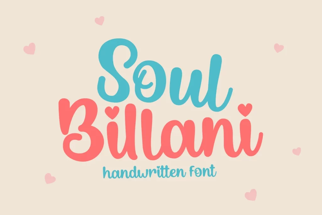
Soul Billani: Fun, Bubbly Font
Make a bold, artistic statement with Soul Billani’s unconventional display characters. Perfect for captivating logos, titles, and headers or even cheap custom stickers. If you like this bubbly look, you might also want to check out our list of 47 Bubble Fonts that Really ‘Pop’.
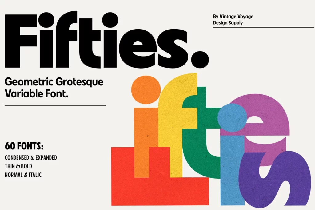
Fifties Font: Timeless Geometric Typeface
Fifties beautifully blends geometric and humanist styles for a retro-modern look. With 60 styles including italics across various weights and widths, this variable font offers endless options from airy elegance to bold dynamism. Ideal for posters, apparel, websites, and more.
Why Your Font Choice Matters
Fonts Influence First Impressions
Studies show 60% of a viewer’s assessment comes from the typography alone. The right font quickly conveys mood and tone.
The font makes an immediate visual impression on readers, shaping their perception subconsciously before they even read the words. Viewers decide if content seems formal, casual, elegant, bold, lighthearted, serious etc based predominantly on font choice rather than the actual text.
Choosing a font aligned with your goals makes content more likely to be received as intended. If using a font that conveys the wrong style, the content may not have the desired effect on readers.
Font Psychology Impacts Readers
Fonts elicit distinct emotions and associations. Scripts imply elegance, bold font strength, fun font cheerfulness.
Serif fonts feel traditional, formal, and sophisticated. Sans serif fonts feel clean, minimalist, and modern. Script and handwritten fonts feel personal, artistic, and creative. Display and decorative fonts feel lively, celebratory, and unique.
Leverage these instinctive psychological associations to reinforce the tone of the quote. If it is inspirational, a bold font amplifies that message. If it is lighthearted, a bubbly font complements the mood. Font psychology primes readers to perceive the quote accordingly.
Readability Affects Comprehension
Harder-to-read fonts undermine the message. Easy-to-read fonts let readers focus on meaning. Prioritize clarity.
Ornate, intricate fonts may look beautiful but actually make textual content harder to quickly comprehend. This diverts focus from the meaning. Readers expend more effort decoding words rather than absorbing the message.
Opt for fonts optimized for legibility and reading ease at smaller sizes. Clean lines and spacing create a transparent reading experience where the words themselves shine.
Use Typography to Reinforce Intent
Match font to purpose. Traditional serifs for heritage, clean sans serifs for efficiency, and scripts for creativity. Wield fonts intentionally.
Rather than random font choices, intentionally select fonts that align with the quote’s core purpose. If it is conveying longevity, go for a classic serif like Times New Roman. If the goal is modernity, use a streamlined sans serif. Align stylistic qualities with messaging goals.
Key Factors for Pairing Fonts with Quotes
Consider Quote Mood and Tone
Playful quote? Choose a playful font! Somber quote? Traditional serif font. Match the font style to the quote.
The font should enhance and complement the inherent tone of the quote itself. A serious quote will be undermined by a bubbly, casual font. An elegant quote diminished by an edgy display font. Make choices harmonizing with the quote.
Account for Audience Preferences
Younger audiences appreciate modern fonts. Traditional audiences prefer classic looks. Know preferences.
Consider demographics like target age, background, expectations, and craft content accordingly. Youth may appreciate trendy fonts but traditional serifs better suit mature audiences. Know the audience and pick fonts catering to their aesthetic sensibilities.
Evaluate Presentation Medium
Digital needs legible fonts like sans serifs. Print can use delicate serifs. Account for visibility.
Factor where readers will interact with the quote—website, poster, invitation, etc. Smaller online fonts need clarity while large printed headers can use more delicate fonts. Ensure it is optimized for the medium.
Align with Brand Identity
Use brand fonts or complementary styles. Avoid a disconnect between quotes and brand identity.
For quotes used in branding, ensure the font feels cohesive with an existing visual identity like logo, colors, and website style. Maintain brand consistency. But also consider personal quotes shared on social media—what impression do you want to convey about your brand identity?
Recommended Categories for Quotes
Traditional Serif Fonts
Serif fonts like Garamond exude sophistication. Great for formal quotes.
Timeless serif fonts imply heritage, authority, and prestige. The slight adornments elevate the words. Ideal for quotes where elegance and gravity are assets, like tasteful book covers.
Modern Serif Fonts
Modern serifs like Georgia add stylized flair. Polished yet current.
With more pronounced serifs and unique shapes, modern serif fonts blend classic elegance with contemporary, stylized energy. The best balance for quotes that are refined yet fresh.
Sans Serif Fonts
Clean sans serifs like Helvetica convey clarity. Ideal for digital quotes.
Sans serifs’ clean lines and visual simplicity make them extremely legible, especially at smaller sizes. This clarity is key for digital quotes on websites, mobile, social media—times when readability is paramount.
Script and Handwritten Fonts
Cursive script fonts like Pacifico feel artistic and personalized. Lovely for invitations. Handwriting fonts feel organic, authentic and charming.
The artistic flourish of script fonts adds a touch of refinement and beauty to quotes. Their flowing connecting letters feels intimate, like elegant handwriting. Perfect for wedding invitations, logos, and other creative uses.
Slab Serif Fonts
Bold slabs like Rockwell grab attention. Perfect for eye-catching headlines.
Slab serifs command attention with their bold, blocky aesthetic. This makes them ideal for high-impact quotes you want to notice—website headers, poster designs, book covers. The heaviness emphasizes importance.
Artistic Display Fonts
Fun display fonts like Luckiest Guy add playful, unique vibes. Use for impact.
Choose a font with personality for a lively, artistic take on quotes. Display fonts with whimsical shapes and textures breathe quirky life into quotes in a way standard fonts cannot. Perfect for adding originality.
Carefully Select Fonts for Maximum Impact
Choosing the perfect font for quotes requires aligning style with tone, audience, medium, and brand identity. Lean on classic serifs for heritage, modern sans serifs for clarity, scripts for elegance, and displays for artistic flair. With strategic font choices, you can make ordinary quotes extraordinary.