In this article:
- Why 90s Color Palettes are "All That and a Bag of Chips"
- The 8 Freshest 90s Color Palettes
- How to Use 90s Color Palettes in Modern Design
- Why Were These Colors So Popular in the 90s?
- Incorporating 90s Color Palettes in Different Design Fields
- Conclusion: Bringing It All Back Home
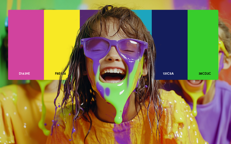
As a 90s kid turned designer, I have a special fondness for the color palettes that defined my childhood. From the vibrant hues of Nickelodeon to the cool aesthetics of grunge, 90s color schemes are making a major comeback in modern design.
If you’re looking to add some fresh, nostalgic vibes to your next project, you’re in for a treat. I’ve put together 9 totally fresh 90s color palettes that are sure to inspire you and transport your designs to this iconic era of sitcoms, boy bands, and dial-up internet.
Why 90s Color Palettes are “All That and a Bag of Chips”
Before we jump into the specific palettes, let’s talk about why 90s colors are so fresh and relevant today. The 1990s were a time of rapid technological advancement, cultural shifts, and a unique blend of optimism and cynicism. This complex spirit was reflected in the eclectic color choices of the era, from the bright, playful hues of children’s entertainment to the muted, earthy tones of grunge fashion.
As a designer, I find that incorporating 90s-inspired colors into modern projects can add a sense of nostalgia, playfulness, and even a touch of irony that resonates with millennials and Gen Z alike. Whether you’re working on a retro-inspired brand identity, a quirky web design, or even a throwback fashion collection, these palettes can help you create a look that’s both nostalgic and fresh.
The 8 Freshest 90s Color Palettes
1. Nickelodeon Splat
- Slime Green (#1AB21C)
- Orange (#FF6700)
- Purple (#7F3FBF)
- Yellow (#FFD800)
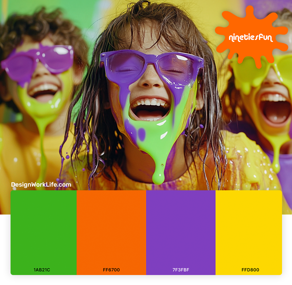
This palette screams 90s kids’ TV. Inspired by the iconic Nickelodeon logo and slime, it’s perfect for designs that need a playful, energetic vibe. I love using these colors for youth-oriented brands or any project that wants to tap into 90s nostalgia.
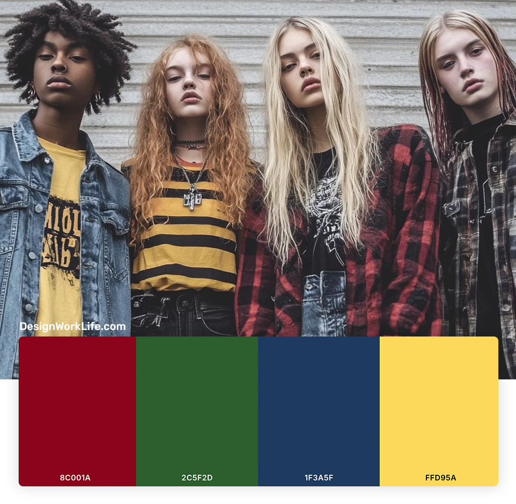
2. Grunge Flannel
- Deep Red (#8C001A)
- Forest Green (#2C5F2D)
- Navy Blue (#1F3A5F)
- Mustard Yellow (#FFD95A)

Get 300+ Fonts for FREE
Enter your email to download our 100% free "Font Lover's Bundle". For commercial & personal use. No royalties. No fees. No attribution. 100% free to use anywhere.
Inspired by the iconic flannel shirts of the grunge era, this palette brings a moody, alternative edge to designs. I find it works well for brands going for a more serious, introspective 90s vibe.
3. Fresh Prince Neon
- Hot Pink (#FF1493)
- Turquoise (#00CED1)
- Neon Yellow (#FFFF00)
- Purple (#8A2BE2)
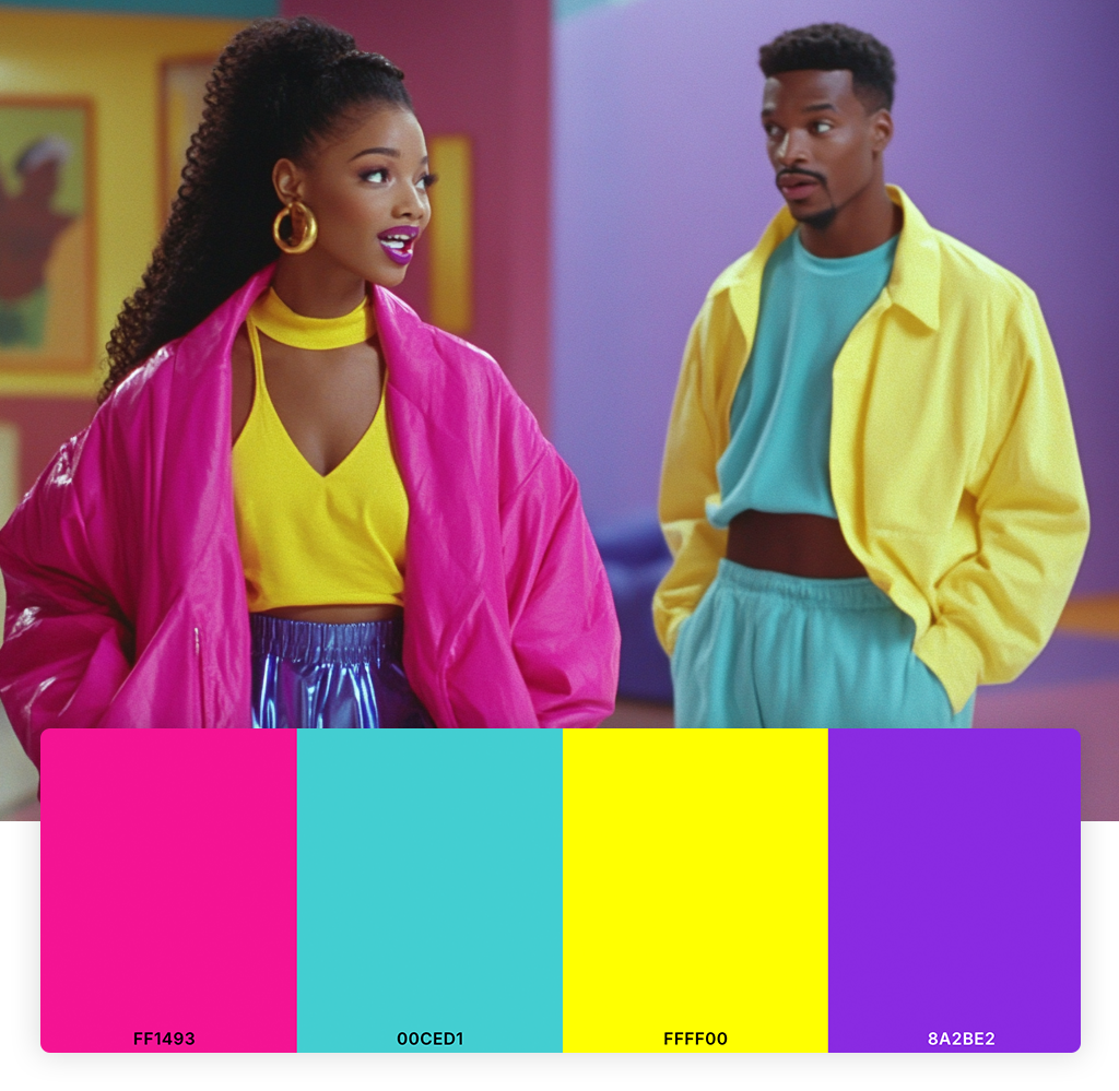
Inspired by the wild patterns and colors of The Fresh Prince of Bel-Air, this palette captures the bold, urban aesthetic of early 90s hip-hop culture. It’s great for designs that need to stand out and make a statement.
4. Lisa Frank Rainbow
- Hot Pink (#FF69B4)
- Electric Blue (#00FFFF)
- Neon Green (#39FF14)
- Bright Purple (#9370DB)
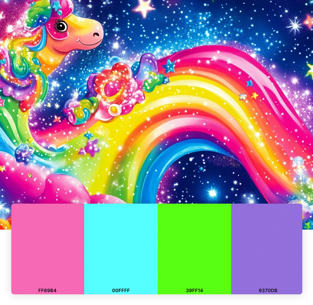
No 90s color roundup would be complete without a nod to Lisa Frank. This hyper-saturated rainbow palette is perfect for designs that need a dose of over-the-top fun and whimsy.
5. Tech Startup
- Teal (#008080)
- Gray (#808080)
- Black (#000000)
- Bright Green (#3fde3f)
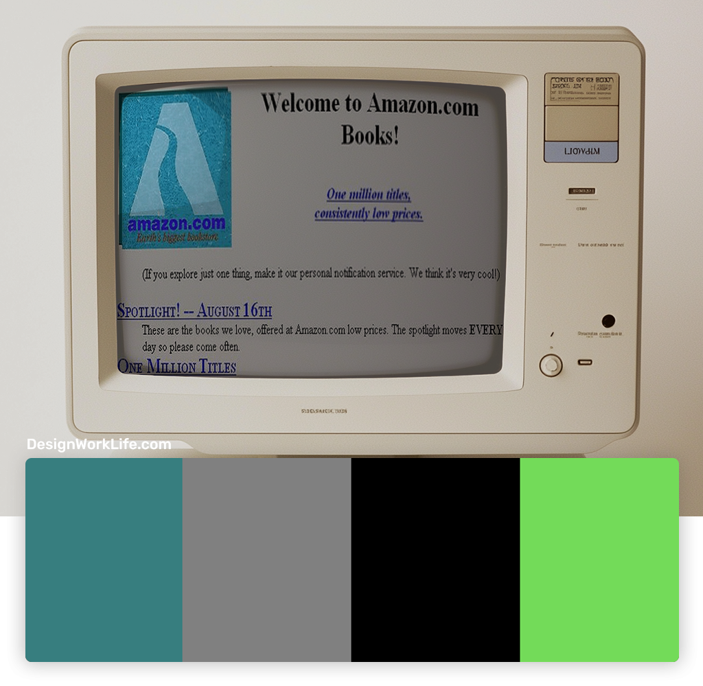
Inspired by the early days of web design and the dot-com boom, this palette captures the sleek, futuristic aesthetic of 90s tech. I often use it for projects that want to evoke a sense of innovation and cutting-edge technology.
6. Coffee Shop Neutrals
- Coffee Brown (#6F4E37)
- Beige (#F5F5DC)
- Sage Green (#9CAF88)
- Muted Blue (#6699CC)
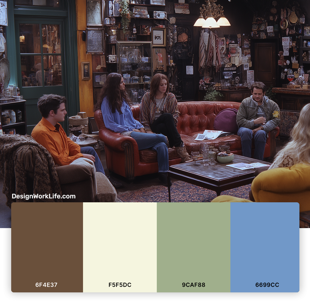
The 90s weren’t all about bright colors. This palette, inspired by the cozy coffee shops that became cultural hubs in the 90s, offers a more subdued take on the decade. It’s great for creating warm, inviting designs with a hint of 90s nostalgia.
7. Saved by the Bell
- Hot Pink (#FF4190)
- Cyan (#4ECDC4)
- Yellow (#FFD93D)
- Purple (#8C51C1)
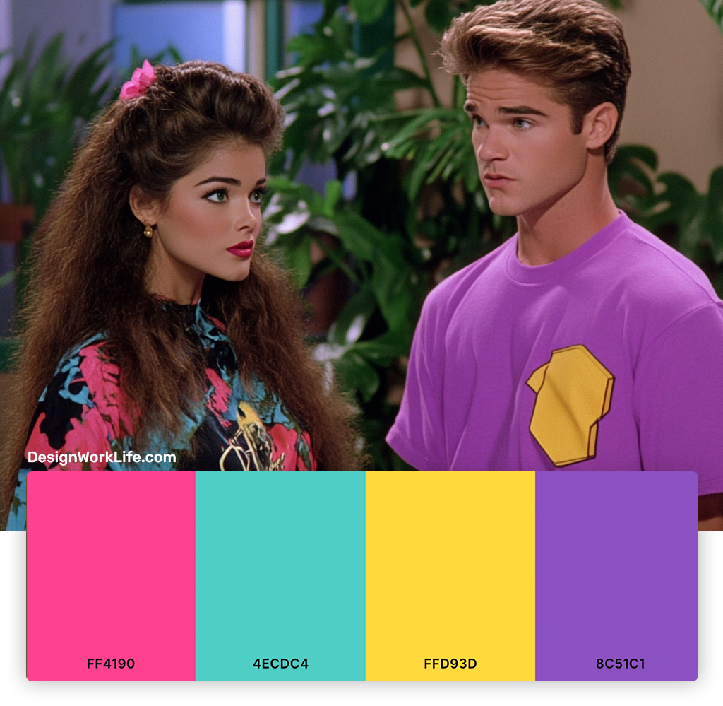
Inspired by the iconic 90s TV show, this palette captures the fun, carefree spirit of the early 90s. I love using these colors for designs that need a boost of energy and playfulness.
8. Muted Neon Lite
- Plum (#8E4585)
- Moss Green (#8A9A5B)
- Burnt Orange (#CC5500)
- Steel Blue (#4682B4)
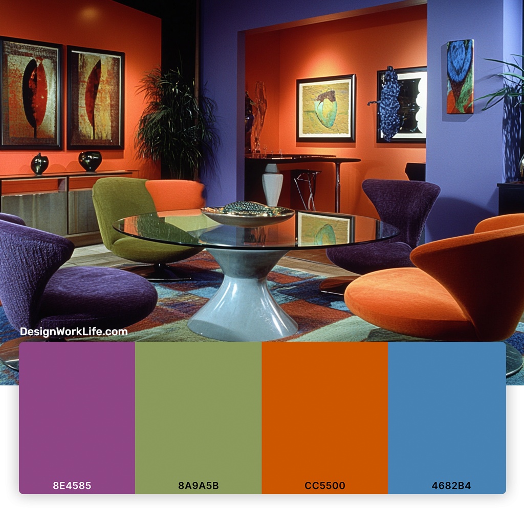
A softer take on the neon aesthetic, this palette combines muted, earthy tones with subtle pops of color. It’s perfect for designs that want to reference 90s alternative culture without going full neon colors.
How to Use 90s Color Palettes in Modern Design
Now that we’ve explored some totally fresh 90s color palettes, you might be wondering how to incorporate them into your modern design projects without looking dated. Here are some tips I’ve picked up over the years:
1. Use Bold Colors Strategically
90s palettes can be pretty in-your-face. Try using the boldest colors as accents against more neutral backgrounds for a modern twist on the 90s look.
2. Embrace Typography
The 90s were a golden age for experimental typography. Pair 90s colors with interesting fonts to create a cohesive retro vibe.
3. Incorporate Patterns
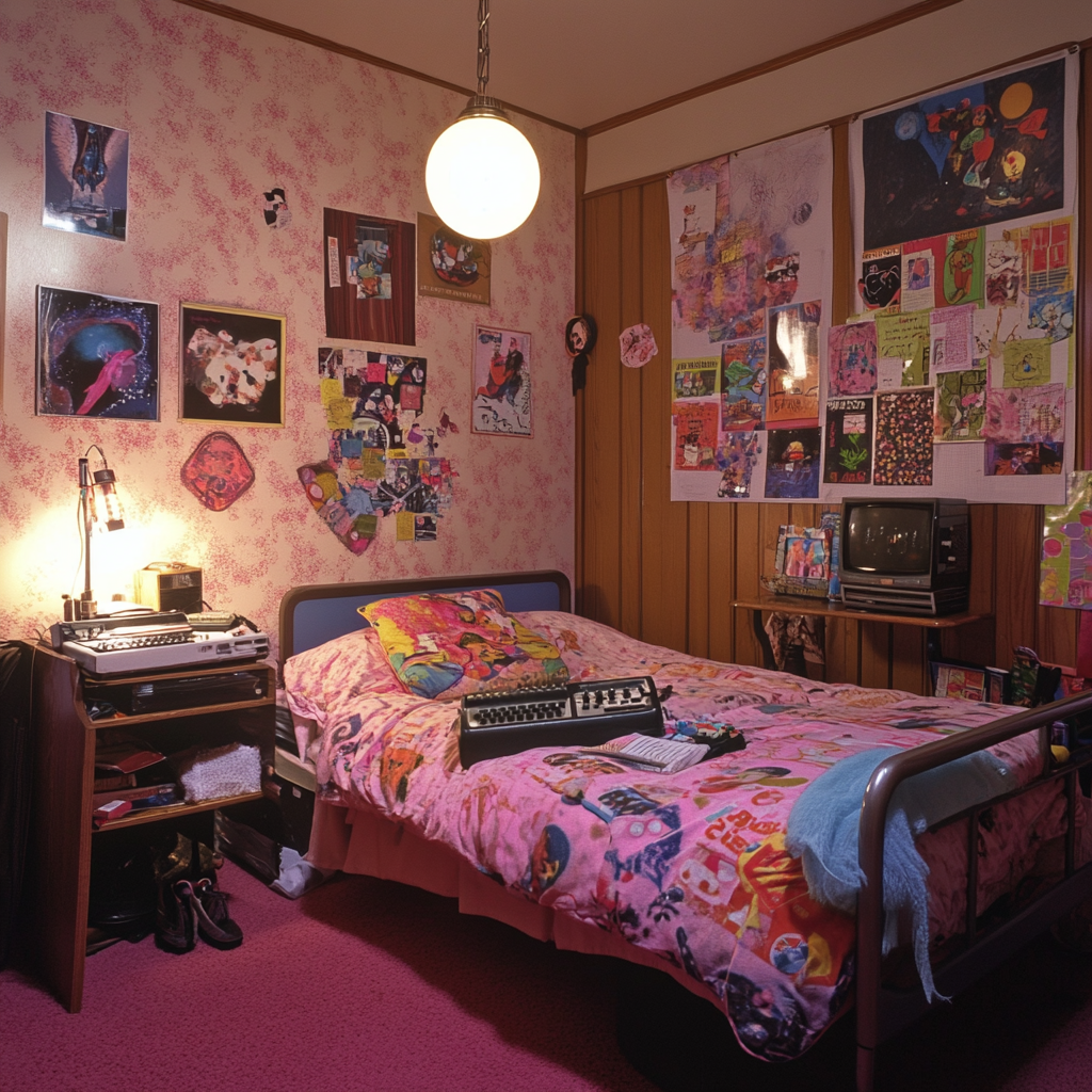
Geometric patterns were huge in 90s design. Try using 90s color palettes in simple patterns for a subtle nod to the era.
4. Balance with White Space
Many 90s designs were cluttered by today’s standards. Balance out bold 90s colors with plenty of white space for a more contemporary feel.
5. Use Gradients (Again)
Gradients were big in the 90s and they’re back in style. Try creating subtle gradients with 90s color combos for a modern-retro look.
Why Were These Colors So Popular in the 90s?
As a design history enthusiast, I find it fascinating to explore the cultural and technological factors that influenced 90s color trends:
- Technological Advancements: The rise of the internet and more advanced computer graphics allowed for more complex and vibrant color displays.
- Pop Culture Influence: TV shows, music videos, and movies of the era heavily influenced color trends in all areas of design.
- Economic Factors: The economic prosperity of the 90s encouraged bold, optimistic color choices in many areas of design.
- Generational Shift: As Gen X came of age, their desire for authenticity and individuality influenced color trends, particularly in fashion and graphic design.
- Multicultural Influences: Increased globalization in the 90s brought influences from various cultures into mainstream design, expanding color palettes.
Understanding these factors can help us appreciate why these colors resonated so strongly then, and why they continue to captivate us today.
Incorporating 90s Color Palettes in Different Design Fields
One of the things I love about 90s color palettes is their versatility. Here’s how I’ve seen them successfully used across different design fields:
Graphic Design
In graphic design, 90s color palettes can add a punch of nostalgia and energy. I often use these colors for logo design, particularly for brands targeting millennials or creating throwback product lines. The key is to balance the bold colors with modern, clean layouts.
Web Design
90s-inspired color palettes can create truly unique and memorable websites. I’ve seen designers use these colors for microinteractions, hover effects, or even full-page backgrounds. Just remember to prioritize usability and readability over nostalgia.
Interior Design
In interior design, 90s colors can create spaces that are both nostalgic and fresh. I’ve seen designers use bold 90s hues for accent walls or furniture pieces, balanced with more neutral tones. It’s a great way to add personality to a space without going full-on time capsule.
Fashion
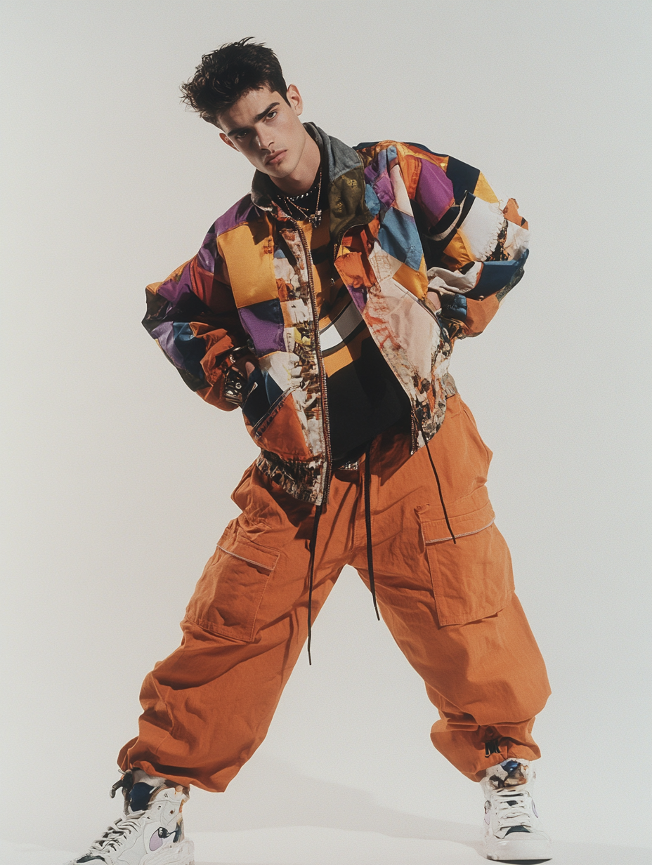
The fashion world has been having a major 90s moment for several years now. As a designer, I love seeing 90s color palettes used in color blocking, patterns, and accessories. It’s all about balancing those bold 90s hues with more timeless pieces.
Conclusion: Bringing It All Back Home
As we’ve explored these 9 totally fresh 90s color palettes, I hope you’ve gained a new appreciation for the diverse, energetic hues of this iconic decade. Whether you’re designing a retro-inspired logo, giving your living room a Saved by the Bell makeover, or just looking to add a pop of nostalgic charm to your next project, these palettes offer endless possibilities.
Remember, the key to successfully using 90s color palettes in modern design is balance and context. Don’t be afraid to experiment, but also consider how these colors interact with modern design elements. And most importantly, have fun with it! The 90s were all about self-expression and pushing boundaries, so let your creativity run wild.
So go ahead, embrace the fresh and the bold. Whether you’re a seasoned designer or just starting out, these 90s color palettes are sure to inspire you and add a touch of nostalgic magic to your work. Now, if you’ll excuse me, I’m off to dig out my old Tamagotchi for some more color inspiration. Stay fresh!

