In this article:
- What Are Neon Colors?
- Where Did Neon Colors Come From?
- When Should I Use Neon Colors in My Designs?
- When Should I Avoid Neon Colors?
- Examples of Great Neon Color Combinations
- Examples of Neon Color Combinations to Avoid
- How to Use Neon Colors in Your Designs
- How will YOU use neon colors?
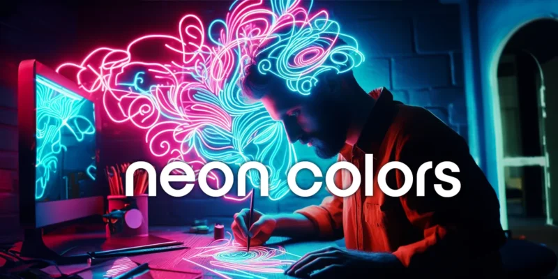
Neon colors have become a popular design trend in recent years, reviving that classic look from the 90s. But how and when should you use neon in your own designs? This comprehensive guide has everything designers need to know about working with neon colors in 2023.
What Are Neon Colors?
Neon colors refer to extremely bright, intense shades. They give off an artificial glow that makes them stand out, especially when paired with darker colors.
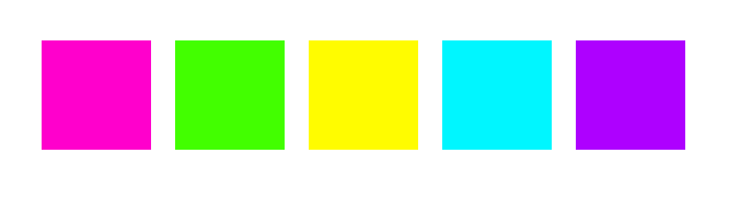
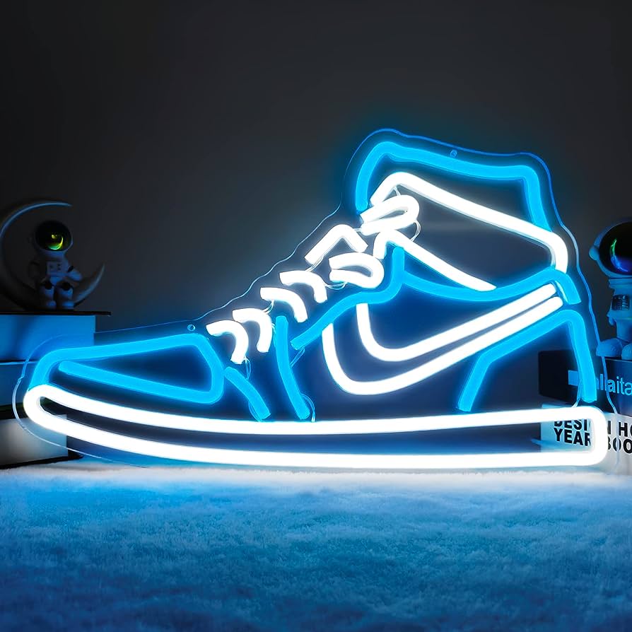
Some examples of popular neon colors include Neon pink, Neon green, Neon yellow, Neon blue, and Neon purple as shown below:
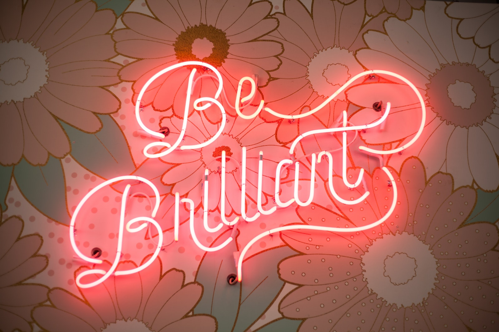
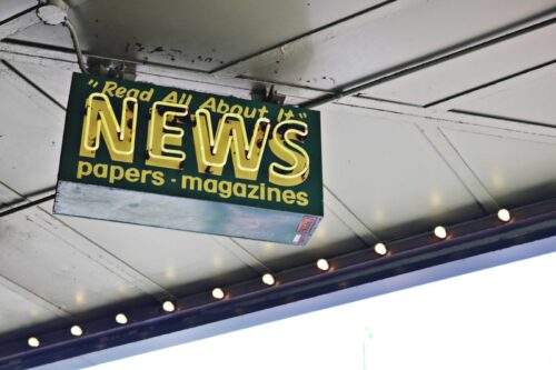
True neon colors are created by filling glass tubes with noble gases like neon, argon, krypton, or zenon and running electricity through them. This gives off an incredibly bright glow. Neon lights and signs rely on this technology. Think “open” signs or those trendy signs in cafes that are totally Instagrammable.
Similarly, in design, “neon” colors refer to any super bright, intense shades reminiscent of this artificial neon glow. They’re most often achieved in print and digital projects by using pure RGB/CMYK values at 100% saturation.
Where Did Neon Colors Come From?
The origins of neon as a design trend can be traced back to the neon lights first created in the early 20th century.

Get 300+ Fonts for FREE
Enter your email to download our 100% free "Font Lover's Bundle". For commercial & personal use. No royalties. No fees. No attribution. 100% free to use anywhere.
In 1910, French inventor Georges Claude created the first neon lamp by applying an electric charge to a sealed tube of neon gas. Claude displayed the first neon lamp in Paris in 1912.
Through the 1920s and 1930s, neon lights became popular for signage and decor. They gave cities like Las Vegas their signature glow.

Custom Neon Signs are widely used. They are also an indispensable decorative element in various festivals and celebrations. Whether it is the lanterns of the Spring Festival, the national flag of the National Day, or the Christmas tree of Christmas, neon lights can be used to decorate and create a strong festive atmosphere. Bars, nightclubs, KTVs, wedding venues, and other entertainment venues also often use neon lights for decoration.
Neon signs are also an important part of urban landscape lighting. Through careful design and layout, neon lights can outline the outline of buildings and enhance the three-dimensional and artistic sense of buildings. Neon lights can also be used as a medium for artistic creation. Artists can use neon lights to create various artworks, which not only have unique visual effects but also convey the artist’s thoughts and emotions.
Eventually, the bold, intense colors of neon found their way into fashion and graphic design. Pop art of the 1960s helped usher neon into mainstream design. Fashion designers like Pierre Cardin and Paco Rabanne incorporated neon into mod styles.
Over the decades since, neon has gone in and out of fashion. It saw resurgences in the 1980s and 90s. Today it remains a popular accent color in all types of designs, giving any layout a fun, futuristic look.
When Should I Use Neon Colors in My Designs?
Neon colors have the ability to catch someone’s eye from across the room. They instantly add youthful energy to designs. This makes them perfect for:
- Grabbing attention, especially in advertisements, banners, and headlines
- Promoting energetic events like concerts, races, and parties
- Appealing to a young target demographic
- Adding excitement to food packaging and restaurant branding
- Making an edgy artistic statement
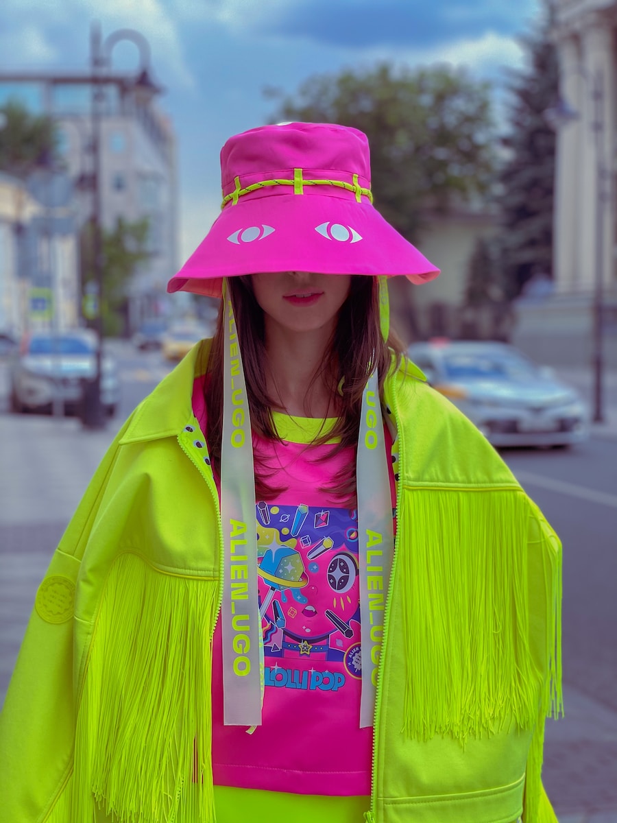
Neon accents are also popular in apparel and accessories – think neon workout gear or a pair of bright statement sunglasses.
In your designs, consider adding neon:
- As the color of headlines and call-to-action buttons
- In logos and slogans
- As the background of an interesting geometric layout
- On packaging for youth-oriented products
- In small accents throughout a design
When Should I Avoid Neon Colors?
While neon colors have their time and place, they may not be right for every design. In some cases, neon can come across as tacky, loud, or unprofessional if used incorrectly.
Avoid relying solely on neon colors when designing for:
- Corporate or professional brands wanting an elegant, serious look
- Older target audiences who may perceive neon as unsophisticated
- Complex informational material like charts and infographics, where neon will be distracting
- Products, services or campaigns related to health, finance, or other serious matters (in most cases)
Neon combinations can look harsh on the eyes if overdone. Use neon sparingly in more subdued designs and avoid neon text on neon backgrounds.
Also be aware of cultural color associations. In some countries, certain neon colors like green and yellow have very specific connotations. Do your research before using neon prominently in international designs.
Examples of Great Neon Color Combinations
When used strategically, neon colors can take a great design and make it extraordinary. Here are some examples of neon used effectively:
Neon Yellow + Charcoal Gray
Neon yellow pops against darker shades like charcoal gray. This combination works well in sports designs, giving off a bold, energetic vibe. The charcoal gray tempers the brightness.

Neon Green + Black
Pairing neon green with classic black is an edgy, punk rock-inspired choice. This high-contrast combo works for rock band promotions, extreme sports designs, and urban streetwear fashions.
Neon Blue + White
For a clean, futuristic neon look, combine neon blue with crisp white. This simple pairing looks modern and technological when used in minimalist website designs, app interfaces, and more.
![]()
Neon Pink + Royal Purple
Using two neon colors together can really make them pop. Try pairing hot pink with royal purple for a fun ‘80s inspired effect. This neon combo works well for dance club flyers and youth-oriented event branding.
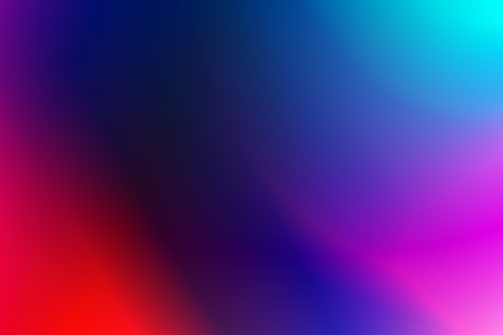
Neon Color Gradients
Gradating between two or more neon shades creates a colorful ombre effect. Use neon gradients as bold backgrounds in posters, digital ads, packaging, and other designs.
Examples of Neon Color Combinations to Avoid
Some combinations involving neon hues simply don’t work. They end up clashing rather than contrasting. Stay away from:
- Neon green and neon red: These two intense complementary colors are jarring side by side.
- Neon yellow on neon pink: Similar levels of brightness and intensity compete.
- Neon text on a neon background: Avoid neon-on-neon designs that are hard to decipher.
- Too many competing neon colors: Stick to one or two neon accents for the boldest impact.
How to Use Neon Colors in Your Designs
Follow these tips to effectively incorporate neon into your graphic designs:
Choose the Right Neon Shade
Neon colors each evoke a slightly different mood and vibe. Consider the overall tone you want to achieve with your design when selecting a neon hue:
- Neon pink conveys youthful energy and a bubbly, fun vibe. Use it for designs related to parties, concerts, events, fashion, and youth brands.
- Vibrant neon green takes on an edgy, rebellious feeling. It’s commonly associated with extreme sports, gaming, punk rock, and urban streetwear styles.
- Neon blue has a modern, futuristic look. It feels sleek and technological. Use neon blue for science fiction themes or to give a cutting-edge vibe.
- Neon yellow takes on a playful, cheerful mood. Use it for children’s designs or to show enthusiasm.
- Neon purple blends the excitement of pink and the sophistication of blue. It works well for music, dance, or spiritual designs.
Take time to consider the exact neon shade that aligns with the desired tone and audience. Selecting the right hue is key.
Use Neon as an Accent
Resist the urge to make neon the dominant color in your design. Used sparingly as an accent, neon pops. But used everywhere, it quickly becomes overwhelming.
Use neon strategically on key design elements like:
- Headlines
- Subheads
- Logos
- Graphic details
- Border accents
- Icons
- Charts/graphs
Keep neon accents consistent throughout a design. For example, use neon pink on all H2 subtitles or neon green on every call-to-action button. This selective neon usage keeps the overall design cohesive.
Pair with Contrasting Dark Shades
On its own, neon can look jarring. Pairing it with darker shades creates essential contrast. This makes the neon really stand out while anchoring it in the design.
Try combining neon colors with:
- Black – classic, sophisticated
- Charcoal – modern, sleek
- Navy – nautical, versatile
- Deep purple – elegant, creative
- Dark grays – refined, professional
A dark color scheme with pops of neon creates depth and dimension. It prevents neon from looking too loud or overwhelming.
Be Consistent with Neon Usage
While a single neon color can add some nice accents, sticking to just one creates continuity. Avoid scattering random neon colors throughout your design.
Keep neon usage consistent by sticking with one neon hue at a time. For example:
- Use neon pink on every H2 subhead
- Make neon blue the color of your call-to-action buttons
- Outline each icon in neon green
This makes the neon look purposeful rather than haphazard. Consistent neon application also helps reinforce brand recognition.
Use Neon for Data Visualizations
When used minimally, neon is extremely effective for highlighting key data in charts and graphs. It instantly draws the viewer’s eye to important info.
Some ways to selectively use neon for data viz:
- Make a key data line neon while other lines remain neutral
- Use neon bars or slices for segments you want to emphasize
- Apply neon only to data labels and values you want to stand out
- Use neon to accent average lines, goal metrics, or other key markers
Sparingly using neon gives focus to main data points. But be sure to apply it consistently across all graphs and charts.
Apply Neon to Geometric Shapes
Pairing neon colors with geometric shapes enhances the futuristic, tech-forward neon aesthetic. Circles, triangles, lines, and angles complement neon’s intense artificial vibe.
Ways to combine neon and geometric shapes:
- Place neon text within colored geometric shapes
- Divide sections or pages with neon diagonal lines
- Use neon circles or triangles as bullet points
- Outline geometric icons and graphics with neon lines
- Create neon accents on counters, bars, or progress element
Avoid pairing neon with softer, organic shapes and illustrations. The geometry keeps the design anchored and purposeful.
Use Neon Typography
Use neon coloring minimally on typographic elements. In particular, neon works well on:
- Headlines
- Logos
- Pull quotes
- Subheads
- Page numbers
- Short label or captions
Avoid neon on body paragraphs and longer sections of text. The intensity fatigues the eyes. Reserve neon for short typographic elements you want to emphasize. And be sure neon text contrasts well with the background.
Applied selectively to key text elements, neon type packs a punch!
How will YOU use neon colors?
When used strategically, neon colors can take a design portfolio to the next level. Use this guide to choose complementary neon palettes, pair neon with other shades, and incorporate neon details into your graphic designs.
Neon colors instantly add excitement. But restraint is key. Follow these neon design tips to create youthful designs with just the right pop of brightness!
