In this article:
- Classic With a Twist: Traditional Typography Gets an Update
- The Human Touch: Fighting Back Against AI Perfection
- Playing With Dimension: Typography Gets Deep
- Breaking Convention: When Rules Are Meant to Be Broken
- Movement & Animation: Typography Comes Alive
- Nostalgia & Revival: Everything Old is New Again
- Technical Innovation: When Typography Gets Smart
- Making a Statement: Typography That Demands Attention
- What Does All This Mean For You?
Typography isn’t just about picking a pretty font anymore.
With brands fighting harder than ever to stand out online, typography has become one of the most powerful tools in a designer’s arsenal.
But here’s the thing: choosing the right typography trend for your brand isn’t as simple as following what everyone else is doing.
You have to consider what message you’re trying to send, who you’re trying to reach, and how you want your brand to be perceived.
That’s why I’ve put together this massive guide to typography trends for 2025. We’re going to look at everything from the revival of classic serifs to experimental AI-resistant designs.
And I’m not just talking about a few basic trends here.
We’re diving deep into over 50 different typography trends that are shaping the design world right now. Some of these might surprise you. Others might be exactly what your brand needs to level up its visual game.

Get 300+ Fonts for FREE
Enter your email to download our 100% free "Font Lover's Bundle". For commercial & personal use. No royalties. No fees. No attribution. 100% free to use anywhere.
The best part? I’m not just going to tell you what’s trending. I’m going to show you why these trends matter and how you can actually use them in your designs.
Ready to discover what’s shaping typography in 2025?
Let’s dive in.
Classic With a Twist: Traditional Typography Gets an Update
Remember when everyone thought serifs were dead?
Well, 2025 is proving them wrong in a big way.
1. The Return of Serifs
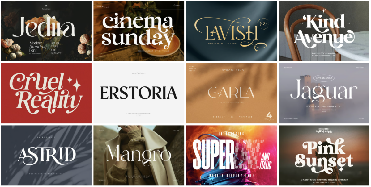
After years of minimalist sans-serif dominance, serifs are making a dramatic comeback. But these aren’t your grandmother’s serif fonts.
Designers are taking classic serif styles and adding modern twists – think bolder strokes, unexpected angles, and even some experimental flourishes.
This isn’t just about nostalgia. It’s about finding that sweet spot between tradition and innovation.
2. Elegant Royal Fonts
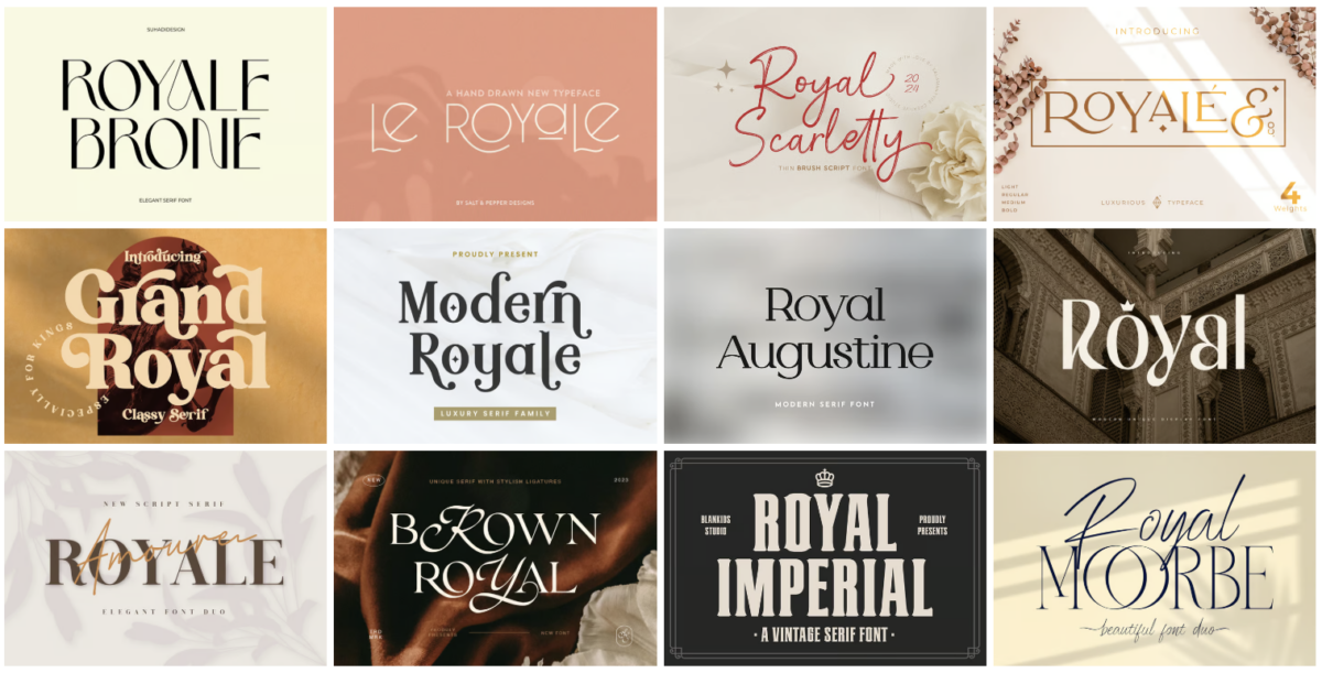
Luxury brands are falling in love with royal-inspired typography, and it’s easy to see why.
These fonts ooze sophistication with their regal curves and ornate details. But here’s the twist – designers are stripping away the stuffiness and adding contemporary elements.
The result? Typography that feels both timeless and fresh.
3. Transforming Serifs
This might be my favorite trend in this category.
Designers are taking traditional serif fonts and morphing them in unexpected ways. Letters might start with a classic serif top and transform into something completely different by the bottom.
It’s like watching typography break free from its own rules.
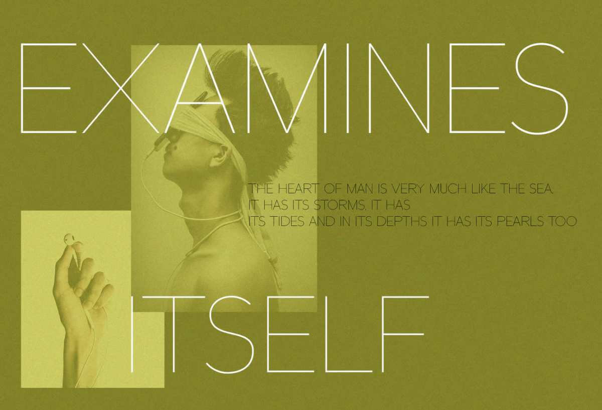
4. Ultra-Thin Sans
Think minimalism is over? Think again.
Ultra-thin sans serif fonts are having a moment, but with a crucial difference. They’re being used in ways that actually make them readable – larger sizes, higher contrast backgrounds, and smarter spacing.
It’s minimalism that actually works.
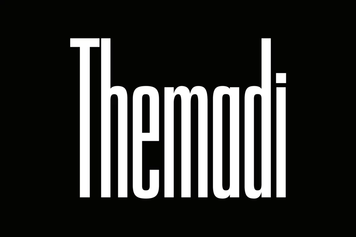
5. Tall and Elongated Letters
Sometimes the simplest twist can make the biggest impact.
That’s exactly what’s happening with elongated letterforms. Designers are stretching traditional fonts vertically, creating dramatic silhouettes that command attention.
This trend works especially well for logos and headlines where you want to make a bold statement without getting too fancy.
The key to using any of these trends? Don’t just copy them blindly.
Think about how they align with your brand’s personality. A luxury skincare brand might rock those elegant royal fonts, while a modern tech company might get more mileage out of those transformed serifs.
Remember: the best typography choices are the ones that tell your brand’s story.
The Human Touch: Fighting Back Against AI Perfection
Here’s something interesting: as AI gets better at creating perfect designs, designers are pushing back.
And they’re doing it in the most human way possible.
6. Imperfect Lettering
Forget pixel-perfect alignment and flawless curves. Designers are embracing the beauty of imperfection.
We’re seeing letters with wobbly edges, inconsistent baselines, and uneven strokes. And you know what? It works.
These “flaws” make brands feel more authentic and approachable. In a world of AI-generated perfection, a little human messiness goes a long way.
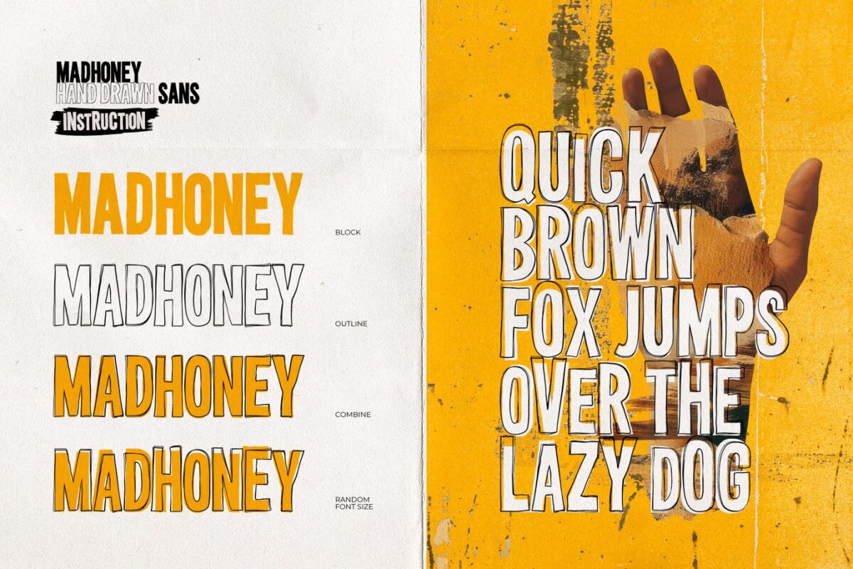
7. Hand-Drawn Elements
This isn’t just about using handwriting fonts.
Designers are incorporating actual hand-drawn elements into their typography. Smudges, brush strokes, even fingerprints – anything that screams “a real person made this.”
It’s raw. It’s authentic. And it’s impossible for AI to truly replicate.
8. Raw Typography
Think unedited, unfiltered, straight-from-the-sketchbook vibes.
This trend takes the rough drafts and preliminary sketches that designers usually hide and puts them front and center.
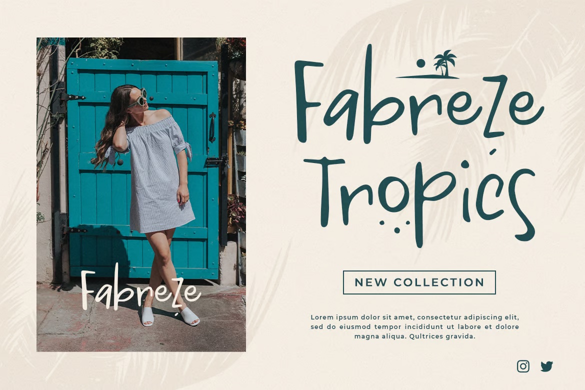
It’s like showing your work in math class, but way cooler.
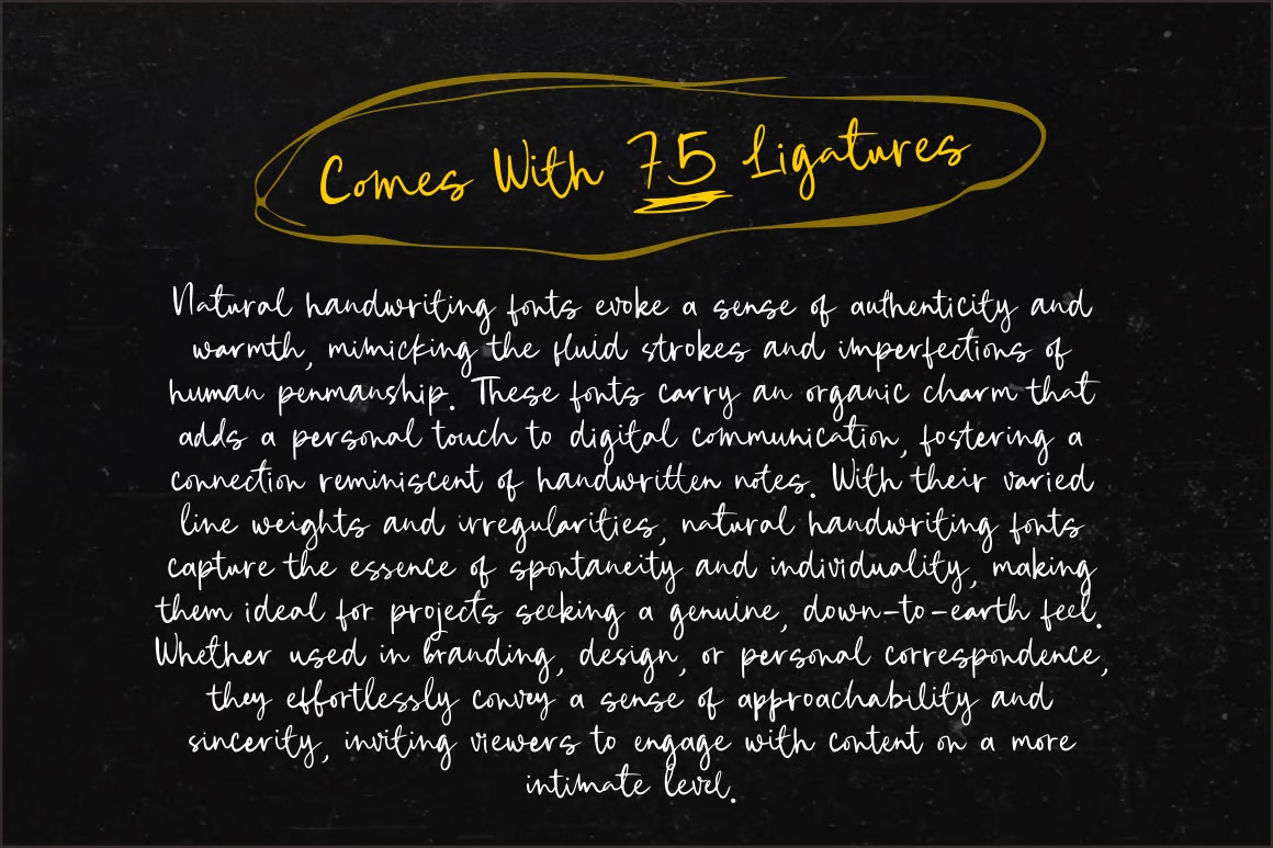
9. Pen to Paper Styles
Remember when we actually wrote things by hand?
This trend does. It captures the natural flow and imperfections of real handwriting – complete with ink blots, uneven pressure, and those little flourishes that happen when you’re writing without thinking.
It’s personal. It’s genuine. And it makes your audience feel like they’re reading a note from a friend.
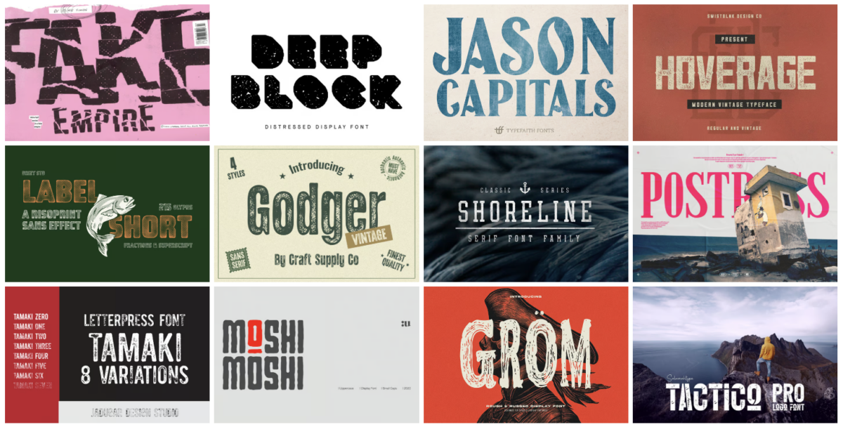
10. Distressed Effects
Perfect isn’t always better. Sometimes you need a little wear and tear.
Distressed typography adds texture and character through intentional imperfections – scratches, erosion, fading, you name it.
It’s like the typography equivalent of pre-ripped jeans. And just like those jeans, when it’s done right, it looks effortlessly cool.
Here’s the thing about all these human-touch trends: they’re not just about looking different.
They’re about making a connection. In a world where everything’s becoming more digital, more automated, more perfect – these imperfect touches remind us that there are real humans behind the brands we love.
And that’s something no AI can replicate.
Playing With Dimension: Typography Gets Deep
Flat design had its moment. Now typography is getting a serious depth upgrade.
And we’re not just talking about basic drop shadows here.
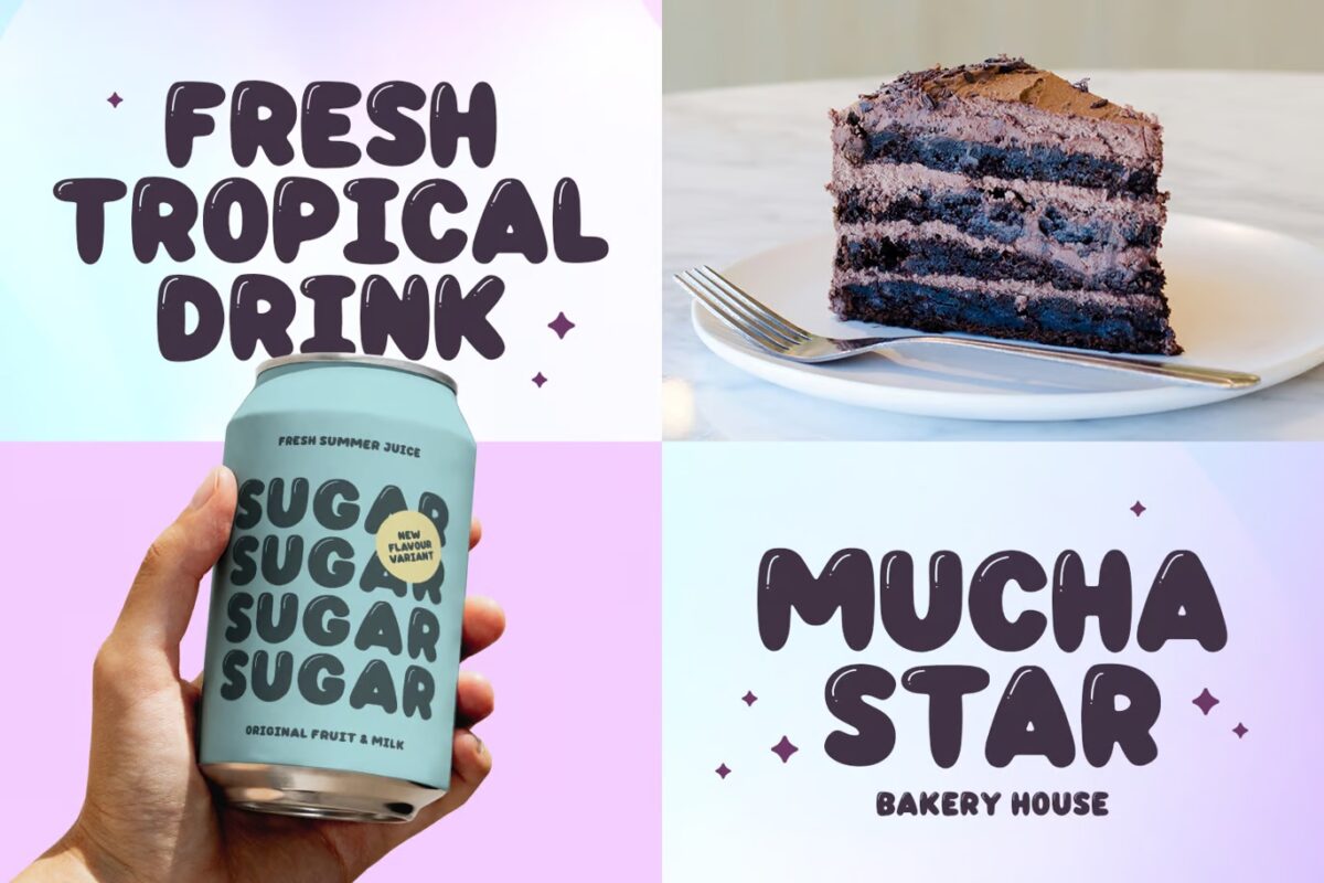
11. 2D Bubbles
Picture letters that look like they’re about to float right off your screen.
This bubble font trend takes regular typography and adds a bubbly, inflated feel that makes you want to reach out and touch it.
It’s playful, it’s fun, and it’s everywhere in youth-focused brands right now.
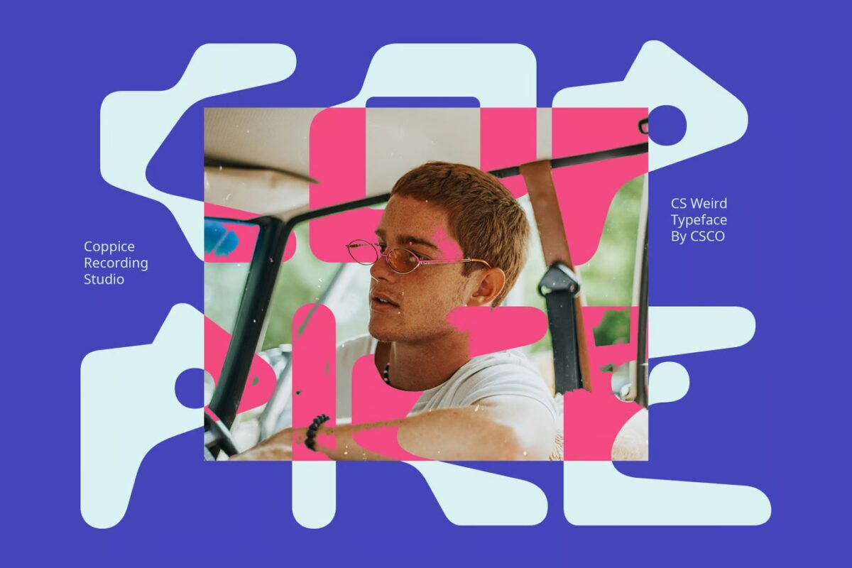
12. Globby Fonts
Think bubble letters met a lava lamp.
Globby fonts have this liquid, organic feel – like the letters are constantly moving and morphing. They might look simple at first glance, but there’s some serious design work happening here.
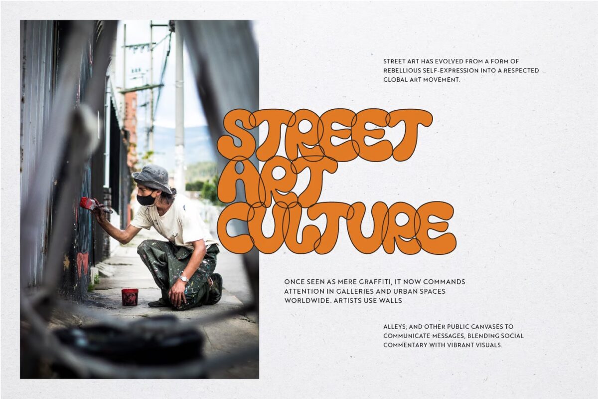
And brands are loving how these fonts grab attention without trying too hard.
13. Liquid Text
Here’s where things get really interesting.
Designers are creating typography that appears to melt, drip, or flow across the page. But unlike the old days of cheesy WordArt effects, this new approach is sophisticated and intentional. Like this talented designer who literally drew text with Sriracha sauce.
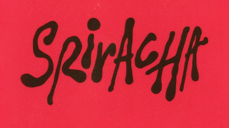
The trick? Only liquifying parts of the letters. It creates this cool hybrid look that’s both solid and fluid.
14. Fuzzy Distortion
Imagine letters with a glow that’s gone rogue.
Fuzzy distortion adds this soft, blurred edge to typography that makes it look like it’s radiating energy. It’s like someone cranked up the ambiance on your text.
When done right, it can make even the simplest words feel electric.
15. Layered Effects
This isn’t your basic overlay.
Designers are getting clever with how they stack and intersect different elements of typography. Letters might peek through other letters, overlap with images, or create unexpected shadows.
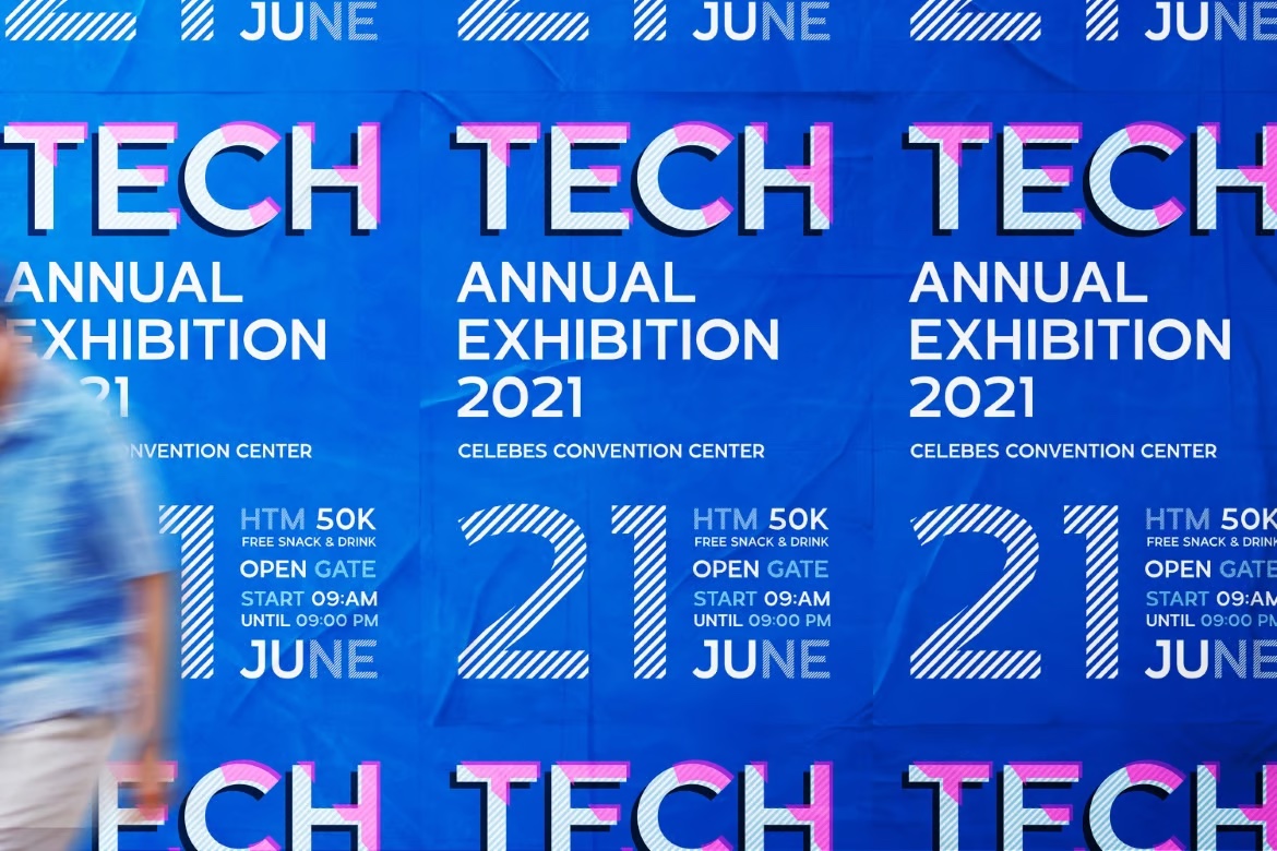
It’s like typography learned to play hide and seek.
But here’s the catch with all these dimensional trends: they’re tricky to get right.
Too much dimension and your text becomes unreadable. Too little and it looks like you didn’t quite commit to the trend.
The sweet spot? That’s where the magic happens.
Breaking Convention: When Rules Are Meant to Be Broken
Sometimes the best designs happen when you throw the rulebook out the window.
And 2025 is definitely the year of typographic rebellion.
16. Unaligned Text
Remember all those rules about perfect alignment? Yeah, designers are pretty much ignoring those now in favor of more bold graphic design trends like this one.
Letters bounce up and down. Words drift off their baselines. Spacing gets weird – intentionally.
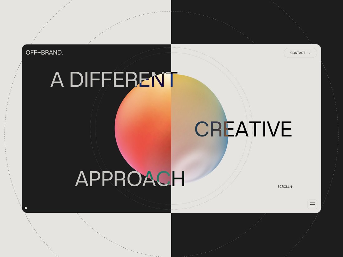
It sounds messy, but when done with purpose, it creates this amazing energy that perfectly aligned text just can’t match.
17. Mixed Typefaces
The old rule was simple: stick to two fonts max.
Well, that rule’s getting broken left and right these days.
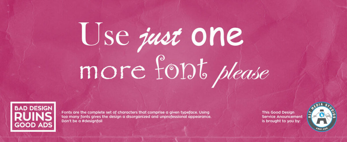
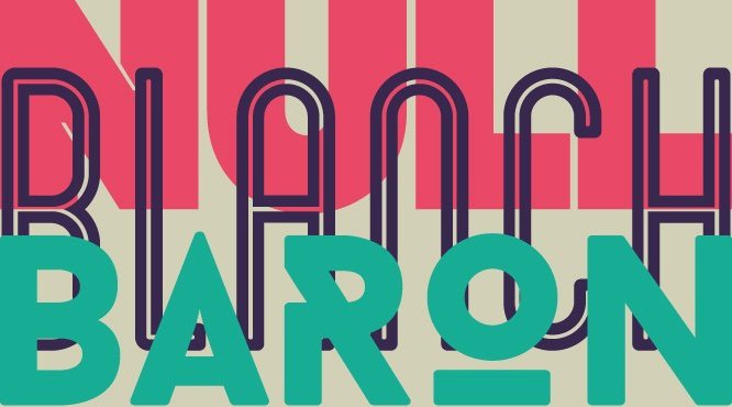
Designers are mixing three, four, sometimes even more typefaces in a single design. Serif meets sans serif meets script meets display font – and somehow, it works.
18. Unexpected Matches
This trend takes mixed typefaces to the next level.
We’re seeing combinations that would have made design professors cringe a few years ago. Ultra-thin fonts paired with chunky display types. Formal serifs dancing with playful scripts.
It’s like typography started speed dating, and all the weird matches turned out to be perfect.
19. Interlocking Letters
Who says letters need personal space?
This trend has letters overlapping, intertwining, and generally getting cozy with each other. Sometimes they share strokes. Sometimes they create new shapes where they meet.
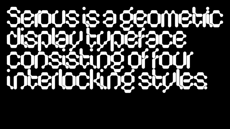
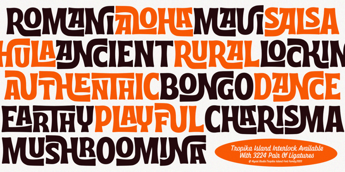
It’s like watching letters play Tetris.
20. Anti-Design Approaches
This might be the boldest trend of all.
Anti-design typography basically looks at every established design principle and does the opposite. Legibility? Optional. Harmony? Not required. Balance? Who needs it?
It’s chaotic. It’s rebellious. And when it works, it really works.
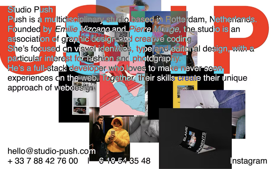
Here’s the thing about breaking conventions, though: you need to know the rules before you can break them effectively.
The best designs in this category aren’t just random – they’re carefully calculated chaos.
That’s what makes them so powerful.
Movement & Animation: Typography Comes Alive
Static typography is so last year.
In 2025, letters are dancing, morphing, and putting on a show.
21. Kinetic Typography
This isn’t just about making text move.
Kinetic typography tells stories through motion.

Letters bounce, spin, and transform in ways that actually mean something.
And with more brands focusing on video content, this trend is absolutely exploding.
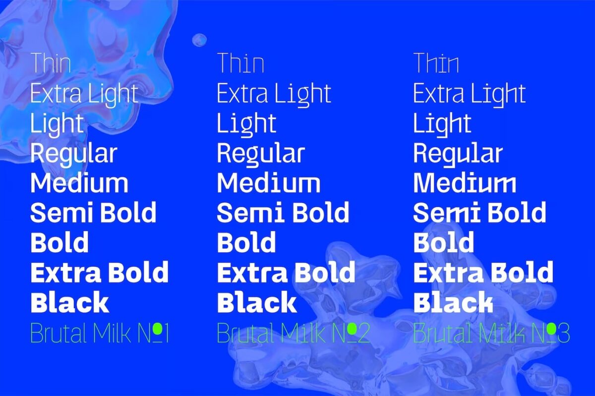
22. Variable Fonts
Think of variable fonts as typography that adapts in real-time.
One font file can morph from ultra-light to super-bold, from condensed to extended, all while keeping its core character.
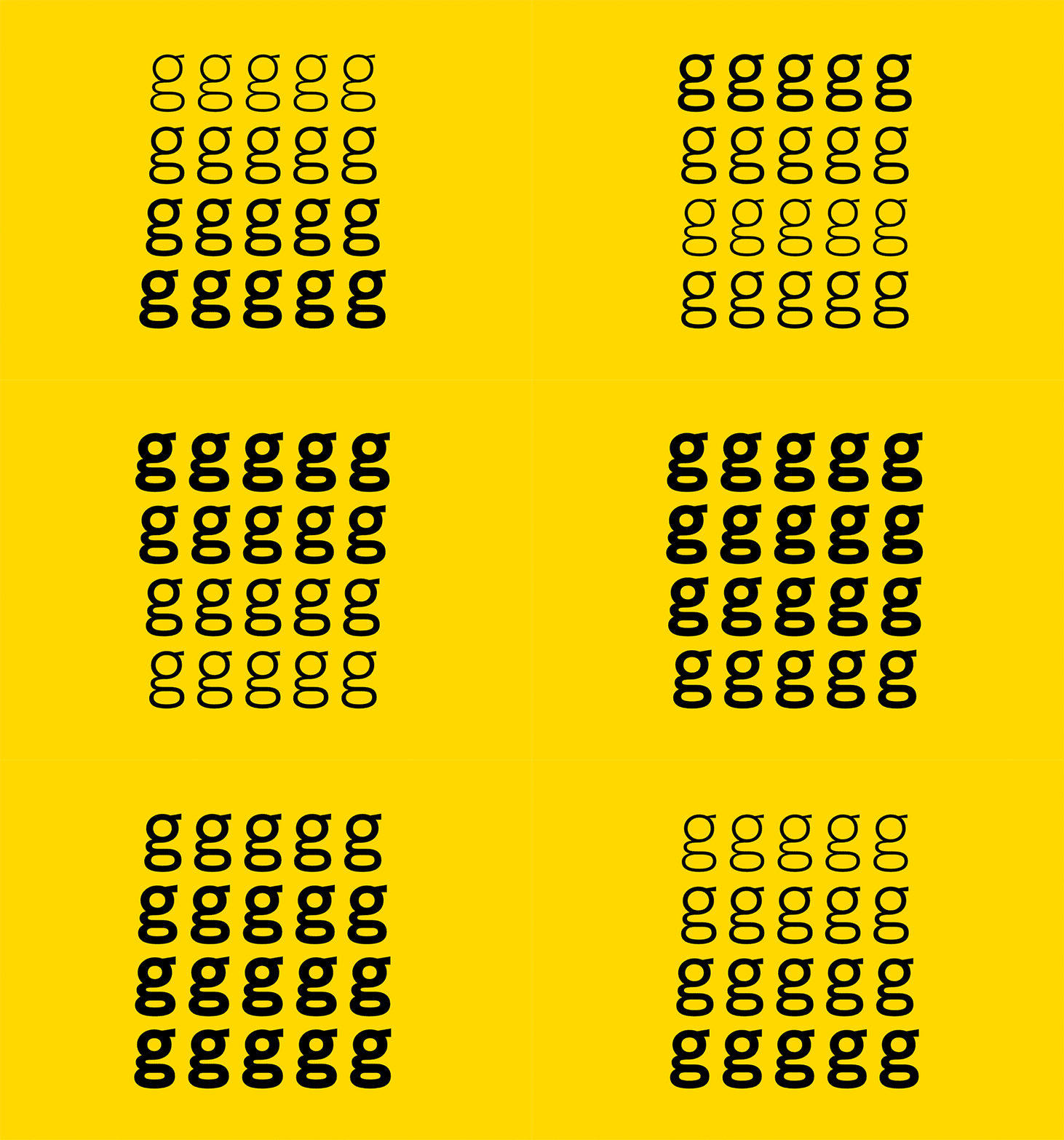
It’s like having an entire font family in a single file that can change on the fly.
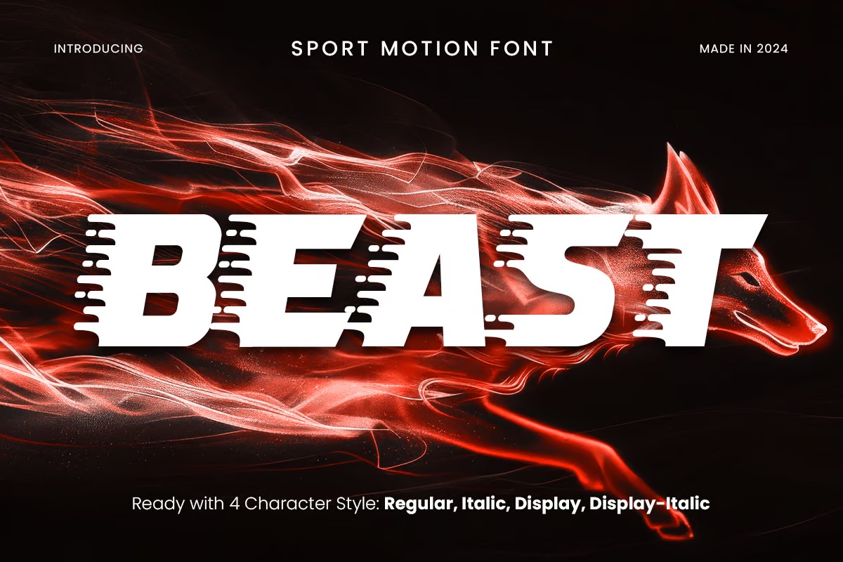
23. Fonts in Motion
Here’s where things get really interesting.
Designers are creating fonts that look like they’re in motion even when they’re standing still. Think slanted angles, speed lines, and dynamic shapes.
It’s all about creating that sense of movement without actually animating anything.
24. Interactive Type
This trend puts users in the driver’s seat.
Typography that responds to clicks, hovers, and scrolls isn’t just eye-catching – it’s engaging. It turns passive readers into active participants.
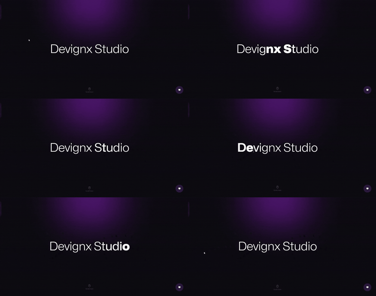
And in 2025, that kind of interaction is pure gold.
25. Animated Elements
We’re way beyond basic fade-ins and slide-ups.
Modern animated typography breaks letters apart, reconstructs them, and transforms them in ways that were impossible just a few years ago.
The best part? These animations actually enhance the message instead of just looking cool.
But here’s the catch with all this motion: you’ve got to use it wisely.
Too much movement can make your content unreadable. Too little defeats the purpose.
The sweet spot is where motion enhances your message without stealing the show.
Nostalgia & Revival: Everything Old is New Again
Funny how the future of typography looks a lot like its past.
But trust me – these aren’t your basic throwback fonts.
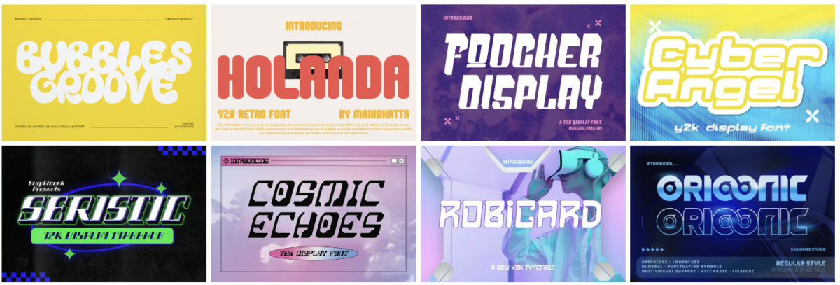
26. Y2K Aesthetics
The early 2000s are back, and they brought their fonts with them.
We’re talking chrome effects, bubble letters, and those chunky pixel fonts that dominated early web design.
But this time around, designers are mixing in modern techniques to create something totally fresh. It’s like Y2K got a software update.
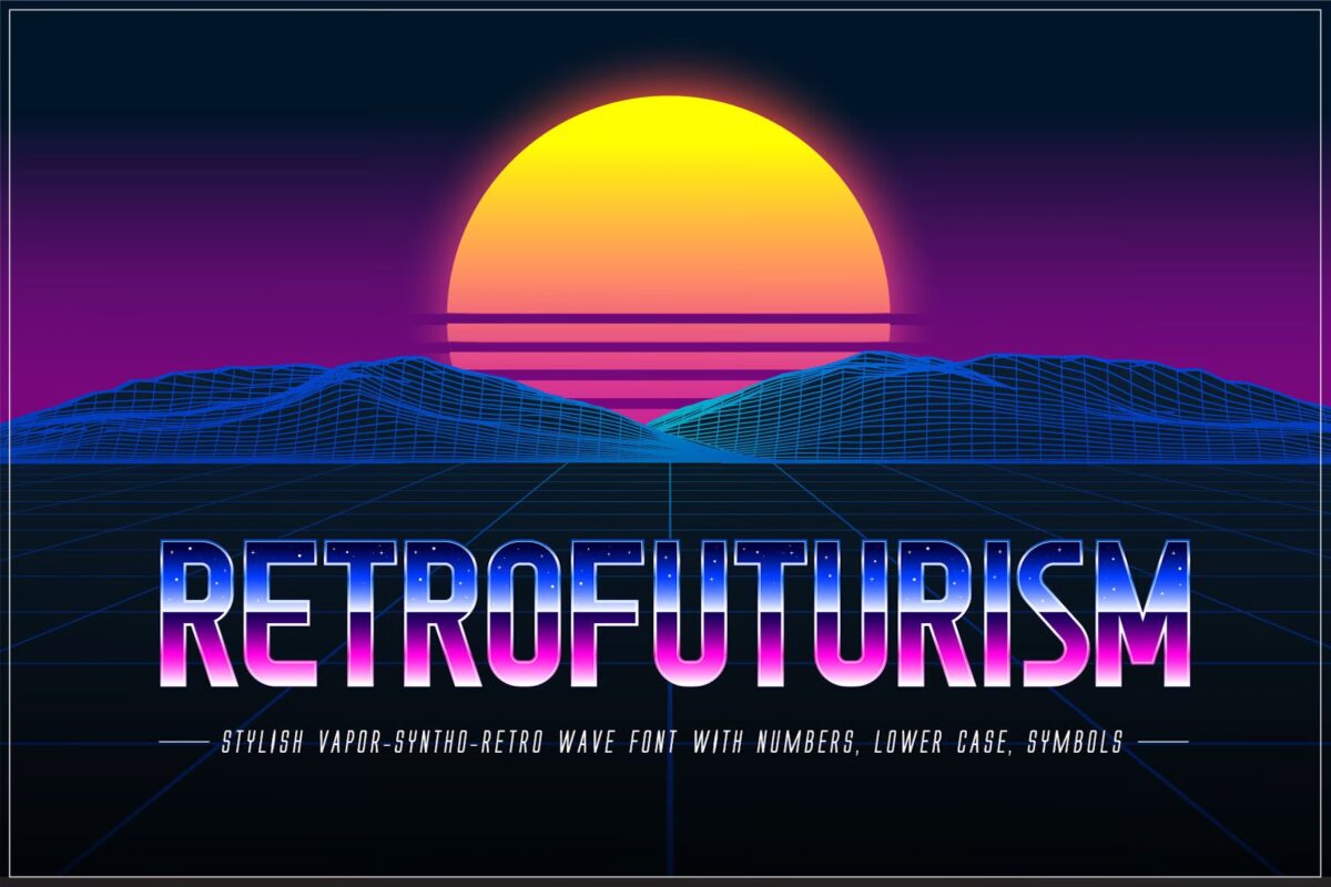
27. Retro-Futurism
Ever wonder how people in the ’70s imagined future fonts would look?
That’s retro-futurism in a nutshell. Think sci-fi movie posters meets vintage space race typography.
It’s nostalgic and forward-looking at the same time. And somehow, it totally works.
28. Art Deco Revival
Art Deco never really went away. But in 2025, it’s getting a major upgrade.
Those classic geometric shapes and luxurious curves are being reimagined with modern twists. Less Great Gatsby, more neo-luxury.
And brands are eating it up.
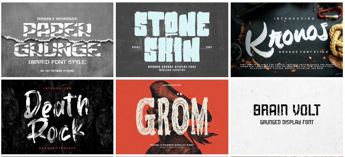
29. ’90s Grunge
Grunge typography is back from the underground.
But this isn’t just copying Kurt Cobain’s album covers. Today’s grunge fonts mix that raw, DIY attitude with cleaner, more purposeful design.
It’s like grunge grew up – but didn’t sell out.
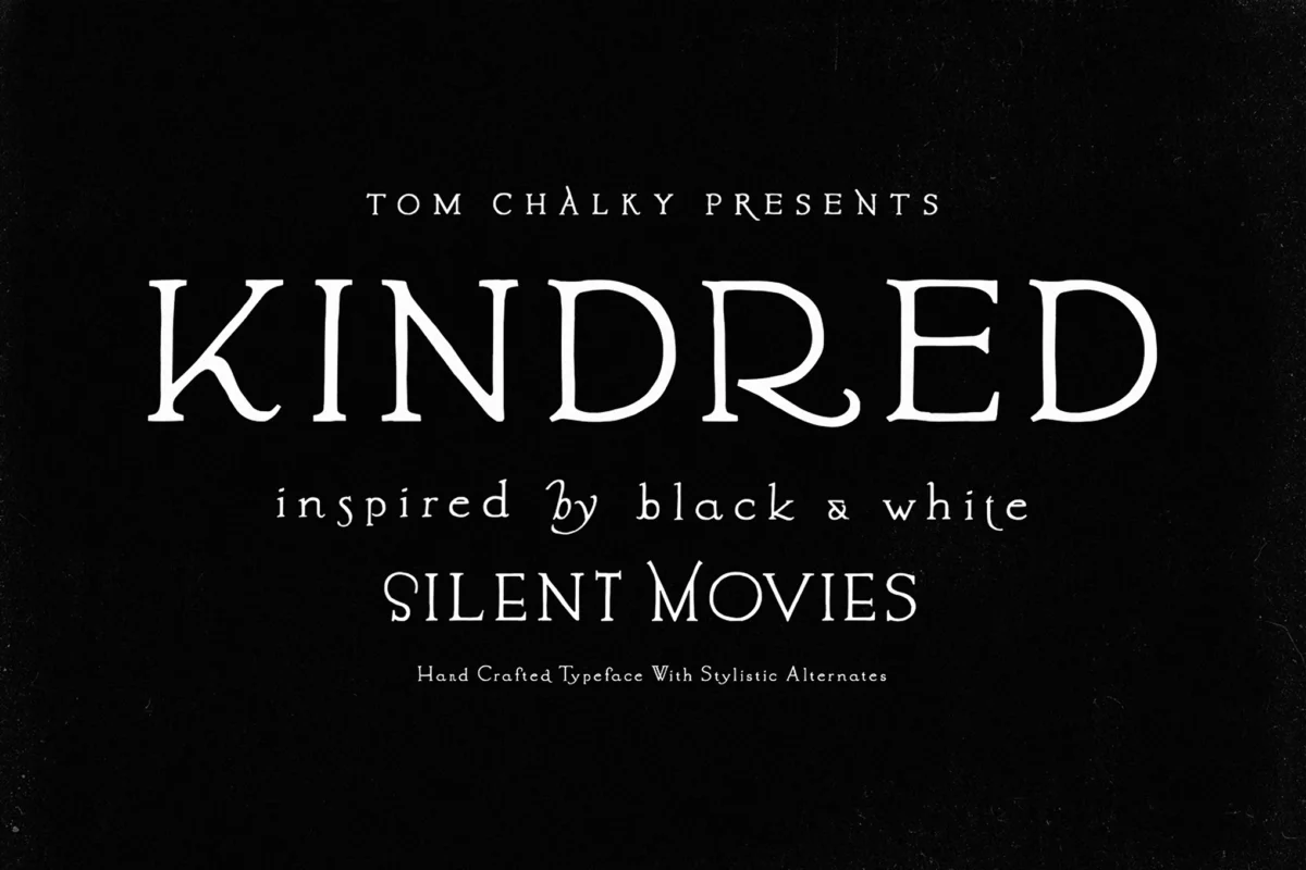
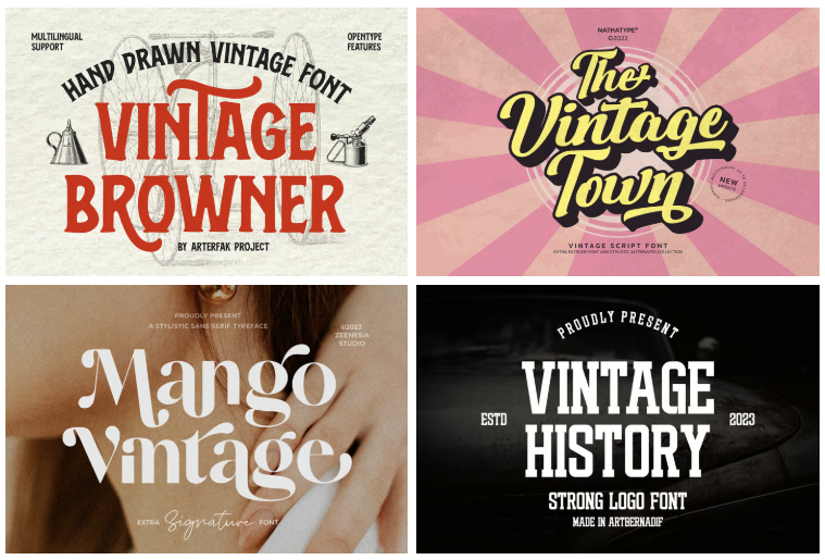
30. Vintage Ephemera
Designers are digging through old ticket stubs, postcards, and packaging for inspiration.
The result? Typography that feels worn, loved, and full of stories.
It’s not about making things look old – it’s about capturing that feeling of discovering something special in your grandparents’ attic.
Here’s what makes these revival trends work: they’re not just copying the past.
They’re taking what worked then and making it relevant now.
That’s the difference between trendy and timeless.
Technical Innovation: When Typography Gets Smart
Technology is changing everything about design.
And typography? It’s right at the cutting edge.
31. Optical Sizes
This might sound technical, but stick with me – it’s actually pretty cool.
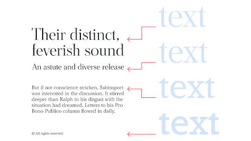
Optical sizing means one font can automatically adjust its details based on how big or small you’re using it. Think of it as responsive design for letters.
At small sizes, the letters get simpler and more legible. At large sizes, they show off all their fancy details.
32. Ink Traps
Here’s something interesting: those little notches designers used to cut into letters to prevent ink bleeding? They’re making a comeback.
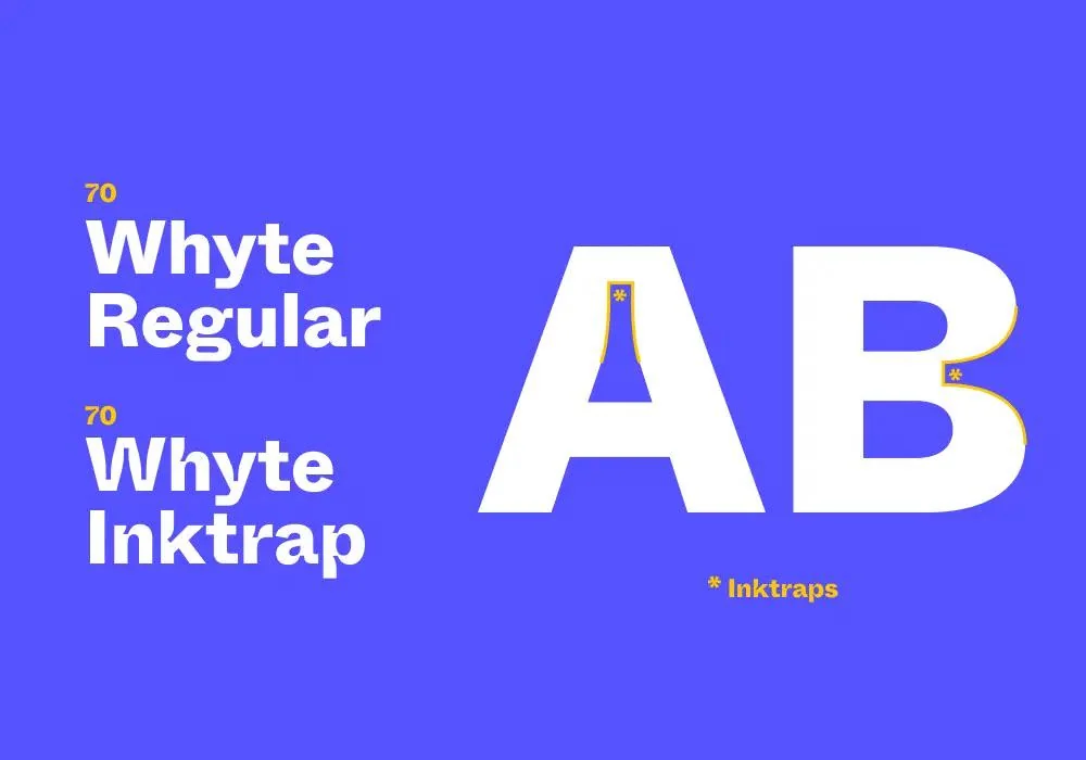
But not because we need them anymore. Designers are using them as style elements.
It’s like typography’s version of ripped jeans – taking something functional and making it fashionable.
33. Custom Brand Fonts
More brands are saying goodbye to off-the-shelf fonts.
Instead, they’re investing in completely custom typefaces. Fonts that perfectly match their personality. Fonts nobody else can use.
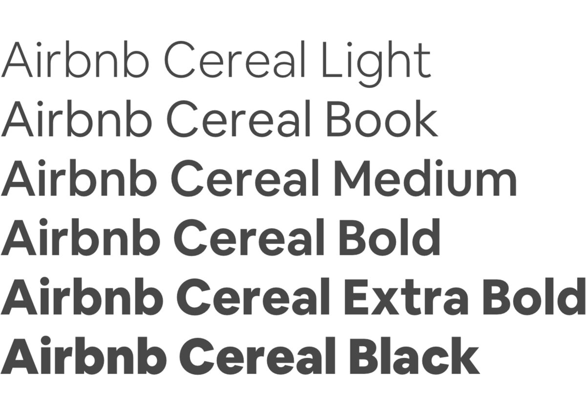
It’s expensive. It’s time-consuming. But for big brands? It’s becoming essential.
34. Ultra-Versatile Fonts
Think of these as the Swiss Army knives of typography.
These fonts can shape-shift from formal to casual, traditional to modern, all while maintaining their core character.
One font, endless possibilities. That’s the future of typography.
35. Experimental Typefaces
Some designers aren’t just pushing boundaries – they’re completely ignoring them.
We’re seeing fonts that break every rule in the book. Letters that barely look like letters. Shapes that shouldn’t work as type but somehow do.
It’s wild. It’s weird. And sometimes, it’s exactly what a design needs.
Here’s the thing about technical innovation in typography: it’s not just about showing off.
It’s about solving real problems and creating new possibilities.
And in 2025, we’re just scratching the surface.
Making a Statement: Typography That Demands Attention
Sometimes you need typography that whispers.
This isn’t about those times.
36. Brutalism
Brutalist typography doesn’t care about your feelings.
It’s bold, raw, and unapologetically in-your-face. No decorative elements. No fancy flourishes. Just pure, stripped-down letterforms that pack a punch.
And in 2025, that kind of honesty is refreshing.
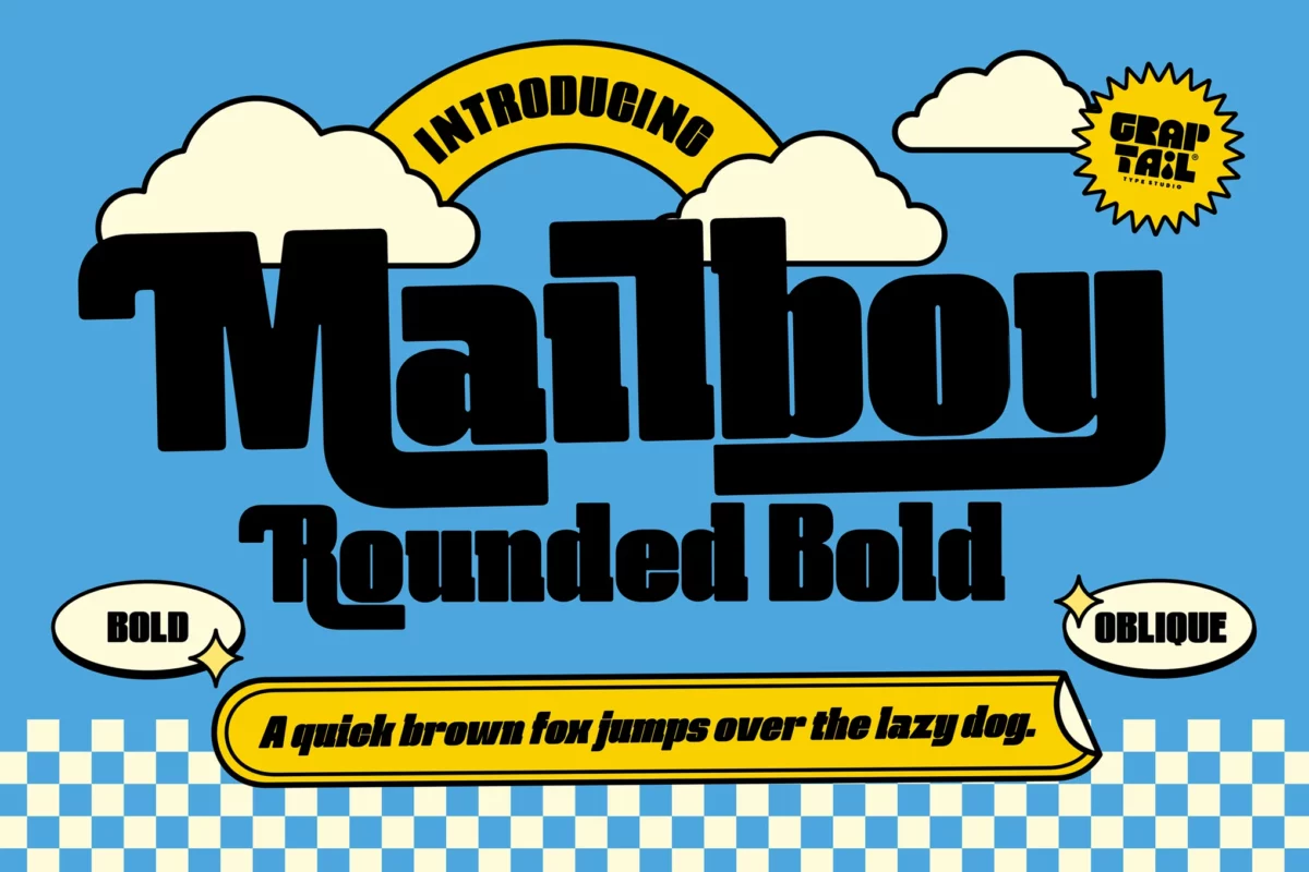
37. Big Chunky Titles
When subtle just won’t cut it, designers are going big. Really big.
We’re talking about headlines that take up most of your screen. Letters so thick they’re practically 3D.
It’s not about being loud – it’s about being impossible to ignore.
38. Fullscreen Text
Why use a small headline when you can use your entire screen?
Fullscreen typography turns words into landscapes. Every letter becomes part of the experience.
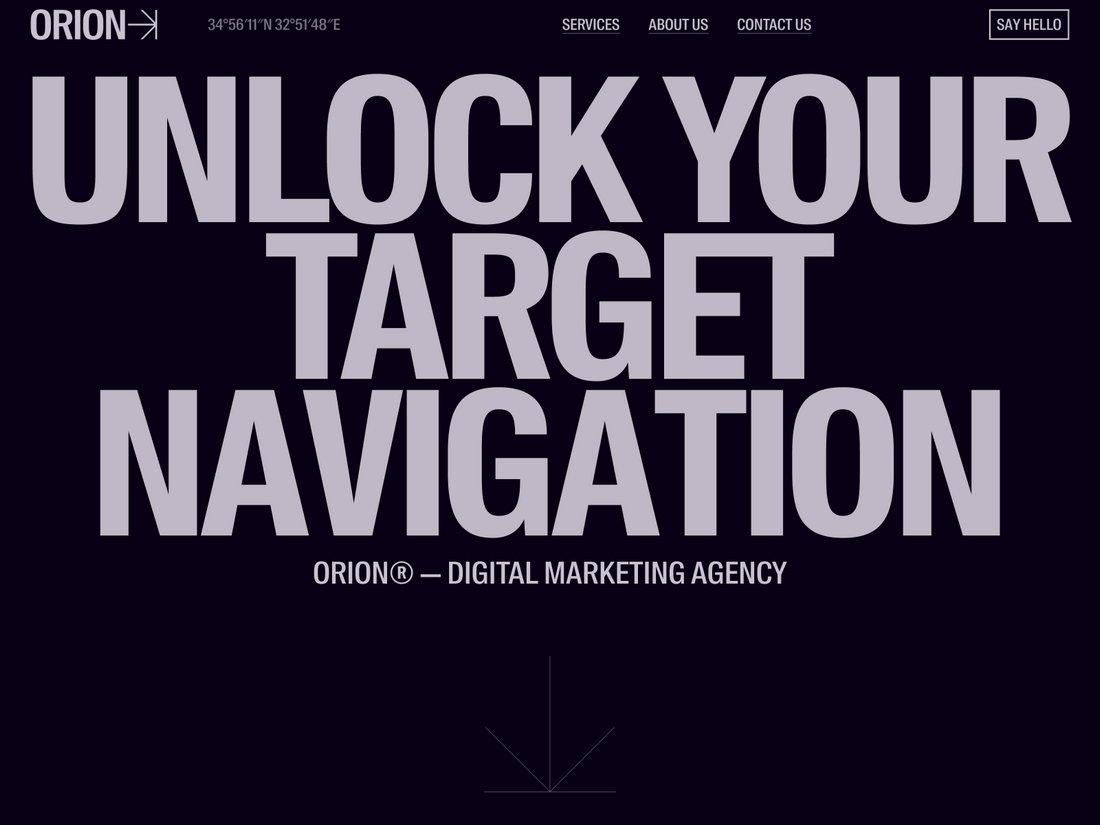
It’s bold. It’s dramatic. And when done right, it’s unforgettable.
39. Strong Character Fonts
These aren’t your friendly neighborhood fonts.
Strong character fonts have personality. Attitude. Maybe even a bit of an edge.
They’re not trying to please everyone – and that’s exactly why they work.
40. Statement Pieces
Some typography isn’t meant to be part of the background.
Statement pieces turn words into art. They break rules, mix styles, and generally refuse to be ignored.
They’re conversation starters in font form.
But here’s the thing about making statements with typography: timing is everything.
Use these trends when you really have something to say. When your message deserves that kind of attention.
Because when you go big, you better make it count.
What Does All This Mean For You?
Feeling overwhelmed by all these trends? Don’t be.
Here’s the thing about typography trends: they’re not meant to be a checklist.
They’re more like a buffet – take what works for you, leave what doesn’t.
The key is understanding your brand’s personality.
Maybe those chunky statement fonts are perfect for your energetic startup. Or maybe your luxury brand needs those elegant serif revivals.
The best typography choices aren’t just trendy – they’re strategic.
How to Use These Trends
Start small. Pick one trend that resonates with your brand.
Test it out on a single project. See how your audience responds.
Remember: trends come and go, but good design is timeless.
Focus on what works for your brand, not what everyone else is doing.
What’s Next?
Typography will keep evolving. New trends will emerge. Others will fade away.
But one thing won’t change: the power of typography to tell your brand’s story.
So get out there. Experiment. Have fun with it.
And if you need help choosing the right typography trend for your brand? Drop a comment below. I’d love to hear what you’re working on.

