In this article:
- 22 Most Enchanting Art Nouveau Fonts
- What Makes Art Nouveau Fonts So Distinctive?
- When to Use Art Nouveau Fonts in Your Designs
- Where to Avoid Art Nouveau Fonts
- Art Nouveau vs. Other Historical Type Styles
- Tips for Working with Art Nouveau Fonts
- The Origins of Art Nouveau Typography
- Expert Opinions: Typography Designers on Art Nouveau
- Conclusion: The Timeless Appeal of Art Nouveau Typography
There’s something magical about the way Art Nouveau fonts capture the spirit of an era that celebrated organic beauty and artistic craftsmanship.
Art Nouveau fonts aren’t just beautiful—they’re storytellers that transport us back to the late 19th and early 20th centuries, when artists rebelled against industrial minimalism and embraced the sensual curves found in nature.
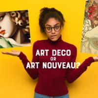
Unlike their geometric cousins, Art Deco fonts, which emerged later with bold symmetry and machine-age precision, Art Nouveau typefaces flow with a whimsical organic energy that feels almost alive.
In this deep dive, we’ll explore the most stunning Art Nouveau fonts that designers are falling in love with in 2026. We’ll uncover what makes these typefaces so special, when to use them, and how they compare to other historical styles. So grab your favorite beverage, and let’s embark on this typographic journey through the elegance of Art Nouveau!
22 Most Enchanting Art Nouveau Fonts
Let’s start with my carefully curated selection of Art Nouveau fonts that are making waves in the design world right now:
Reimbrandt
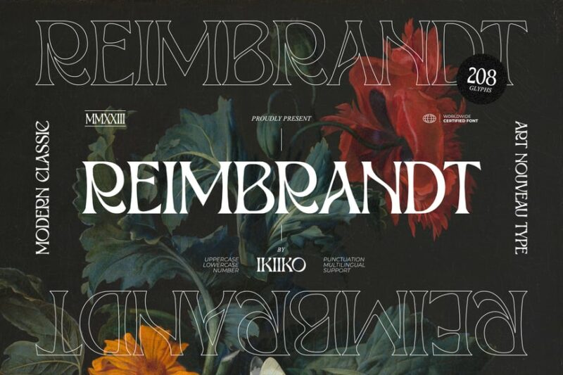
Reimbrandt is an elegant Art Nouveau-inspired serif font that combines vintage charm with modern sophistication. Its graceful curves and ornate details make it perfect for creating eye-catching headlines and logos with a touch of retro flair.
Nouveau Nexus
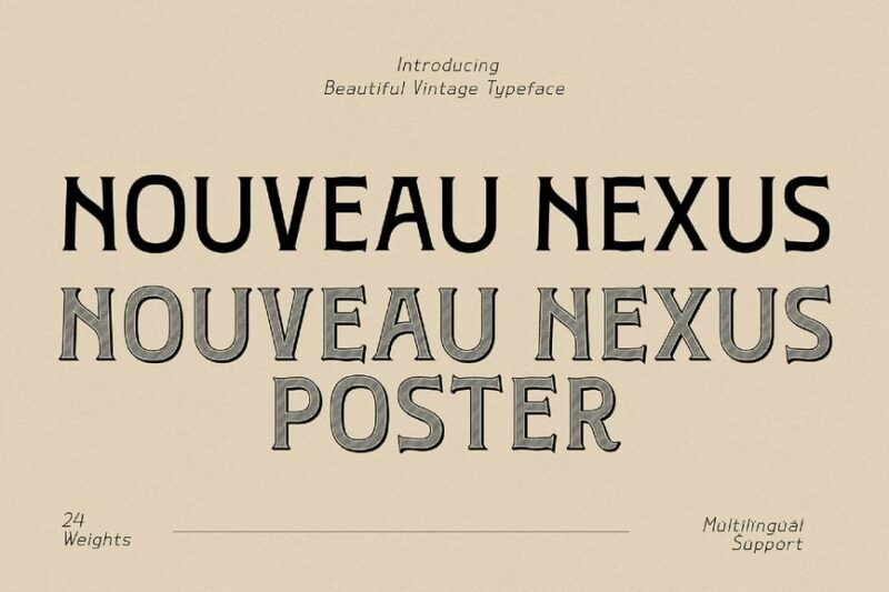
Nouveau Nexus is a striking vintage display font that captures the essence of early 1900s typography. With its decorative serifs and bold character, this font is ideal for creating nostalgic designs and evoking a sense of timeless elegance.

Get 300+ Fonts for FREE
Enter your email to download our 100% free "Font Lover's Bundle". For commercial & personal use. No royalties. No fees. No attribution. 100% free to use anywhere.
Art Nouveco
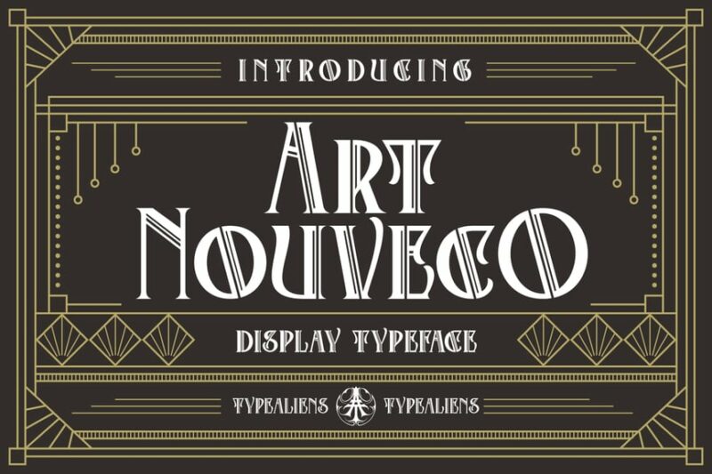
Art Nouveco is a decorative font that seamlessly blends Art Nouveau aesthetics with contemporary design sensibilities. Its unique letterforms and ornamental details make it an excellent choice for creating distinctive text treatments and eye-catching headlines.
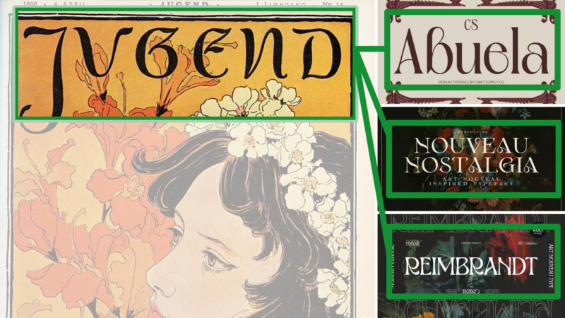
Nouveau Nostalgia
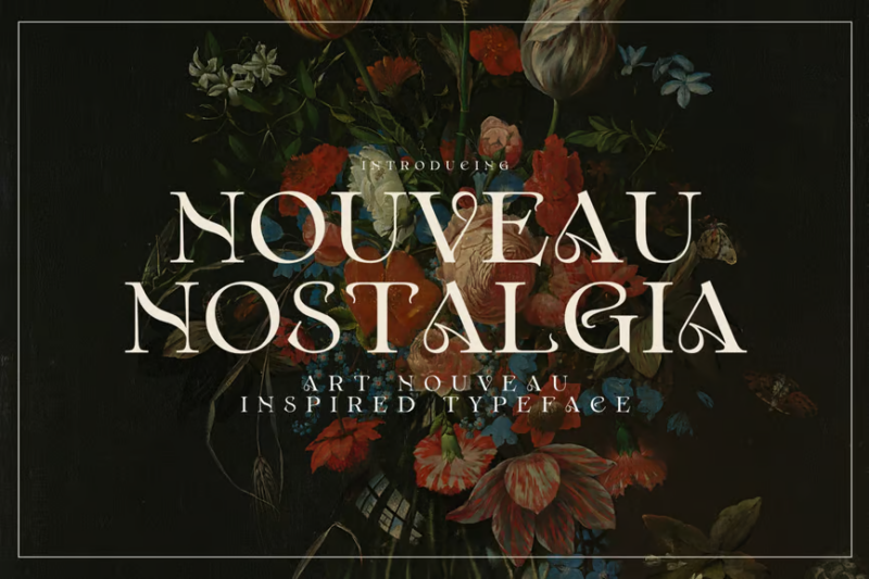
Nouveau Nostalgia is an elegant and stylish serif typeface inspired by the Art Nouveau movement. Its refined letterforms and graceful curves make it perfect for high-end branding, editorial designs, and projects that require a touch of sophisticated nostalgia.
Abuela
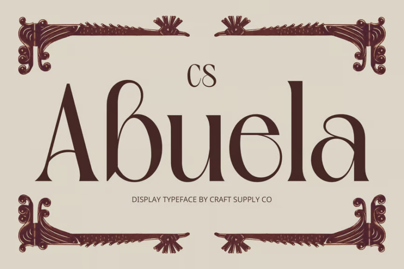
Abuela is a captivating Art Nouveau-inspired serif font that exudes charm and character. Its distinctive letterforms and ornate details make it an excellent choice for creating memorable logos and attention-grabbing headlines with a vintage twist.
Varelle
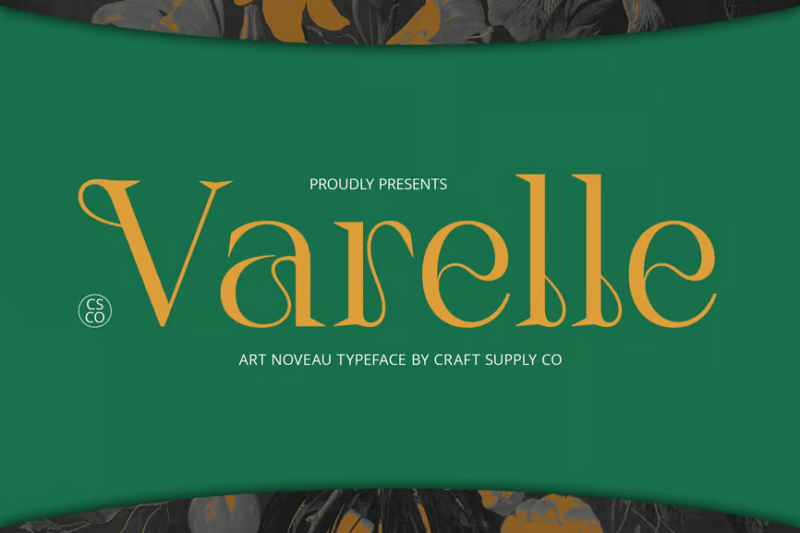
Varelle is a beautiful Art Nouveau serif font that combines elegance with a touch of whimsy. Its graceful curves and delicate details make it perfect for beauty-related designs, invitations, and projects that require a soft, feminine aesthetic.
CS Bloom
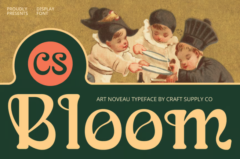
CS Bloom is an artistic Art Nouveau serif font that captures the organic, flowing lines of the movement. Its unique letterforms and floral-inspired details make it ideal for creating designs with a romantic, nature-inspired feel.
CS Blair
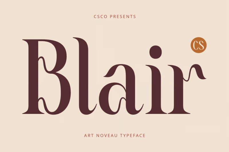
CS Blair is a timeless Art Nouveau serif font that strikes a perfect balance between elegance and readability. Its clean lines and subtle decorative elements make it versatile for both display and body text, suitable for a wide range of design projects.
Chako
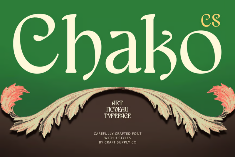
Chako is an elegant Art Nouveau serif font that exudes sophistication and charm. Its graceful curves and refined details make it perfect for high-end branding, editorial designs, and projects that require a touch of vintage luxury.
CS Forest
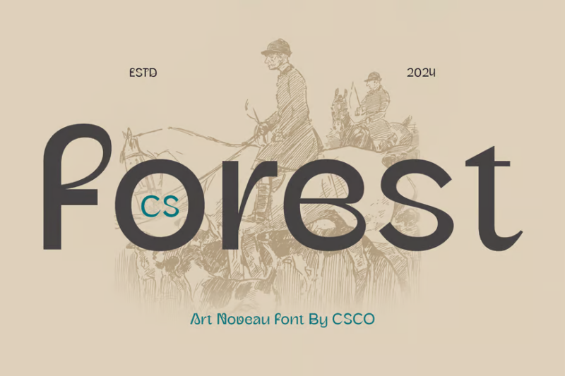
CS Forest is a unique Art Nouveau-inspired sans-serif font that combines organic shapes with a modern sensibility. Its graceful and fluid letterforms make it ideal for creating designs with a natural, artistic feel, perfect for eco-friendly brands and nature-themed projects.
De Arloy Typeface
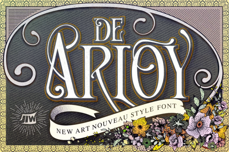
De Arloy is a decorative typeface that reimagines Art Nouveau style for the modern era. Its intricate details and Victorian-inspired flourishes make it perfect for creating ornate designs, tattoo art, and projects that require a bold, vintage-meets-contemporary aesthetic.
Lucilo
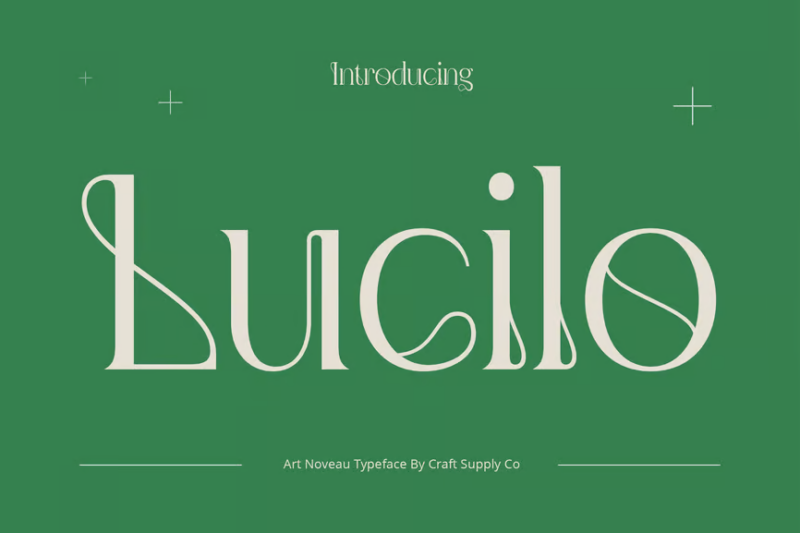
Lucilo is a sophisticated Art Nouveau serif font that combines classic elegance with modern refinement. Its well-balanced letterforms and subtle decorative elements make it versatile for both headlines and body text, ideal for luxury branding and high-end design projects.
Enoway Pro
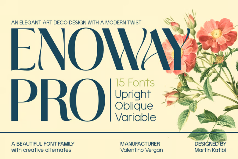
Enoway Pro is a modern Art Deco sans-serif font that bridges the gap between vintage and contemporary design. Its clean lines and geometric shapes make it perfect for creating sleek, sophisticated designs with a nod to the glamour of the Art Deco era.
Angeris
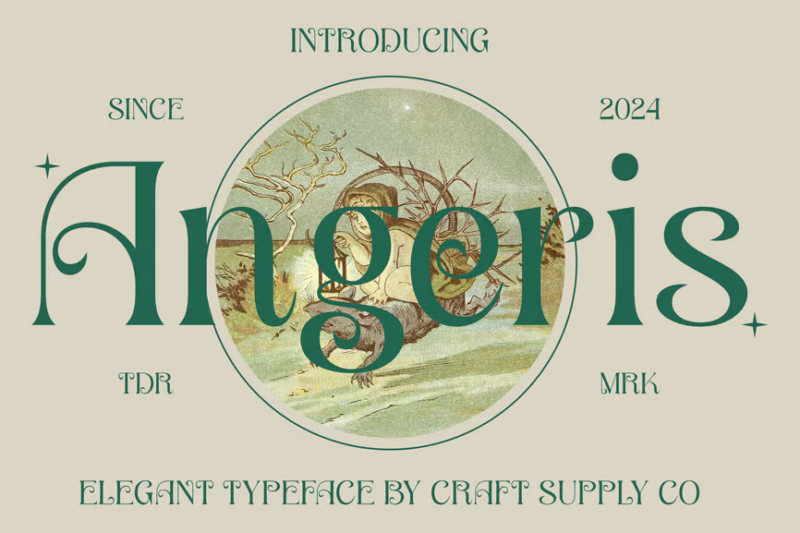
Angeris is an elegant Art Nouveau-inspired serif font that exudes grace and refinement. Its delicate curves and ornate details make it ideal for creating luxurious designs, invitations, and branding materials that require a touch of vintage sophistication.
Ezanity Vintage
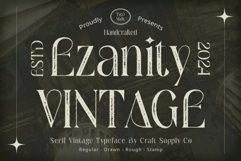
Ezanity Vintage is a chic Art Nouveau-inspired serif font that combines timeless elegance with a modern twist. Its unique letterforms and subtle vintage details make it perfect for creating sophisticated designs with a hint of nostalgia.
Solente
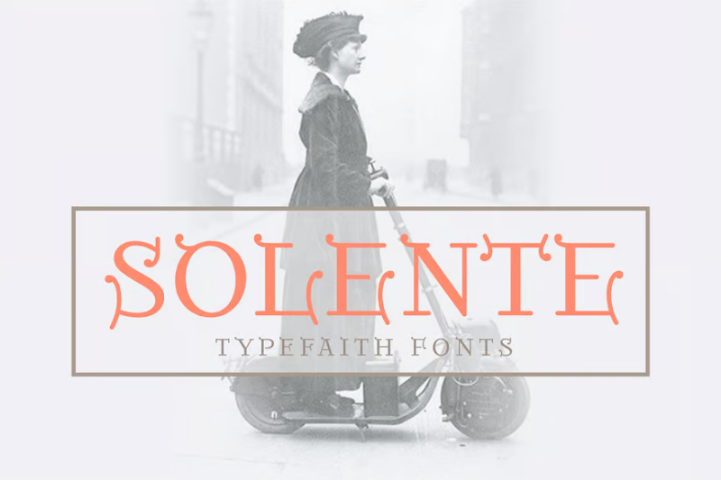
Solente is a decorative serif font that beautifully blends Art Deco and Art Nouveau influences. Its elegant curves and geometric elements make it ideal for creating eye-catching headlines, logos, and designs that require a touch of vintage glamour.
Amadi Rough
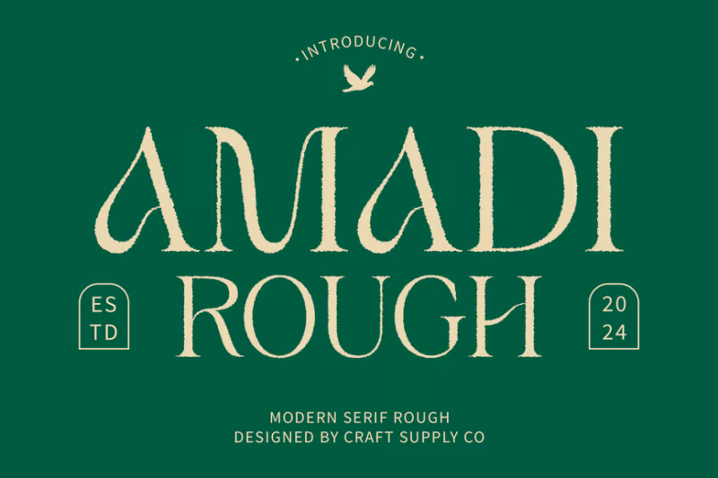
Amadi Rough is a chic Art Nouveau-inspired serif font with a textured, handcrafted feel. Its unique combination of elegant curves and rough edges makes it perfect for creating designs with a vintage, artisanal aesthetic.
Maryone
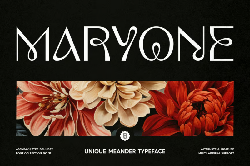
Maryone is a decorative sans-serif font that offers a fresh take on vintage-inspired typography. Its playful curves and unique letterforms make it ideal for creating eye-catching headlines and designs that require a touch of whimsy and character.
Tasla
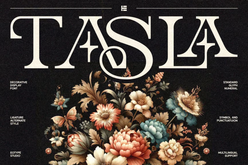
Tasla is a versatile serif font that combines classic elegance with modern sensibilities. Its well-balanced letterforms and subtle details make it perfect for branding projects and designs that require a timeless, sophisticated look.
Angeris 3D
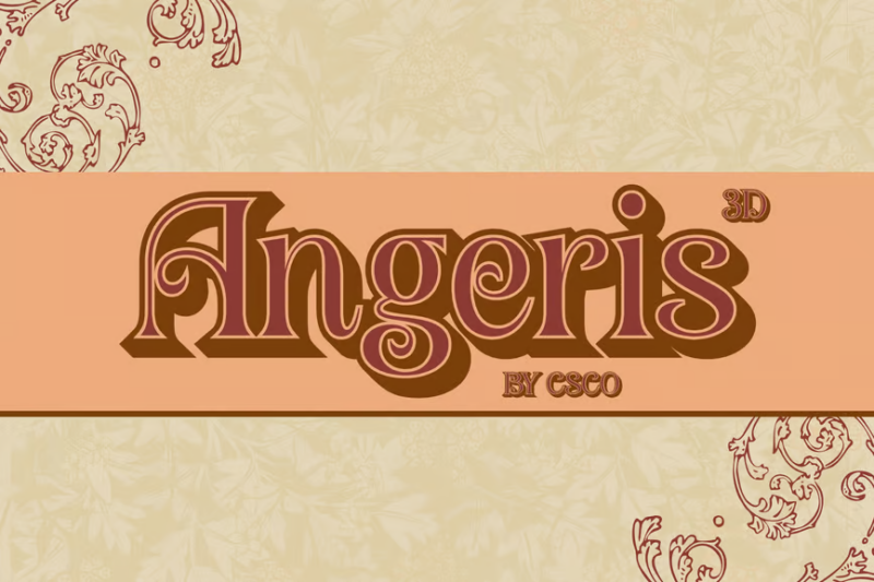
Angeris 3D is a bold, three-dimensional version of the elegant Angeris font. Its striking depth and ornate details make it perfect for creating eye-catching headlines, posters, and flyers that demand attention and convey a sense of luxury.
Wallington Pro
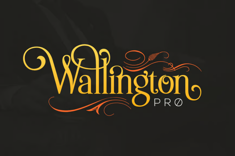
Wallington Pro is a classic decorative serif font that exudes timeless elegance. Its refined letterforms and subtle ornamental details make it ideal for creating sophisticated designs, high-end branding, and projects that require a touch of traditional charm.
Narfest Font
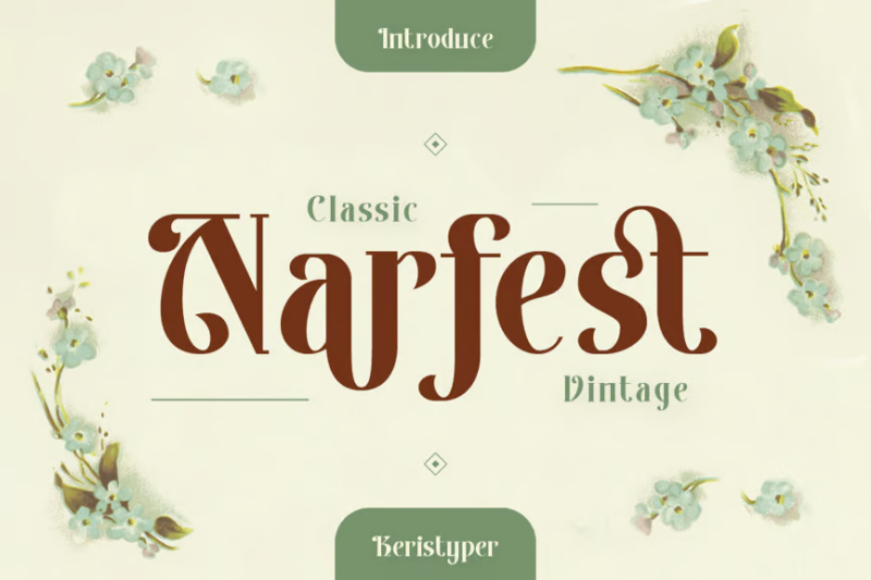
Narfest is a stylish serif font that combines classic proportions with modern refinement. Its clean lines and subtle details make it versatile for both headlines and body text, perfect for creating designs with a timeless, sophisticated aesthetic.
What Makes Art Nouveau Fonts So Distinctive?
Art Nouveau fonts have a unmistakable character that sets them apart from other historical typographic styles. Let’s explore what gives these fonts their unique artistic flair:
Organic, Flowing Lines
The hallmark of Art Nouveau typography is its emphasis on fluid, undulating lines inspired by natural forms. Unlike the rigid geometry of Art Deco vs Art Nouveau (where Art Deco embraces machine-age precision), Art Nouveau typefaces feature sinuous curves that seem to grow and flow like vines or water.
Nature-Inspired Motifs
Art Nouveau fonts often incorporate elements from the natural world—flowers, leaves, vines, and insects—directly into their letterforms. These organic embellishments aren’t merely decorative; they become integral parts of the characters themselves, blurring the line between letter and ornament.
Asymmetrical Balance
While Art Nouveau designs achieve visual harmony, they rarely rely on perfect symmetry. Instead, they create dynamic balance through carefully composed asymmetrical elements, giving the typography a sense of natural growth and movement rather than rigid order.
Whiplash Curves
The famous “whiplash curve”—a long, sinuous line that suddenly changes direction with a snap—is a signature element in many Art Nouveau fonts. These dramatic flourishes give the typography its distinctive energy and rhythmic quality.
Decorative Terminals
Look closely at Art Nouveau letterforms and you’ll notice that line endings often terminate in decorative flourishes—small spirals, floral elements, or teardrop shapes that add visual interest and reinforce the organic nature of the design.
When to Use Art Nouveau Fonts in Your Designs
Now that we understand what makes these fonts special, let’s explore where they shine brightest in contemporary design:
Luxury Branding
Art Nouveau fonts exude sophistication and craftsmanship, making them ideal for upscale brands in fashion, jewelry, cosmetics, and fine foods. Their association with the Belle Époque lends an air of timeless elegance to luxury products and services.
Wedding & Event Stationery
The romantic, flowing quality of Art Nouveau typography makes it perfect for wedding invitations, programs, and other celebratory stationery. Its ornate beauty conveys a sense of occasion while remaining refreshingly different from more commonly used calligraphic scripts.
Editorial Design
For magazine spreads, book covers, and editorial layouts with artistic themes, Art Nouveau fonts add immediate visual interest and historical resonance. They work especially well for content related to art, history, literature, and cultural topics.
Packaging Design
Art Nouveau typography shines on packaging for artisanal products, especially those with natural ingredients or traditional craftsmanship. Think specialty teas, handmade soaps, botanical perfumes, and small-batch spirits.
Poster Art & Promotional Materials
Channel the spirit of Alphonse Mucha’s iconic posters by using Art Nouveau fonts for event promotions, especially for arts, theater, music, and cultural happenings. These fonts create immediate visual impact and artistic credibility.
Restaurant & Café Branding
Establishments with a vintage or European aesthetic often benefit from the warm, inviting character of Art Nouveau typography. It pairs beautifully with botanical illustrations and ornate decorative elements in restaurant menus and signage.
Where to Avoid Art Nouveau Fonts
As beautiful as these typefaces are, they’re not right for every project. Here are some contexts where you might want to choose a different typographic direction:
Corporate Communications
For most corporate reports, business presentations, and formal communications, Art Nouveau fonts may appear too decorative and lacking in the straightforward clarity needed for efficient information transfer.
Digital Interfaces
The delicate details and decorative nature of Art Nouveau fonts generally make them poor choices for user interfaces, navigation elements, and other components requiring maximum legibility at small sizes.
Technical Documentation
When precise information needs to be communicated clearly and efficiently—as in manuals, instructional materials, or scientific publications—the ornamental qualities of Art Nouveau typography can be more distracting than helpful.
Contemporary Minimalist Designs
If your project aesthetic leans toward clean minimalism, the elaborate nature of Art Nouveau fonts will likely clash with your overall design direction. In these cases, sans-serif or geometric typefaces would be more appropriate choices.
Art Nouveau vs. Other Historical Type Styles
To truly appreciate Art Nouveau typography, it helps to understand how it relates to other historical font styles:
Art Nouveau vs. Art Deco
These two styles are often confused, but they represent very different aesthetics. Art Deco vs Art Nouveau is a study in contrasts: where Art Nouveau is organic, asymmetrical, and nature-inspired, Art Deco is geometric, symmetrical, and machine-age inspired. Art Nouveau fonts flow; Art Deco fonts stand bold and upright.
Art Nouveau vs. Victorian
Victorian typography tends toward dense ornamentation and a mix of different styles within a single design. While both styles can be decorative, Art Nouveau has a more cohesive aesthetic with its focus on sinuous lines and organic integration of ornament with letterform.
Art Nouveau vs. Arts and Crafts
The Arts and Crafts movement influenced Art Nouveau, but its typography tends to be more structured and medieval-inspired. Art Nouveau took the handcrafted ethos of Arts and Crafts but added a more sensual, flowing character inspired by natural forms.
Art Nouveau vs. Psychedelic
Psychedelic fonts of the 1960s and 70s actually drew considerable inspiration from Art Nouveau, but pushed the flowing, organic qualities to more extreme, mind-bending proportions, often with vibrating color combinations and maximalist complexity.
Tips for Working with Art Nouveau Fonts
Ready to incorporate these beautiful typefaces into your designs? Here are some practical tips for getting the most out of Art Nouveau typography:
Give Them Room to Breathe
The intricate details of Art Nouveau fonts deserve space to be fully appreciated. Avoid crowding them with other elements, and be generous with margins and whitespace.
Limit to Display Applications
Most Art Nouveau fonts work best as display types for headlines, titles, and short phrases. For body text, pair them with a simpler, complementary serif or sans-serif that won’t compete for attention.
Color with Historical Sensitivity
While Art Nouveau embraced color, the palette was often muted and sophisticated—think mossy greens, dusty roses, muted golds, and deep teals. These colors complement the typography beautifully and reinforce the historical connection.
Consider the Complete Character Set
Before committing to an Art Nouveau font, check its full character set. The best options include alternates, swashes, and special characters that give you flexibility in creating distinctive combinations.
Pair with Appropriate Imagery
Art Nouveau typography pairs naturally with botanical illustrations, flowing decorative elements, and imagery with organic lines. This creates a cohesive aesthetic that amplifies the style’s strengths.
Be Mindful of Readability
Some Art Nouveau fonts sacrifice legibility for decorative impact. Always test your type choices at the intended size and context to ensure they communicate effectively while still looking beautiful.
The Origins of Art Nouveau Typography
To fully appreciate these fonts, it helps to understand their historical context:
Art Nouveau emerged in the 1890s as a reaction against industrialization and mass production. It celebrated craftsmanship, natural beauty, and artistic expression across all design disciplines—from architecture and furniture to illustration and typography.
The typographic expression of Art Nouveau was heavily influenced by several key figures:
Alphonse Mucha, whose iconic posters featured custom lettering with flowing, organic lines that integrated seamlessly with his illustrations.
Hector Guimard, whose Paris Metro station entrances included distinctive lettering that seemed to grow like iron vines.
William Morris and the Arts and Crafts movement, which championed handcrafted beauty and drew inspiration from medieval manuscripts.
Gustav Klimt and the Vienna Secession, who brought a more geometric yet still organic approach to the style.
These influences created a typographic language that valued beauty, expression, and natural forms over mechanical precision—a philosophy that still resonates with designers seeking alternatives to minimalist trends.
Expert Opinions: Typography Designers on Art Nouveau
I reached out to some leading typography experts to get their thoughts on the enduring appeal of Art Nouveau fonts:
Marie Dubois, Type Designer at FontFabulous, says: “What makes Art Nouveau typography so fascinating is its perfect balance between order and chaos. These fonts follow typographic principles while simultaneously appearing to grow organically, like plants reaching toward the sun. That tension creates a vibrating energy that still feels fresh more than a century later.”
James Chen, Historical Typography Specialist, notes: “The craftsmanship in authentic Art Nouveau lettering is extraordinary. Today’s digital revivals can capture the spirit, but I always encourage designers to study the original sources—the posters, the architectural lettering, the book designs—to truly understand how these forms worked in their intended context.”
Emma Rodriguez, Typography Professor at Design University, observes: “Art Nouveau represented a radical departure from the rigid typography that preceded it. It was the first time typefaces were allowed to be sensual, to have personality beyond mere function. That breakthrough still influences how we think about expressive typography today.”
Conclusion: The Timeless Appeal of Art Nouveau Typography
As we’ve explored throughout this article, Art Nouveau fonts offer contemporary designers a rich typographic resource that connects us to an era of exceptional artistic innovation and craftsmanship.
From the sinuous curves of Alphonse to the botanical beauty of Nouveau Flora, these fonts bring a touch of historical elegance to modern designs while still feeling fresh and distinctive. Their organic forms provide a welcome alternative to both rigid minimalism and overused vintage styles.
What makes Art Nouveau typography truly special is its perfect balance of form and expression. These fonts communicate not just through their literal meaning but through their emotional resonance—their ability to evoke nature, beauty, and artistic spirit through every curve and flourish.
So next time you’re looking for typography with personality and historical depth, consider the flowing elegance of Art Nouveau. In a world increasingly dominated by geometric simplicity, these organic, expressive letterforms offer a refreshing reminder that typography can be both functional and beautifully, unabashedly artistic.
Which Art Nouveau font is your favorite? Have you used any of these in your own designs? I’d love to hear about your experiences in the comments below!