In this article:
- The Most Enchanting Fantasy Fonts of 2026
- What Makes a Font Feel Truly "Fantasy"?
- Different Sub-Genres of Fantasy Typography
- Where to Use Fantasy Fonts
- When to Avoid Fantasy Fonts
- How to Pair Fantasy Fonts Effectively
- Fantastic Alternatives to Fantasy Fonts
- Common Fantasy Font Questions
- Crafting Your Own Magical Typography
As designers, we’re constantly seeking fonts that can instantly transport viewers into different worlds. And when it comes to fantasy designs, the right typeface can make all the difference between a mundane project and one that truly feels magical.
Fantasy fonts are characterized by their otherworldly qualities – whether that’s through medieval-inspired flourishes, runic elements, or mystical details that evoke worlds of magic and adventure. These fonts have the power to instantly set the tone for fantasy novels, game logos, movie titles, and more.
The Most Enchanting Fantasy Fonts of 2026
After countless hours exploring the vast realms of fantasy typography, I’ve compiled what I believe are the most spellbinding fantasy fonts currently available. Each brings its own magical qualities to the table:
Fantasy Magist
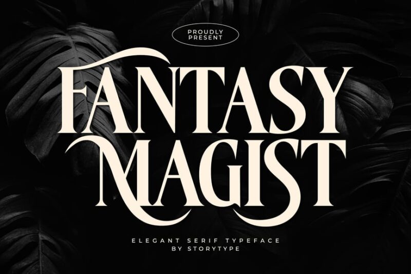
A sophisticated elegant serif typeface that balances fantasy elements with refined craftsmanship. Perfect for high-end branding projects that require a touch of whimsy while maintaining professionalism and readability.
Aquary
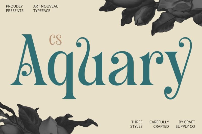
A distinctive serif font featuring Art Nouveau influences with flowing, whimsical letterforms. Ideal for projects requiring a dreamy, ethereal quality while still maintaining the structure and formality of a serif typeface.
Redina
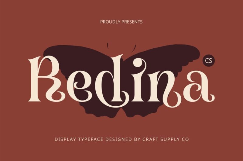
A chic fantasy serif that combines ornate details with modern sensibilities. Its balanced proportions and subtle flourishes make it perfect for fashion-forward branding and editorial designs that need to convey sophistication with a hint of fantasy.
Romancial
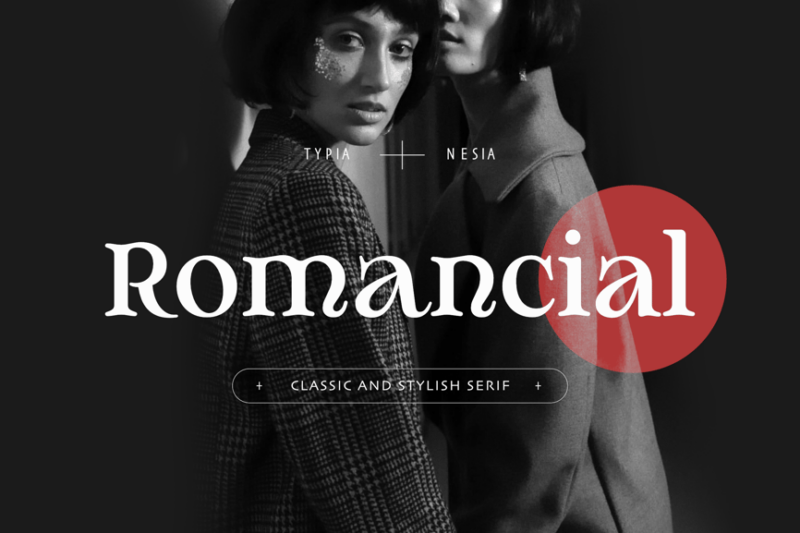
A romantic classic fantasy serif that evokes nostalgia while remaining elegantly legible. This typeface strikes a beautiful balance between ornate detailing and practical application, making it ideal for wedding stationery, period-inspired designs, and romantic branding.

Get 300+ Fonts for FREE
Enter your email to download our 100% free "Font Lover's Bundle". For commercial & personal use. No royalties. No fees. No attribution. 100% free to use anywhere.
Guest Lunch
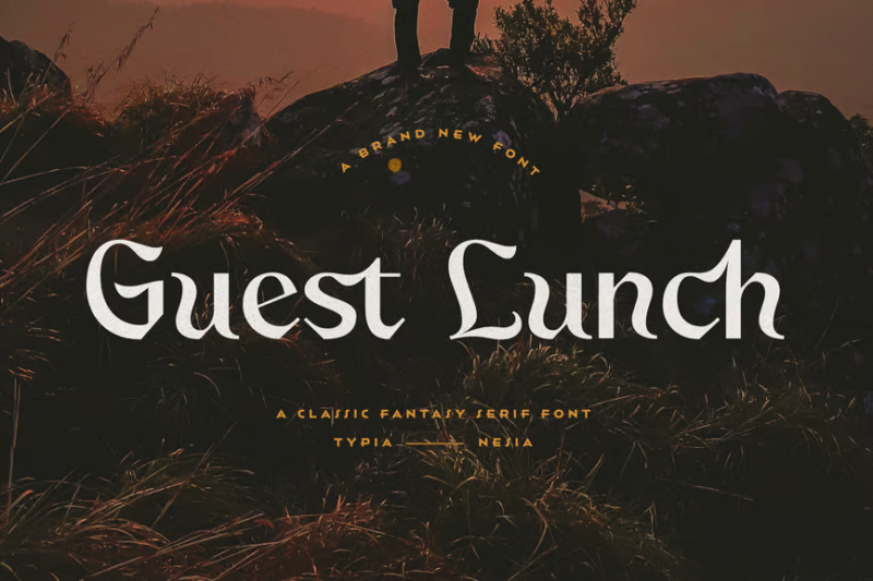
A vintage classic fantasy serif that captures the charm of bygone eras with a magical twist. Its carefully crafted letterforms combine nostalgic elements with fantasy-inspired details, perfect for creating designs with historical charm and whimsical appeal.
Pirates Blue
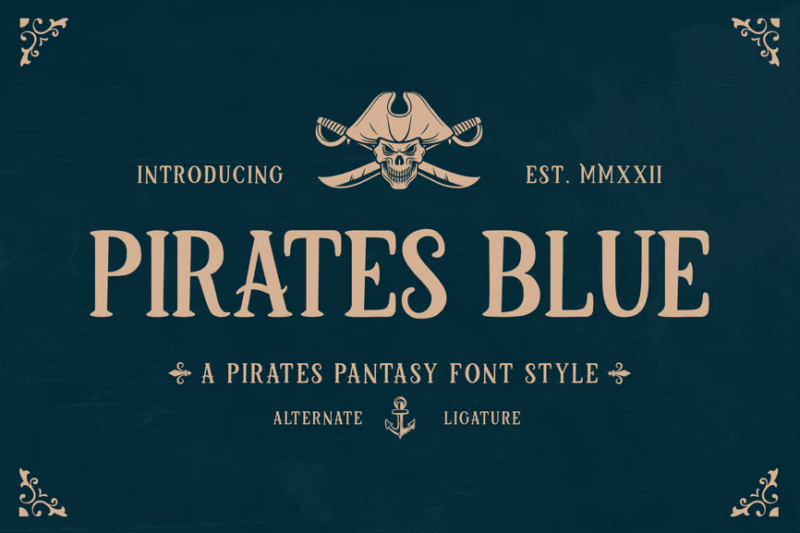
A bold decorative pirate font that captures the adventurous spirit of pirate lore with distinctive nautical characteristics. Excellent for creating immersive brand identities for adventure-themed projects, games, or establishments wanting to convey a sense of exploration and daring.
Wonder Magic
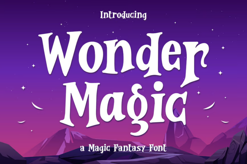
A playful, fancy decorative font that radiates joyful magical energy through its unique letterforms. The whimsical character shapes and joyful aesthetic make it perfect for children’s products, fantasy-themed events, and designs aimed at creating a sense of wonder and delight.
Pirate Hunter
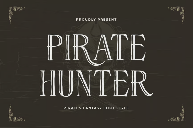
A rugged decorative font that embodies the gritty adventure of pirate ships and high-seas pursuits. Its weathered, action-oriented character set is ideal for creating authentic maritime-themed designs, adventure game titles, or immersive themed experiences.
Gorck Helozat
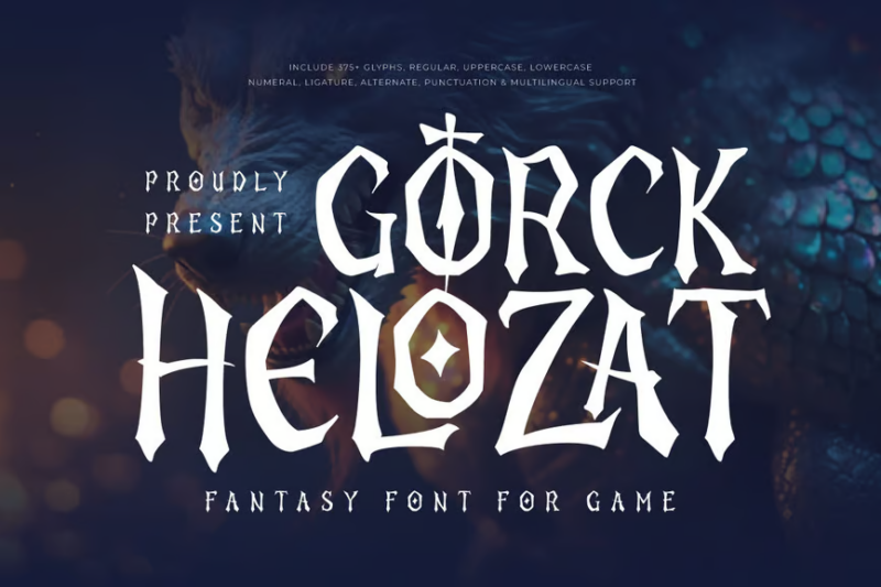
A bold display fantasy serif designed specifically for gaming applications and eye-catching posters. Its powerful presence and distinctive character shapes command attention while maintaining readability at various sizes, making it excellent for titles and headlines in fantasy-themed media.
Fantasy Emilia

A flowing handwritten script that infuses fantasy elements with the personal touch of calligraphy. This versatile font bridges the gap between formal branding requirements and organic handwritten charm, making it perfect for projects that need to feel both magical and authentically personal.
Mowgle
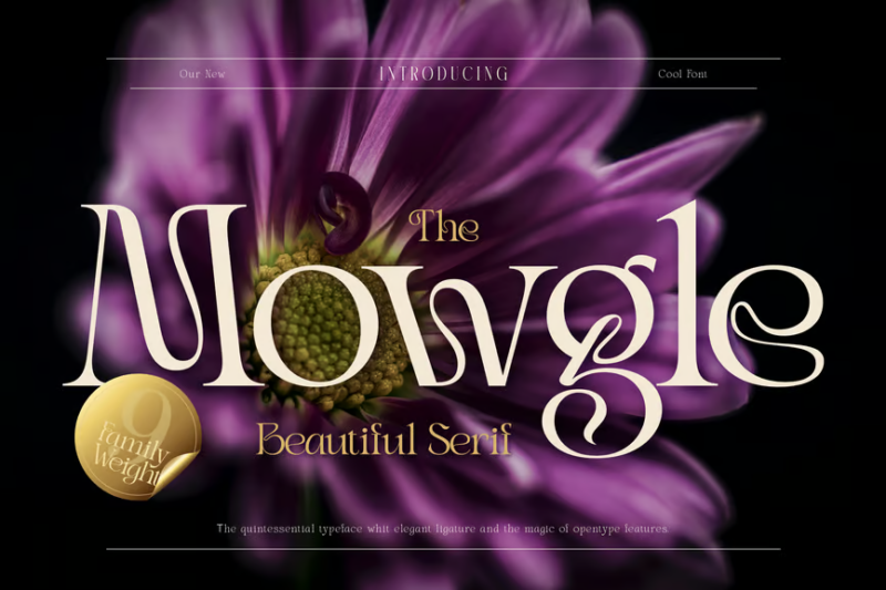
An elegant serif font that combines classic proportions with subtle contemporary touches. Its refined character set offers excellent readability while providing just enough distinctive flair to make designs stand out, perfect for sophisticated branding projects requiring timeless appeal.
The Crow
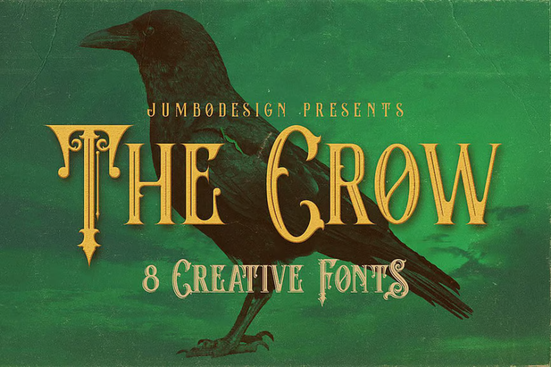
A versatile vintage-style font that works across multiple categories including serif, decorative, and symbolic elements. Its distinctive headline qualities and display characteristics make it ideal for creating atmospheric designs with a touch of gothic nostalgia and mysterious appeal.
Whimsy
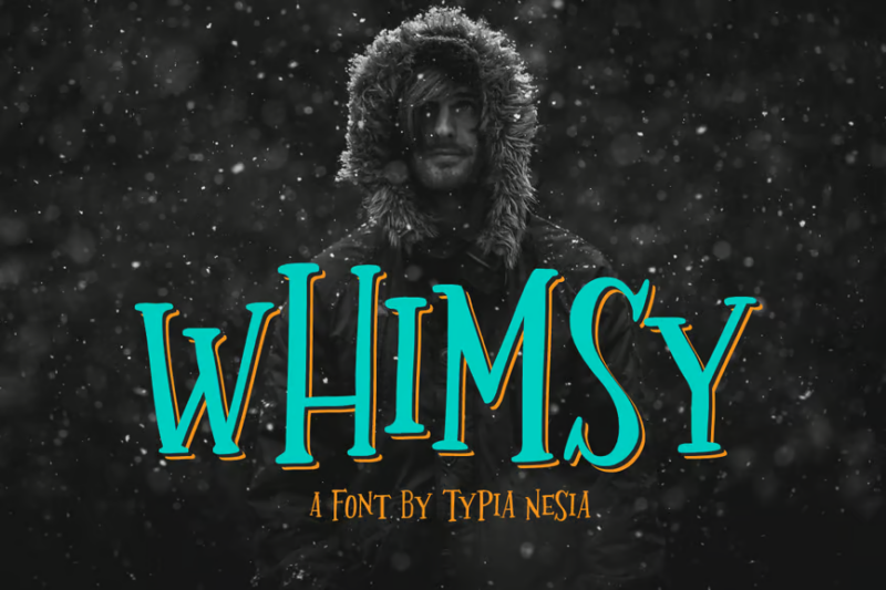
A playful multi-category font that seamlessly blends serif, decorative, and handwritten script elements. Its fantasy-inspired character set creates a sense of childlike wonder while maintaining enough structure to be versatile across various design applications.
Solaire Rough
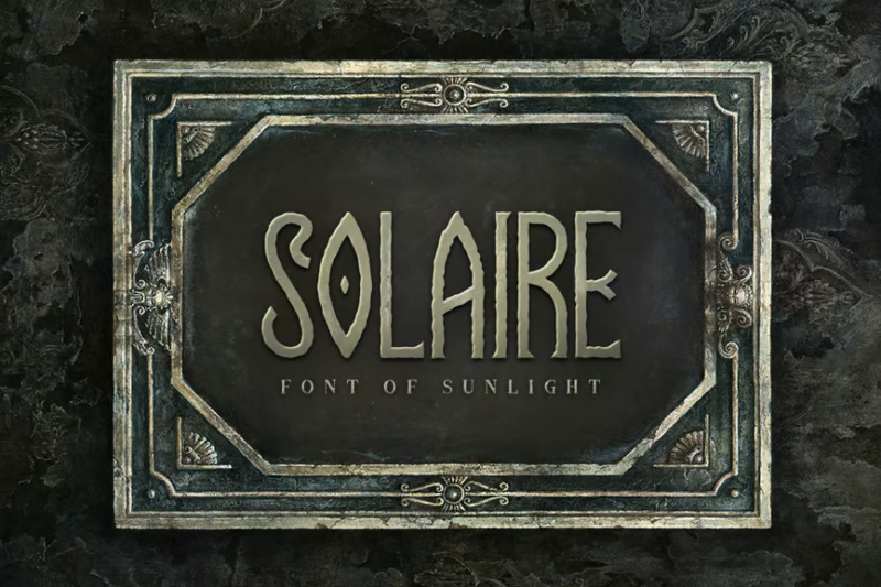
A textured decorative font with fantasy-inspired details and deliberately rough edges that add character and depth. Perfect for creating designs that require an authentic, handcrafted feel while still maintaining the otherworldly qualities needed for fantasy-themed projects.
Magic Curls
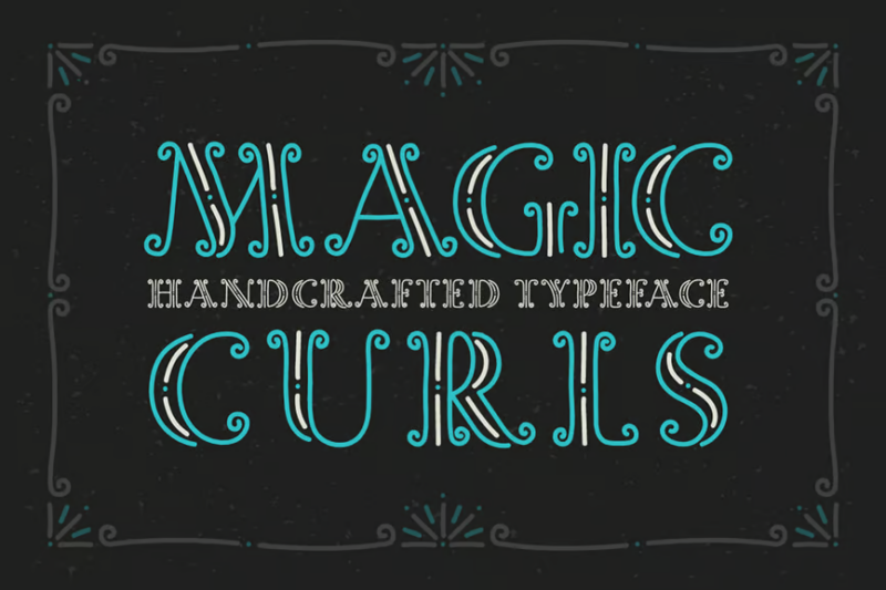
A whimsical decorative typeface featuring fairy-like curls and ornate flourishes throughout its character set. The delicate, flowing forms create an enchanted atmosphere, making it ideal for magical-themed designs, children’s book covers, or fairy tale illustrations.
Mysteria
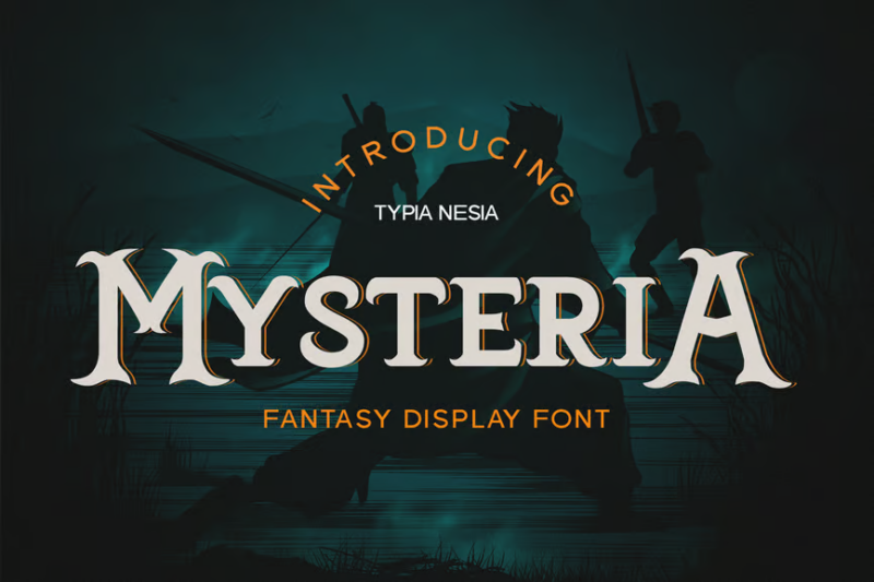
A powerful game-ready font that combines decorative and serif elements with a focus on display and musical applications. Its mysterious character shapes and balanced proportions work exceptionally well for fantasy game interfaces, album covers, and immersive media projects.
Zalora Typeface
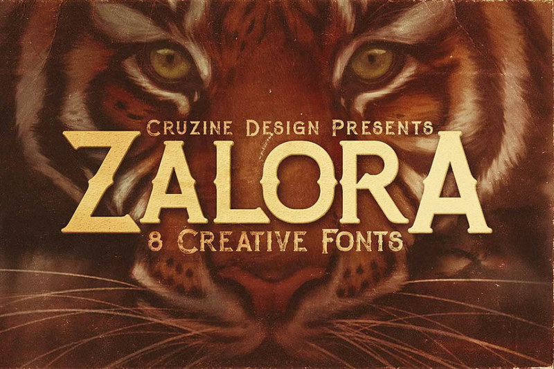
A distinctive serif and decorative hybrid font featuring sophisticated typography with subtle grunge textures. Its unique character set bridges elegance and edginess, making it perfect for contemporary branding projects that want to combine classical refinement with modern, slightly weathered aesthetics.
The Venture
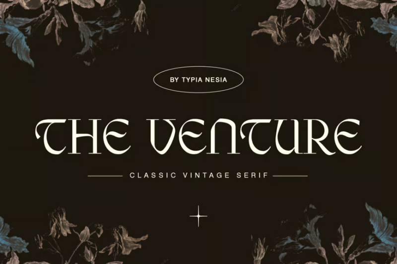
A luxurious vintage serif font that balances classic elegance with subtle fantasy elements. Its refined proportions and carefully crafted details make it perfect for high-end branding, editorial designs, and projects that require a sense of heritage with a touch of the fantastical.
Jupiter Retro
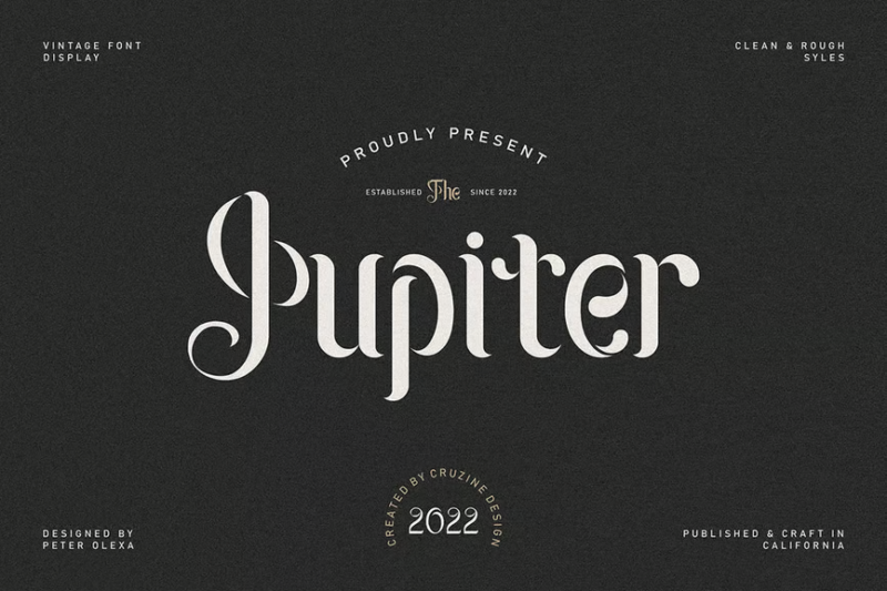
A distinctive sans-serif font family with decorative retro-futuristic elements that create a uniquely eye-catching aesthetic. This versatile type system offers multiple weights and styles while maintaining its signature retro charm, perfect for bold branding and statement typography.
Eleyn Avesa
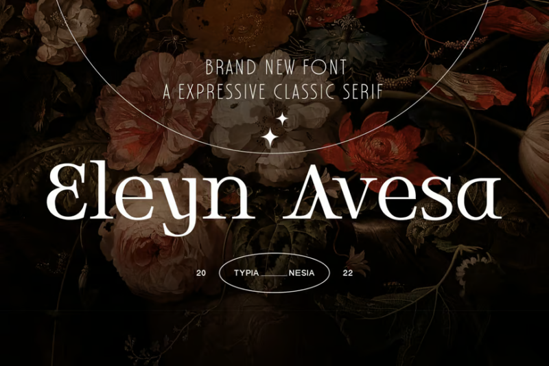
A classic elegant display serif characterized by its refined proportions and sophisticated detailing. The typeface combines traditional serif principles with contemporary display sensibilities, making it excellent for luxury branding, editorial headlines, and designs requiring timeless elegance.
Rebound
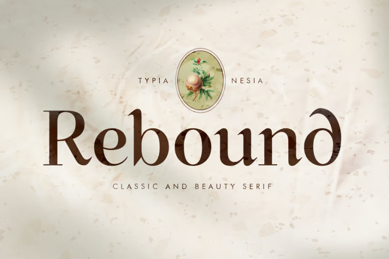
A classic beauty serif with vintage-inspired detailing that celebrates traditional typography with a contemporary twist. Its display-quality letterforms offer excellent versatility for headlines, logotypes, and editorial designs that aim to convey sophisticated nostalgia.
Arcane Fable
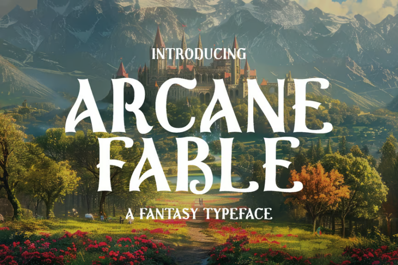
A richly detailed fantasy-inspired decorative typeface that evokes the feeling of enchanted storybooks and magical realms. Perfect for creating immersive branding for narrative-driven projects, fantasy gaming, or any design that needs to transport viewers to worlds of imagination and wonder.
Rosemary Vintage Serif
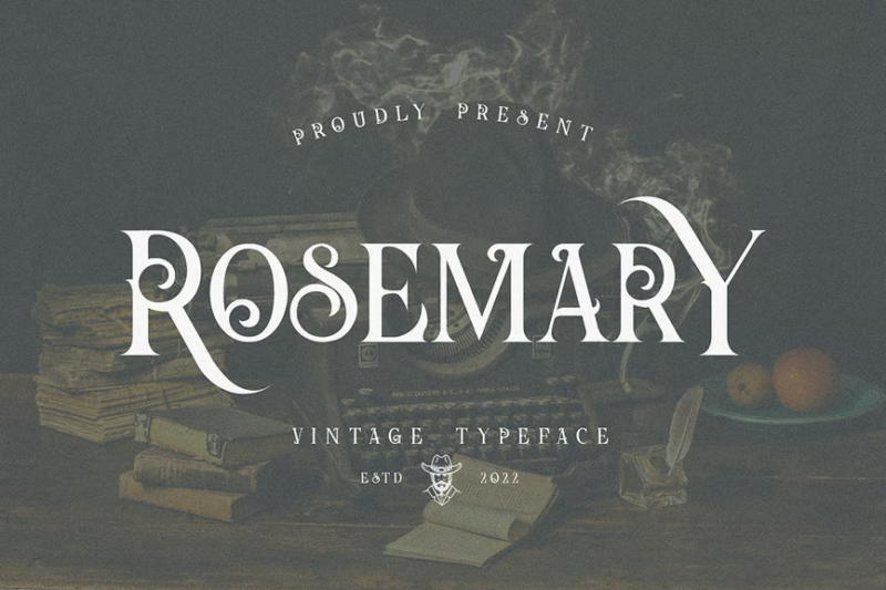
A charming vintage serif with decorative elements that balance traditional typography with distinctive character. Its refined letterforms offer excellent versatility while providing enough personality to create memorable typeface-driven designs with a nostalgic, slightly ornate quality.
Candelabra
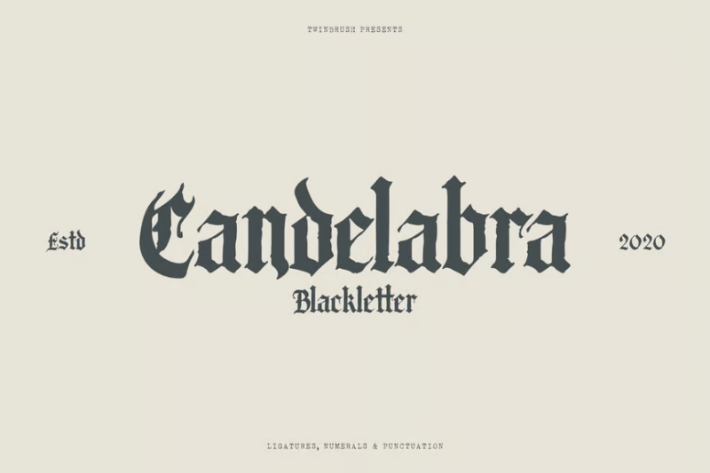
A dramatic blackletter-inspired font that combines decorative elements with handwritten script influences and medieval aesthetics. Its gothic character forms create a powerful historic atmosphere, perfect for creating designs with an authentic old-world feeling or dramatic statement typography.
Rosamone
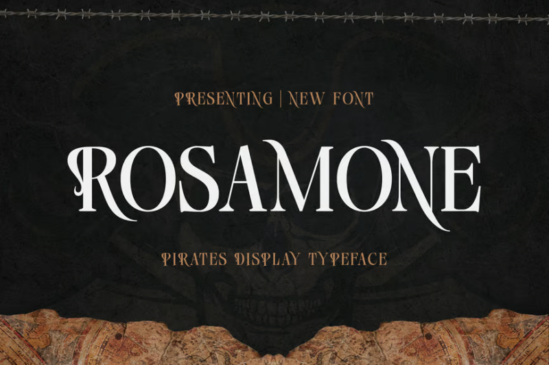
A bold pirates-themed display typeface that captures the adventurous spirit of maritime exploration through its distinctive decorative elements. Ideal for creating immersive brand experiences for themed entertainment, adventure products, or any design requiring swashbuckling character and bold presence.
Black Record
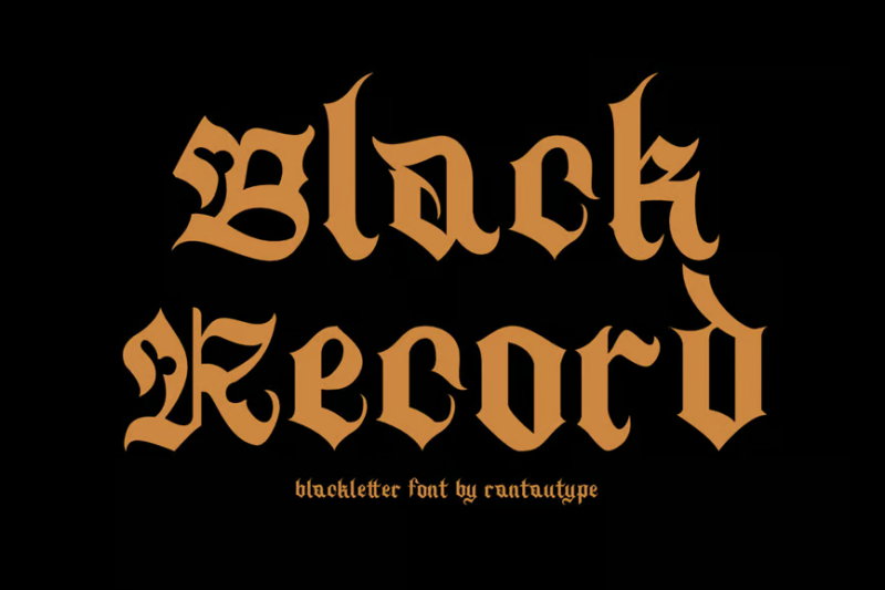
A stylish contemporary blackletter decorative font that modernizes gothic typography while maintaining its powerful impact. The balanced blend of traditional blackletter structure with updated proportions makes it versatile for modern applications requiring dramatic, dark aesthetics with improved readability.
Mystic Root
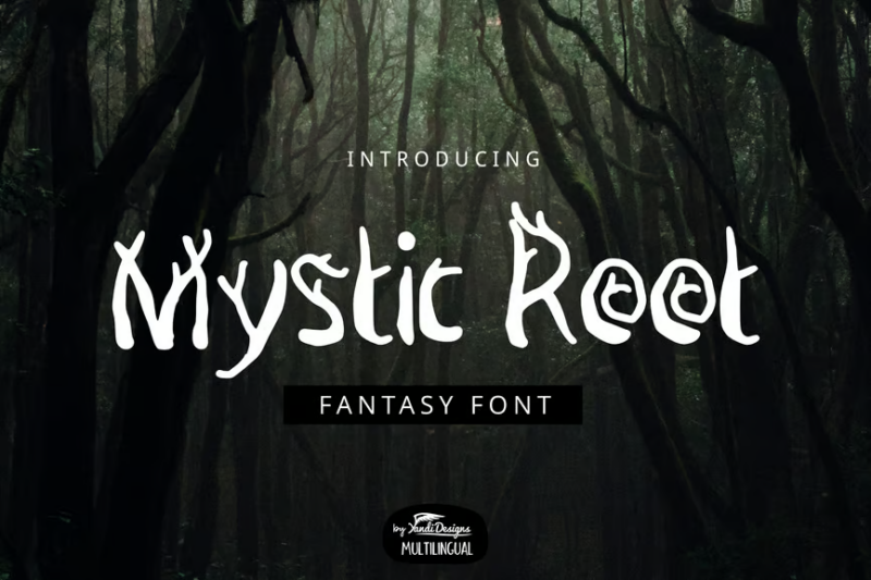
A unique sans-serif font with mystical symbolic elements incorporated throughout its character set. Its otherworldly qualities are balanced with practical readability, making it excellent for creating esoteric branding, spiritual products, or designs that need to convey ancient wisdom with contemporary clarity.
Maquire
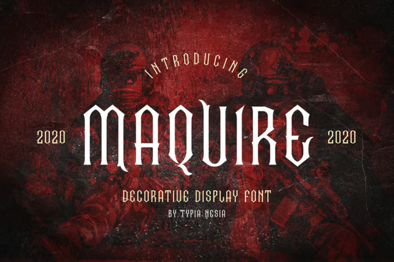
A Victorian-inspired decorative serif font featuring ornate display characteristics with historical references. Its elaborate letterforms evoke the craftsmanship of 19th-century typography while maintaining enough clarity to function in contemporary contexts that require period authenticity with flair.
Angeris
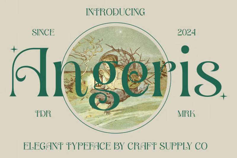
An elegant Art Nouveau-influenced serif typeface that captures the flowing organic qualities of this distinctive artistic movement. Its graceful curves and refined proportions make it perfect for creating sophisticated designs with a touch of historical reverence and timeless beauty.
Mythshire
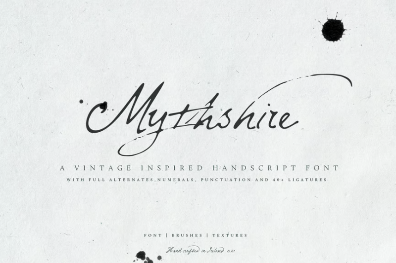
A fantasy-inspired script font that combines handwritten authenticity with decorative mythical elements. Its flowing character connections and magical details create an immersive writing style perfect for fantasy maps, book covers, game interfaces, or any design requiring an enchanted handcrafted quality.
Thoth Legacy
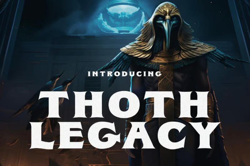
A specialized Egyptian-themed typeface that balances authentic hieroglyphic influences with fantasy elements. Its distinctive character set is perfect for creating immersive themed experiences, museum exhibitions, or designs requiring an ancient mystical aesthetic with historical references.
Crowd
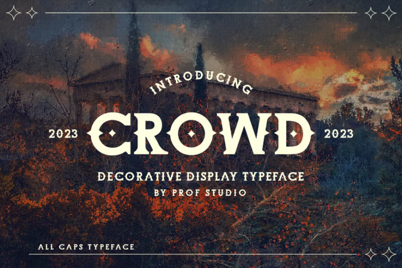
A medieval-inspired decorative display typeface with serif elements that create a powerful visual presence. Its distinctive letterforms evoke historical manuscripts while maintaining excellent legibility for contemporary applications, making it ideal for creating dramatic headlines with period authenticity.
Enchant
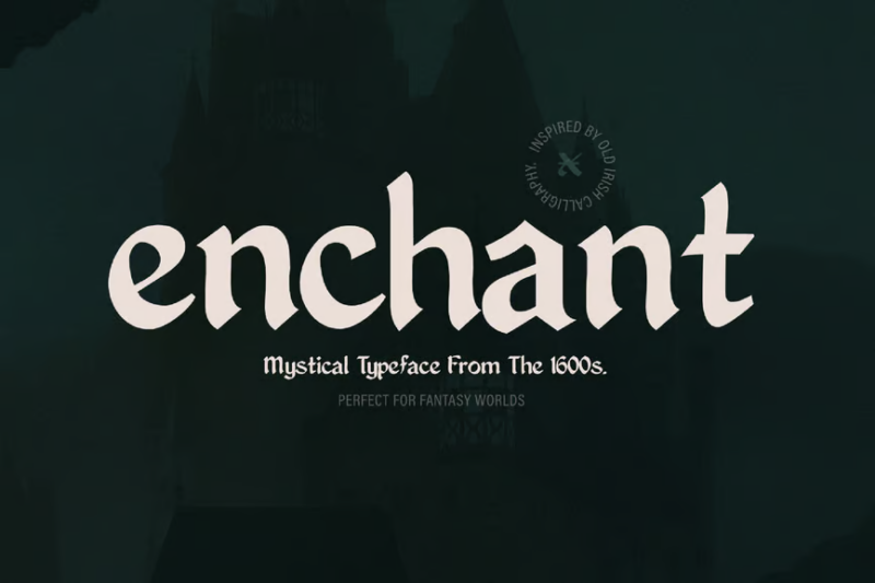
A mystical decorative typeface inspired by 1600s typography with gothic influences and magical undertones. Its historical references are balanced with fantasy elements, creating a perfect typeface for period-inspired designs with an enchanted, slightly mysterious quality.
Cartius
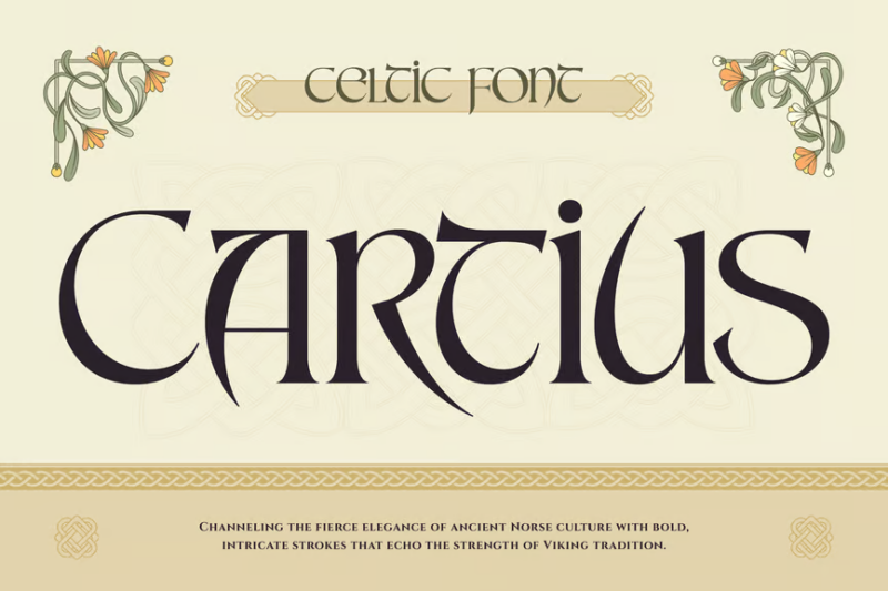
A distinctive serif font with decorative elements inspired by Celtic and medieval font traditions. Its balanced character set offers excellent versatility for creating designs with historical authenticity, fantasy gaming applications, or branded content requiring old-world charm with clarity.
Stella
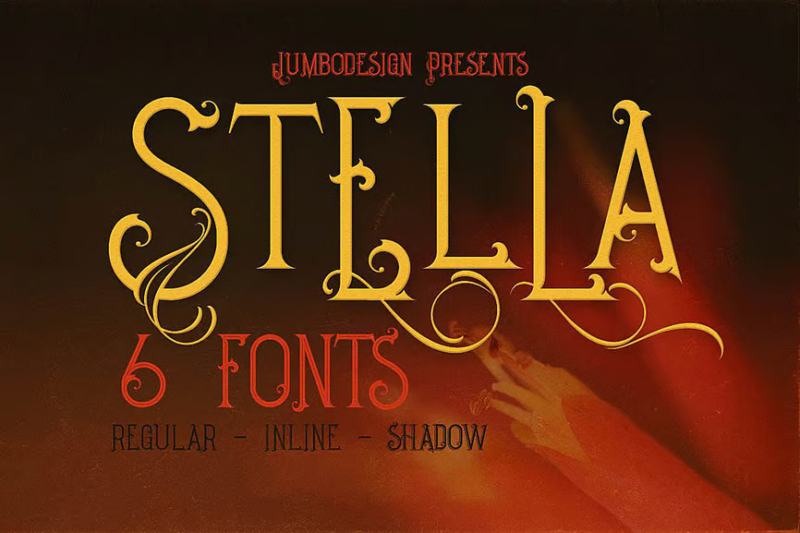
A refined decorative serif font with thoughtfully crafted display characteristics that balance ornate details with practical application. Its elegant letterforms offer excellent versatility across various design contexts while providing enough distinctive personality to create memorable typographic statements.
Alweron
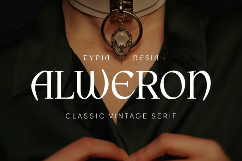
A vibrant classic serif font that combines vintage aesthetics with pop sensibilities and retro styling. Its character set bridges multiple eras of design, making it perfect for creating nostalgic yet contemporary designs with a playful, slightly fantastical quality.
Monastery

A historically informed medieval display typeface with decorative elements that capture the essence of ancient manuscripts and monastic writing. Perfect for creating authentic period designs, fantasy gaming interfaces, or brand identities requiring an old-world, slightly mysterious atmosphere.
Shavonca
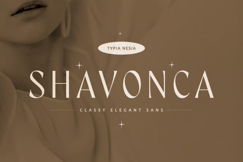
A sophisticated hybrid font that combines sans-serif modernism with serif-inspired elegance, creating a uniquely classy character set. Its beautiful balance of contemporary clean lines with subtle traditional influences makes it perfect for fashion-forward branding and designs requiring refined versatility.
Ovatine
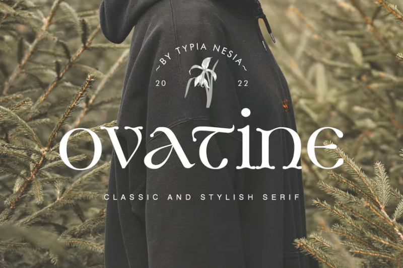
A timeless classic serif font that embodies vintage elegance through its beautifully proportioned character set. Its refined details and balanced stroke contrast make it perfect for luxury branding, editorial design, and sophisticated typography that requires enduring beauty with excellent readability.
Noatun
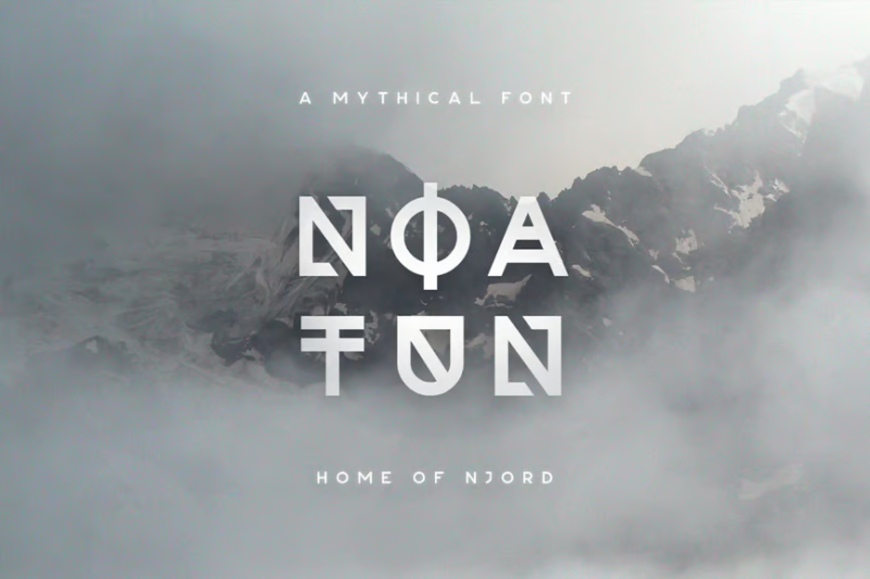
An unconventional sans-serif typeface with strange decorative display characteristics that create a distinctively otherworldly aesthetic. Its unique norse-like letterforms challenge traditional typography while maintaining enough structure to function effectively in contemporary design contexts requiring bold, unexpected visual language.
Bella Queta
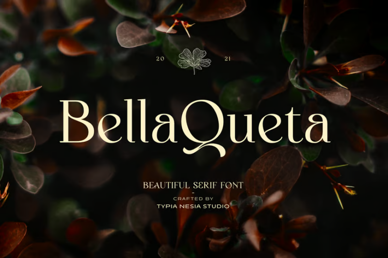
A beautiful classic serif font with decorative elements that balance timeless elegance with a royal personality. Its refined proportions and carefully crafted details make it excellent for creating sophisticated typography with enough character to be memorable across branding, editorial, and display applications.
What Makes a Font Feel Truly “Fantasy”?
Fantasy fonts cast their spell through several key characteristics that instantly transport viewers to realms of magic and adventure:
Historical Influences
Many fantasy fonts draw inspiration from historical scripts and calligraphy – particularly medieval blackletter, uncial scripts, and Celtic lettering. These historical roots give fantasy fonts an instant sense of age and tradition, perfect for worlds set in reimagined pasts.
The angular forms of gothic scripts or the rounded shapes of ancient Celtic lettering immediately signal to viewers that they’re entering a world different from our modern one. Just think about how instantly recognizable the “Game of Thrones” typography feels – its medieval-inspired letterforms immediately transport us to Westeros.
Organic, Flowing Elements
Fantasy fonts often incorporate natural, organic elements – vines, branches, flames, or water-like flourishes that extend from letterforms. These decorative elements suggest a world where magic flows through nature, where trees might speak and elements can be controlled by spells.
The best fantasy fonts use these organic elements strategically, creating a sense of motion and life in the typography itself. Letters might appear to be growing like plants or flowing like water, adding a dynamic quality to the text.
Mystical Symbols and Glyphs
Many premium fantasy fonts include special glyphs, runes, or symbols that enhance their magical qualities. These might be incorporated into letterforms or offered as standalone elements that can be used alongside the main alphabet.
These symbols tap into our collective understanding of magic – stars, moons, ancient runes, and mysterious markings that feel like they might hold secret powers. When used thoughtfully, these elements can elevate a simple fantasy font into something that feels truly magical and otherworldly.
Distinctive Character Forms
Fantasy fonts often feature unusual letter shapes with exaggerated serifs, unexpected curves, or distinctive treatments of specific characters. The capital letters might be particularly ornate, with elaborate initial caps that feel like illuminated manuscripts.
These unique character forms are what give fantasy fonts their instantly recognizable quality. A single glance at a word set in the right fantasy font can immediately establish the tone and setting for an entire project.
Different Sub-Genres of Fantasy Typography
The realm of fantasy fonts is as diverse as fantasy literature itself. Let’s explore some distinct sub-genres:
Medieval Fantasy
Inspired by illuminated manuscripts and blackletter scripts, these fonts evoke worlds of knights, castles, and royal intrigue. They typically feature strong vertical strokes, angular forms, and a certain heaviness that feels substantial and ancient.
Perfect for: Fantasy worlds inspired by medieval Europe, games with royal courts and knights, or any project with a historical fantasy setting.
Elvish/Ethereal
Characterized by flowing, elegant lines and delicate forms, elvish-inspired fonts capture the grace and immortality associated with elves in fantasy literature. These fonts often have extremely thin strokes, elongated ascenders and descenders, and a light, airy quality.
Perfect for: Elven realms, fairy tales, ethereal magical settings, or any design requiring a sense of otherworldly beauty.
Runic/Dwarven
Drawing from Norse runes and angular stone-carved letters, these fonts feature strong geometric forms, sharp corners, and a sense of durability. They often appear as if carved into stone or metal.
Perfect for: Dwarven kingdoms, Norse-inspired worlds, stone magic systems, or any setting with ancient, enduring powers.
Dark/Occult Fantasy
These fonts embrace the darker side of fantasy with sharp, sometimes jagged forms, dripping elements, or details that suggest blood, thorns, or otherworldly horrors. They often incorporate subtle references to occult symbols.
Perfect for: Horror-infused fantasy, vampire tales, dark magic schools, or any project exploring the more sinister side of fantasy.
Whimsical/Fairytale
Playful and often featuring unexpected curves and bouncy baselines, these fonts bring a sense of childlike wonder and fairytale magic. They might include star shapes, tiny flourishes, or elements that feel hand-drawn.
Perfect for: Children’s fantasy books, magical school stories, fairytale retellings, or any project needing a lighter, more enchanted feel.
Where to Use Fantasy Fonts
Now that we understand what makes fantasy fonts magical, where can we best deploy them in our designs?
Book Covers & Publishing
Fantasy fonts find their most natural home on the covers of fantasy novels, where they immediately signal the genre to potential readers. They’re also excellent for chapter headings, map labels, and other paratextual elements within fantasy books.
When designing for publishing, consider the specific sub-genre of fantasy you’re working with. A dark, gothic font might be perfect for a tale of vampires and dark magic, while a more elegant, elvish-inspired typeface would better suit a story of ancient elven kingdoms.
Game Design
From the main logo to in-game interfaces, fantasy games rely heavily on typography to establish their worlds. Fantasy fonts can transform menu systems, character names, location labels, and item descriptions into elements that feel native to the game world.
When designing for games, consider legibility carefully. While ornate fantasy fonts look stunning in logos and headers, you’ll want to ensure that any text players need to read frequently remains accessible.
Film & Television
Fantasy fonts help establish the visual identity of fantasy films and shows through title sequences, marketing materials, and even on-screen text elements like maps or magical tomes shown within the narrative.
The most successful fantasy productions often develop custom typography that becomes instantly associated with their worlds – think of how recognizable the “Harry Potter” or “Lord of the Rings” title treatments have become.
Branding & Merchandise
From Renaissance faires to theme park attractions, fantasy fonts help create immersive branded experiences for fantasy-themed businesses and events. They’re also perfect for merchandise connected to fantasy properties.
When using fantasy fonts for branding, consider developing a consistent typography system where more ornate fantasy fonts are used for headers and display text, while more readable alternatives handle body copy.
Role-Playing Games
Tabletop RPGs use fantasy fonts extensively in rulebooks, character sheets, and supplementary materials to enhance the immersive experience for players.
For RPG materials, balance is key – use distinctive fantasy fonts for titles and headers, but ensure that rules text and information players need to reference often remains highly readable.
When to Avoid Fantasy Fonts
While fantasy fonts cast powerful spells in the right contexts, there are situations where they should remain locked away:
Body Text
Most fantasy fonts are simply too decorative or unusual for extended reading. Their distinctive features, while perfect for headlines, can become exhausting or illegible when used for paragraphs of text.
For longer text passages in fantasy-themed materials, pair your fantasy display fonts with more readable serif or sans-serif fonts that complement the fantasy aesthetic without sacrificing legibility.
Professional/Corporate Contexts
Unless you’re specifically designing for a fantasy-themed business or event, these fonts can undermine the credibility and seriousness of professional communications.
Even the most elegant elvish-inspired font would feel out of place on a business card or corporate annual report. Reserve fantasy fonts for contexts where magical, otherworldly associations are desired.
Modern Settings
Fantasy fonts can feel jarringly out of place in designs representing contemporary or futuristic settings. Their historical and magical associations create cognitive dissonance when paired with modern elements.
For projects blending fantasy with modern settings, consider using fantasy fonts very selectively, perhaps only for elements specifically connected to the magical aspects of the world.
Sensitive or Serious Topics
The playful or dramatic nature of many fantasy fonts can unintentionally trivialize serious subject matter. A font that suggests wizards and dragons might undermine the gravity of serious topics.
When addressing weighty themes even within fantasy contexts, consider more neutral typography that won’t distract from or diminish the seriousness of the content.
How to Pair Fantasy Fonts Effectively
Creating magical typography systems requires thoughtful pairing:
Contrast is Key
Pair ornate fantasy display fonts with simpler, more readable fonts for body text. The contrast helps the fantasy elements stand out while ensuring overall readability.
For example, a medieval blackletter-inspired fantasy font might be paired with a clean, readable serif that has subtle historical qualities but prioritizes legibility.
Thematic Consistency
Ensure all fonts in your design share a consistent mood and historical inspiration. A runic, angular fantasy font would clash with an elegant, flowing script, as they evoke different fantasy traditions.
Look for complementary fonts that feel like they belong to the same magical world, even if one is more decorative and one more functional.
Hierarchy Through Weight and Size
When working with fantasy fonts that come in multiple weights, use the more ornate versions for primary headers and the simpler versions for subheadings.
This creates a natural hierarchy while maintaining a consistent visual language throughout your design.
Consider the Full Character Set
Many fantasy fonts have unusual treatments of certain characters or limited punctuation options. Ensure any fonts you pair can handle all the textual needs of your project.
This is particularly important for multilingual projects or designs requiring special characters and symbols.
Fantastic Alternatives to Fantasy Fonts
Sometimes you need the essence of fantasy without going full wizard. Here are some alternatives:
Historical Serifs
Fonts like Goudy Old Style, Garamond, or Bembo have historical qualities that can suggest fantasy settings while remaining highly readable and versatile.
These classic serifs work well for the body text in fantasy books or materials, complementing more distinctive fantasy fonts used for titles and headers.
Hand-Drawn Fonts
For a whimsical fantasy feel that’s not overtly medieval or runic, consider hand-drawn fonts that add a touch of the unexpected while remaining relatively versatile.
These can be particularly effective for more contemporary fantasy settings or projects aimed at younger audiences.
Tuscan Serifs
With their distinctive bifurcated serifs and often decorative qualities, Tuscan-style fonts can suggest Victorian fantasy or steampunk aesthetics without going fully into fantasy territory.
These work particularly well for projects blending historical and fantasy elements, like gaslamp fantasy or alternate history with magical elements.
Subtle Texture
Sometimes, applying a slight texture or distressing to a more conventional font can suggest age and fantasy without sacrificing readability or versatility.
This approach works well for projects that need to balance fantasy elements with broader appeal or applications.
Common Fantasy Font Questions
Let’s address some frequently asked questions about fantasy typography:
What font is used in Lord of the Rings?
The iconic “Lord of the Rings” logo uses a modified version of a font called “Ringbearer,” specifically designed to evoke Tolkien’s world. The books themselves typically use more traditional serif fonts for body text, with fantasy fonts reserved for maps and special elements.
What font do fantasy books use?
Most fantasy novels use standard, highly readable serif fonts for their interior text. Fantasy fonts are typically reserved for cover design, chapter headings, and special elements like maps or fictional documents within the book.
What is the Harry Potter font called?
The “Harry Potter” logo uses a modified font called “Adobe Caslon” with distinctive lightning-shaped details added to certain letters. For the chapter headings in the books, a font called “Lumos” was created specifically for the series.
Are fantasy fonts copyright protected?
Like all fonts, fantasy fonts are software that comes with specific licensing terms. Many are protected by copyright and require proper licensing for commercial use. Always check the licensing terms before using any font commercially.
Crafting Your Own Magical Typography
Fantasy fonts have the power to transport viewers instantly to worlds of magic and adventure. When used thoughtfully, they can transform ordinary designs into portals to extraordinary realms.
The key to successful fantasy typography lies in understanding the specific traditions and associations these fonts carry, and deploying them strategically where they’ll have the greatest impact. Use them for display text that needs to make a strong first impression, while ensuring the rest of your typography supports readability and usability.
Remember that the best fantasy designs don’t rely solely on fonts to create their magical atmosphere – typography works alongside illustration, color, texture, and other design elements to build cohesive, immersive worlds.
Whether you’re designing for the next blockbuster fantasy game, crafting the perfect book cover, or creating materials for a fantasy-themed event, the right font choices can make the difference between a design that feels truly magical and one that falls flat.
So go forth, intrepid designer, and wield these typographic spells wisely! With the right fantasy fonts in your arsenal, you’ll be creating enchanting designs that transport viewers to worlds limited only by imagination.
Which fantasy font is your favorite? Are there any magical typefaces I missed? Let me know in the comments below!

