In this article:
- Top 27 Egyptian Fonts for Various Design Needs
- What Makes a Font Feel Egyptian?
- Types of Egyptian Fonts
- How to Choose the Right Egyptian Font
- Using Egyptian Fonts in Design
- Egyptian Fonts in Different Industries
- Future of Egyptian Fonts
- Conclusion
- FAQs About Egyptian Fonts
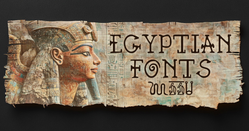
The first commercially available slab serif typeface, known as ‘Antique,’ was designed by Vincent Figgins in 1815. These Egyptian fonts stood out for their boldness, grabbing more attention than traditional serifs ever could! Today, they aren’t just relics of the past; they play a vital role in modern design. From creating striking headlines to adding a touch of historical flair, Egyptian fonts are versatile and powerful.
In this article, I’ll explore the best Egyptian fonts available in 2026, their history, and how they continue to influence contemporary design trends. Let’s delve into the world of timeless elegance and modern creativity!
Top 27 Egyptian Fonts for Various Design Needs
Thoth Legacy
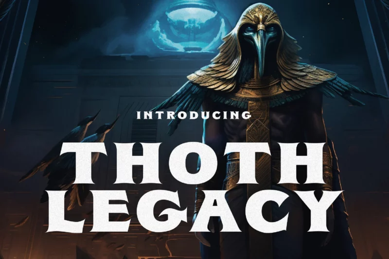
An extraordinary Ancient Egyptian typeface that captures the essence of antiquity, designed to transport viewers into Egypt’s mysterious past through its distinctive hieroglyphic-inspired characters.
Hodgeson
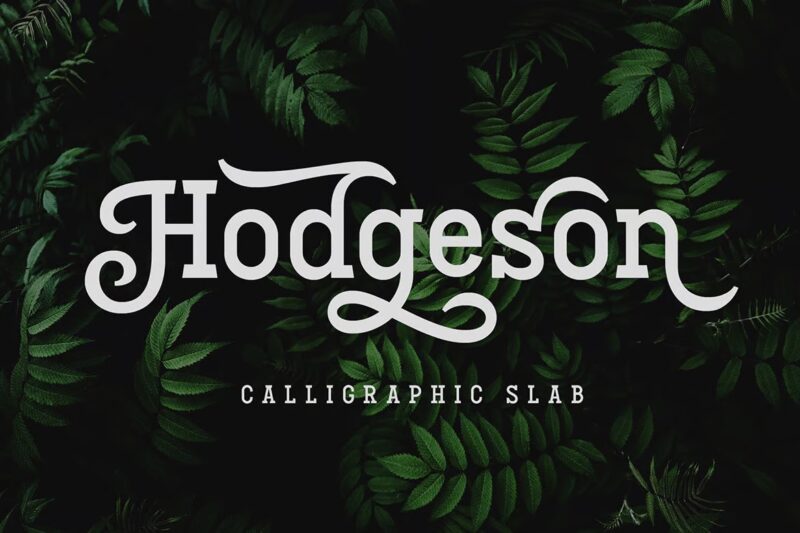
A versatile calligraphic slab serif font that combines custom lettering with Egyptian styling, available in four distinct styles for flexible design applications.
Anubis Mythical
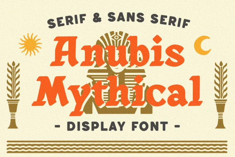
A dynamic Egyptian-inspired font offering three unique styles – regular, rough, and stamp – perfect for creating distinctive badges, logos, and branding materials.
Cleopatra Font
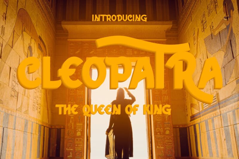
A modern sans serif font designed for versatile applications, from logo design to social media content and brochures.
Hollow Mummy Font
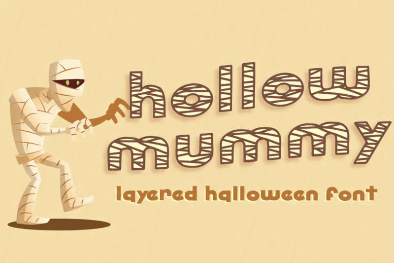
A bold and distinctive display font that makes creative ideas stand out with its authentic, eye-catching design.

Get 300+ Fonts for FREE
Enter your email to download our 100% free "Font Lover's Bundle". For commercial & personal use. No royalties. No fees. No attribution. 100% free to use anywhere.
Khonsu Font
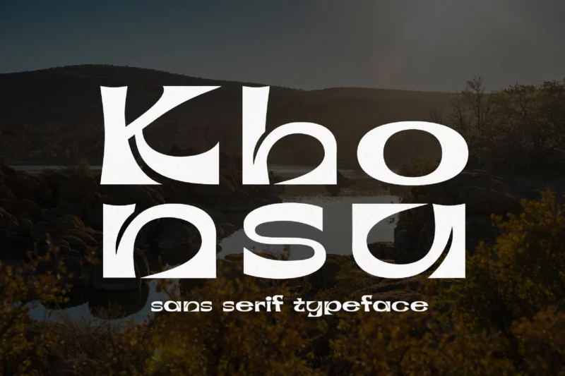
A glamorous sans serif typeface featuring elegant curves, perfect for fashion, branding, and lifestyle applications.
Kimbo
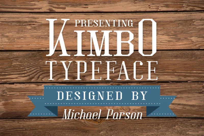
A squared slab serif typeface that maintains strong definition in large sizes while ensuring readability in smaller text applications.
MartiniThai Neue Slab
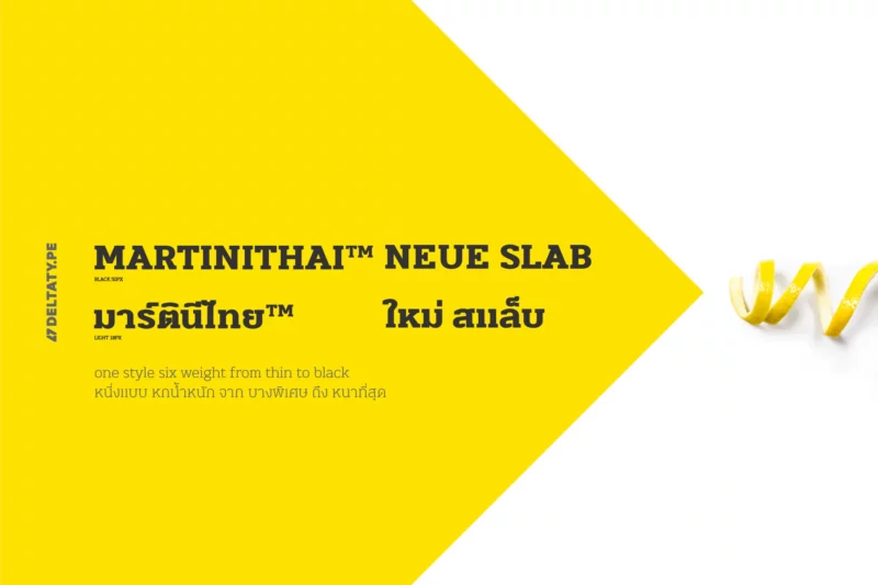
A comprehensive slab-serif typeface offering six weights from thin to black, with advanced typographical support.
Aspernatur
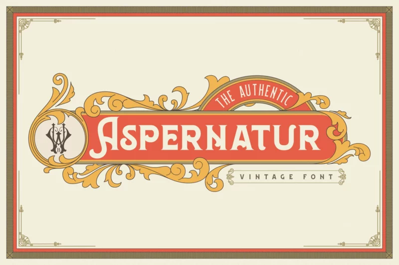
A vintage display font family inspired by late 1800s typography, bringing historical charm to modern designs.
Mionic Font
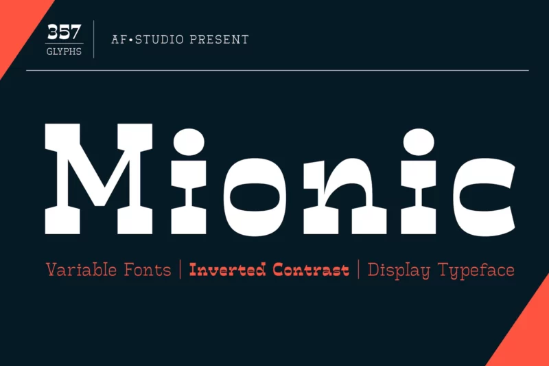
An innovative inverted contrast display typeface that combines antique slab serif elements with contemporary design principles.
Sabana
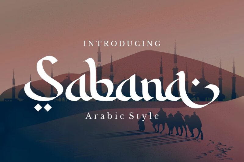
An Arabic-style typography specially designed for Ramadan projects, featuring authentic Islamic character elements.
Zahra
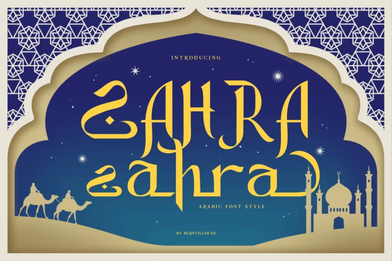
An Arabic-style display typeface with advanced ligature features, supporting multilingual applications.
Glyphic
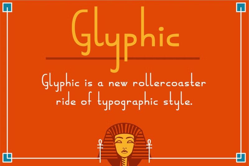
A contemporary interpretation of ancient Egyptian hieroglyphics adapted for modern design applications.
K H E P R I
Atletico – Stencil font
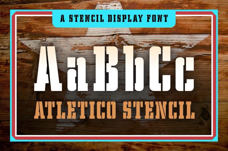
A bold stencil typeface that brings a modern, athletic edge to the Egyptian font style.
Peralta Pro
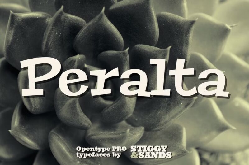
A unique take on Egyptian slab serif letterforms that playfully breaks traditional balance rules for a distinctive look.
Aldogizio
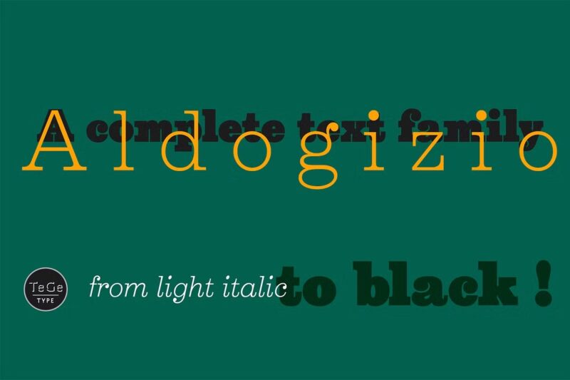
A contemporary slab-serif family inspired by Aldo Novarese’s Egizio, offering a fresh interpretation of classic Egyptian typography.
Sunblast 2.0
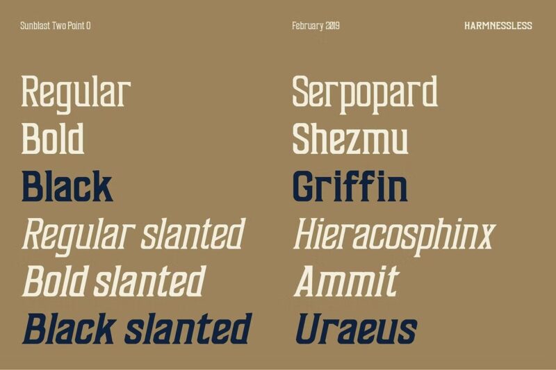
A six-style display font family blending neo-psychedelic elements with ancient Egyptian mythology in a modern design.
Empyramid
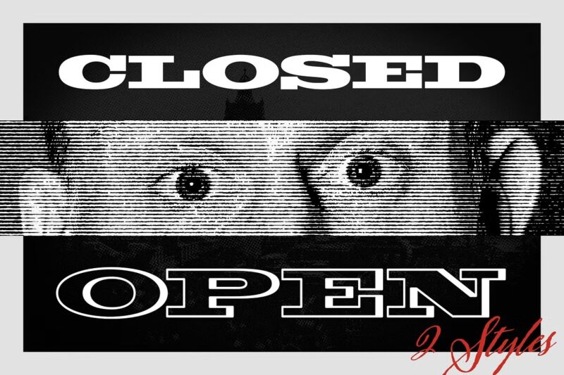
A bold, mono-width typeface designed to evoke the grandeur of ancient civilizations with simple yet powerful forms.
Bloke Display Font
A modern revival of the classic ‘Egyptian Expanded’ metal typeface by Miller & Richard, updated for contemporary use.
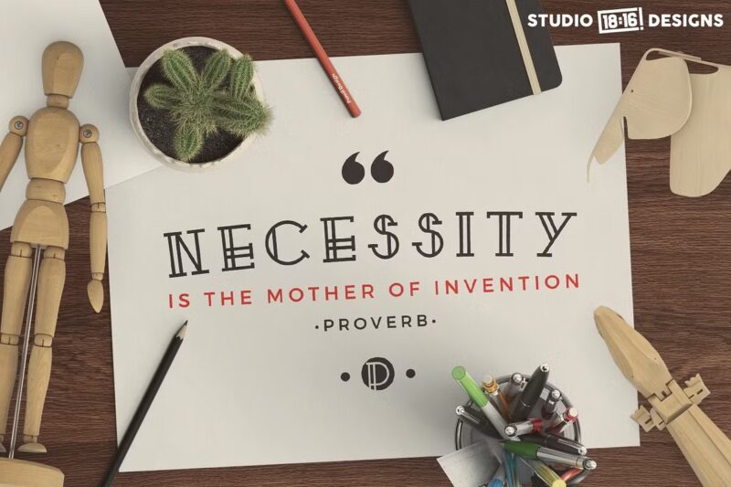
Proverbs Regular
A precisely crafted slab-serif display font featuring carefully matched curves and lines throughout its character set.
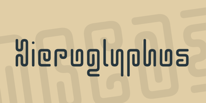
Hieroglyphos Font
A refined interpretation of hieroglyphic writing systems, designed for improved readability while maintaining authentic character.
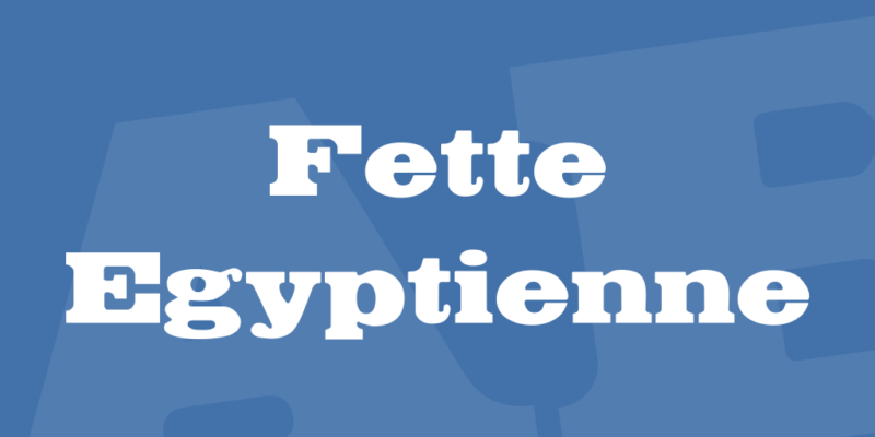
Fette Egyptienne Font
A classic Egyptian-style typeface created by Typographer Mediengestaltung, offering traditional slab serif characteristics.
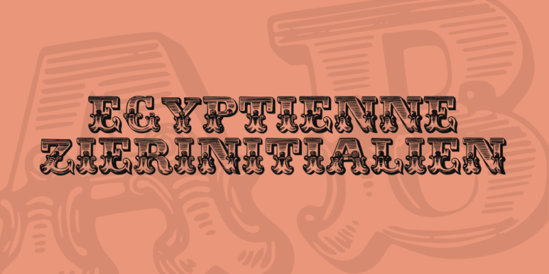
Egyptienne Zierinitialien Font
A digitized and carefully hinted Egyptian-style font featuring decorative initials, created by Dieter Steffmann.
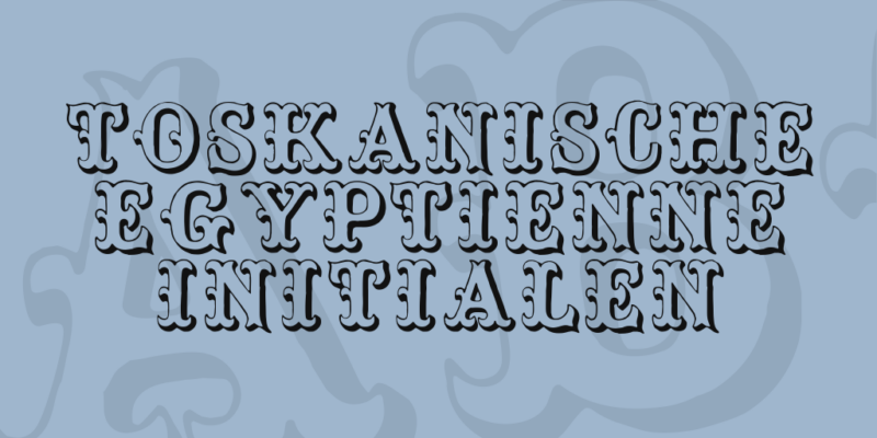
Toskanische Egyptienne Initialen Font
A historical revival based on Schelter & Giesecke’s 1889 designs, featuring ornate Egyptian-style initials.
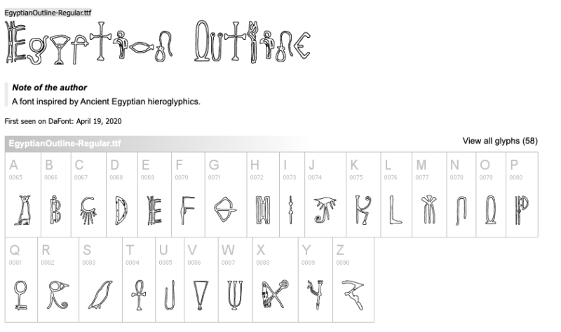
Egyptian Outline

A contemporary outline font drawing inspiration from ancient Egyptian hieroglyphics for modern design applications.
Egyptian Nights Font
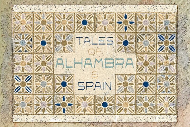
A popular Egyptian-style font created in 2013, offering a modern take on ancient Egyptian typography.
What Makes a Font Feel Egyptian?
You know that feeling when a font stands out? Egyptian fonts do that for me. They’re bold and striking, shouting, “Look over here!” What’s the real charm behind them?
A. Definition and Characteristics
First off, let’s break down what makes Egyptian fonts unique. They’ve got this solid presence that grabs your attention right away. Here are a few features I’ve noticed:
- Thick Serifs: Those chunky, flat ends on the letters make them feel strong. It’s like they’re saying, “I’m not going anywhere!”
- Consistent Stroke Width: Everything flows smoothly. This uniformity is what makes them so easy to read.
- Bold Look: Egyptian fonts just pop on the page. They’re perfect for making headlines that need to grab attention.
B. Historical Context and Evolution
So, here’s a fun fact: Egyptian fonts became popular in the 19th century. Imagine the excitement of that era, with Egyptology taking off and everyone fascinated by ancient wonders. Plus, new printing techniques, like lithography, meant designers could push the boundaries.
When I think about it, that must have been a thrilling time for type designers! They were creating something fresh and impactful, and it shows in the enduring appeal of these fonts.
C. Difference Between Egyptian Fonts and Other Serif Styles
Now, you might wonder how Egyptian fonts compare to other serif styles. Honestly, they’re like the cool cousin who always knows how to have fun. Here’s a quick comparison:
- Weight and Shape: Egyptian fonts have a heftier feel compared to traditional serifs. They stand out more in a crowd.
- Mood: While classic serifs might give off a formal vibe, Egyptian fonts are all about modernity and confidence. They can elevate your design!
When choosing a font, consider the message you want to convey. Egyptian fonts are great for grabbing attention, but they may not suit every project.
Practical Tip: Visualize your audience and how they’ll feel when they see your text. This can help narrow down your options!
Types of Egyptian Fonts
Exploring Egyptian fonts reveals a treasure of unique designs and history. Here are the four main types:
A. Traditional/Classic Egyptian Fonts
These fonts give a nod to the ancient Egyptian hieroglyphs, and honestly, they’re beautiful! They have that classic feel, with strong serifs that just scream authenticity.
- Characteristics:
Think of ornate details and a strong visual presence. These fonts can add elegance to anything they touch. - Use Cases:
Perfect for museum exhibits, educational materials, or anything that needs a historical flair. - Pro Tip:
I’ve found pairing these with simple sans-serif fonts for body text works wonders. It keeps things readable while letting that classic vibe shine!
B. Modern Egyptian Fonts
Now, if you want a fresh take, modern Egyptian fonts blend the classic with today’s trends. They’re streamlined and a bit edgy.
- Characteristics:
You’ll notice clean lines and subtle serifs. They manage to feel contemporary without losing that traditional touch. - Use Cases:
Great for branding, websites, or any advertising that needs a modern twist. - Pro Tip:
Don’t shy away from larger sizes for headers! It makes a bold statement, and trust me, legibility stays intact even in smaller sizes.
C. Decorative Egyptian Fonts
If you’re looking to make a splash, decorative Egyptian fonts are your go-to. They’re bold and often filled with intricate designs that catch the eye.
- Characteristics:
These fonts are highly stylized and visually striking, but watch out! They can easily become overwhelming if you use them too much. - Use Cases:
Ideal for party invitations, artistic posters, or any project that wants to stand out and be noticed. - Pro Tip:
Keep it to short phrases or headings. This way, you maintain clarity, and your message doesn’t get lost in all that flair.
D. Slab Serif Egyptian Fonts
Slab serif Egyptian fonts are like the perfect blend of tradition and modernity. Those thick, block-like serifs give them a strong, robust look.
- Characteristics:
They’re versatile and easy to read—perfect for all applications. - Use Cases:
Think of book titles, web design, or anything where you want a strong visual punch. - Pro Tip:
Use various weights from the font family; bold for headlines and lighter for body text to create a clear visual hierarchy.
How to Choose the Right Egyptian Font
A. Consider the Project Type
Each project has unique needs, so match the font to the vibe.
- Branding: Go for bold, impactful Egyptian fonts that grab attention.
- Web design: Opt for fonts that are versatile and legible on different devices.
- Print materials: Choose a font with a range of weights to ensure it looks good in various sizes.
B. Legibility and Readability Factors
Let’s discuss legibility. While fancy Egyptian fonts look cool, if they’re hard to read quickly, they’re useless. Many struggle with beautiful fonts that don’t work on smaller screens.
- Size Matters: Test your font at different sizes. What looks good in large headlines might be a mess in the body text.
- Contrast: Ensure that the font has enough contrast between thick and thin strokes, so it’s easy on the eyes.
I found that a simple test—reading the text from a few feet away—can quickly tell you if your font is readable or not.
C. Pairing Egyptian Fonts with Other Typefaces
Pairing fonts can be tricky. It’s like choosing the right wine; balance is key. Since Egyptian fonts are bold, opt for a complementary font that won’t clash.
- Go Simple: Pair bold Egyptian fonts with clean, sans-serif fonts to avoid overwhelming your design.
- Experiment: Don’t be afraid to experiment. Sometimes the most unexpected pairings are the best.
Pairing an Egyptian font with a fancy script can lead to disaster, resembling a ransom note. However, using a simple sans-serif alongside it creates a harmonious design.
D. Cultural Sensitivity and Appropriateness
Using Egyptian fonts requires caution due to their cultural significance. Respect their heritage; for instance, avoid using ancient styles on modern tech websites.
- Research: Make sure the font aligns with your project’s cultural and historical aspects.
- Avoid Stereotypes: Not every project calls for a stereotypical “ancient” look, so be mindful of the message you’re sending.
Some designs using Egyptian fonts feel like a parody and miss the mark. Respecting the style’s origin enhances the overall design.
Using Egyptian Fonts in Design
Diving into Egyptian fonts can be exciting yet overwhelming. These fonts capture the essence of an ancient civilization, whether for logos, posters, or adding historical flair.
A. Tips for Effective Implementation:
Initially, common mistakes included overusing hieroglyphic-style text. Egyptian fonts need rhythm and balance. Here’s what to remember:
- Mix fonts sparingly: Pairing an Egyptian font with a simple sans-serif can enhance readability while keeping that ancient vibe.
- Mind your spacing: Egyptian fonts often look crowded, so increase the letter spacing slightly for a cleaner design.
- Use them for headlines: They shine best in larger sizes, where their details can stand out.
A key triumph is balancing modern and ancient elements. The trick is to avoid overdoing it; let Egyptian fonts shine without competing with other flashy designs.
B. Common Mistakes to Avoid
Fonts can be hard to read in small sizes or long blocks of text. Here’s what you need to know:
- Avoid body text: Stick to titles or short phrases to keep readability high.
- Don’t over-layer: Too many graphic elements with these fonts can make the design chaotic.
- Choose colors wisely: Neutral or earthy tones work best, letting the detailed style pop.
C. Examples of Successful Designs Using Egyptian Fonts
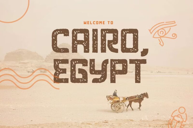
Egyptian fonts can enhance designs effectively. A memorable project was a museum exhibit poster featuring a bold Egyptian title paired with a clean sans-serif subtext and a minimal background, resulting in a sharp and mystical look.
- Museum displays: Perfect for exhibit titles that need to convey history and authenticity.
- Branding projects: Great for brands aiming for a timeless, classic feel.
- Book covers: Ideal for historical fiction or non-fiction about ancient cultures.
Working with Egyptian fonts is a journey with its fair share of bumps. But when you get it right, it’s like finding the Rosetta Stone for your design skills!
Egyptian Fonts in Different Industries
Fonts can transform a design’s vibe, and Egyptian fonts uniquely transport users to another era, adding a historical touch to modern projects.
A. Publishing and Editorial Design
Using an Egyptian font on a magazine cover transformed the design from mundane to captivating. Their bold and striking appearance makes them perfect for capturing attention in the publishing industry.
- Best for: Historical novels, themed publications, and any cover that needs to stand out.
- Avoid: Small text; the details can get lost and make it hard to read.
Use Egyptian fonts mainly for headlines or titles—keep the body text simple to avoid overwhelming the reader.
B. Branding and Logo Design
Branding with Egyptian fonts can be transformative, adding elegance and tradition to logos. These fonts work wonders for businesses aiming to convey a classic and upscale feel.
- Perfect for: Luxury brands, heritage businesses, and anything aiming for a timeless feel.
- Pairing tip: Combine with modern, clean elements to balance the vintage vibe.
The challenge lies in restraint. A touch of Egyptian flair can enhance a logo’s class, but excessive use may come off as outdated.
C. Web and Digital Design
Egyptian fonts can enhance web design by providing strong visual contrasts, perfect for minimalist sites. They add character and highlight key elements effectively.
- Best used for: Headlines, call-to-action buttons, and other standout elements.
- Adjustments: Increase the letter spacing slightly for better readability on screens.
Avoid using them for long paragraphs—they’re more for making statements, not for reading novels.
D. Packaging and Product Design
Here’s where Egyptian fonts truly excel. Adding an Egyptian touch to a product label can elevate its perceived quality, conveying authenticity and craftsmanship effortlessly.
- Great for: Labels on wine bottles, gourmet foods, or artisanal products.
- Pair with: Textures like stone, leather, or papyrus to enhance that ancient feel.
Keep it simple—if you add too many details, it can make the packaging look busy and cluttered.
Future of Egyptian Fonts
A. Current Trends in Egyptian Typography
Egyptian fonts are making a comeback, blending ancient vibes with modern elements for a fresh take while still honoring their historical roots.
- Minimalist Use: Designers are using Egyptian fonts in a minimalist way, primarily in headlines or branding to convey strength.
- Bold Colors and Contrasts: These fonts are paired with bold colors and sharp contrasts, making them pop on digital platforms.
- Retro Revival: There’s a trend of using Egyptian fonts in retro-themed projects, offering a vintage touch that feels nostalgic and timeless.
B. Predictions for Future Developments
Looking ahead, Egyptian fonts are set to evolve even further—like an old classic car getting a modern engine upgrade, retaining charm with improved performance.
- Experimental Designs: Expect more designs merging traditional Egyptian elements with futuristic styles.
- Integration with Augmented Reality (AR): Imagine Egyptian fonts in AR, guiding virtual museum experiences with a blend of ancient and modern texts.
- Variable Fonts: This trend is gaining traction, allowing Egyptian fonts to adapt weight, width, and slant in real time for greater design freedom.
- Customizable Features: Soon, designers may be able to tweak Egyptian fonts for unique designs while preserving that classic touch.
C. The Role of Technology in Font Evolution
Technology has transformed fonts, including Egyptian fonts. Gone are the days of manual adjustments—AI-driven design software now makes font design almost effortless.
- AI and Machine Learning: These tools analyze how different elements of Egyptian fonts work together and suggest tweaks that might not have been considered.
- 3D Printing: Egyptian fonts may influence 3D printing, leading to intricate hieroglyph-inspired patterns on products.
- Open-Source Platforms: More fonts are open-source, allowing designers to refresh Egyptian fonts while keeping their traditional roots.
The future of Egyptian fonts is looking exciting, standing at the crossroads between the past and the future. It will be fascinating to see where it leads!
Conclusion
Egyptian fonts offer a perfect blend of tradition and versatility, making them an essential tool for any designer looking to create impactful visuals. Their bold style works wonders in headlines and historical themes, adding a unique flair to your projects. As you explore these fonts, remember to balance readability with aesthetic appeal and respect cultural significance. We encourage you to experiment with different pairings to find what suits your needs best.
If you have your own tips or experiences using Egyptian fonts, we’d love to hear them—share in the comments below!
FAQs About Egyptian Fonts
1. What exactly is an Egyptian font?
Egyptian fonts are characterized by their bold, slab-like serifs and strong, geometric shapes, evoking a sense of strength and historical significance.
2. Are Egyptian fonts suitable for body text?
While Egyptian fonts can be legible, they are best used for headlines or display text due to their distinctive, attention-grabbing style.
3. How do Egyptian fonts differ from other serif fonts?
Egyptian fonts feature pronounced, block-like serifs, giving them a more modern, robust look compared to traditional serif fonts, which are often more delicate.
4. Can I use Egyptian fonts for modern design projects?
Absolutely! Egyptian fonts are versatile and can be effectively integrated into contemporary designs, adding a unique blend of history and modernity.
5. Are there free Egyptian fonts available for commercial use?
Yes, there are free Egyptian fonts available for commercial use. Websites like Google Fonts and Font Squirrel offer options under open licenses.
6. How do I pair Egyptian fonts with other typefaces?
Pair Egyptian fonts with simpler sans serifs or elegant scripts. Ensure contrast in weight and style to maintain visual harmony without overwhelming the design.
7. Are Egyptian fonts culturally appropriate for non-Egyptian themed designs?
While Egyptian fonts can enhance designs, use them thoughtfully. Consider cultural context and sensitivity to avoid misrepresentation in non-Egyptian themes.

