This post has been removed at the request of the designer....
Love this student project by Colin Dunn: The Fortress of Solitude is an invitation only ice-hotel for super people who need to get away from it all. T...
Mike Rogers created this fun ticket invitation for the Carnival de ScentAir....
I’ve been catching snippets of The Lost Type Co-Op on Dribbble the last couple of months so I am thrilled to see the site finally launch today. Here’s...
I’m loving the typography and compositions of this Personal Composition poster series by Anthony Martinez. via Graphic Exchange...
This whimsical brand identity created by Adam Hill for Mad Brew Productions, a live music event company. The aesthetic was inspired by the concept of ...
A little while back we spent a rainy Saturday at the Museum of Natural History here in New York. I had never been so I was excited to explore the cave...
For Sita Murt’s first pop-up store, Barcelona-based cla-se created a dynamic environment using hand-painted, fluorescent pink typography, which defini...
Studio8 does some really great editorial work; and I’m especially loving their use of typography and grid in Issue 5 of Elephant Magazine. via What Ka...
Here is yet another example of the excellent work coming out of Sweden’s Lundren+Lindqvist—the Loft Investments branding. More details, and larger ima...
This identity system for Vital Findings, a market research and design firm, is just one example of the top-notch work found in Natalie Schaefer’s port...
Here’s another Student Spotlight for your Friday afternoon. There certainly is quite a bit of young talent out there—check them out. Elisa Penello: EM...
Lisa Hedge‘s portfolio features a broad selection of projects with an inclination toward clean, modern, and carefully crafted typography. Case in poin...
As a follow up to the previous post, I couldn’t resist sharing this additional And Smith project for Coworth Park, the brand identity for The Barn, an...
I’m loving this extensive brand identity created by And Smith for a Coworth Park, a luxury hotel outside London. There are quite a few more images in ...
Check out this recent promo for American Crew’s new product Superglue, designed by Karsh\Hagan. The promotional materials, which celebrate the comebac...
I recently came across the work of Bianca Chang in this month’s O Magazine. (By the way, I have to say I’m consistently impressed by the caliber and d...
Wayne Tang is a recent graduate of Art Center College of Design (and a classmate of Vanessa Lam, who I posted about last week). I have been truly impr...
I’m loving this poster series designed for the 140th anniversary of French Paper, a mill whose paper I use often. I can only assume they were designed...
Check out this identity for Abilene, Texas-based boutique, Betty and June, designed by Ryan Feerer. Quite a bit of hand-stamping was incorporated into...
I’m pretty interested in this new project by Evan Stremke, Invitation to an Assassination. In his own words, “The ‘Invitation to an Assassination’ ser...
Congratulations Neha! Be on the lookout for an email from me. And thanks to everyone who took the time to comment and enter....
From Barcelona, a project that aimed to promote tourism in Spain, was designed by Anders Hernando Balsells as part of his master’s degree program....
Shed Labs is a small design and illustration studio based in Greenville, South Carolina, whose portfolio features a wide range of work—from screenprin...
I’m loving these sophisticated, minimalistic collateral pieces designed for Stoltz & Company—a captive insurance specialist—by Jonathan Davies....
I’m extremely impressed with this conceptual project by Vanessa Lam, a recent graduate of the Art Center College of Design. Her incredibly thorough re...
As a designer at Palantir.net, Michael Mesker was responsible for creating the branding and collateral for 2011’s DrupalCon Chicago, a conference for ...
I can’t help but admire Elixir Design‘s strikingly beautiful identity system and packaging design for Naturopathica, a line of organic skin and beauty...
Check out these lively materials created by José Guízar for Jazzatlán, a jazz club in the heart of Cholula, Mexico....
I was recently lucky enough to get my hands on a review copy of Mike Perry’s Pulled, A Catalog of Screen Printing, which can perhaps best be described...
This afternoon I’m admiring the minimal, yet luxe, packaging for Atura musk perfume oil, which was designed by Tel Aviv-based Koniak Design....
I’m loving the collateral for this Oktoberfest party by Carisa Flaherty. Great color palette....
Check out this identity for Grill’d, an Australian restaurant chain that offers healthy burgers. The design was created by Andrea Wilcock of Kudio whi...
Belmondo, which means “beautiful world” in Italian, is a line of organic skincare products. The lovely black and white identity and packaging, which f...
Designer Nathalie Cone is doing some awesome work for Gilah Press, from promotional materials to posters to stationery systems. Here are just a few ex...
I can’t help but love the details of UK-based Andfold Studio’s stationery system. The pieces feature a truly sophisticated a color palette, and a vari...
Designer Jamie Stolarski recently updated his portfolio with loads of new design and illustration work. In particular, I’m loving the identity design ...
A year ago yesterday, the massive Gulf oil spill began. In recent months though, chatter about the disastrous event has all but disappeared. The impen...
Today marks the relaunch of the official blog of Two Paper Dolls, Louella Court, after a break since the end of last year. During the time off they’ve...
Chicago-based Mike McQuade is one talented designer. His portfolio features everything from illustration to web design, and a penchant for hand-letter...
Check out this amazing book project by Jon Wong, a new intern over at ISO50 and current student at The Academy of Art, San Francisco. Exploradonia is ...
I’m loving all of the gig posters in the portfolio of Nerl Says, aka John Knoerl. Pick some up for yourself in his etsy shop....
Posters of Fortune is a current initiative of The Type Directors Club and Cardon Copy. Twenty internationally renowned designers were each sent a fort...
The Bicycle cap is a new collaboration between the Spanish textile company, peSeta, and NYC’s New Museum. The exclusive line of caps were made using a...
I’m loving the branding for Fiction by Danny Jones, aka YASLY. Many more details here....
10 Numbers is a collection of images created by Giuseppe Salerno through the use of Chinese ink on smooth paper. The complete set is available for pur...
I’m loving the invitation package design for FAME‘s annual party—this year’s theme is Cinco de Fame-O—by Poom Sutasinee Seitz. via Allan Peters...
A new Student Spotlight has been long overdue. Here are a few projects from a few promising student designers from around the country: Benoit Berger M...
Social was called in to create custom “tender” for use at concerts, growers markets, local shops and restaurants. Based on the colorful Old Town ident...
Sometimes I find that ultra clean, modern design can seem cold; so I love those pieces that add an extra layer of richness through high quality produc...
Love this identity for Morehouse, a high school counseling and support program, by Markatos Moore. It’s too bad the program wasn’t implemented—a youth...
Silver Screen Society is a self-initiated project created by Adam Hanson, Brandon Schaefer, and Trevor Basset. Each month a cast of contributors creat...
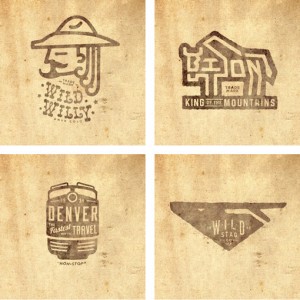
Jeremy Pruitt, aka Thinkmule, has quite the logo portfolio. Many more here....
Before his passing, Doyald Young was working on a collaborative poster with Josh Higgins as a gift for a mutual friend. Since the project was unfinish...
There are so many great pieces in Jillian Frey’s portfolio that it was tough to choose which to feature. Though I have to say I loved these gift cards...
For the Sentimental Journey postcard series, poet Kate Camp collaborated with Sarah Maxey and Kris Sowersby in a somewhat exquisite-corpse-themed proc...
I’m fairly certain I’ve never met a Stitch project I haven’t liked. So unsurprisingly, I love the new identity they’ve created for photographer Charlo...
Check out this new project from TunnelBravo—the identity for The Arrogant Butcher, a new restaurant in Phoenix, Arizona. It looks like it was such a f...
Wallflowers is a beautiful pattern font by Laura Worthington....
I’m so glad I stumbled upon No.Zine, an arts publication that is curated and art directed by Patrick Fry. Each issue features a variety of artists and...