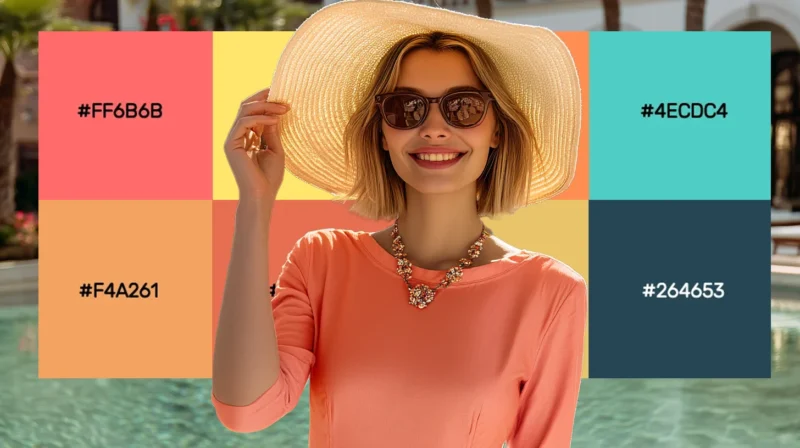
Coral’s magic lies in its perfect balance—vibrant yet sophisticated, warm yet refined. This versatile hue elevates everything from brand identities to...
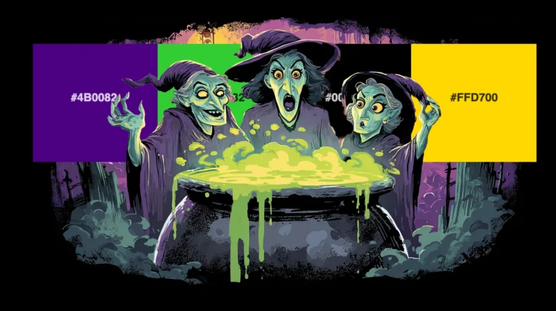
As a designer who absolutely lives for the spooky season, I can’t help but get excited when October rolls around and Halloween colors start making the...
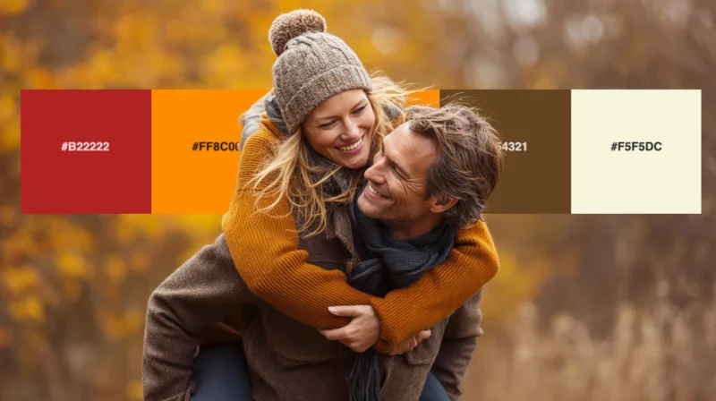
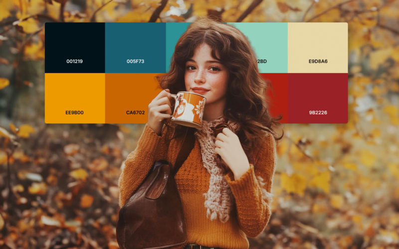
As the leaves begin to turn and the air grows crisp, I find myself completely captivated by the rich, warm hues that autumn brings. There’s something ...
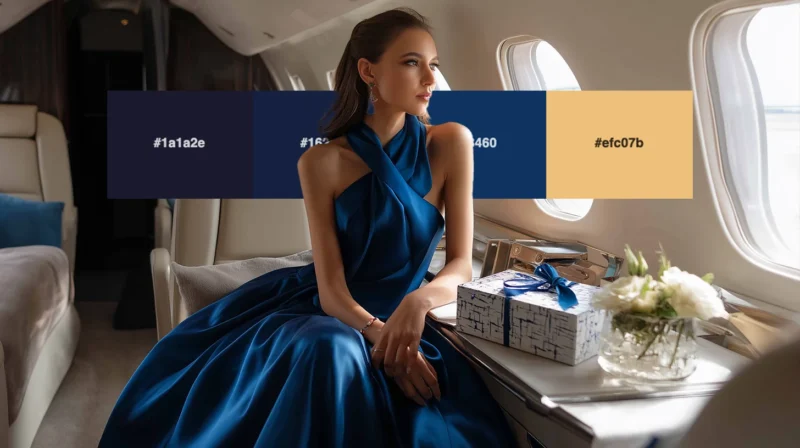
As a designer who’s worked with premium brands for over a decade, I can tell you that nothing elevates a design quite like the right luxury color pale...
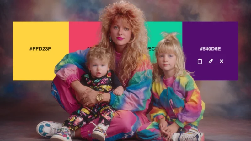
There’s something absolutely magnetic about the electric energy of 1980s color schemes. The decade was unapologetically bold, mixing neon brights with...
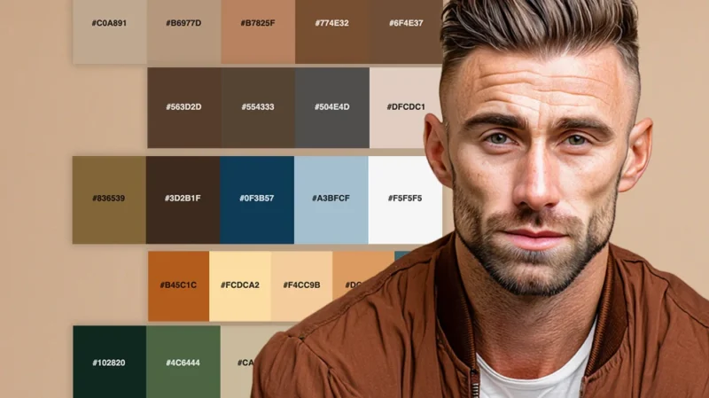
Brown might not be the flashiest color in the spectrum, but as a designer who’s worked with countless color combinations over the years, I can tell yo...
Chasing the perfect balance between impact and subtlety is not always easy. I’ve developed a deep appreciation for muted color palettes. There’s an un...
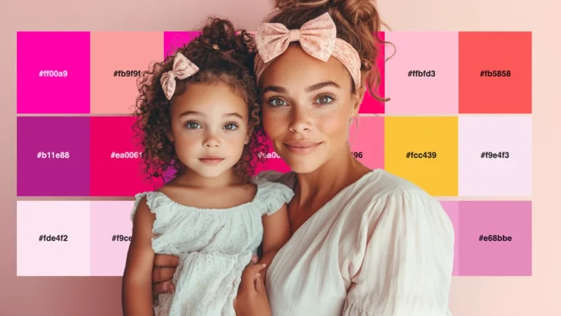
I can confidently say that pink is having its moment—and it’s not going anywhere. Far from being just a “girly” color, pink has evolved into one of th...
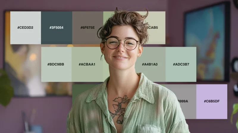
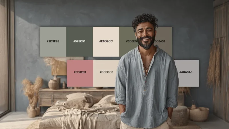
There’s something undeniably calming about sage green that makes it one of my absolute favorite colors to work with as a designer. This muted, earthy ...
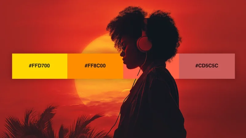
There’s something absolutely magical about watching the sun dip below the horizon, painting the sky in breathtaking hues that seem almost too beautifu...
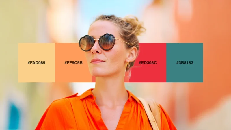
There’s nothing quite like the embracing quality of warm colors to make a design feel inviting and alive. As someone who’s spent years working with co...
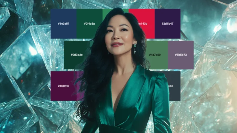
As a designer who’s always searching for color combinations that exude sophistication and richness, I find myself constantly returning to jewel tones....
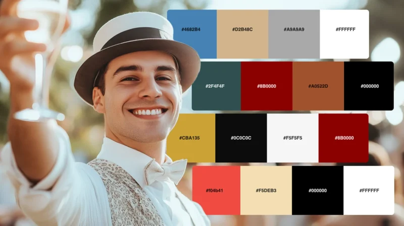
There’s something undeniably captivating about the color schemes of the Roaring Twenties. As a designer with a passion for historical aesthetics, I’ve...
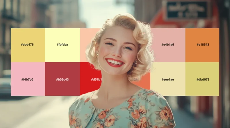
When I look for inspiration that balances nostalgia with timeless appeal, I always find myself drawn to the refined elegance of 1950s color schemes. T...
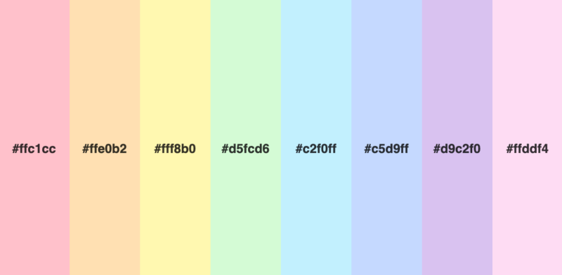
Few palettes are as universally appealing as the pastel rainbow. There’s something magical about these soft, muted versions of vibrant colors that ins...
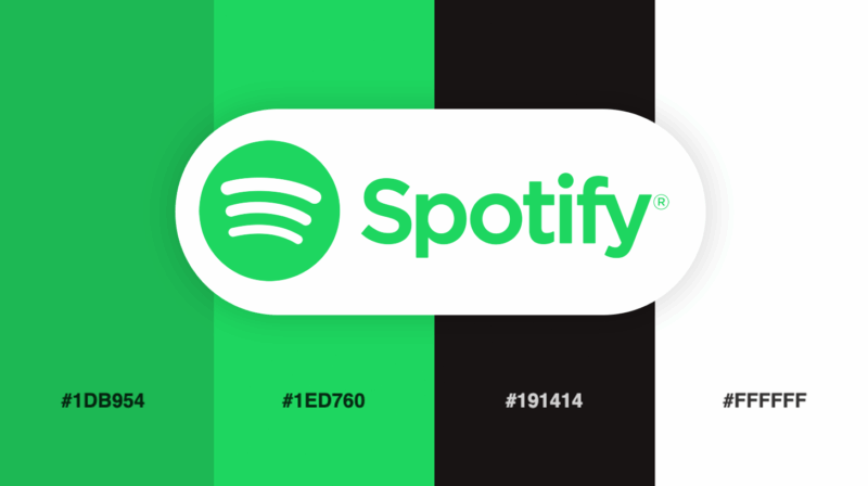
Color choice can make or break a brand’s visual impact. Few companies illustrate this principle better than Spotify, the streaming giant that has revo...
As a 90s kid turned designer, I have a special fondness for the color palettes that defined my childhood. From the vibrant hues of Nickelodeon to the ...
As a designer, I’m constantly drawn to the bold, expressive colors of the 1970s. There’s something about those vibrant hues and earthy tones that just...