
This past Fall, Fast Company—a magazine I subscribe to and highly recommend—launched a redesign featuring three custom typeface families by Commercial Type: Kaiser, Zizou Slab and Zizou Sans:
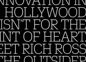
Kaiser, a condensed sans serif in 3 widths designed by Vincent Chan, is used for display and is the primary typeface on the cover. Inspired by 1920s and 30s-era German display typefaces, it is characterized by tight and regular spacing, and by a highly simplified lowercase. Zizou Sans originally began as Christian Schwartz’s attempt to draw Antique Olive from memory, but ended up with its own distinct personality. Zizou Slab takes a straightforward approach in adapting these forms into a slab serif, resulting in a simple, personable and compact slab serif. These two families are used at a wide range of point sizes for headlines, captions, sidebars and info graphics throughout the magazine.


This month, fastcodesign.com also launched a redesign—by Simple.Honest.Work—using web versions of Kaiser and Zizou to visually tie together the offline and online publications.

Get 300+ Fonts for FREE
Enter your email to download our 100% free "Font Lover's Bundle". For commercial & personal use. No royalties. No fees. No attribution. 100% free to use anywhere.


Both Zizou families will be available for licensing from Commercial Type in late 2012. In the meantime, if you’d like to explore the fonts in use further, check out this article to get a closer look.
