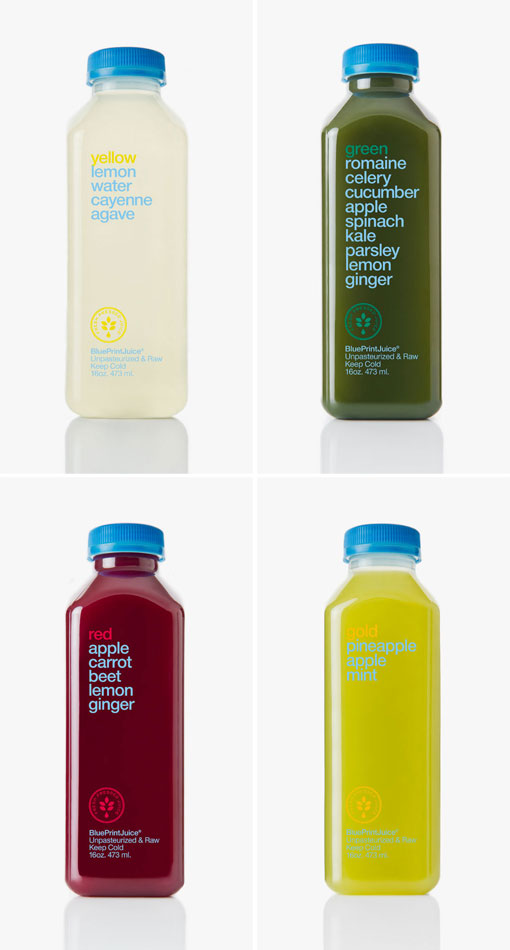
Love the idea of not having to squint to get the fine print. The ingredients are right out in plain site! Very clean looking.
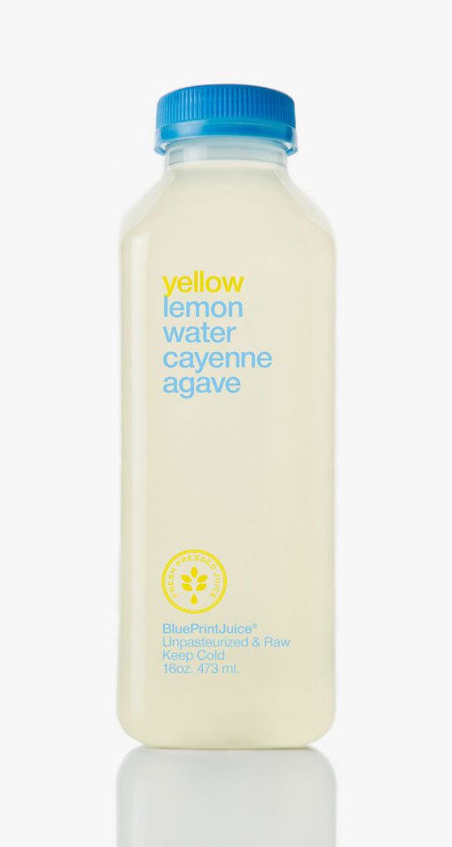
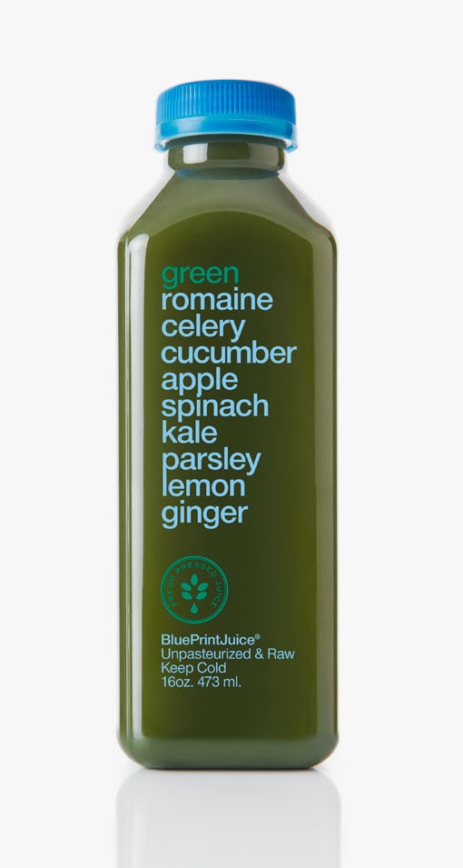
ok idea, lack of follow through and attention to detail in typography shows. spacing between words in ‘yellow’ and ‘green’ drink are bunching up at times.
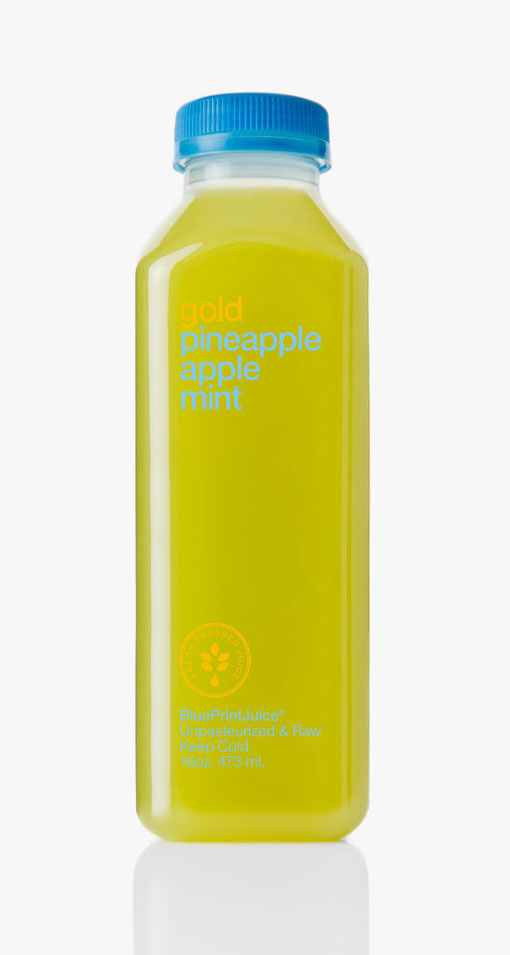
Hmm I actually disagree. Yes, the letter and line spacing is tight, but that’s done pretty consistently throughout. So to me, it seems like that is just the look they were going for.
Loving the package design.
reminds me of “water malt hops yeast” beer design.
[…] via Colossal and design work life […]
[…] saw this on DWL this morning and i knew mr. dschwen would f’n love it so i posted it up. I dug a little […]
[…] [Laughingsquid ] via [ DesignWorkLife […]
[…] To jedne z najbardziej szczerych i pięknych opakowań. Zaprojektowane przez Doubleday i Cartwright butelki są przeźroczystą, na których cała etykieta jest po prostu listą składników wydrukowaną w kontrastowym kolorze do koloru soku. Bardzo przyjazne opakowanie. http://doubledayandcartwright.com/#/2011/06/blueprintjuice-2 http://designworklife.com/2011/10/07/doubleday-cartwright-blueprintjuice/ […]
Love the idea of not having to squint to get the fine print. The ingredients are right out in plain site! Very clean looking.
ok idea, lack of follow through and attention to detail in typography shows. spacing between words in ‘yellow’ and ‘green’ drink are bunching up at times.
Hmm I actually disagree. Yes, the letter and line spacing is tight, but that’s done pretty consistently throughout. So to me, it seems like that is just the look they were going for.