As a Boston native, Christmas shopping in Downtown Crossing was an annual ritual for me. So I was really excited to come across this project that branded the area. From what I gather, the large-scale branding and urban planning project was completed by 160over90 with the help of Able.
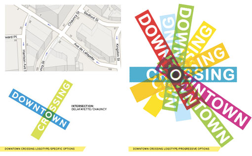
Here is some of what Able came up with:
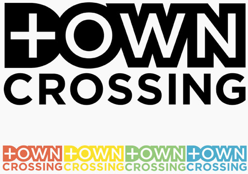
And here is where 160 over 90 ended up:

Get 300+ Fonts for FREE
Enter your email to download our 100% free "Font Lover's Bundle". For commercial & personal use. No royalties. No fees. No attribution. 100% free to use anywhere.
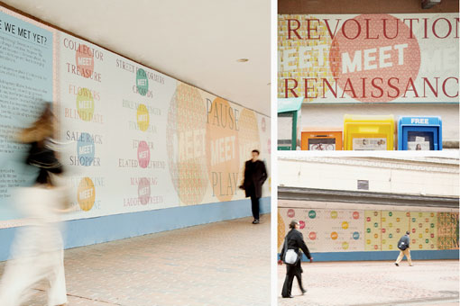
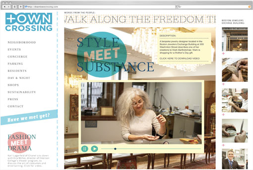
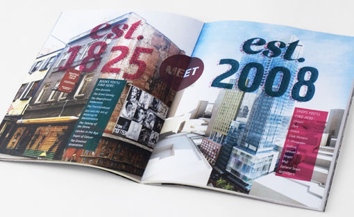
Personally I think I prefer the direction Able was heading in with the logo. I think you read the final logo as “Down Crossing”. The “town” part doesn’t come across very well and the the “T” within the “D” reads more like a plus sign than an actual letter. But I do really like the supporting branding—it creates a fun vibe that is indicative of the area. I also think the “blank MEET blank” language is a really fun idea. It makes perfect sense and has endless possibilities for expansion. Can’t wait to check it out for myself on the next trip North.
