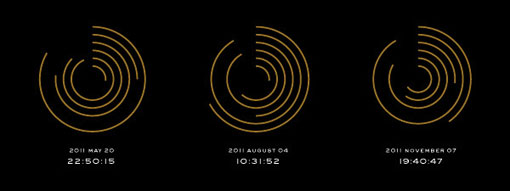
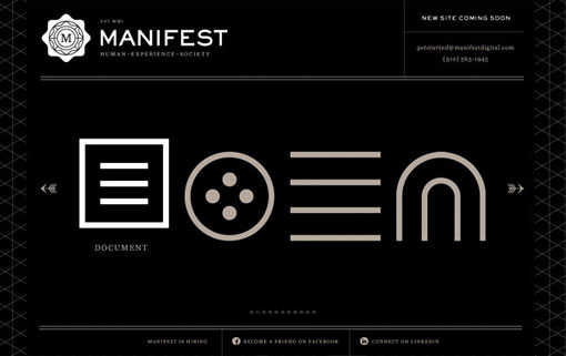
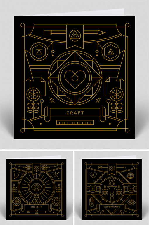
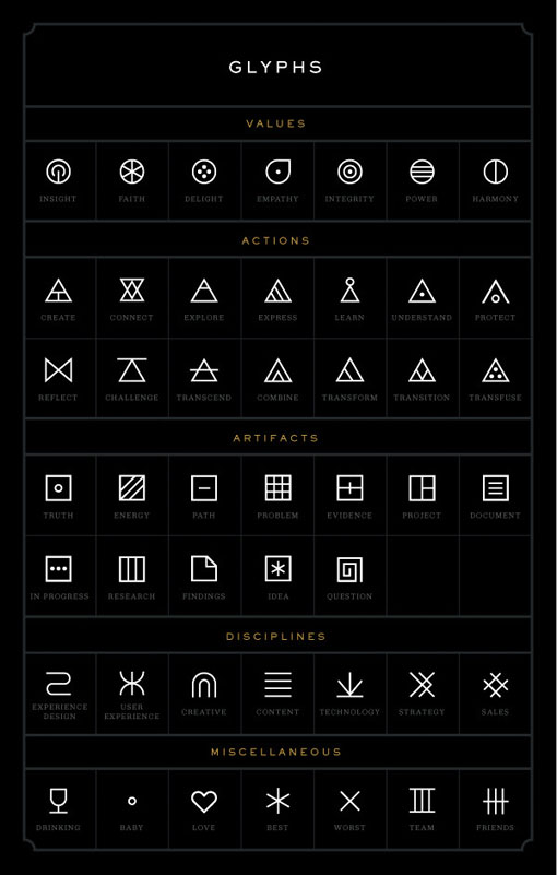
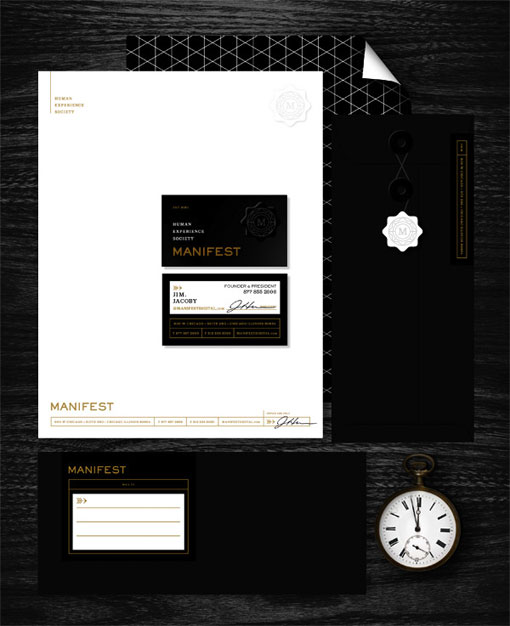
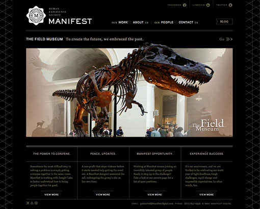
Now here is a perfect example of design that is both visually interesting and incredibly smart. For the rebranding of digital agency Manifest, Eight Hour Day took a conceptual approach by exploring the notions of time, human experience, connections and creativity. And as a result, in addition to the usual branding deliverables, the team also developed an impressive 40-character glyph language, “an ever-evolving timestamp and supplemental “chapter” marks, each of which represent an area of discipline or a core value.” I love how this all came together, in both concept and execution—there are so many layers and details to uncover that I can’t possibly see it getting stale any time soon.



Get 300+ Fonts for FREE
Enter your email to download our 100% free "Font Lover's Bundle". For commercial & personal use. No royalties. No fees. No attribution. 100% free to use anywhere.
