In this article:
- The Most Heart-Wrenching Emo Fonts of 2026
- What Makes Emo Fonts Feel So Emotionally Intense?
- Where Can You Use Emo Fonts?
- Where to Avoid Emo Fonts
- How to Choose the Perfect Emo Font
- Beautiful Emo Font Alternatives
- The Cultural Impact of Emo Typography
- Expert Insights on Emo Typography
- Common Emo Font Questions
- Conclusion: The Enduring Power of Emotional Typography
There’s something hauntingly beautiful about the way emo fonts balance delicate vulnerability with raw emotional intensity. I’ve spent countless late nights (probably while listening to My Chemical Romance) analyzing the typographic DNA that makes these fonts so perfectly capture that bittersweet aesthetic of beautiful pain.
It’s not just about looking edgy or dramatic (though they absolutely nail that vibe); these fonts are the visual embodiment of emotional complexity. From bleeding script letters that look like they were written with tears to jagged display fonts that feel like broken glass, emo typography tells stories that words alone never could.
In this deep dive into the shadows, we’ll explore the best emo fonts that perfectly capture that dark romantic energy. So put on your favorite dashboard confessional album, light some candles, and let’s dive into this beautifully melancholic typographic journey together!
The Most Heart-Wrenching Emo Fonts of 2026
Let’s face it – not all fonts can capture that perfect balance of vulnerability and angst that defines true emo typography. So I’ve curated a collection of the most emotionally evocative fonts that will make your designs bleed with authentic feeling. Here they are:
Nightcore
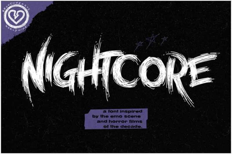
Nightcore is an emo-inspired horror font that combines sans-serif, script, and handwritten styles. It features unique symbols and decorative elements, making it perfect for edgy, branded designs in the alternative music scene.
Black Orchestra
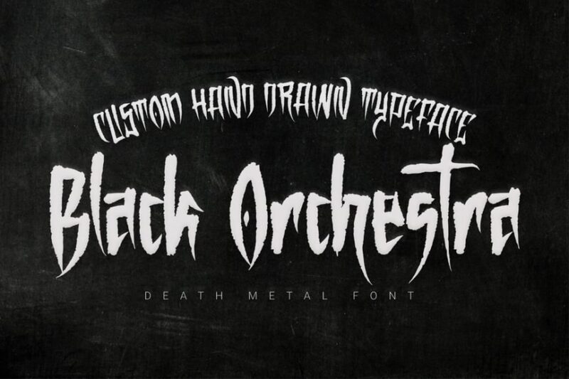
Black Orchestra is a dramatic script and handwritten font that evokes a sense of darkness and elegance. It’s ideal for album covers, posters, and other designs that require a bold, artistic touch with a hint of mystery.
Anxiety Of Sadness
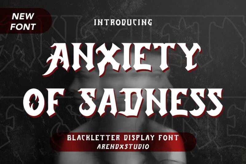
Anxiety Of Sadness is a blackletter display font with a modern twist. Its intricate, customizable design makes it suitable for esports branding, album covers, and other projects that require a touch of gothic elegance.

Get 300+ Fonts for FREE
Enter your email to download our 100% free "Font Lover's Bundle". For commercial & personal use. No royalties. No fees. No attribution. 100% free to use anywhere.
Emoligons
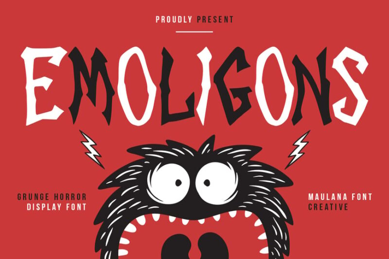
Emoligons is a grunge horror display font that combines edgy aesthetics with a comic-like feel. Its distressed appearance and unique character make it perfect for horror-themed designs, alternative music branding, and gritty visual projects.
Wasted Youth
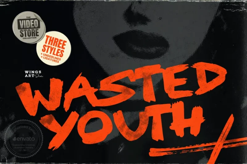
Wasted Youth is a 90s grunge-inspired brush font that blends sans-serif and handwritten styles. Its raw, energetic appearance makes it ideal for nostalgic designs, alternative music branding, and projects that aim to capture the spirit of 90s youth culture.
Punk Of Sad
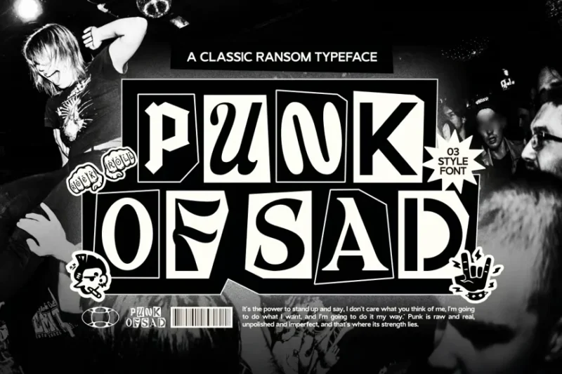
Punk Of Sad is a decorative punk font that embodies the rebellious spirit of punk rock. Its rough, edgy design makes it perfect for band logos, album covers, and other designs in the alternative music scene that require a raw, emotional impact.
Ink Boy
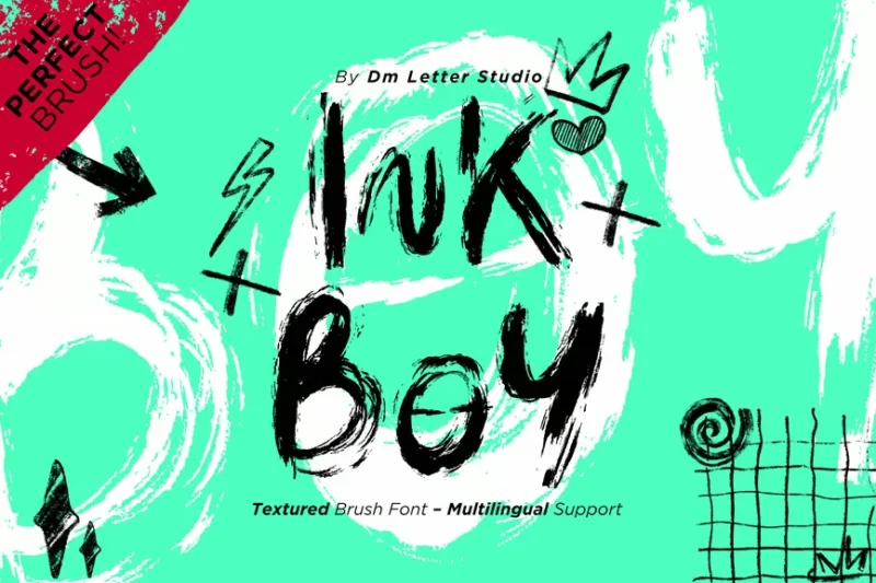
Ink Boy is a textured brush font that mimics the look of hand-drawn ink lettering. Its organic, imperfect appearance makes it ideal for designs that require a personal touch, such as book covers, posters, and branding for artistic projects.
Deadcore
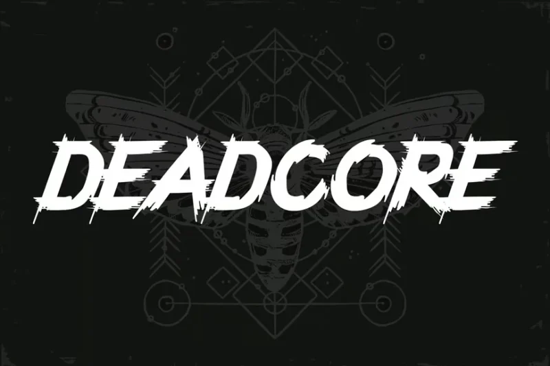
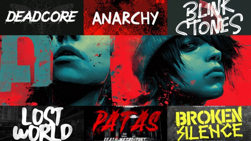
Deadcore is a metal music font designed to capture the intensity of the genre. Its sharp, aggressive style makes it perfect for heavy metal band logos, album artwork, and festival posters that need to convey raw power and energy.
Across the Line
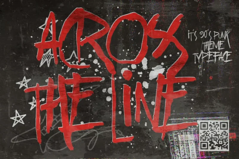
Across the Line is a trash and rebel typeface that combines script and handwritten styles. Its grungy, rebellious appearance makes it ideal for music-related designs, posters, and any project that aims to convey a sense of defiance and individuality.
Fearless Souls
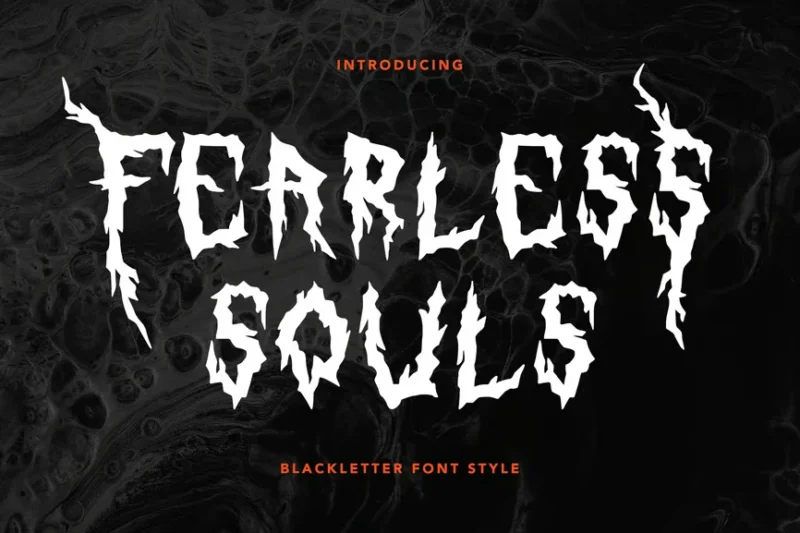
Fearless Souls is a decorative blackletter font that exudes confidence and strength. Its bold, intricate design makes it suitable for card designs, logos, and branding projects that require a touch of gothic elegance with a modern twist.
Emotica
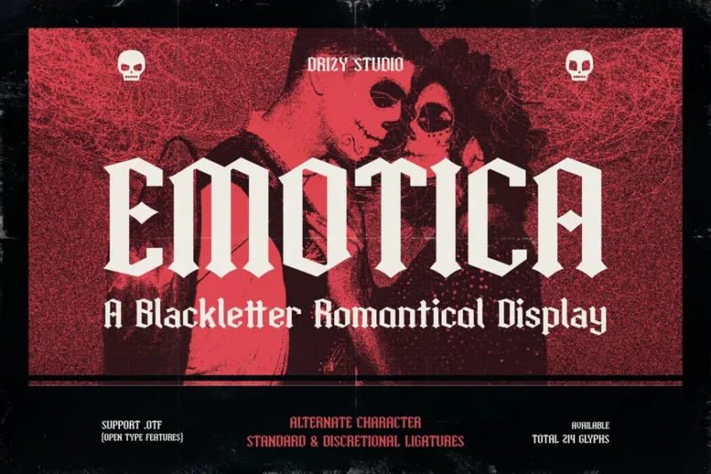
Emotica is a gothic romance font that combines blackletter elements with a touch of elegance. Its decorative, calligraphic style makes it perfect for display purposes, romantic-themed designs, and projects that require a blend of drama and sophistication.
Rebel Music Font – Anarchy
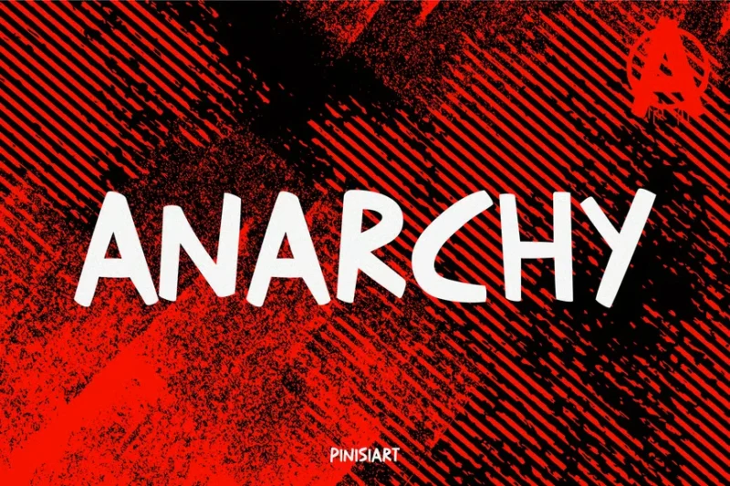
Rebel Music Font – Anarchy is a sans-serif font that embodies the spirit of rebellion. Its grungy, distressed appearance makes it ideal for designs related to punk rock, protest movements, and any project that aims to convey a sense of defiance and anarchy.
Blink Stones
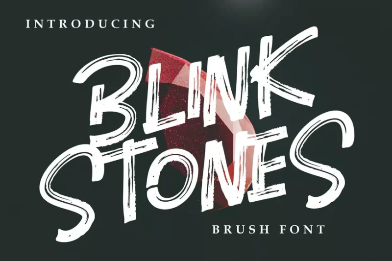
Blink Stones is a decorative font that combines natural elements with elegance. Its unique design makes it suitable for branding projects, packaging designs, and any application that requires a touch of organic sophistication.
Trash Mercy
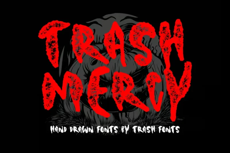
Trash Mercy is a decorative font that blends horror and death metal aesthetics. Its gritty, intense design makes it perfect for Halloween-themed projects, metal band logos, and designs that aim to convey a sense of darkness and aggression.
Violencia
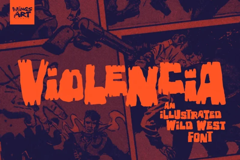
Violencia is an illustrated Wild West font with a sans-serif base. Its rugged, cowboy-inspired design makes it ideal for Western-themed projects, vintage posters, and designs that aim to capture the spirit of the American frontier.
Lost World
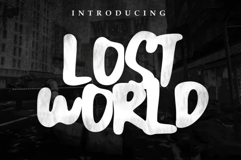
Lost World is a decorative font that evokes a sense of mystery and adventure. Its unique design makes it perfect for logo creation, apparel designs, and branding projects that require a touch of intrigue and exploration.
Rebel Riff
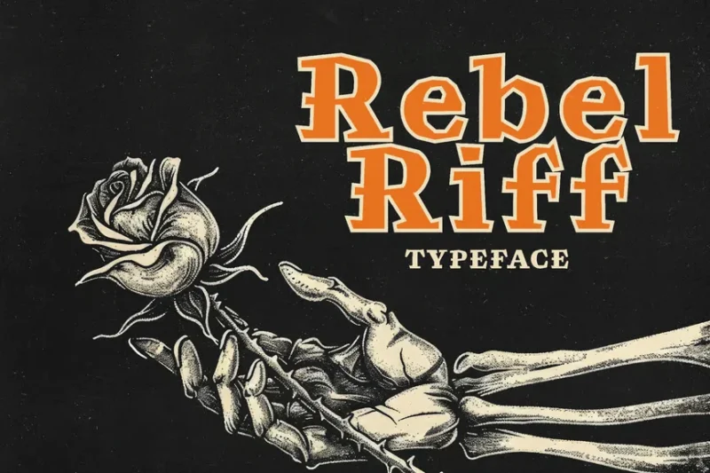
Rebel Riff is an edgy typeface that captures the spirit of punk and skateboarding culture. Its bold, aggressive style makes it ideal for youth-oriented designs, street wear brands, and projects that aim to convey a sense of rebellion and energy.
Patas Horror Metal Display Font
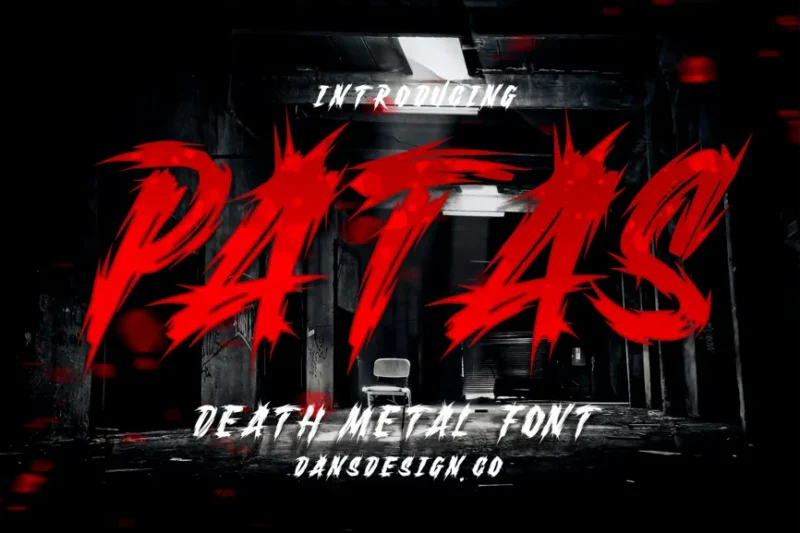
Patas is a horror metal display font that combines frightening elements with a heavy metal aesthetic. Its intense, aggressive design makes it perfect for metal band logos, horror-themed projects, and designs that aim to shock and captivate.
Electro Soul
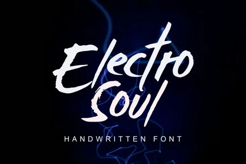
Electro Soul is a script and handwritten font that blends electronic and spiritual elements. Its distorted, energetic appearance makes it ideal for music-related designs, event posters, and projects that aim to convey a sense of modern mysticism.
Crome Stroms
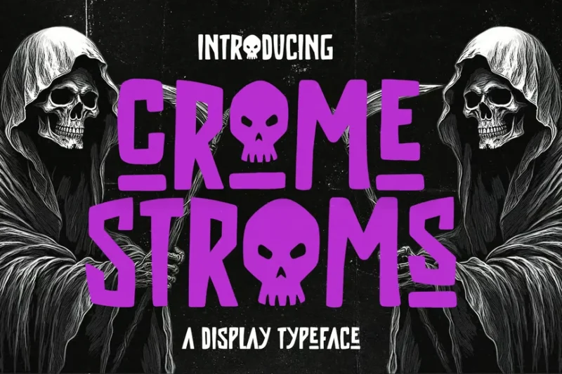
Crome Stroms is a horror display typeface that mimics the look of marker-drawn letters. Its eerie, handmade style makes it perfect for horror movie posters, album covers, and designs that require a raw, unsettling aesthetic.
Solid Punk
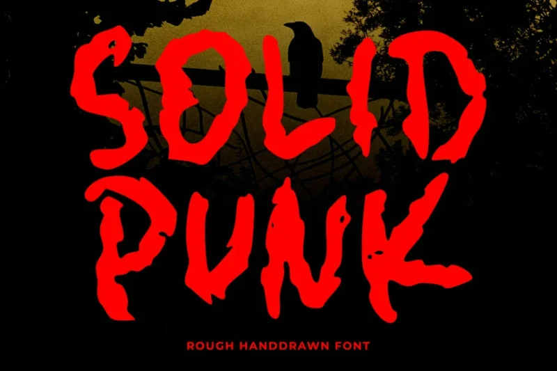
Solid Punk is a scary font that embodies the bold spirit of punk rock. Its strong, angular design makes it ideal for band logos, concert posters, and any project that aims to capture the energy and attitude of punk culture.
EMOH
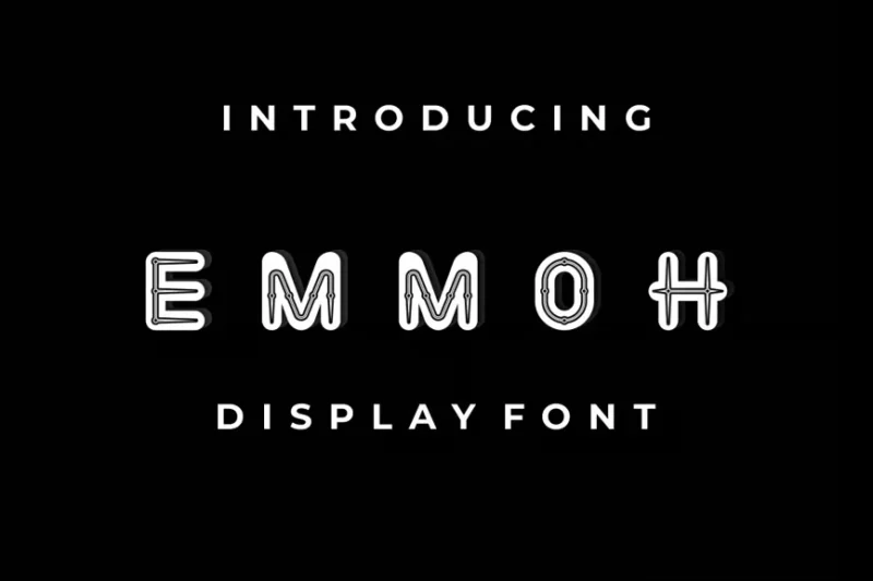
EMOH is a sans-serif font with a unique twist. Its clean lines and modern aesthetic make it versatile for various design applications, from branding to digital interfaces, while still maintaining a distinctive character.
Afruemo
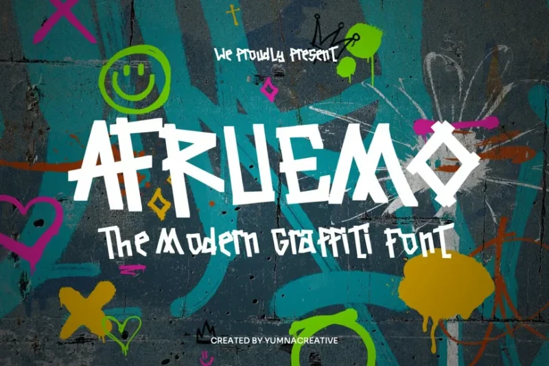
Afruemo is a modern graffiti font that brings street art to typography. Its bold, expressive style makes it perfect for urban-themed designs, street wear brands, and projects that aim to capture the energy and creativity of street culture.
Rustic Age
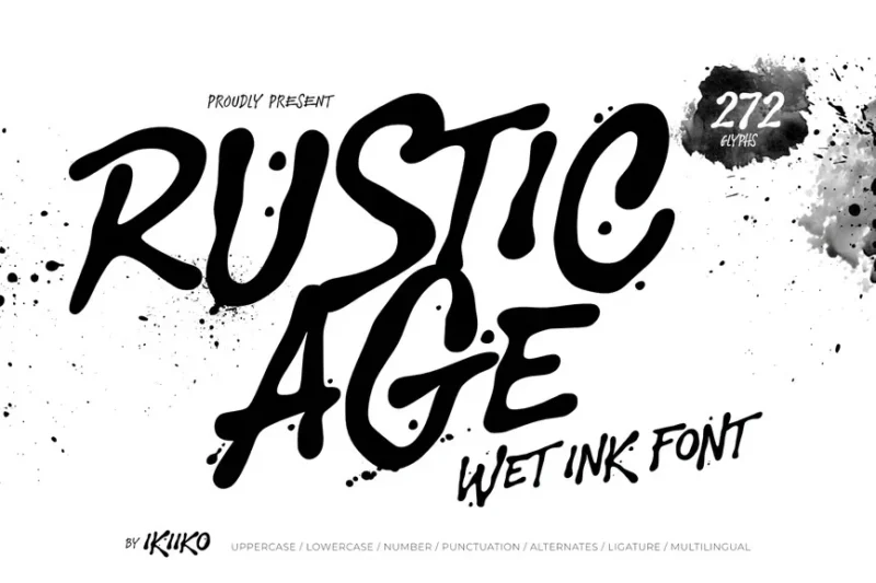
Rustic Age is a wet ink font that mimics the look of handwritten brush strokes. Its organic, imperfect appearance makes it ideal for designs that require a personal touch, such as invitations, packaging, and artisanal branding.
Madhoney
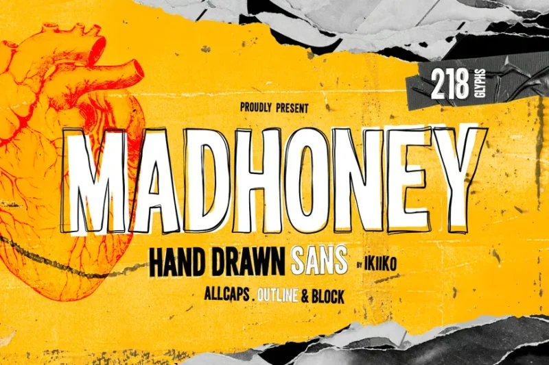
Madhoney is a hand-drawn sans-serif font with a rough, organic feel. Its imperfect lines and unique character make it perfect for designs that require a personal, handcrafted touch, such as packaging, branding, and editorial projects.
Metalcore
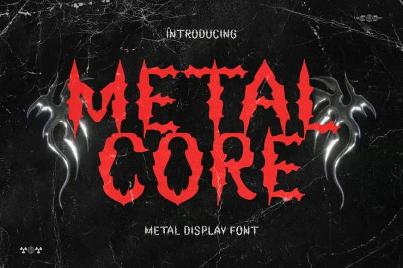
Metalcore is a heavy metal font designed to capture the intensity of the genre. Its sharp, aggressive style makes it ideal for metal band logos, album artwork, and designs that need to convey power and energy in the music industry.
Sijusto
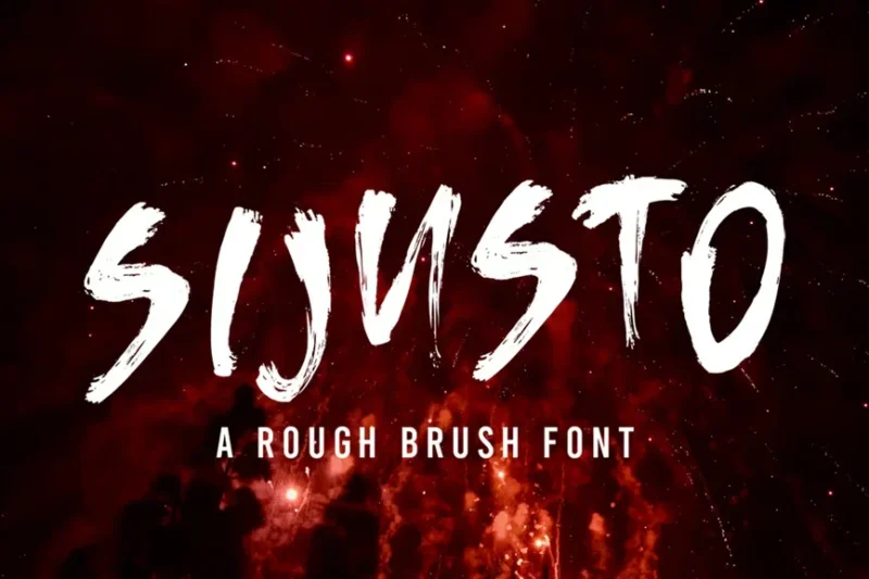
Sijusto is a brush font that combines decorative elements with a handmade feel. Its expressive, dynamic style makes it perfect for poster designs, inspirational quotes, and projects that require a bold, artistic touch.
Retroma Vibes
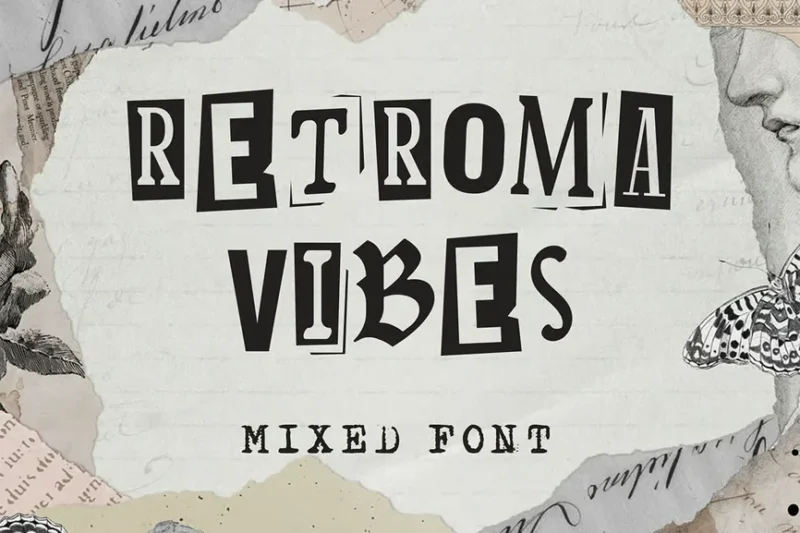
Retroma Vibes is a mixed font that combines various styles for a collage-like effect. Its eclectic, punk-inspired design makes it ideal for retro-themed projects, album covers, and designs that aim to capture a sense of nostalgia and rebellion.
Broken Silence
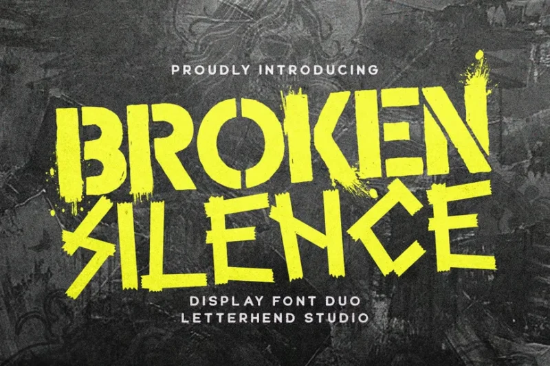
Broken Silence is a decorative font with a stencil-like appearance. Its urban, gritty style makes it perfect for street art-inspired designs, industrial branding, and projects that require a bold, edgy aesthetic.
Zombie Punks
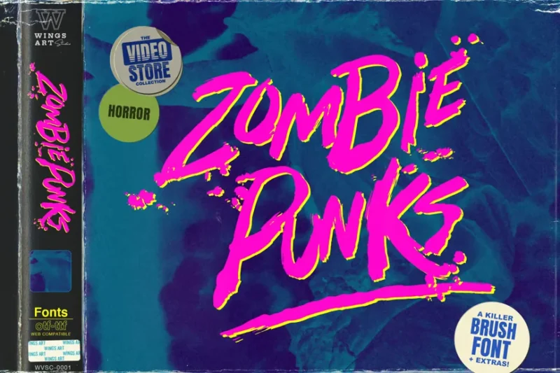
Zombie Punks is a retro horror movie font with a sans-serif base. Its handmade, slightly unsettling appearance makes it ideal for Halloween-themed designs, horror movie posters, and projects that blend nostalgia with a touch of the macabre.
Arclone Moods
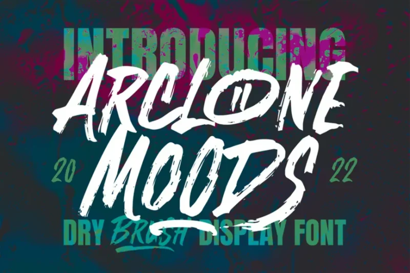
Arclone Moods is a decorative font with a dry, textured appearance. Its unique character makes it suitable for various design applications, from branding to editorial projects, where a distinctive and slightly weathered look is desired.
Punkbro
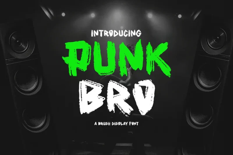
Punkbro is a font that combines decorative and script styles with a handwritten feel. Its paint-like appearance and rebellious character make it perfect for punk rock-themed designs, grungy branding, and projects that require a raw, expressive aesthetic.
What Makes Emo Fonts Feel So Emotionally Intense?
Emo fonts get their soul-crushing beauty and emotional depth from several key characteristics that work together to create that perfect storm of vulnerability and darkness:
Dramatic Contrast and Weight Variation
The most powerful emo fonts feature extreme contrast between thick and thin strokes, much like the emotional highs and lows that define the emo experience itself. These dramatic weight variations create letters that feel like they’re struggling to hold themselves together – much like a heart on the verge of breaking.
The heavy downstrokes feel weighty with emotion, while the delicate hairlines appear fragile and vulnerable. This visual tension mirrors the internal conflict that drives emo aesthetics.
Bleeding and Distressed Effects
Many emo fonts incorporate bleeding, dripping, or distressed effects that make letters appear wounded or weathered by pain. These imperfections aren’t flaws – they’re features that add authentic emotional texture.
The bleeding effects often make text look like it was written in tears or blood, while distressed textures suggest the wear and tear of a broken heart that’s been through too much.
Ornate Gothic Details
Drawing inspiration from Gothic architecture and Victorian mourning aesthetics, emo fonts often feature elaborate flourishes, pointed serifs, and decorative elements that feel both beautiful and haunting.
These ornate details reference historical periods associated with romance, death, and melancholy – perfect visual metaphors for the emo emotional landscape.
Handwritten Vulnerability
Script-style emo fonts often mimic tortured handwriting – the kind you might find in a diary entry written at 3 AM after a devastating heartbreak. The imperfect letterforms feel personal and authentic, like glimpses into someone’s private emotional world.
Where Can You Use Emo Fonts?
Now that we understand what gives emo fonts their emotional power, where can we actually channel that dark energy in our designs? Their intense vibe makes them surprisingly versatile for the right contexts:
Music and Entertainment
Emo fonts are naturals for band logos, album covers, concert posters, and music festival branding. They’re perfect for alternative rock, metal, goth, punk, and of course, emo bands looking to visually communicate their emotional intensity.
They also work beautifully for horror movie posters, dark romance novel covers, and any entertainment that deals with themes of love, loss, and redemption.
Fashion and Lifestyle Brands
Gothic fashion brands, alternative clothing lines, jewelry companies specializing in dark romantic pieces, and tattoo parlors can all benefit from emo typography that matches their aesthetic.
These fonts help brands targeting alternative subcultures communicate authenticity and emotional depth.
Personal Expression
Emo fonts excel in contexts where personal vulnerability is the goal – poetry books, personal blogs, artistic portfolios, wedding invitations for couples who embrace darker aesthetics, and memorial designs.
They’re perfect for any project where you want to convey genuine emotion rather than corporate polish.
Digital and Social Media
On platforms like Instagram, TikTok, or personal websites, emo fonts help create that authentic, emotional connection with audiences who appreciate deeper artistic expression.
They work particularly well for quote graphics, poetry posts, and any content exploring themes of love, heartbreak, mental health, or personal growth.
Where to Avoid Emo Fonts
While perfect for many emotional contexts, emo fonts aren’t universally appropriate. Consider avoiding them in situations requiring:
Corporate Professionalism
For traditional business applications – legal documents, financial reports, corporate presentations – emo fonts can appear unprofessional and potentially alienating to conservative audiences.
Children’s Content
The intense emotional weight and sometimes dark imagery of emo fonts make them inappropriate for most children’s products, educational materials, or family-friendly brands.
Medical and Healthcare
In contexts where trust, clarity, and calm authority are essential, the emotional intensity of emo fonts can feel overwhelming or inappropriate.
How to Choose the Perfect Emo Font
To select an emo font that perfectly captures your intended emotional tone, consider these key factors:
Emotional Intensity Level
Different projects call for different levels of emotional drama. A subtle script with slight bleeding effects might work for a romantic wedding invitation, while a heavily distressed display font with Gothic flourishes could be perfect for a metal band logo.
Consider how much emotional weight your message needs to carry, then match the font’s intensity accordingly.
Legibility Requirements
Some emo fonts prioritize emotional impact over pure readability. Ensure your chosen font remains legible at your intended size and application. Highly decorative or distressed fonts work better for headers than body text.
Brand Authenticity
The best emo fonts feel genuine rather than contrived. Choose fonts that authentically reflect your brand’s emotional core rather than simply adopting emo aesthetics for shock value.
Cultural Sensitivity
Be mindful that emo aesthetics deal with serious emotional themes including depression, self-harm, and suicide. Use these visual languages respectfully and avoid trivializing real mental health struggles.
Beautiful Emo Font Alternatives
If pure emo fonts feel too intense for your project, several alternatives can capture similar emotional depth with different approaches:
Gothic Revival Fonts
Fonts like Blackletter styles or Victorian-inspired serifs offer the ornate, historical drama of emo typography with slightly more restraint and sophistication.
Distressed Handwriting Fonts
Imperfect script fonts that look authentically handwritten can provide personal vulnerability without the heavier Gothic elements.
Dramatic Serif Fonts
High-contrast serif fonts with extreme thick-thin variation offer emotional intensity through typographic means rather than decorative effects.
The Cultural Impact of Emo Typography
Emo fonts represent more than just aesthetic choices – they’re visual artifacts of a cultural movement that gave permission to feel deeply and express vulnerability authentically. In a world that often demands emotional suppression, emo typography created space for genuine feeling.
These fonts helped normalize conversations about mental health, heartbreak, and emotional complexity. They proved that darkness and beauty aren’t opposites – they’re dance partners in the complex choreography of human experience.
Expert Insights on Emo Typography
I reached out to designers and cultural historians to understand the deeper significance of emo typography:
Sarah Blackwood, Alternative Culture Historian: “Emo fonts represent a typographic rebellion against emotional suppression. They gave visual form to feelings that mainstream culture often silenced, creating a safe space for authentic emotional expression.”
Marcus Chen, Typography Designer: “The best emo fonts understand that vulnerability requires strength. The bleeding effects and Gothic flourishes aren’t just decoration – they’re visual metaphors for the courage it takes to feel deeply in a disconnected world.”
Elena Rodriguez, Brand Designer: “What makes emo typography so powerful is its honesty. These fonts don’t pretend emotions are simple or pretty. They embrace the complexity of human feeling – the beauty and the pain together.”
Common Emo Font Questions
What makes a font “emo”?
Emo fonts typically feature dramatic contrast, bleeding or distressed effects, Gothic-inspired details, and an overall aesthetic that captures emotional vulnerability and intensity. They often look handwritten, wounded, or ornately decorative.
Can emo fonts be used professionally?
While not appropriate for traditional corporate contexts, emo fonts can be highly professional for brands in creative industries, alternative fashion, music, entertainment, and any business serving communities that value authentic emotional expression.
Are emo fonts still relevant in 2026?
Absolutely! As conversations about mental health and emotional authenticity become more mainstream, emo aesthetics – including typography – continue to resonate with audiences seeking genuine emotional connection.
What’s the difference between emo and goth fonts?
While there’s overlap, emo fonts tend to emphasize emotional vulnerability and personal pain, while goth fonts often focus more on dark romanticism and supernatural themes. Emo typography usually feels more personally intimate.
Conclusion: The Enduring Power of Emotional Typography
Emo fonts remind us that typography isn’t just about communication – it’s about connection. In a digital world that often feels cold and impersonal, these emotionally charged letterforms create bridges between hearts and minds.
From the delicate vulnerability of bleeding scripts to the ornate drama of Gothic display fonts, emo typography proves that our deepest feelings deserve beautiful expression. These fonts don’t just spell out words – they spell out souls.
Whether you’re designing for a band that channels raw emotion, a brand that serves alternative communities, or a personal project that demands authentic feeling, the right emo font can transform your message from mere information into genuine human connection.
So embrace the beautiful darkness. Let your typography bleed. And remember that in a world full of shallow aesthetics, authentic emotional expression will always cut deeper.
In the immortal words of the emo movement: it’s okay to not be okay. And sometimes, the most beautiful designs come from our most vulnerable moments.
What emo font speaks to your soul? Share your favorites in the comments below!

