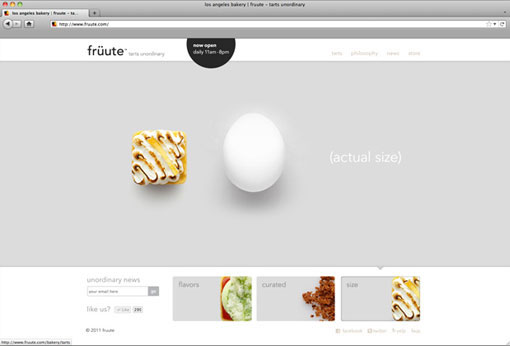
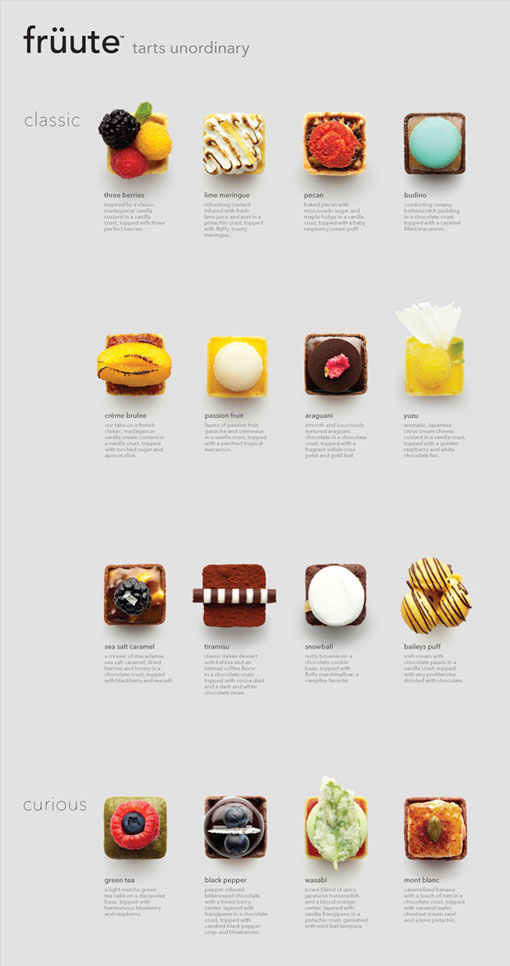
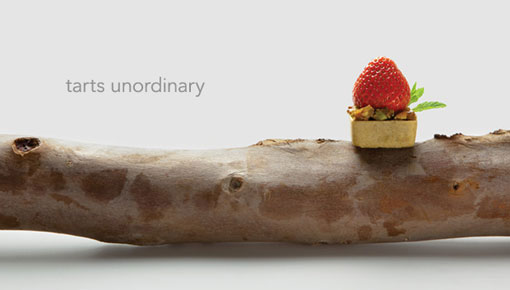
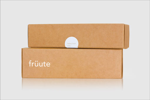
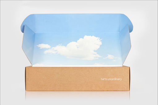
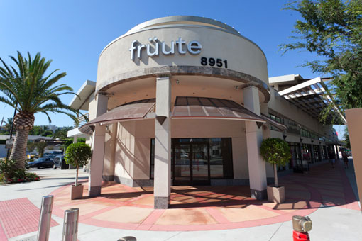
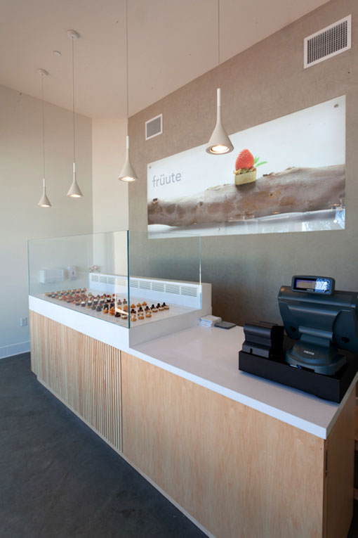
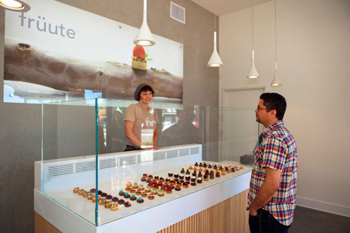
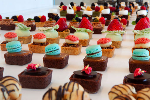
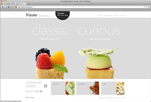
Check out Ferroconcrete‘s clean, minimal and whimsical branding for früute, who makes all sorts of colorful and interestingly constructed tarts. The brand provides a perfect backdrop to showcase these mini works of art. If I make it out to the West Coast any time soon, I will definitely be making a stop there.
I love that box!
gilead in bloom
An absolutely gorgeous find! Thanks for sharing!
I love how the brand was translated into the store/register area. Beautifully designed and incorporated!
The photography is great, sure. But the usability is not so great. The navigation is clunky and counter-intuitive, the mouse over images take forever to load and there are no calls to action. From a web marketing standpoint, I’m not impressed.
Not sure I agree with that… While I was posting the branding (including the site) from a primarily visual perspective, I definitely try not to post work that isn’t user friendly. I don’t find the navigation clunky or counter-intuitive, I find it to be unique, playful and inviting. The images are also loading fine for me, but maybe I have a speedier internet connection than most.
[…] design work life. Design by ferroconcrete. 0 Comments – Leave a comment! « Previous […]
[…] design work life » Ferroconcrete: Fruute Branding. Like this:LikeBe the first to like this post. […]
[…] 資料來源: Design Work Life » Ferroconcrete: Fruute Branding […]
[…] https://designworklife.com/2011/09/08/ferroconcrete-fruute-branding/ (An example of their work) […]