I’m interested in knowing what a couple of the typefaces are. Whats the one that is used for “Turn off the stars” and in the last piece “out of the” and also “hair and wit” They’re beautiful!
Thanks to Seamless Creative for posting my work and thanks to everybody else for the nice comments. :)
Now, onto the important stuff; Typefaces!
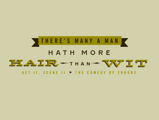
– The slab serif font is Hellenic Wide
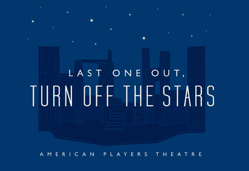
– “Turn off the Stars” is an amended version of Tall Films
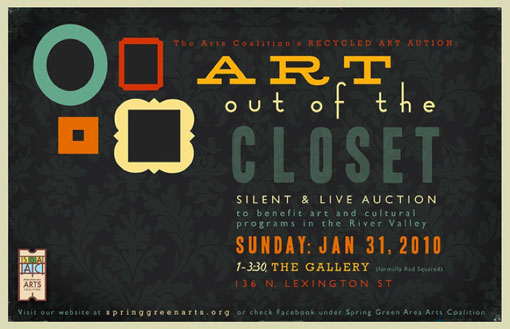
– “out of the” is Fashion Victim
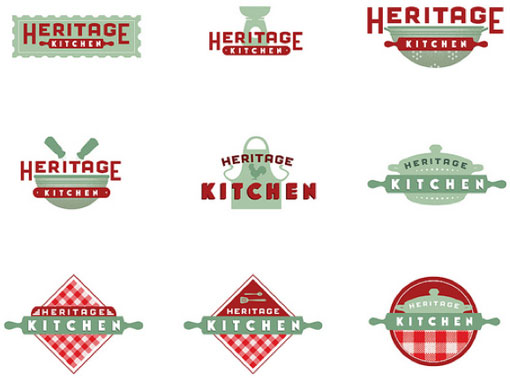
I really like the Heritage Kitchen executions. It’s nice to see the culinary icons done in a modern-vintage way.
Holy Cannoli! Check out her work for Furthermore Beer. I think she won some awards for those. Deserved it too. Nailed it. So original.
wow~so awesome!
i like the last one!
I found a link to the beer labels Erin Fuller did. So cool! I need to get to know this woman.
http://www.furthermorebeer.com/beer
love it
What is the beautiful slab serif extended font?
I’m interested in knowing what a couple of the typefaces are. Whats the one that is used for “Turn off the stars” and in the last piece “out of the” and also “hair and wit” They’re beautiful!
Thanks to Seamless Creative for posting my work and thanks to everybody else for the nice comments. :)
Now, onto the important stuff; Typefaces!
– The slab serif font is Hellenic Wide
– “Turn off the Stars” is an amended version of Tall Films
– “out of the” is Fashion Victim