In this article:
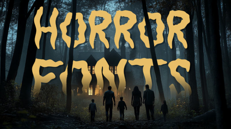
- 33 Most Blood-Curdling Horror Fonts of 2026
- The Psychology Behind Effective Horror Typography
- Choosing the Right Horror Font for Your Project
- Practical Applications for Horror Fonts
- Expert Tips for Pairing Horror Fonts
- Common Horror Font Questions
- The Evolution of Horror Typography
- Conclusion: The Power of Horror Typography
When it comes to creating spine-chilling, hair-raising designs, nothing sets the mood quite like the perfect horror font. These eerie typefaces can transform ordinary text into nightmarish messages that crawl under your audience’s skin.
Horror fonts capture that perfect blend of unease and intrigue – letterforms that feel just distorted enough to be unsettling while remaining readable. In 2026, we’re seeing horror typography evolve beyond the classic dripping blood aesthetic into something more psychologically disturbing.
Let’s venture into the shadows and discover how the right typography can make your audience’s blood run cold.
33 Most Blood-Curdling Horror Fonts of 2026
Horror Joys
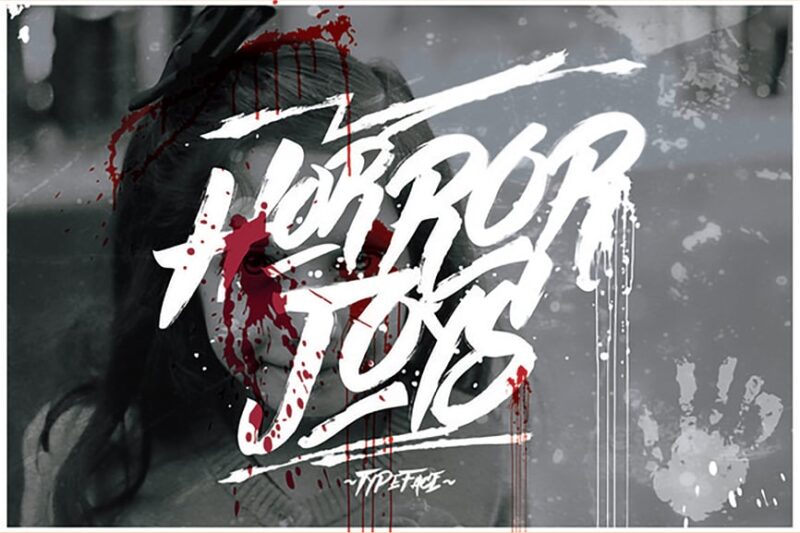
Horror Joys is a versatile font that combines serif, decorative, and script styles. It offers a unique blend of elegance and eeriness, perfect for creating atmospheric designs with a touch of handcrafted charm.
Horror Vibes
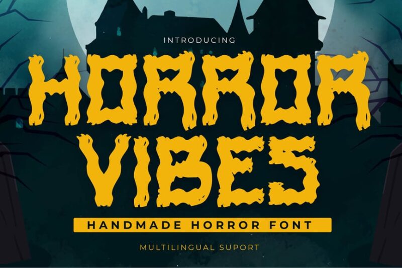
Horror Vibes is a handmade sans-serif font with a textured, brushed appearance. Its raw and organic feel makes it ideal for creating authentic, gritty horror-themed designs with a DIY aesthetic.
Horror Movies
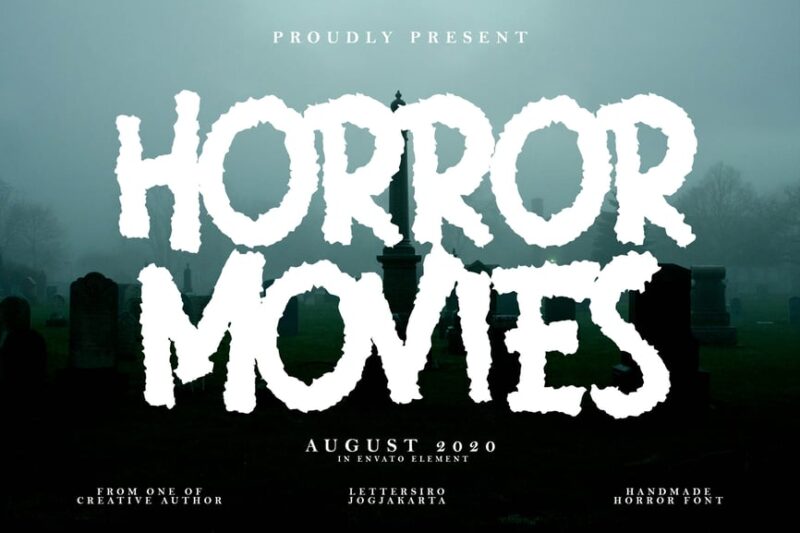
Horror Movies is a decorative font that incorporates skull-like elements into its design. This classically cinematic font is perfect for movie posters, book covers, or any project that requires an instantly recognizable horror aesthetic.
Horror Story
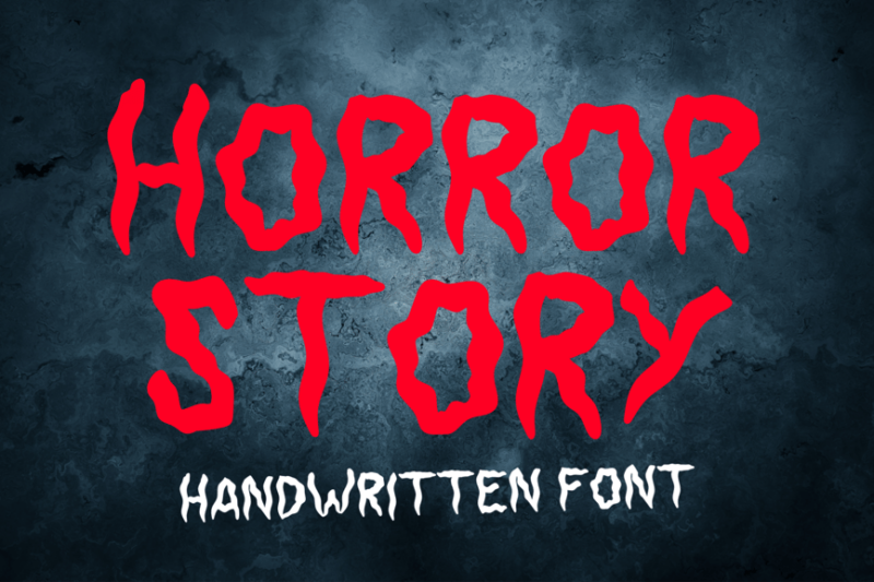
Horror Story is a decorative font designed with Halloween themes in mind. Its eerie, twisted letterforms create an unsettling atmosphere, making it ideal for spooky storytelling and seasonal promotions.

Get 300+ Fonts for FREE
Enter your email to download our 100% free "Font Lover's Bundle". For commercial & personal use. No royalties. No fees. No attribution. 100% free to use anywhere.
Terroret
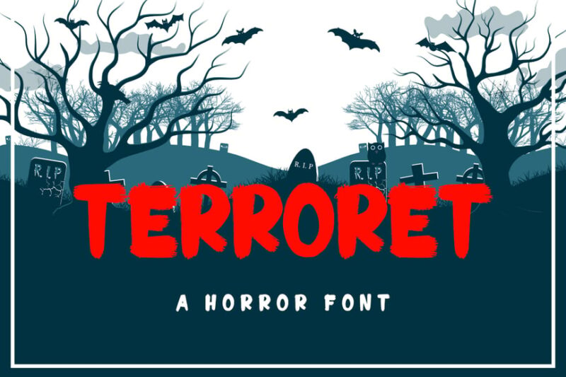
Terroret is a creepy, decorative font that embodies the essence of horror. Its distressed and irregular characters create a sense of unease, perfect for projects that aim to evoke fear and tension.
Deep Horror Font
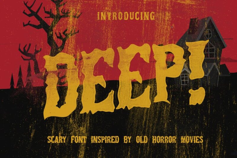
Deep Horror Font is a versatile typeface that combines decorative, sans-serif, and serif styles. Its multi-layered design allows for depth and shadow effects, making it suitable for various horror and Halloween-themed projects.
AL – Horror Corps
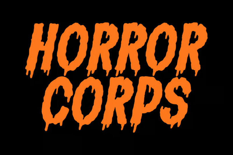
AL – Horror Corps is a script font with a handwritten feel. Its irregular, scratchy appearance adds an element of unease to designs, making it perfect for creating personalized, horror-themed typography.
Fighter Horror Font
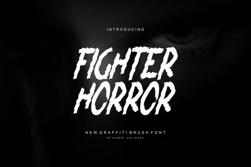
Fighter Horror Font is a bold, decorative typeface that combines elements of horror with a fighting spirit. Its strong, aggressive letterforms make it ideal for action-horror projects or intense, confrontational designs.
Devil Horror Handwritten
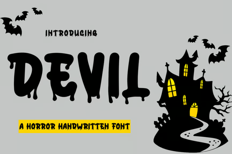
Devil Horror Handwritten is a script font with a devilish twist. Its fluid, yet menacing strokes create a sense of supernatural malevolence, perfect for Halloween designs or demonic-themed projects.
Exorcist
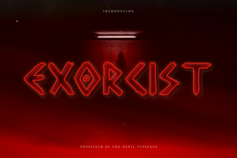
Exorcist is a horror display typeface that combines decorative and script elements. Its haunted appearance and intricate details make it ideal for creating eerie, supernatural-themed designs with a touch of elegance.
Ghorst
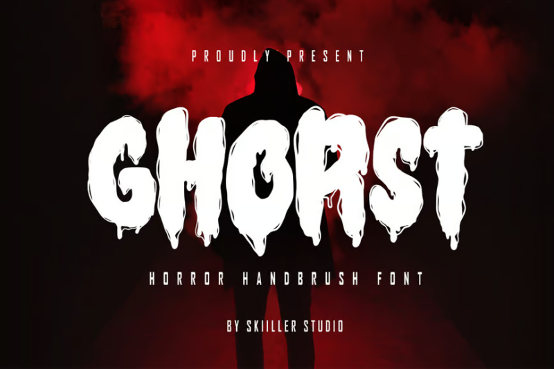
Ghorst is a horror handbrush font with a unique twist on Christmas themes. Its rough, brushed texture combined with spooky elements makes it perfect for creating unconventional holiday horror designs.
Magic Horror
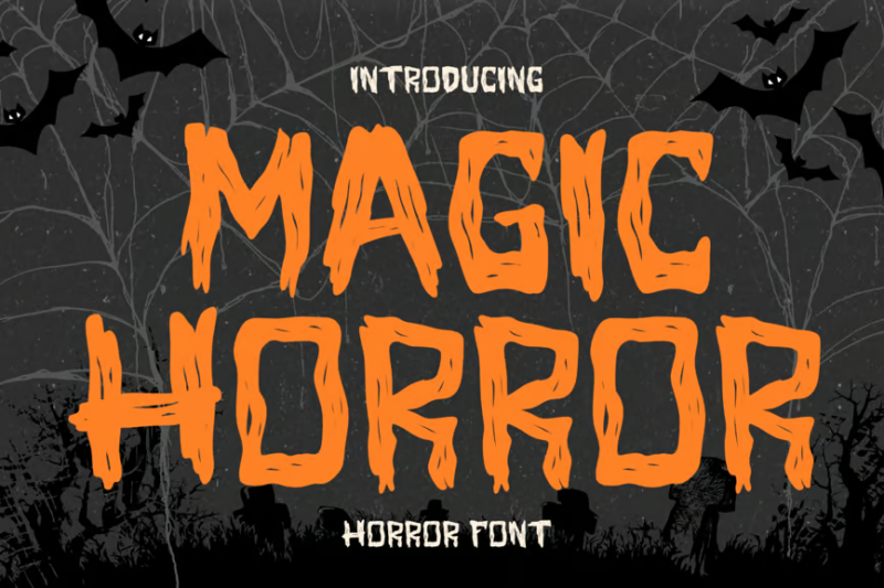
Magic Horror is a sans-serif font with decorative elements that blend magic and horror themes. Its grunge style and Halloween-inspired design make it suitable for creating mystical, yet frightening visuals.
Hereday Horror Font
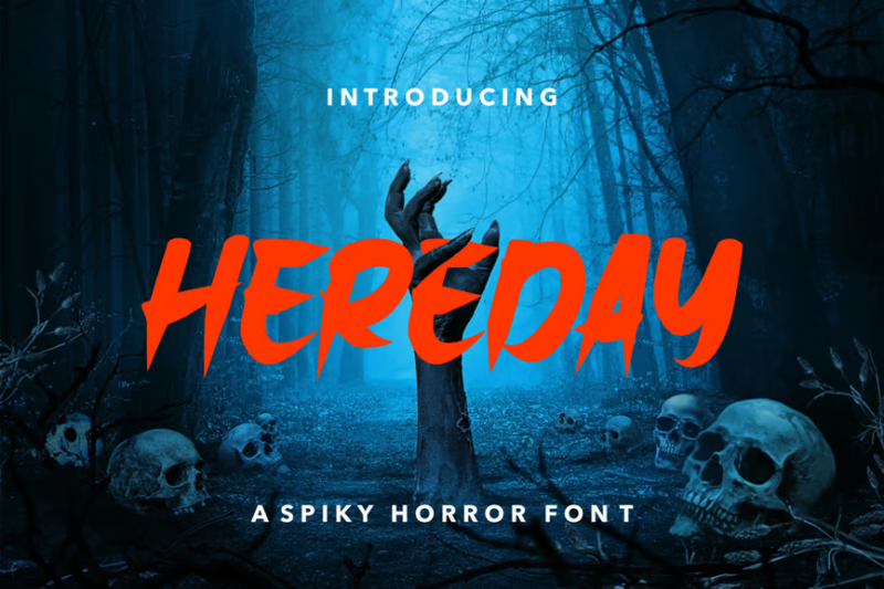
Hereday Horror Font is a script typeface that captures the essence of scary, handwritten text. Its irregular, shaky appearance adds an authentic touch to horror-themed designs, evoking a sense of unease and tension.
Sepattan
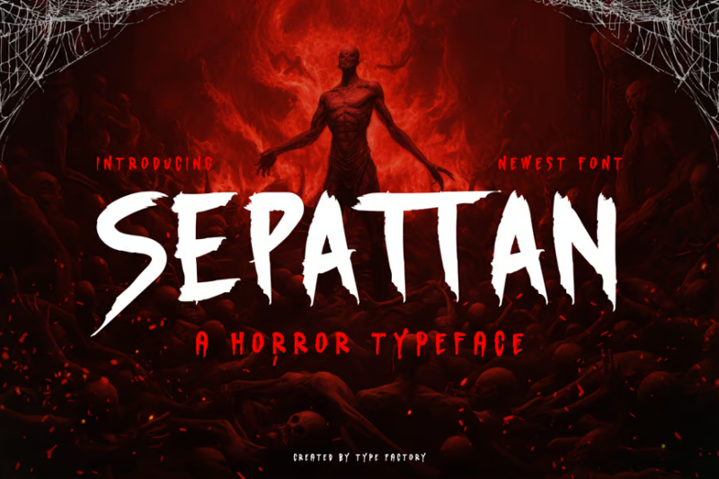
Sepattan is a chilling and eerie decorative horror typeface. Its intricate, unsettling design creates a sense of foreboding, making it perfect for projects that require a strong, creepy visual impact.
Tacurse
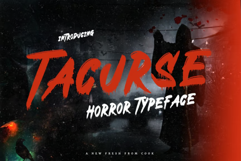
Tacurse is a decorative horror font designed with Halloween themes in mind. Its cursed appearance and irregular forms make it ideal for creating spooky, attention-grabbing typography for seasonal projects.
Moaned
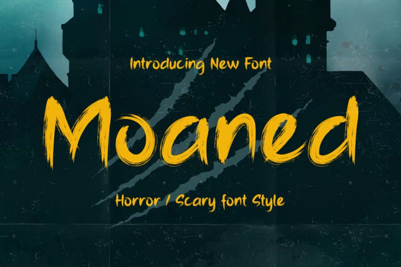
Moaned is a scary decorative font that mimics the look of distressed, painful writing. Its rough edges and uneven strokes make it perfect for crafting horror-themed designs with a raw, emotional impact.
Halloween Horror Fonts | Hantu
Hantu is a mysterious and eerie decorative font designed for Halloween. Its ghostly appearance and intricate details make it ideal for creating haunting visuals and spooky themed designs.
FC Horror Corpse
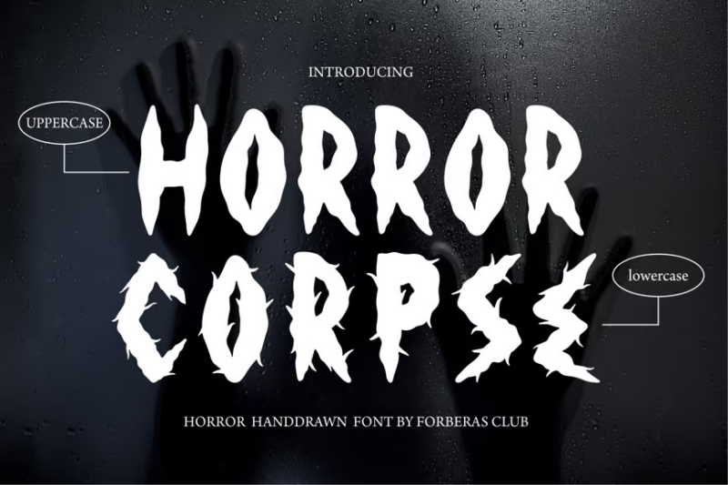
FC Horror Corpse is a script font that emulates decaying, corpse-like handwriting. Its unsettling appearance makes it perfect for horror movie promotions or any design that aims to evoke a sense of death and decay.
Vampires Horror Brush Font
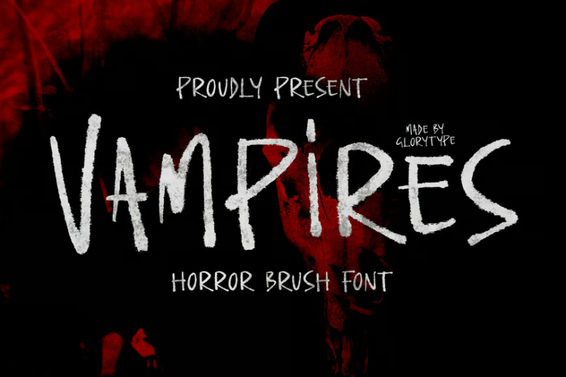
Vampires Horror Brush Font is a handwritten typeface with a dark, vampiric twist. Its fluid, blood-like strokes make it ideal for creating gothic horror designs or vampire-themed branding projects.
Wicked
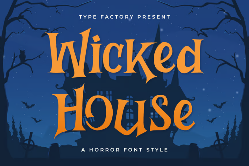
Wicked is a decorative horror font style that combines elements of magic and wickedness in a more cartoony style. Its intricate, spell-like design makes it perfect for creating mystical horror themes or crafting designs with a touch of dark enchantment.
Creature
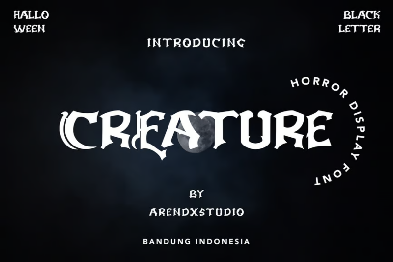
Creature is a horror display font with a casual yet monstrous appearance. Its organic, creature-like forms make it ideal for creating eye-catching titles or logos for horror-themed projects with a touch of playfulness.
Earthen Parasite
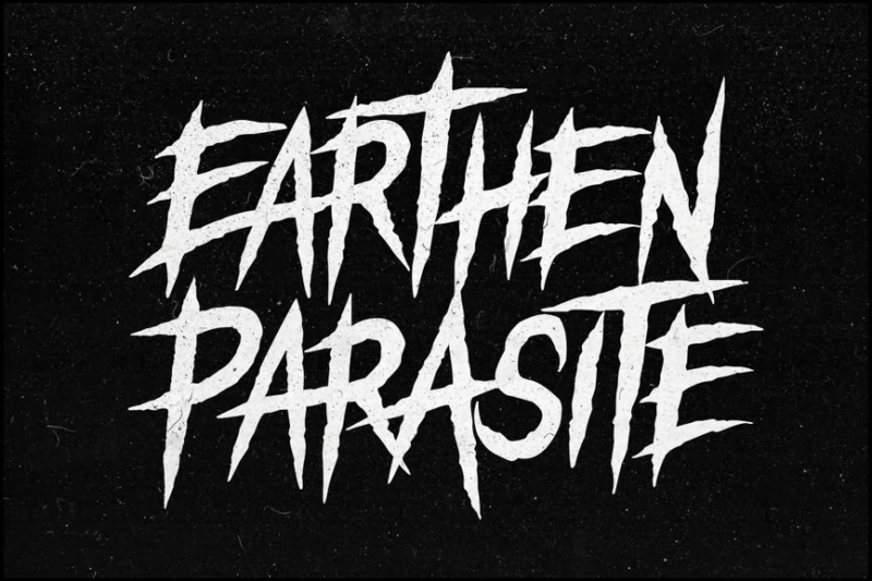
Earthen Parasite is a multi-style horror font that includes script, decorative, sans-serif, and symbol variations. Its diverse character set makes it versatile for creating comprehensive horror-themed designs with a focus on biological horror.
Acholic Horror Display Typeface
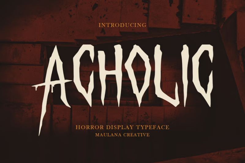
Acholic is a horror display typeface with a unique, unsettling design. Its distorted letterforms create a sense of disorientation, making it perfect for projects that aim to disturb and unsettle the viewer.
Night Fears
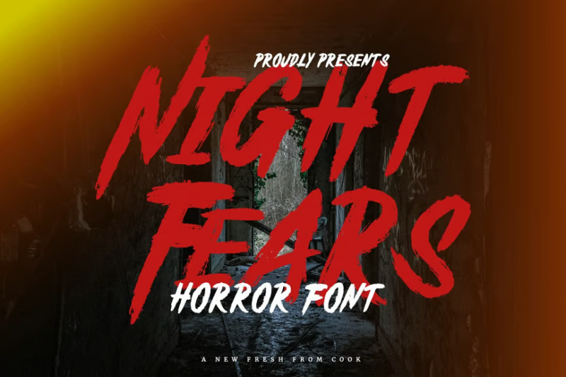
Night Fears is a decorative horror font that embodies the essence of nocturnal terrors. Its sharp, menacing forms make it ideal for creating designs that evoke the fear and unease associated with the darkness of night.
Horror Night Halloween Font
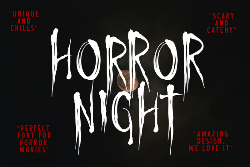
Horror Night Halloween Font is a decorative typeface that blends elegance with horror elements. Its refined yet eerie design makes it suitable for creating sophisticated Halloween-themed logos or upscale horror event branding.
Mustkill
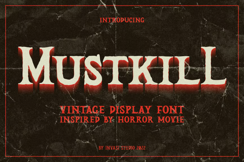
Mustkill is a vintage-inspired sans-serif horror font. Its distressed appearance and chaotic elements make it perfect for creating retro horror designs or projects that require a classic, unsettling aesthetic.
Littox Horror Display Font
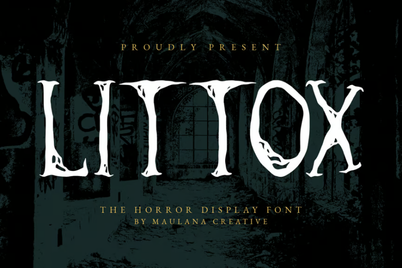
Littox is a brush-style horror display font with a raw, organic feel. Its irregular strokes and eerie forms make it ideal for creating hand-crafted horror designs with an authentic, artisanal touch.
Crused Marrie
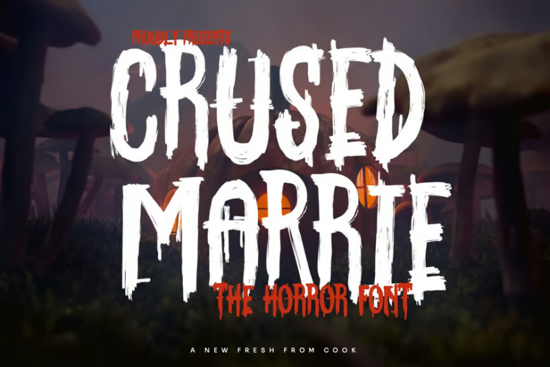
Crused Marrie is a decorative horror font with a cursed, otherworldly appearance. Its distorted and unsettling letterforms make it perfect for Halloween-themed projects or designs that aim to create a sense of supernatural dread.
Mysteric
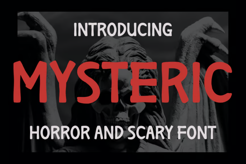
Mysteric is a script font that combines horror and mystery elements. Its fluid yet unsettling strokes create an air of supernatural intrigue, making it ideal for creating eerie, atmospheric designs with a touch of elegance.
Mistis

Mistis is a decorative horror font style with a ghostly, brush-like appearance. Its spectral forms and irregular strokes make it perfect for creating haunting designs or projects that require a supernatural, misty aesthetic.
Haunted Farmer Horror Display Font
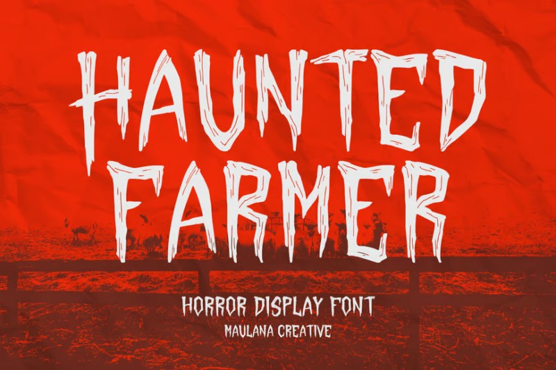
Haunted Farmer is a horror display font that combines rural themes with supernatural elements. Its distressed, organic letterforms evoke images of abandoned farmlands and ghostly apparitions, perfect for creating unsettling rural horror designs.
Outright Horror
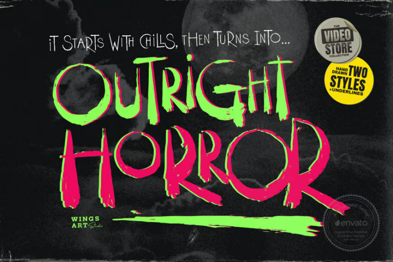
Outright Horror is a hand-drawn Halloween script font. Its rough, painted appearance gives designs an authentic, DIY feel, making it ideal for creating personalized, nightmare-inducing typography with a handmade touch.
Something Unfriendly
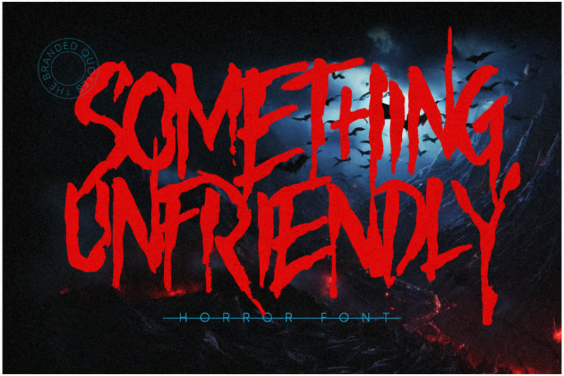
Something Unfriendly is a decorative horror font that embodies an unsettling, hostile presence. Its jagged, aggressive forms make it perfect for creating designs that evoke a sense of danger and malevolence, especially for Halloween-themed projects.
Nightcore
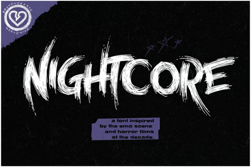
Nightcore is a versatile emo horror font that includes sans-serif, script, symbol, and decorative styles. Its edgy, almost punk-like style makes it ideal for creating branded content that appeals to alternative subcultures with a dark, horror-inspired aesthetic.
The Psychology Behind Effective Horror Typography
What exactly makes a font feel “scary”? It’s not just about adding blood drips or knife slashes. The most effective horror typography taps into deep psychological triggers that make us feel uneasy:
Uncanny Valley Effect
The most unsettling horror fonts often play with the “uncanny valley” concept – they look almost normal but contain subtle distortions that trigger our brain’s warning systems. Letters that are slightly misshapen, inconsistently sized, or that break expected patterns create a sense that something is profoundly wrong without being obvious about it.
Primal Fear Triggers
Certain shapes and patterns universally register as threatening to humans. Sharp, jagged edges that resemble teeth or claws. Organic, asymmetrical forms that suggest disease or decay. Even subtle animations that mimic predatory movement patterns. The best horror fonts incorporate these elements in ways that trigger our evolutionary fear responses.
Cultural Horror Associations
Some fonts tap into established visual languages of fear – the scrawled handwriting of the mentally disturbed, the elegant yet macabre aesthetics of Victorian mourning culture, or the clinical coldness of asylum signage. These cultural touchpoints have ready-made fear associations that skilled designers can leverage.
Tension Between Readability and Chaos
Horror typography often walks a delicate line between legibility and chaos. Letters that appear to be breaking apart, melting, or transforming create tension as our brains struggle to process information that’s simultaneously recognizable and wrong. This cognitive dissonance creates powerful unease.
“The most effective horror fonts make you uncomfortable without you immediately understanding why,” explains Sarah Horrocks, typography professor at Dark Arts University. “They tap into something primal – the feeling that reality itself is unstable.”
Choosing the Right Horror Font for Your Project
Not all horror is created equal. The perfect font for a zombie apocalypse game would feel completely out of place for a psychological thriller. Here’s how to match your horror font to your specific project:
Consider the Sub-Genre
Horror has numerous distinct flavors, each with its own typographic traditions:
For slasher/gore horror: Look for fonts with aggressive, sharp edges that imply violence – letters that appear to be carved, slashed, or dripping with blood.
For psychological horror: Subtle is better. Choose fonts with uncanny distortions that feel “off” without being obviously monstrous. Slightly warped letters or inconsistent sizing creates unease without screaming “horror.”
For supernatural/occult horror: Fonts with historical or mystical elements work well – Gothic blackletter styles, script fonts with unusual flourishes, or characters that incorporate strange symbols.
For cosmic/Lovecraftian horror: Consider fonts with organic, almost alien qualities. Letters that seem to twist impossibly or that contain elements suggesting tentacles or strange geometry.
Think About Era and Setting
A horror story set in Victorian London calls for different typography than one set in a 1980s summer camp or a futuristic space station. Match your font to the time period and setting for authenticity.
Historical horror often benefits from period-appropriate typography with subtle disturbing elements added, while futuristic horror might use clinical sans serifs with unsettling proportions or glitch effects.
Consider Your Medium
A font that works brilliantly for a movie poster might be completely unreadable when used for body text in a book. Think about where and how your audience will encounter your typography:
For titles and logos: You can go more extreme with distortion and decorative elements.
For body text: Horror-themed fonts with higher readability are essential. Consider using a more conventional font with just one or two subtle horror elements.
For digital vs. print: Some horror effects that work on screen (like subtle animations or certain texture overlays) may not translate to print.
Practical Applications for Horror Fonts
While the obvious uses for horror fonts are in movies, books, and Halloween promotions, these typography styles have a much wider range of applications:
Entertainment Industry
Beyond just horror films, these fonts work brilliantly for:
- Video game UI (especially for horror and dark fantasy games)
- Album covers for metal, industrial, and certain electronic music genres
- Podcast artwork for true crime, paranormal, and mystery shows
- Theatrical productions exploring dark themes
Seasonal Marketing
Horror fonts shine for:
- Halloween promotions (obviously)
- Friday the 13th special events
- Autumn/winter seasonal campaigns for brands with an edgy identity
- Limited edition “dark” versions of product packaging
Thematic Venues & Experiences
Create immersive atmospheres for:
- Escape rooms and haunted attractions
- Gothic or horror-themed restaurants and bars
- Murder mystery events
- Immersive theater experiences
Editorial Design
Add emotional impact to:
- True crime magazine features
- Investigative journalism on disturbing topics
- Opinion pieces about societal fears
- Literary journals focused on gothic or horror fiction
Even non-horror brands sometimes leverage these fonts for campaigns challenging audience expectations or signaling a dramatic departure from their usual approach.
Expert Tips for Pairing Horror Fonts
The most sophisticated horror designs rarely use scary fonts in isolation. Here’s how to pair them effectively:
The Contrast Principle
Pair an extreme horror display font with something clean and minimal to create tension. This contrast often feels more unsettling than using horror fonts exclusively.
For example, a jagged, blood-dripping title font combined with a sterile, clinical sans serif for body text creates an unsettling juxtaposition reminiscent of forensic reports or psychiatric evaluations.
The Whisper and Scream Technique
Use a subtle, quietly unsettling font for most text, then introduce an extreme horror font for maximum impact at key moments. This creates a pacing of fear similar to how horror films use quiet tension punctuated by jump scares.
Historical Anchoring
Pair horror fonts with historically appropriate typography to ground your designs in a specific era. A Victorian-inspired horror font alongside proper Victorian text styles creates authenticity for period horror.
Symbol Integration
Many premium horror fonts come with symbol sets – strange marks, occult signs, or disturbing dingbats. Integrate these thoughtfully among more conventional typography for subtle unease.
“The most frightening typography often comes from restraint,” notes Mark Daniels, designer for Nightmare Studios. “Using horror fonts judiciously alongside more conventional type creates tension. It’s the typographic equivalent of the monster you only glimpse rather than see fully.”
Common Horror Font Questions
Let’s address some frequently asked questions about horror typography:
What font is used in horror movies?
Classic horror films like “Halloween” and “Friday the 13th” typically used modified versions of fonts like Helvetica Bold and ITC Benguiat. Modern horror often features custom typography, though fonts like Trajan (with modifications) appear frequently in psychological horror films.
What is a creepy text font?
Creepy text fonts generally feature irregular shapes, distressed textures, and unsettling proportions. They often include characteristics like dripping elements, sharp edges, or letterforms that appear to be deteriorating or transforming.
What fonts are used in creepypasta?
Internet horror stories (creepypastas) frequently use monospaced fonts like Courier to evoke the feeling of found documents or archival text. This mimics the aesthetic of old typewriters or early computer terminals, adding authenticity to digital horror narratives.
How can I make my own horror font?
Creating horror fonts requires font design software like Glyphs or FontLab. Begin with a base font style, then systematically introduce disturbing elements – irregular baselines, jagged edges, or decaying effects. Remember that subtle distortions often create more sophisticated horror than obvious gore effects.
The Evolution of Horror Typography
Horror fonts have come a long way from the dripping blood letters of 1980s VHS covers. Let’s look at how they’ve evolved:
Classic Era (1960s-1980s)
Early horror typography was often literal and explicit – think blood drips, knife slashes, and fonts that looked like they were made of bones or scratched with claws. These direct approaches reflected the more explicit nature of horror in this period.
Minimalist Period (1990s-2000s)
As horror films became more psychological, typography followed suit. The 90s saw a move toward stark, clinical fonts with subtle distortions. Films like “Se7en” used damaged, weathered typography to create unease without obvious “scary” elements.
Digital Horror Era (2000s-2010s)
The rise of digital horror (found footage films, creepypastas, etc.) brought glitched, corrupted typography that reflected technological anxiety. Fonts appeared to break, pixelate, or malfunction in disturbing ways.
Contemporary Horror Typography (2026)
Today’s horror fonts are more psychologically sophisticated. They often appear almost normal at first glance, with disturbing elements that reveal themselves more subtly. Many incorporate slight animations or variable font technology to create unsettling movement effects.
“Horror typography has become more confident,” explains typography historian Eleanor Graves. “It no longer needs to scream ‘I’m scary!’ to be effective. Contemporary horror fonts whisper rather than shout, and that’s much more unsettling.”
Conclusion: The Power of Horror Typography
Typography is uniquely positioned to evoke horror because it exists at the intersection of communication and art. When letterforms – the very symbols we use to share ideas – become corrupted or threatening, it creates a profound sense of wrongness that resonates deeply.
The best horror fonts don’t just decorate text; they transform it into something that feels alive and malevolent. They make the act of reading itself feel dangerous, as if the very information might be harmful. That’s powerful design.
Whether you’re creating a book cover, film title, game interface, or seasonal promotion, the right horror font can elevate your project from simply “spooky themed” to genuinely unsettling.
The fonts we’ve explored in this article each tap into different facets of fear – from the primal terror of sharp, predatory shapes to the existential dread of decay and distortion. By understanding the psychology behind what makes typography frightening, you can make more intentional choices about which horror fonts will create the specific emotional response you’re looking for.
Remember that restraint often creates more sophisticated horror than excess. A subtle typographic distortion that makes readers do a double-take can be far more effective than obvious blood drips and slashes. The most terrifying monsters, after all, are the ones that lurk just at the edge of our perception.
So experiment with these horror fonts in your next project. Play with contrast, context, and subtle manipulation. Typography has the power to bypass rational thought and speak directly to our deepest fears – use it wisely, and your audience won’t just see your message. They’ll feel it crawling up their spine.