

In this article:
- What Budget, Environment and Lifespan Ask of Your Design
- How Viewing Conditions Shape Your Typography
- How to Choose Materials and Finishes for Real-World Use
- What Prototyping Reveals About Your Design
- Let Your Constraints Write the Brief
A sign can look perfectly legible when you’re designing it on a screen, then disappear into its reflection in the afternoon sun. That’s where I’d reconsider what makes the design work. If people need to read it as they walk past, the finish deserves as much scrutiny as the lettering.
Material constraints can sharpen design thinking by giving you concrete criteria, from budget to environment to expected lifespan, for revisiting choices made at your workstation.
What Budget, Environment and Lifespan Ask of Your Design
Treat budget, environment and lifespan as criteria for comparing concepts before production. A 2022 meta-analysis of 111 articles found an overall positive relationship between constraints and creativity, though results varied and didn’t establish that constrained environments outperform unconstrained ones. For your practice, consider what decision each limitation could help you make more deliberately.
Budget Sets the Boundaries of What You Can Build
With a fixed display budget, I’d ask what the design would lose if I removed a feature, then protect what carries the message. If you need a headline readable across a room, compare simplifying the decorative finish with shrinking the lettering. Price production and installation together so you can evaluate whether a simpler outline or fewer custom components would preserve the scale your message needs.
When you compare quotes, give each fabricator the same message size, quantity and installation assumptions. If a lower quote calls for a different shape or mounting method, check what that change means for the design. You may need to retest it before deciding whether the savings are worth it.
What Your Material Has to Withstand
Specify conditions rather than relying on a broad label, such as outdoor use. For a sun-facing sign, record the orientation and approach direction, while for a handled display, identify where people will touch or clean the surface. You can then ask your fabricator which samples to evaluate under those conditions, giving the discussion a specific problem to solve before you narrow the material palette.
How Long Your Design Needs to Perform
Define acceptable wear against the time the object needs to serve you. A weekend event graphic and a permanent wayfinding panel invite different replacement plans, particularly when the information changes faster than the supporting structure. For an annually updated directory, consider a replaceable graphic panel.

Get 300+ Fonts for FREE
Enter your email to download our 100% free "Font Lover's Bundle". For commercial & personal use. No royalties. No fees. No attribution. 100% free to use anywhere.
Then, assess whether you can change the message while retaining the frame and preserving its intended visual relationship with surrounding signs.
How Viewing Conditions Shape Your Typography
Start from the position where someone encounters the lettering, including the distance, angle and light. Considering open counters and distinct letterforms offers useful selection principles, but you still need to judge the complete setting at its intended physical scale. Compare easily confused characters in the actual message, then review how size, spacing and contrast work together from the reader’s position rather than your screen.
For signs subject to Americans with Disabilities Act (ADA) visual-character requirements, U.S. Access Board guidance specifies a minimum character height of ⅝ inch for baselines 40-70 inches above the finished floor or ground and horizontal viewing distances under 6 feet. This distance extends to a fixed obstruction preventing closer approach. Treat this as one dimensional requirement, not a complete compliance checklist.
Designing Lettering You Read Underfoot
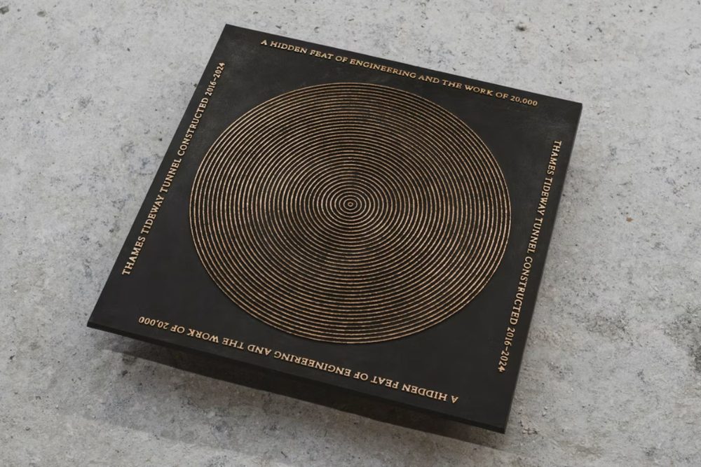
Source: https://www.pentagram.com/work/thames-tideway-s-bronze-drain-covers
Pentagram’s bronze drain covers for Thames Tideway use Doves Type, connecting the lettering to the riverside setting through the typeface’s history. According to the studio, metal type from the Doves Press in Hammersmith ended up in the Thames, and recovered pieces later informed Robert Green’s digital revival. Marina Willer’s team chose lettering with a documented relationship to the place where you encounter the finished covers.
Pentagram describes overlapping discs with linear patterns that evoke the river’s fluidity, giving you a concrete relationship between the bronze surface and its setting to examine. For your own legibility assessment, separate that documented rationale from how the lettering reads underfoot. Compare a close-up with an installed view from an approaching pedestrian’s sightline to judge whether the letterforms remain distinguishable alongside the pattern at an oblique angle.
How to Choose Materials and Finishes for Real-World Use
Once you’ve established exposure and service life, compare materials against specific requirements for the surface and message. You might ask whether the sign needs rigidity, resistance to weathering or a finish you can read under difficult light, then request evidence relevant to that requirement. Keep the substrate, applied graphics and finish in the same conversation so you can assess the proposed assembly rather than judging an isolated sample.
According to signage provider Duncan-Parnell, the most durable materials for permanent outdoor signage include aluminum for weather and corrosion resistance, stainless steel where impact or graffiti matters, and acrylic or fiberglass-embedded panels for clarity and rigidity. Use those distinctions to frame questions about your site and required lifespan with a dedicated provider. The same discipline applies to packaging, where you can ask which components need to provide protection and structure.
A fresh sample tells you how a finish looks on day one. Before you approve it, ask how it will hold up at the site and what it will take to clean or maintain it. If one part is likely to wear out sooner, check whether you can replace it on its own.
How PUMA Redesigned the Shoebox to Use Less Cardboard
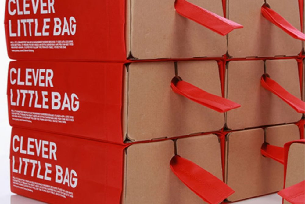
Source: https://fuseproject.com/case-studies/puma-clever-little-bag-sustainable-packaging/
For PUMA’s Clever Little Bag, fuseproject developed a folded cardboard insert inside a cloth bag to rethink the familiar shoebox while accommodating existing distribution infrastructure. The studio describes investigating how packaging moved through production, transport, storage and retail before deciding on the new structure. In the finished package, you can see a rigid inner form paired with a flexible outer bag that also serves as the shopper’s carrier.
The iF Design project description reports 65% less cardboard than a standard shoebox, with the bag helping the folded insert retain its shape and protect the shoes. For your packaging work, the transferable decision is to reconsider which component performs each task before specifying a lighter stock. Sketch the responsibilities separately, then explore whether redistributing them would let you change the package’s construction while meeting the same brief.
What Prototyping Reveals About Your Design
A flat packaging layout leaves questions you can investigate with a folded sample made from the intended stock. Materials and printing techniques shape packaging design, alongside protection and practical use. If a fold crosses important artwork, I’d assemble the sample and check what lands on the crease before deciding whether to move the graphic, revise the structure or discuss another production method.
A 2024 study of 26 student projects examined how ideas developed into tangible prototypes through interaction with available tools, materials and constraints. The researchers highlight hands-on iteration as a way to align concepts with physical reality, alongside the demands of teamwork. You can apply that principle by giving each sample a defined question and recording which design decision its result would change.
What the Eames Chair Teaches You About Letting Material Lead
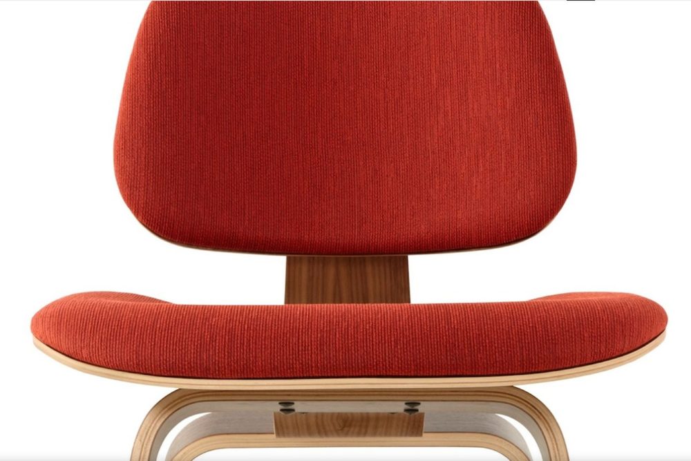
Source: https://www.hermanmiller.com/products/seating/side-chairs/eames-molded-plywood-chairs/design-story
Charles and Ray Eames initially pursued a single molded plywood shell for their chair design, but the material couldn’t withstand stress where the seat and back joined. Herman Miller’s design story describes the shift to separate molded plywood panels, with one forming the seat and another the back. In the finished chair, you can see the separation, making the material response part of its visible form rather than concealing it within the original silhouette.
For your own project, identify the point where the proposed form asks most of its material and make that the focus of a sample. In a folded display, you might investigate a narrow connection before refining the surrounding graphics, then compare versions with different proportions or construction. Decide what result would justify revising the form so you can respond to the test instead of defending the initial drawing.
If you change the stock and the joint in the same sample, it can be hard to tell which change made the difference. When you can, change one at a time and jot down what happened. That gives you something concrete to discuss with your fabricator before you approve the next version.
Let Your Constraints Write the Brief
Budget, environment and lifespan can give you reasons to keep, alter or remove a design choice. Write them as requirements you can discuss with the people producing and using the object, then compare concepts against those requirements rather than against a screen rendering alone. You can preserve a strong visual intention while revising the form, surface or assembly that carries it, with a clear purpose for each choice.
If your sign needs to be readable across a room, specify the viewing position and prepare a full-size sample before approving the lettering and finish together. Decide what you need to observe and what you’ll reconsider if the message becomes difficult to distinguish. On your next project, identify one requirement your design must meet and decide how you’ll test it before committing to a material or finish.