
In this article:
- Make it Easy to Read
- Make Visual Hierarchy a Priority
- Keep it Simple
- Match Publication Style and Branding
- Enhance with Strategic Splashes of Color
- Incorporate Relevant Graphics and Images
- Explore Typography and Layout Variety
- Leverage Shapes and Negative Space
- Strategize Page Placement
- Format for Scannability
- Align with Grid Guidelines
- Learn from Creative Layout Innovation
- Account for Practical Implications
- Optimize Scan-ability and Flow
- Craft Descriptive Yet Concise Headings
- Callout Must-Have Content
- Summarize Chapters Concisely
- Verify Accuracy
Ah, the table of contents.
How can something that feels so boring on the surface also feel so intimidating as a designer?
So today, I’d like to share some of my best advice for creating well-crafted and perfectly-designed tables of contents and help keep at bay that feeling of self-doubt we all carry.
Designing TOCs with a Purpose
Before we dive in, let’s not forget: the best designs often come from understanding the purpose and function of our work.
A table of contents acts as a map for readers to navigate through a book or document. Well-designed table of contents allow readers to easily scan and jump to chapters or sections they are most interested in. Considering both form and function is key in table of contents design.
So in this guide, I’ll explore essential design factors like hierarchy, typography, color, and graphical elements. I’ll provide concrete examples of how manipulating these basic building blocks can take your tables from bland textbooks to visually compelling invitations that draw readers into the content.
Here’s what to keep in mind when designing a table of contents:

Get 300+ Fonts for FREE
Enter your email to download our 100% free "Font Lover's Bundle". For commercial & personal use. No royalties. No fees. No attribution. 100% free to use anywhere.
Make it Easy to Read
When designing your table of contents, readability should be a top priority. Incorporate ample line spacing between section heads and body text. Format content in columns with comfortable margins if you have a longer table of contents. Utilize proper font sizes and weights that make textual elements scannable but don’t strain the eyes. And don’t forget to implement white space between elements. Uncrowded compositions ensure seamless readability.
Make Visual Hierarchy a Priority
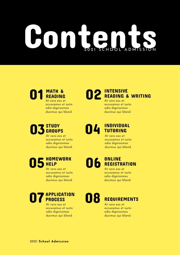
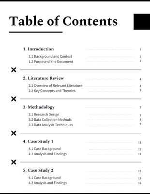
Implementing hierarchy allows readers to easily distinguish between main and sub sections when scanning. You can establish relationships through simple yet effective visual indicators. Indent subsections below their main headings. Change font sizes and weights to differentiate parents from children. Number sections clearly and format pages to align logically. Employ special formatting like bold or italic for section heads as needed.
Keep it Simple
Cluttered and overly complex tables of contents require more work for readers to scan and obscure key information. Instead, adopt a minimalist approach. Only include the most necessary text to communicate sections and structure. Use clean lines and ample spacing rather than cramped and crowded compositions. Limit decorative graphical elements if they don’t enhance readability. Maintain a simple, consistent structure and placement for elements.
Match Publication Style and Branding
Visual harmony with the larger publication strengthens cohesion and readability. Mirror colors and color schemes already established. Coordinate typography styles, sizes and weights. Align other visual styles including imagery if incorporated. And preserve style guide rules – don’t disregard existing branding. Blend your table of contents seamlessly with the overall piece through unified, complementary design.
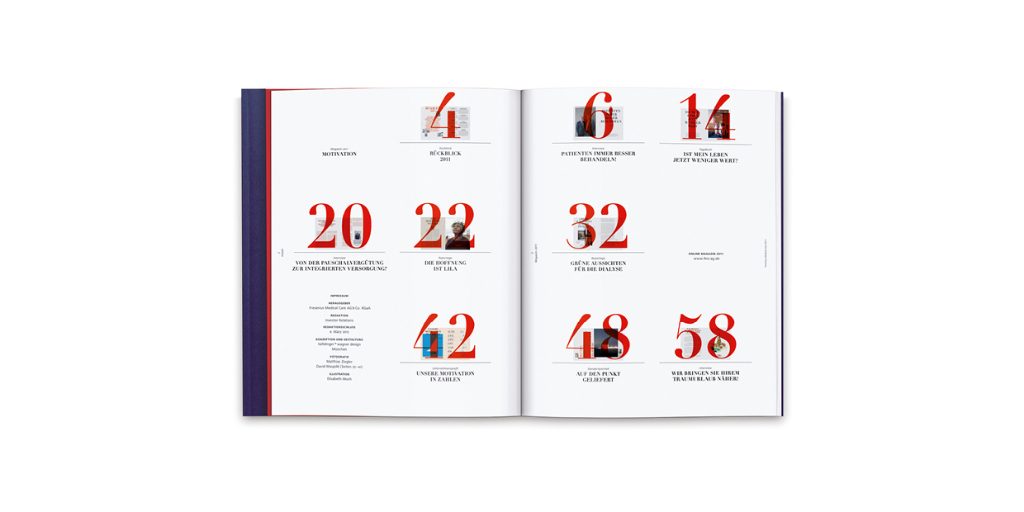
Enhance with Strategic Splashes of Color
Pops of color, whether through type or background stylings, can draw the eye across the page and accentuate key content you want readers to hone in on first. Use tones complementary to your branding colors or introduce an entirely new accent color that aligns with section themes. Just be wary of overusing hues to the point they compete for attention rather than guide progressively.
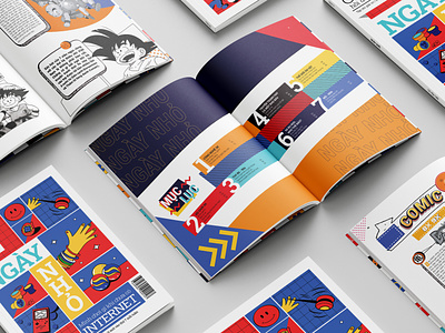
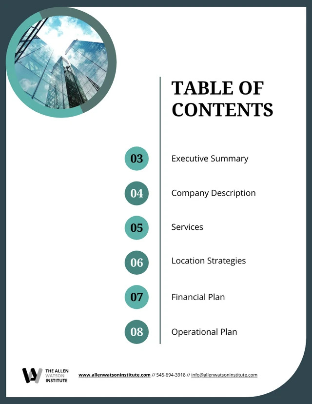
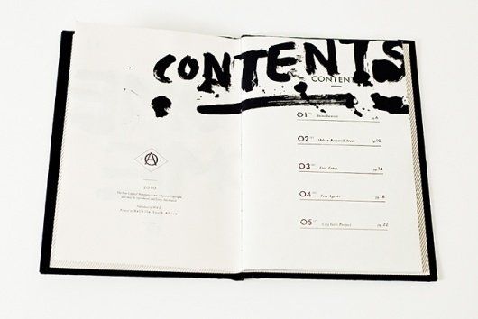
Incorporate Relevant Graphics and Images
Photography and custom iconography can amplify the content they accompany in moderation. For some publications, images may not make sense. But consider playing with illustrated motifs that lend deeper metaphorical meaning or including partial visuals from feature articles. Integrate selectively based on contextual relevance and be sure they enhance rather than distract from textual content.
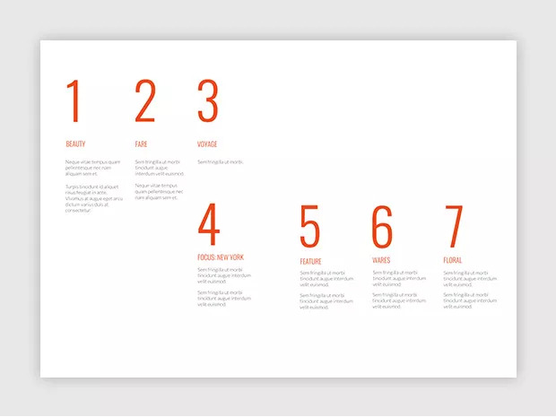
Explore Typography and Layout Variety
Collections of content sections provide the perfect opportunity for type experimentation. Intermix serif and sans-serif body text or section heads. Adjust scale and weight for more dynamic headers. Play with letter and word spacing for artistic flair. Shift alignments with asymmetric or diagonal layouts. And push beyond multi-column grid constraints with new forms. Just retain readability.
Leverage Shapes and Negative Space
You don’t have to keep things linearly rectangular. Flow text around circular or angular abstracted shapes. Allow generous negative space to draw added focus. Cut out geometric forms either as containers or stand-alone graphic elements. Shape stylings can lend metaphorical symbolism or simply up the modernity. Just make them meaningful design choices rather than arbitrary ones.
Strategize Page Placement
Where should your table of contents live? Tradition dictates placing it at the very beginning, which is best for print books and ensures readers always know the reference exists right up front. However, you can get creative by moving it to the end as a reference tool instead. Or integrate it visually onto your front cover for added intrigue while retaining an interior duplicate.
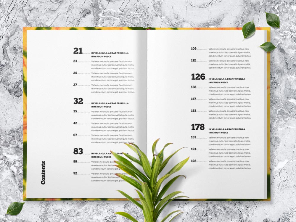
Format for Scannability
Once you’ve determined placement, fine-tune the details for strong scannability. Format content in easy-to-scan columns that don’t strain the eye from margin to margin. Leverage tab indentations to connect subgroups with their parent sections. For digital publications, hyperlink section heads for quick in-line jumps. Or expand beyond a single page with a vibrant table of contents spread if your piece warrants it.
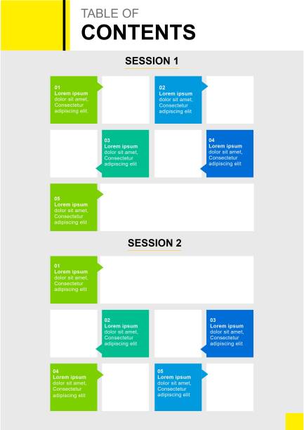
illustration of Table of contents design for news letters and large scale publications/
Align with Grid Guidelines
Finally, align your developing layout with your brand’s established grid guidelines if they exist. Having preconfigured margins, columns, and gutters for placing text, images, colors and other elements will strengthen continuity while allowing you to push creativity. Anchor your table of contents stylistically through unified structure.
As you make these key structural decisions, return to the core functionality we discussed. Form truly does need to follow function for tables of contents in order for your publication’s navigation to feel intuitive.
Learn from Creative Layout Innovation
When flipping through magazines and books, take note of TOC designs that grab your attention. Spotlighting bold executions, both modern and classic, can provide a trove of inspiration to ignite your own creative sparks.
Dissect inventive samples and analyze why certain unconventional approaches effectively work while others may falter. Consider factors like alignment with brand, enhancement of content flow, and consistency with overall publication themes and tones. Finding the line between innovation and disruption is key.
Spark further inspiration by showcasing a wide variety of visual styles and executions. Compile a swipe file of designer tables of contents spanning minimalist black and white spreads to vibrant paintings adapted stylistically. Soak up these diverse creative perspectives as you shape your own.
Account for Practical Implications
While we certainly want to encourage creative risk-taking, it’s important to account for practical implications as well so functionality isn’t lost. Gauge the appropriate level of TOC detail depth based on publication length and complexity. A short novella may only warrant a simple single page table, while a dense textbook merits more expansive multi-page navigation.
Readability should take priority, especially for printed legacy media. Choose font stylings and sizing appropriate for your medium and audience to enable effortless reading without eye strain. Additionally, adapt layout and formatting considerations to your final output format. Digital platforms provide opportunities like hyperlinks, bookmarks, and dynamic elements that print layouts won’t be able to incorporate.
Optimize Scan-ability and Flow
TOCs serve a vital navigation function first and foremost. While applying visual design variety, be extremely intentional about formatting elements in the most scannable and seamless way possible. Pull out keystone headings in larger type or distinct style groupings so readers can easily pinpoint sections inline without lots of visual noise.
Enhance connections through typographic relationship indicators like tabs for sub-sections or numbering schemes the mirror overall content architecture simply yet clearly as well. For digital TOCs, ensure hyperlinks, bookmarks, and anchor IDs to pages are functioning correctly. Test over multiple devices, browser widths, etc.
Last but not least, be sure to refine TOCs through usability testing with real readers and incorporate that valuable feedback. Even seemingly minor adjustments to help guide flow can vastly improve experience and engagement. Observe people navigating and note where their pain points arise.
Craft Descriptive Yet Concise Headings
Write clear headings that communicate the essence of what each section entails without being overly verbose or cryptic. Readers will rely on these quick snapshot summaries to evaluate relevance and navigate accordingly.
Callout Must-Have Content
Consider using special formatting like bold fonts, text treatments, or color to underscore pivotal chapters or groupings readers absolutely should not miss. This allows key content to stand out.
Summarize Chapters Concisely
If warranted for very extensive publications, provide abbreviated snapshot summaries of each chapter following the headings to help readers understand what each section broadly covers without detail overload.
Verify Accuracy
Finally, meticulously verify that every heading matches its corresponding chapter title perfectly, page numbers are all correct, and any digital jump links work correctly. Inaccuracies undermine credibility and functionality.
