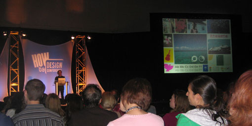
Monday morning’s session presented by Joe Duffy was one I was really looking forward to. I love the work that comes out of Duffy and Partners and I was really excited to get some insight into their process. His presentation did not disappoint. He covered the basics in terms of how his company operates and how it’s changed over time. Duffy says he’s reinvented the company FIVE times since its establishment 25 years ago. However, the most interesting part of the session was when he presented several case studies of their work. I love seeing how other designers approach solving a problem, especially ones I really respect and admire.
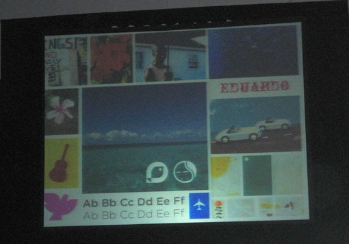
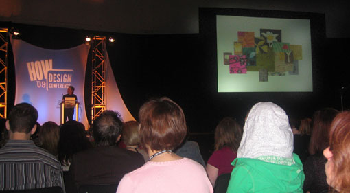
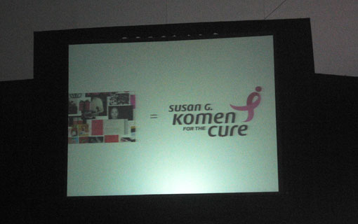
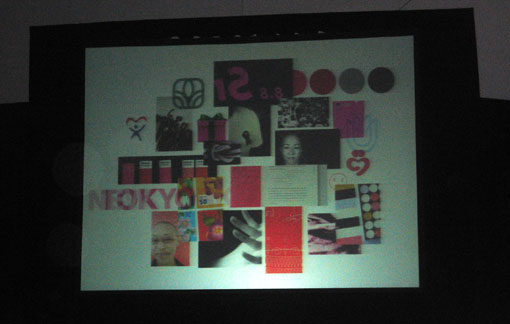
Unfortunately my pictures didn’t come out so great, but hopefully you can get the idea.
The first case study presented was the rebranding of the Bahamas (which I love). He explained the whole process behind the creation of the brand language (including the fact that several of them got to visit all of the Bahamian islands for research purposes), which seems to be pretty standard throughout all of their projects. The staff is constantly collecting imagery that inspires them, whether its photos they take or other designers’ work, which is something I think most designers can relate to—I know I can personally. So typically when they start a project with a client they go to their image library and start pulling imagery that they feel represents the direction the brand should take. They then get the client involved, and invite them to look through all of the imagery with the designers to start narrowing things down. The designers and client then go through a process where they’re picking and choosing until they both agree on a select group that captures the essence of the brand. This client involvement seems to be the key to the process, because as long as the client feels they are a part of the creation from the beginning, they’ll be much less likely to kill the design as you move forward.
Once they have this preliminary collage, the designers at Duffy translate it into a visual brief, which I think is such a great idea. The designers can then work off of a collage of imagery to come up with designs, rather than a traditional written brief. In college we used to use both a written and visual brief, which we referred to as a mood board, but I haven’t put them into practice too much professionally. This approach, however, makes so much sense, and I can’t wait to try something similar in my next project.
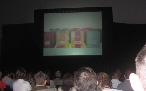
One thing I loved about the presentation was seeing the before and afters of each project. He always started with the visual brief/collage and juxtaposed that with the final project. It was really cool seeing the evolution of where they started to where they ended up. One I particularly enjoyed was some of the packaging for Thymes, which is always unbelievably gorgeous. Below you can see the visual brief and the resulting packaging for one set of designs.

Get 300+ Fonts for FREE
Enter your email to download our 100% free "Font Lover's Bundle". For commercial & personal use. No royalties. No fees. No attribution. 100% free to use anywhere.
Here is another example of their redesign for the Susan G. Komen Breast Cancer Foundation.
Overall it was an excellent presentation, probably one of my favorites from the conference. Find out more about Duffy and Partners on their website, as well as on their blog, Duffy POV.

