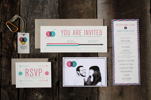
Today I’m pleased to share the invitations Loren Klein designed for his wedding last summer. Below is a bit of background from Loren about the design, and if you’re interested you can see pictures from their wedding—looks like it was an awesome day—right here.
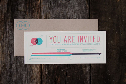
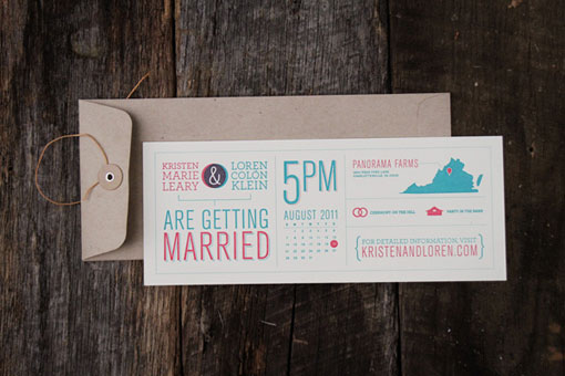
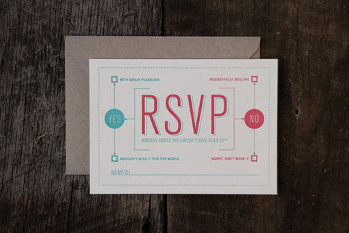
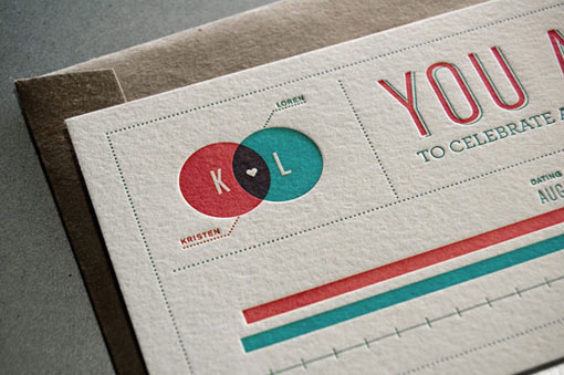
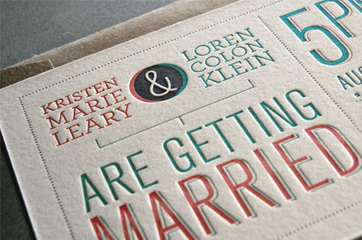
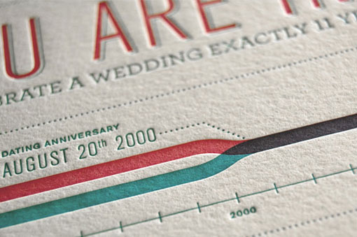
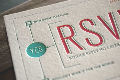
My wife and I met in high school and had been together for over ten years when I began thinking about designing our own wedding invitations. Our wedding was to be held on a beautiful grassy hill on a farm in Charlottesville, VA, with the reception taking place in an old barn. After a lot of thought, I envisioned a timeline of our lives that represented how long we had been together, which led to more ideas involving infographics. The Venn diagram monogram evolved out of this and informed the rest of the design, including icons, a map, and a flow chart. I knew letterpress was going to have the best quality for such an intimate invitation, so I designed with that in mind. I made the monogram consist of two colors, representing the two of us, and we overprinted the circles to create a third color where they overlap. The transparent nature of the ink allows them to blend beautifully. The registration was absolutely perfect on each one, and it gave a cool effect of the little heart popping out. We packaged them up in paper bag-colored envelopes and rubber stamped our logo and return address on them, keeping the feel consistent with the rustic style of the wedding. Overall, I think it really represents my wife and I and our farm wedding perfectly, and I think the design and production turned out better than I could have imagined.

Get 300+ Fonts for FREE
Enter your email to download our 100% free "Font Lover's Bundle". For commercial & personal use. No royalties. No fees. No attribution. 100% free to use anywhere.
The pieces were letterpress printed by Ryan Howell at Rise and Shine Paper.
