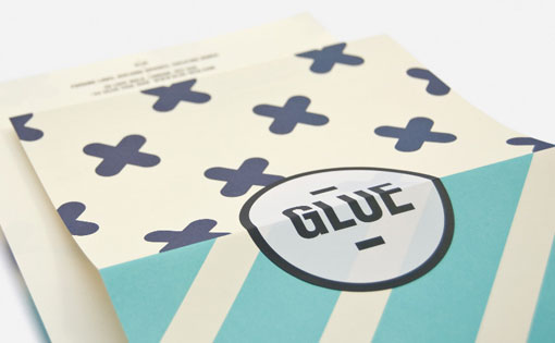
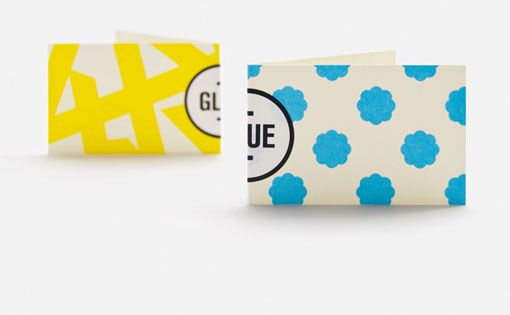
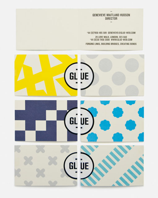
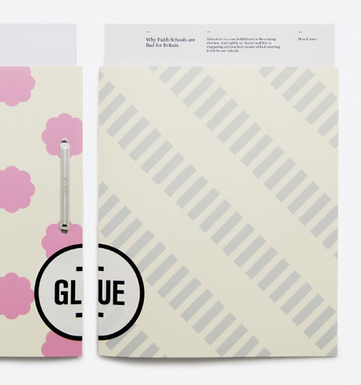
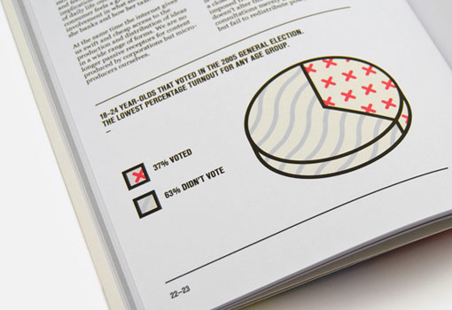
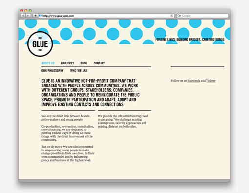
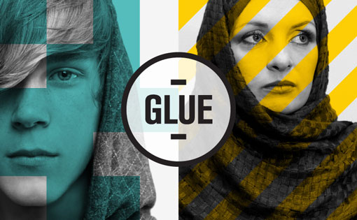
Glue is a think tank, whose brand identity was designed by London-based Magpie Studio. They’ve written such a great description of the work, I had to share:
How to—Make an identity stick.
Glue is new think tank, specialising in connecting brands and policy makers with a largely disaffected youth. The identity, which began with a naming stage, needed to appeal to a demographic of hard-to-reach 16 to 25 year olds.
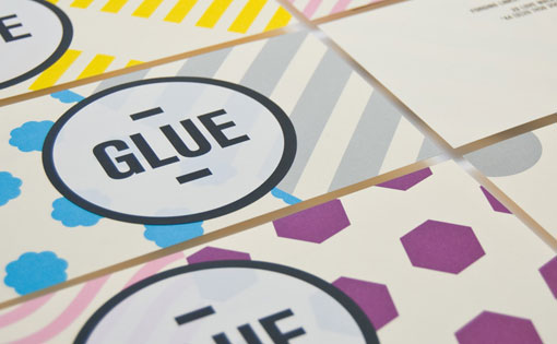
A graphic language of bold patterns was created to represent the different groups and communities that Glue brings together. These contrasting patterns are physically joined by a unifying wordmark, to form a simple and memorable identity that sits in stark contrast to the jargon-heavy, grey identities that typify the sector.

Get 300+ Fonts for FREE
Enter your email to download our 100% free "Font Lover's Bundle". For commercial & personal use. No royalties. No fees. No attribution. 100% free to use anywhere.
