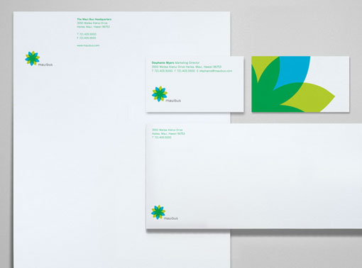
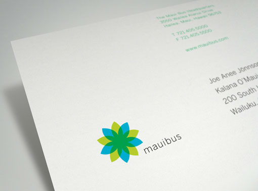
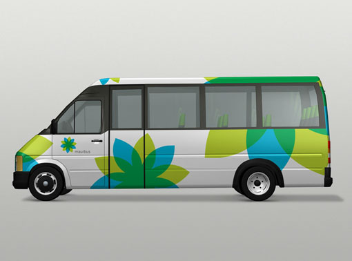
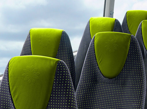
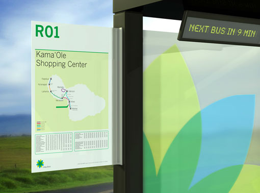
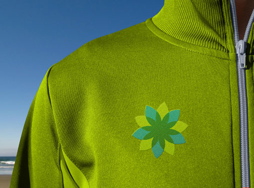
I spotted the fresh, clean design for Maui Bus, Maui’s public transportation system, while on vacation in Hawaii. And after some quick Googling, I learned that the branding was developed by the always fantastic Method. It’s such a nice departure from the advertising-wrapped buses we’re used to around here, and it fits in perfectly in the tropical landscape
beuatiful, i like the simplicity of this corporate design. it´s clear, light and beautiful. very nice :-)
Unfortunately is way too similar to BP logo :/
I completely disagree with you. Yes they both employ star-like shapes, but they are not similar enough that I would consider it a copy. Just because one company does something with a certain geometric quality doesn’t mean all shapes with that quality are then copying it—you can’t copyright a style. Plus it’s used in a completely different context.
Context is everything. When you’re on Maui and you want to take the bus, given your surroundings seeing this wouldn’t necessarily bring to mind BP. Just like we don’t think of virgin girls when we fly Virgin airlines.
That being said, however, there are more than just passing similarities with BP here. Not only is the flower very much like BP’s, the identity also shares a very similar color palette, a strong sense of design austerity, and some very familiar design applications. I would not go so far as to say Method copied the look (they’re quite capable of designing for themselves), but surely they must have known there was a strong design relationship.
It’s definitely treading on thin ice.
I wouldn’t say it was a copy of BP but it is WAY too similar for my taste.
When I mentioned it, I was talking about the shape and colour palette. It made me think about BP right away, so it’s not an offensive, and even a non constructive, critic.
The samples shown have a cohesive look but sadly, I immediately thought of BP and their flower burst as Tania mentioned. Either way, thanks for sharing it with us.
[…] Per consolidare ed espandere i servizi di trasporto pubblico sull’isola hawaiana di Maui, il Comune ha commissionato all’agenzia newyorkese Method la creazione di una nuova identità visiva per i propri bus. Il marchio, oltre ai normali requisiti funzionali di iconicità, identificabilità e riproducibilità su qualsiasi supporto, doveva rispondere alle particolari esigenze dell’isola hawaiana. L’agenzia ha quindi realizzato un logo con un simbolo che riflette sia la flora locale – una rosa dei venti stilizzata – che il concetto di navigazione. I colori inoltre ricordano la combinazione di mare e terra tipica delle Hawaii. (via http://www.designworklife.com) […]