Minted Holiday Challenge Favorites

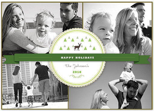
If you’ve been following the Minted Holiday Card Challenge at all, you’re well aware that the number of submissions—over 1300—was record-breaking. That initial set of designs was narrowed down to about 400, which are now in the final round of voting. And now I have the difficult task of deciding on my Judge’s Pick.

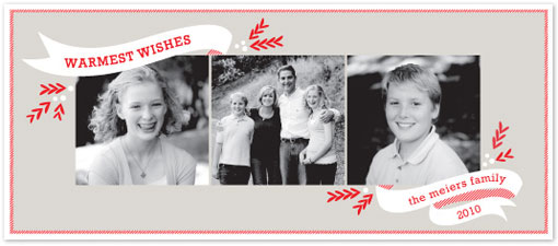
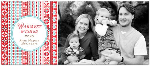
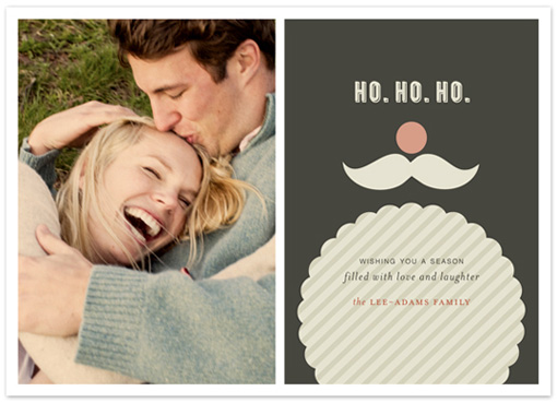
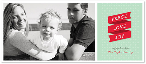
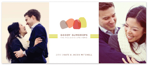
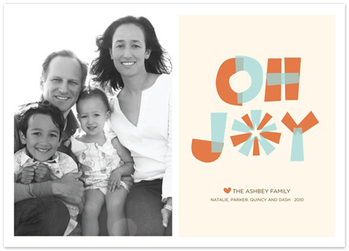
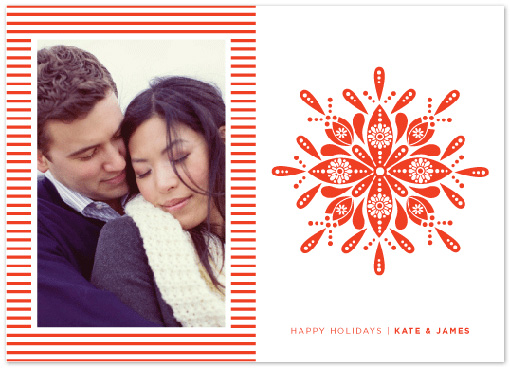
There are quite a few that caught my eye, but I’ve managed to narrow it down to 10. You can click on each image to get to each design’s page, where you can check out the designer and also cast your own votes.

What are your favorites?


34 Comments

  1. While these cards are nice, I think it’s a little bit sad how massively and obviously derivative of other designers and even other specific designs some of the work here is.

  2. I love the “Ho Ho Ho” card, it’s so adorable! and the “Be Merry” card is also super cute. I love that it’s like Christmas all over again!

  3. @Michael Thanks for your comment. My entire opinion on this issue is way too long to share in the comments. Though I’m curious though as to who you see the designs being derivative of? As a member of the design community I’m always trying to be respectful of others’ work, and I don’t want to be posting anything that can be consituted as a ripoff. Feel free to email me personally if you’d like to discuss.

  4. I vote for goody gumdrops. I have to say though…it seems as if the objective of this contest was to create a unique card that had a character unlike the other traditional holiday cards that you commonly see in stores and the like……I’m a bit disappointed in many of the top 400 cards….I feel like the vast majority of them I could have picked out from a kiosk at a big box store. I’m not saying the designs aren’t attractive, just not as creative and unique as I would have hoped to see in the final round of voting for $5,000.

  5. @ annie: I agree to a certain extent. There may not have been a HUGE amount of creativity going on. However, the cards still need to suit their purpose. And I think the requirement of featuring a family photograph limits the freedom you can have with the design. Though as someone faced with the unfortunate task of picking out a Father’s Day card (was too late to make it to my usual paper shops) at Duane Reade this weekend, I have to say these submissions—at least the ones I’m drawn to—are head and shoulders above the kind of thing available in your typical chain stores.

  6. yay! congrats to all of the designers. like karly, i am honored to have one of my designs among a lovely group. thanks!

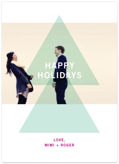
  7. They’re all lovely, but the last one stands out since the layout is completely different from the rest. I like the use of transparency against the couple.

  8. It’s great to see your favorites posted here, and nice to see a discussion about the designs that were passed through to the final round. I was definitely excited to see the addition of holiday cards for couples being submitted, since that’s what I would buy right now. That being said, the last design “Modern Tree” really caught my attention. The design is simple, allows the photo to become part of the design, doesn’t bombard the card with too many colors and type, is young, hip, cool and has a graphic artistic feel to it. Can’t wait to see which design you choose!

  9. Hello again. I suppose I was probably a little bit harsh in my first comment. All these designs are lovely, and certainly a cut above the usual identical supermarket output. All I really meant was that in a design competition called for “chic and modern” I’d have like to see something a little bit more unexpected and exciting rather than the 50s and early 60s aesthetic that is so popular at the moment. I guess I see design competitions as being about innovation, and while all the work here is lovely, it’s not anything new. But I suppose that isn’t really what people want in a Christmas card. I’d buy the Oh Joy design.

  10. @michael, I think that the the challenge inherent in crowdsourced challenges like those that minted offers is the designer is trying to design to the mandate (chic and modern) as well as what will be voted for (likely the very popular retro aesthetic). When you know your cards will be voted on you tend to try and design for the voters, not only the design mandate. I entered a number of designs and the two that were voted into the final round were probably my least “modern.”

  11. I love #1 the most because it’s simple, sweet and unpretentious. # 9 is also very pretty. I believe most people still want a holiday card that looks like a holiday card not an editorial piece. I mean you are sending out a “photo holiday card” to friends and family right? In most cases, it’s to show off all those photos of your kiddos. Just my humble opinion…

  12. @hannahcloud – that was my thought too. Though some very nice designs have made it through to the second round, I’m shocked by some of the ones that made it through based on the guidelines.

    @michael and @ Courtney – I’ve definitely noticed some designs that tread the plagiarism line, and a few that straight up vault over it into the dark waters of stealing. If I can collect up examples, who is the best person to send them to?

  13. I’d definitely echo the sentiments of hannahcloud as well. I think there’s a lot more involved in the design and decision-making process than just the design. @jw if you want, you can send samples directly to me hello[at]designworklife[dot]com. Thanks!

  14. Hi there, I’m the Community Relations Manager at Minted. We were blown away by the incredible outpouring of talent and enthusiasm for the 2010 Holiday Spectacular. We feel truly humbled to work with so many talented designers.

    The topic of plagiarism has come up, and I wanted to make it clear that as a company, we take plagiarism very seriously and will act on any claims that are raised. @jw, if you’d like to forward samples to us as well, feel free to do so at designers[at]minted[dot]com.

  15. @ Ben I think calling someone a plagiarist in such a public forum, without the author of of the working having a chance to defend themselves or informing them of the statement, is incredibly unprofessional and shows a lack of tact on your part. If you have an issue with the work, you have every right to discreetly inform Minted, but smearing someone’s reputation like this is just plain libelous.

  16. Hi Ben!

    Thanks anonymous above. This is Alison Michael. I designed the cardinal holiday card. I honestly and openly say that I am very inspired by Charley Harper. I absolutely love his work and am from Cincinnati, just like he was. I created the cardinal without reference of any kind though. I wanted to make a cardinal card because I love cardinals, they are the state bird of Ohio and they’re beautiful. I also wanted to make something whimsical yet geometric. The shapes I had in mind were round with triangular details. My take on a cardinal is very different from his. I am completely offended and embarrassed that I was called out in a public forum this way and find it completely unprofessional. I think anyone who sees both mine and Charley’s image will agree that while they are both geometric and both cardinals, they are very different. Can anyone make the observation that cardinals are red? Yes. Can anyone make the observation that cardinals have pointy head feathers? Yes. Are the wings of a cardinal slightly darker than their body? Yes. Charley created so much beautiful nature and animal imagery, especially of birds. It is hard to say that most animal artwork isn’t inspired by his work. It is also hard to say that most modern music isn’t inspired by the Beatles. Katherine, the community relations manager at Minted is wonderful and I highly recommend sending complaints about artwork her way. As far as referencing designs in comments, that’s not really the way to go.

  17. @ Anonymous, you’re right. This is a matter that should be taken up with Minted.com directly. I will request that my post be removed.

  18. These two birds may be similar but I certainly wouldn’t consider the second bird to be a knock-off of the first. Inspiration comes from all kinds of places and art is certainly one of them. These two birds hardly exude the same mood. I receive two totally different emotions from these birds which makes each of them stand on their own. One is very happy while the other is quite stoic. I commend “jw” above for finding a way to address his concerns privately and with tact.

  19. Well, I have to say I am blown away by where the comments on this post have gone. When I initially wrote this post I had no idea it would lead to a discussion about plagiarism. I have been meaning to start an open discussion about topics such as this on dwl for quite awhile, so tomorrow I will do so. I have been getting quite a few comments that consist of things like “This looks like this” with a link to the artwork, so I feel like everyone seems to be hyperaware of copyright issues at the moment. I am really interested to hear your opinions on the topic as I agree with a lot of what’s already been said. I hope to see some of you participate when I start up the conversation in its own home. Thanks again guys.

  20. Hello again. @ Alison, I am sorry. My intention was not to offend anyone personally, I clearly did not think before I typed. The post has been removed and best wishes in your design endeavours.

  21. I’m a bit behind in seeing this, but nonetheless thrilled to have one of my designs featured with such a great group of cards- so honored, thanks so much!!

Leave a Reply

Your email address will not be published. Required fields are marked *