In this article:
- Most Famous Orange Logos
- Why Orange Works for Logos
- When to Avoid Orange Logos
- Choosing the Right Shade of Orange
- Design Tips for Orange Logos
- Is Orange Right for Your Logo?
- Over to You
I absolutely love the color orange. It’s bold, energetic, and impossible to ignore – which makes it the perfect color for eye-catching logos.
In this article, I’ll share 25 of the best orange logos from top brands around the world. You’ll discover famous icons like Fanta, Nickelodeon, and Amazon, along with the clever stories behind them.
I’ll also explore:
- The special traits that make orange ideal for logos
- Tips for pairing orange with the right fonts, symbols, and designs
- When an orange logo is NOT the best choice
- How to know if orange is the right fit for your brand
This list will give you tons of orange logo inspiration, plus actionable tips for designing your own orange logos. Let’s dive in!
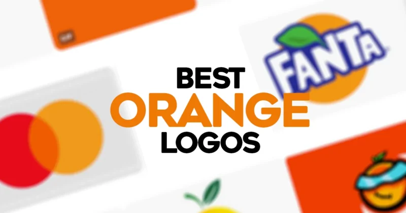
Most Famous Orange Logos
Before we get into the details, here’s a quick overview of some of the most iconic orange logos that you’ll definitely recognize:
1. Amazon
![]()
With its signature swooping arrow shape, the Amazon logo is one of the most identifiable logos worldwide. The orange color evokes shopping joy.

Get 300+ Fonts for FREE
Enter your email to download our 100% free "Font Lover's Bundle". For commercial & personal use. No royalties. No fees. No attribution. 100% free to use anywhere.
2. Nickelodeon
![]()
The fun, splattery Nickelodeon logo captures the network’s playful spirit. Orange represents youthfulness.
3. Fanta
![]()
Fanta’s bubbly script and orange soda splash screams fun. The color matches their tasty orange drink.
4. Firefox
![]()
The fiery fox wrapped around a sphere captures the Firefox brand’s speed and attitude. Orange symbolizes the fox’s fiery spirit.
5. Harley-Davidson
![]()
Harley’s legendary Bar & Shield logo oozes rugged freedom. Orange communicates adventure and independence.
6. Payless
![]()
Payless uses a vibrant orange box in their logo to reflect discount prices and value. Bright, energetic savings.
7. Shutterfly
![]()
The Shutterfly logo features a house shaped like a camera shutter in fun orange and pink. It captures the brand’s cheerful photo sharing experience.
8. Mastercard
![]()
Mastercard’s iconic overlapping red and orange circles symbolize unity and the priceless feeling of acceptance worldwide.
9. Reese’s
![]()
Reese’s orange and brown logo mimics their classic chocolate and peanut butter flavors. It’s a delicious, nostalgic combo.
10. Home Depot

The Home Depot logo uses a solid orange box above their name to symbolize home improvement warehouses. Strong, reliable, helpful.
11. GSK
![]()
GSK’s geometric initials icon in bright orange conveys pharmaceutical innovation and progress.
12. Popeyes
![]()
Popeyes’ bold red and orange logo screams spicy Louisiana flavor. Hot, exciting, and delicious.
13. Little Caesars
![]()
Little Caesars’ orange and blue color scheme feels serious yet still approachable. Affordable quality.
14. bit.ly
![]()
Bitly’s orange and white logo keeps their link shortening service simple and friendly. Clean, straightforward.
15. JBL
![]()
JBL’s orange woofer icon visually captures their audio experience. Bold sound, precision engineering.
16. SoundCloud

SoundCloud’s iconic orange sound wave conveys creativity and music discovery. Energetic audio engagement.
17. Burger King
![]()
Burger King’s blue and orange logo presents their flame-grilled burgers as an exciting alternative to the ordinary burger.
18. Penguin Books
![]()
Penguin Books’ unmistakable orange logo evokes the excitement of reading and adventure. Iconic bookworm vibes.
19. Hot Wheels
![]()
Hot Wheels’ bright orange tracks in their logo reflect the high-speed thrills of their toy cars. Racing excitement.
20. Orange
![]()
Orange, the telecom company, keeps it simple with a clean orange square. Uncomplicated, trusting, friendly.
21. Crush Soda
![]()
The bubbly cursive wordmark pops off the can, enticing soda cravings. Orange conveys Crush’s zesty, fizzy flavor.
22. Dunkin’ Donuts
![]()
Dunkin’s bright orange and hot pink color combo is eye-opening. It’s an energizing start to your day. The colors mirror the warmth and flavor inside.
23. Sunkist
![]()
Sunkist’s logo evokes the juicy, sweet bliss of biting into a fresh orange. Mouthwatering and energizing.
24. Trendyol
![]()
This ecommerce logo uses orange in a minimal tree icon to connect shopping to nature’s bounty. Simple yet meaningful.
25. Hermes
![]()
The iconic Hermes logo uses orange subtly yet powerfully. It conveys luxury, creativity, and style.
Now let’s explore what makes these logos so effective, starting with…
Why Orange Works for Logos
Before jumping into more examples, it’s helpful to understand why orange is such a smart choice for logos in the first place. Here are some of its superpowers when it comes to branding:
Energy and Excitement
Orange has more red in its pigment than yellow, so it carries a bold, energetic vibe. It’s an action color that feels lively, captivating, and spirited.
Attention-Grabbing

In the rainbow spectrum, orange naturally draws the eye. It provides high visibility and cuts through clutter.
Youthfulness and Fun
As a playful, whimsical color, orange evokes a sense of childlike joy and lightheartedness. It’s forever young.
Uncommon
Unlike ubiquitous red, orange is still relatively uncommon in logo design. This helps brands stand out in a sea of blue and red competitors.
Appetizing
Orange can ignite appetite appeal by connecting to delicious foods, like oranges, mangos, carrots, and cheddar cheese. Mouthwatering!
Bright, Energetic

When you want to pump up the energy and vitality, orange is the perfect color choice.
When to Avoid Orange Logos
While orange offers sunny benefits, it isn’t always the right choice. Here are a few cases when orange may not be ideal:
- Finance and law firms that require more conservative colors like blue and black.
- Eco-friendly brands where green would better represent nature.
- Serious or government organizations that need to convey credibility and professionalism.
- Businesses targeting older audiences who often prefer traditional blues and grays.
The bottom line: consider your target audience and branding goals. Make sure orange aligns with the image you want to project.
Choosing the Right Shade of Orange
If you do opt for an orange logo, selecting the ideal shade is key. Here are some top options:

Bright orange – High energy, youthful, fun

Red-orange – Excitement, boldness, intensity

Dark orange – Sophisticated, luxurious, earthy

Yellow-orange – Joy, warmth, friendliness

Burnt orange – Nature, autumn, rustic

Coral orange – Playful, energetic, feminine
The shade choice will depend on your brand personality and the emotions you want to spark in customers.
Design Tips for Orange Logos
To make your orange logo grab attention, complement it with strategic fonts and symbols:
- Combine orange with contrasting colors like blue, green, black or white for greater impact.
- Use friendly fonts like scripts, serifs or rounded sans serifs to enhance orange’s lively energy.
- Incorporate natural elements like leaves, fruit, flowers or animals that match the color.
- Add a clever visual pun to reinforce your brand, like eBay’s colorful pea icon.
- Use interesting shapes, negative space, or double meaning symbols to intrigue viewers.
With smart design choices, your orange logo can captivate audiences and grow your brand.
Is Orange Right for Your Logo?
If you’re considering an orange logo, first reflect on your brand essence and target audience. Ask yourself:
- Does orange match my brand personality and values? Energetic? Outdoorsy? Fun?
- Will orange resonate with my audience’s tastes and preferences? Youthful and casual or refined and upscale?
- Does my industry tend to favor traditional colors like blue and black over orange?
- Will orange help my logo stand out positively amongst competitors?
- Does my orange color work in multiple applications like stickers, social media, apparel and custom patches?
If you answered yes, then embrace orange. It will likely be a vibrant choice that makes your brand memorable.
But if orange doesn’t suit your brand identity, stay authentic to your mission. Pick a color that resonates.
Over to You
Hopefully these brilliant orange logo examples have ignited some inspiration for your own branding. Use these lessons to enhance your logo with smart color choices and compelling design.
The power of orange lies in its bold energy, visibility, and spirit. Wield it wisely to create brand recognition and connect with customers on a deeper color level.